template-parts/blocks/detail/single-logo.php

Why walk when you can ride?

Investment rounds can be a time-consuming process, often involving extensive due diligence and negotiations, leading to delays in funding for promising startups. Saddle up for a refreshing and efficient experience for entrepreneurs seeking capital to fuel their ventures!

Cavalry is a Berlin based VC firm investing in companies that are on the path forward to effect positive change. With their early-stage venture fund they invest in software businesses across Europe in an “as early as it makes sense for the company” stage – often pre-product and pre-revenue.

Cavalry reached out to Studio VEH to sharpen their brand identity with a focus on their tone of voice. The aim: reflecting their attitude of keeping things simple and upfront without unnecessary due diligence – and, thus, reflect the brand name Cavalry:
In the fast-paced world of technology and entrepreneurship, Cavalry stands out as the prominent force in the realm of venture capitalism, that rushes in and fights the battle hands-on alongside you like a true cavalry.

Brand Creation

Brand Repositioning

ConTech

eCommerce

Saddle up for an amazing brand!

Cavalry exists to actively support founders in tech by providing capital, through operational support, and by activating an extensive network of entrepreneurs, scientists, industry experts, and specialists.

After having sharpened the above vision and mission of the company, the next task was to define their tone of voice as the core element of the brand.
Brand Creation

Brand Repositioning

ConTech

eCommerce

Tone of voice

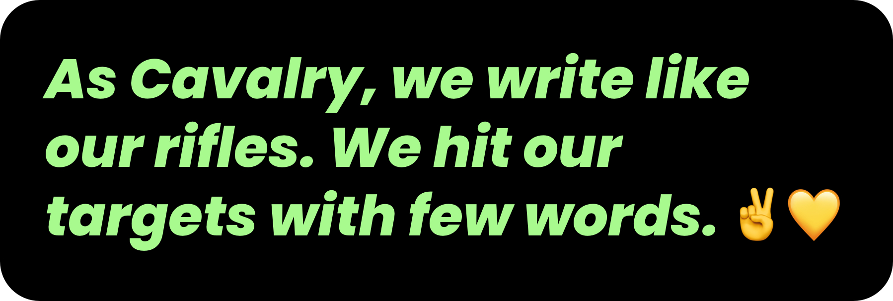
We try to write like we talk. That’s our kind of professionality. It’s authentic. It comes from the heart and is shot from the hip.

Writing like you speak will help to establish a rhythm. For example, after a gunfire of words, a reader needs a little pause.
Right?

Let’s have a look at our brand character, and the language to convey it:

We’re fun! 🥳 Because success is fun. And success is easier to reach if you have fun doing so.

Thus, we speak enthusiastically (but not overly cheery). So we use words like yay!, Friyay, and amazing. 🙌

We are supportive (but not overbearing), we celebrate success, we are inspired by achievements and we try to encourage
new ideas. 🚀

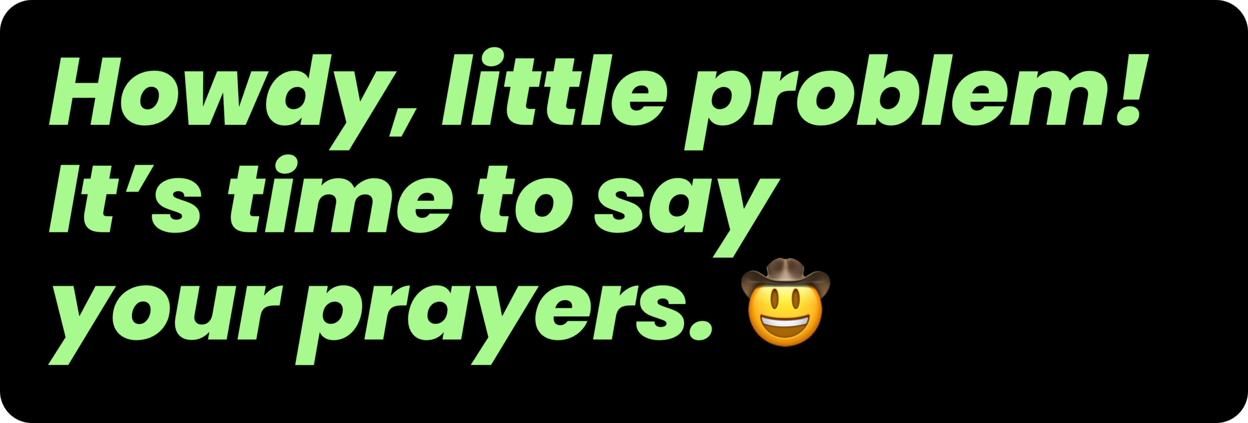
Howdy, little problem!

As the team rides forth as the modern-day cavalry, standing tall, upfront, and unyielding in the commitment to champion honesty and transparency, this also reflects in their brand manifesto:
Brand Creation

Brand Repositioning

ConTech

eCommerce

To every changemaker, dreamer, idealist, yeasayer and pioneer who steps up to a challenge:

We’ve got your back – all along the wild ride ahead of you.

We will share with you lessons learned from our past battles so that you can be even better with us. Your tech product is going to make life easier for others? We will stand by you with our vast network of expertise, our hands-on experience, and our quickly established funding scheme.

So, stop counting tumbleweeds.
Saddle up to ride with us and – once and for all – take it easy.

We’re not a mirage. We are the hard working, setbacks toughened bunch of riders with quite a few war stories in tow. We’re the good so you can achieve great.

We’re the reinforcement.

We are Cavalry! 🤠

Vibrant Green and Yeehaw Yellow

This powerful brand reinforcement also had also to be reflected in the visual identity. We gave their existing word mark a little makeover and made it move. In addition, we defined a vibrant green as the main brand color to reflect both the brand’s bold attitude and its focus on tech businesses.

Brand Creation

Brand Repositioning

ConTech

eCommerce

Brand Creation

Brand Repositioning

ConTech

eCommerce
Brand Creation

Brand Repositioning

ConTech

eCommerce

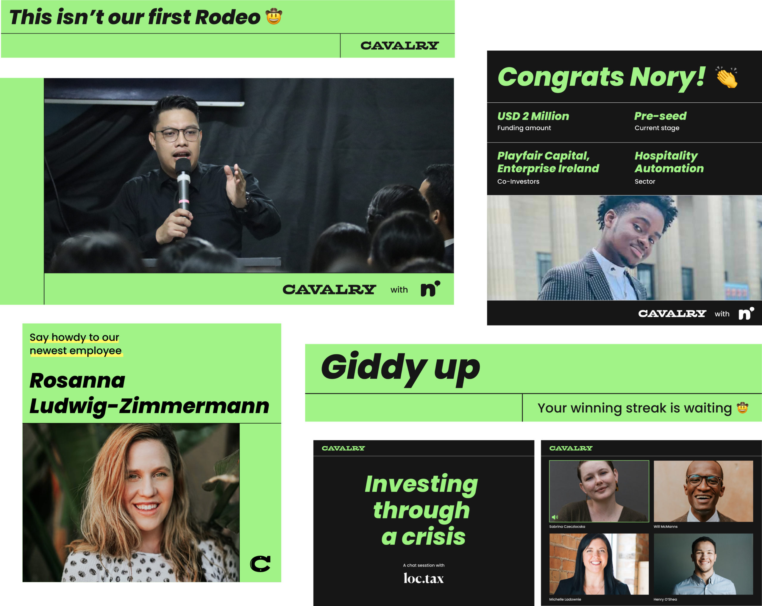
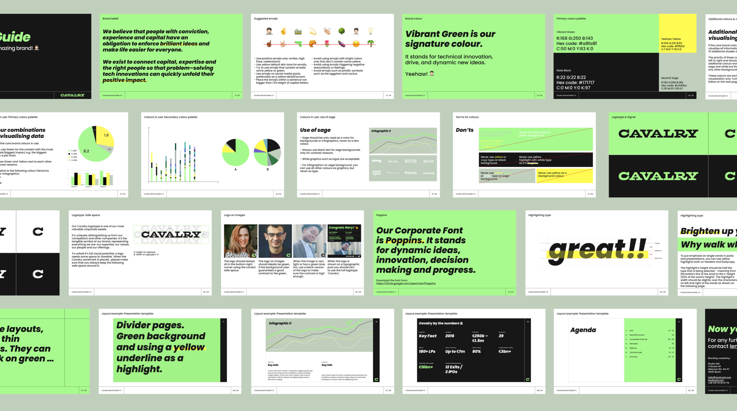
From there, we developed a full design system, starting with the social media appearance, resulting in a full brand identity manual with detailed guidelines in order to enable the Cavalry team to create future brand assets independently.
Brand Creation

Brand Repositioning

ConTech

eCommerce
Brand Creation

Brand Repositioning

ConTech

eCommerce

Team Credits

Strategy: Franziska Veh, Mark-Marcel Müller
Creative Direction: Franziska Veh
Text: Mark-Marcel Müller
Art Direction: Anna Lind Haugaard
Design: Aditi Kapur, Callum O’Neill
Project Management: Kiyoshi Stelzner

Do you have a project and need support? Let’s talk: get in touch via phone, through email or by visiting our studio! We look forward to hearing from you.

Who is applying to whom?

In today’s fiercely competitive job market, the war for talents rages on as organizations vie for the most skilled and qualified individuals to join their ranks. With the success of businesses increasingly reliant on attracting top talent: What is the best strategy to win the battle for the best and brightest?

HR in transition

On average, a job is unfilled for 131 days: Companies in the SME sector in particular have problems filling their vacancies.

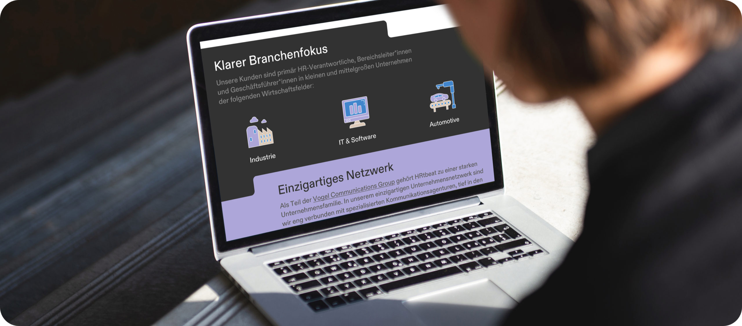
The newly founded agency HRtbeat leaves the classic path of recruiting and combines marketing with HR to make employers attractive and credible — with a clear focus on the automotive, industrial and IT sectors.

Digital recruiting, encompassing online marketing strategies and tools, has revolutionized the way companies find and attract potential candidates. Leveraging digital platforms such as social media, job boards, and company websites, organizations can reach a wider pool of candidates, irrespective of geographical boundaries.

By utilizing targeted marketing techniques, tailored content, and employer branding, HRtbeat enhances an organization’s visibility and appeal to potential hires.

This approach also streamlines the recruitment process, reducing time-to-hire and enabling HR teams to identify and engage with the most suitable candidates efficiently.

Before founding the company, the HRtbeat team turned to Studio VEH to develop the brand strategy and visual identity.

Behind every lead is a person

“What does their heart beat for?” This question was decisive for the company name, HRtbeat: with the intention to make recruiting completely digital, but still 100% personal — because behind every lead is a person, with an individual profile.

In a joint brand workshop with the founding team, Studio VEH developed the complete brand platform and defined brand values, brand belief and brand purpose, as well as a claim based on the positioning in the market:
Recruiting am Puls der Industrie (=Recruiting on the pulse of the industry).

Brand Creation

Brand Repositioning

ConTech

eCommerce

Brand Creation

Brand Repositioning

ConTech

eCommerce

Hi purple squirrel!

Based on the idea of the „purple squirrel“ — a term used in the recruiting industry to describe a candidate that is so perfect for a job that they are almost impossible to find — Studio VEH developed a full visual system for the brand with the goal that the whole HRtbeat team can use and work with in on their own for creating all future digital HR campaigns, including templates for campaign landing pages.

Team Credits

Strategy: Franziska Veh, Mark-Marcel Müller
Creative Direction: Franziska Veh
Claim/Text: Mark-Marcel Müller
Art Direction: Anna Lind Haugaard
Design: Callum O’Neill
Development: Ralf Büsch
Project Management: Kiyoshi Stelzner
Do you have a project and need support? Let’s talk: get in touch via phone, through email or by visiting our studio! We look forward to hearing from you.

Growing memories

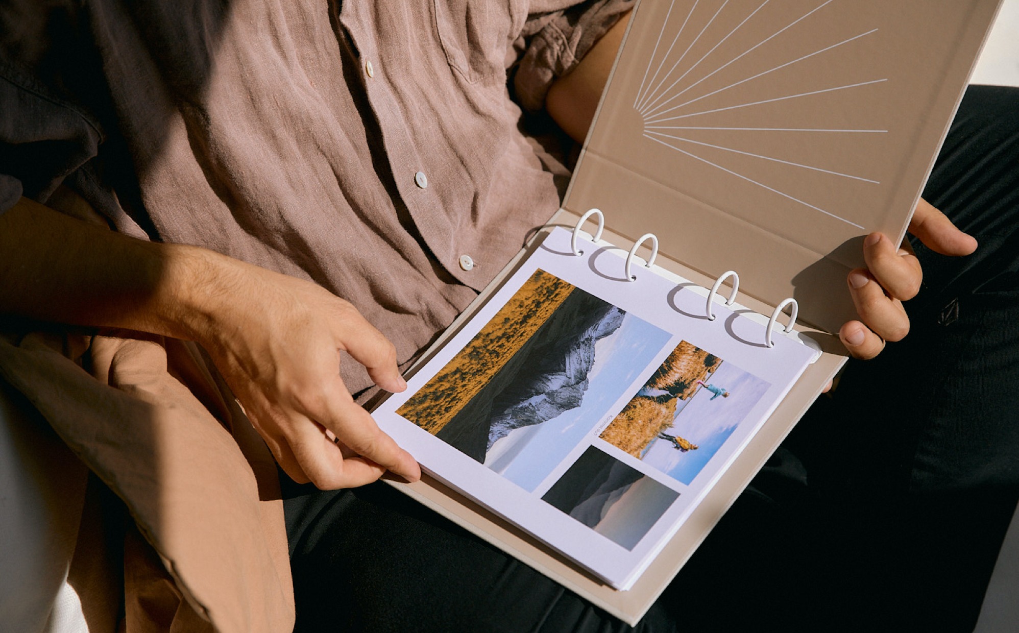
What happens to all the photos we take every day? And where are all the memories safe, even if the smartphone is broken or lost? The brand new answer: Simply collect the most beautiful pictures every month in a timelessly beautiful album.

In the age of smartphone cameras and packed calendars, it is becoming increasingly difficult for families to preserve beautiful memories. Anyone who wants to create a classic photo album is faced with a truly mammoth task.

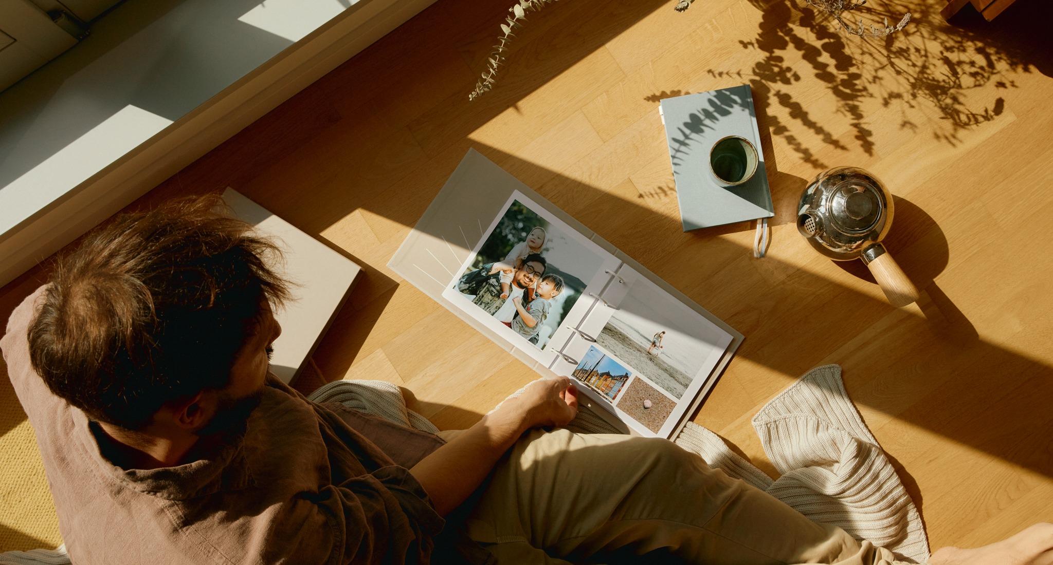
As a father of two young children, Axel Lilienblum, the founder of Grow, was faced with just that. Why hasn’t there been a photo album that simply grows by a few pages with the most beautiful pictures every month? Grow was born.

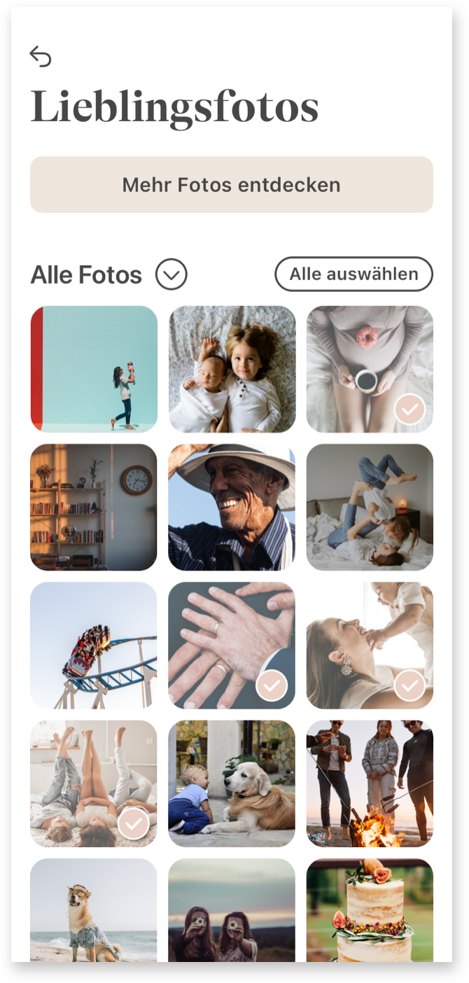
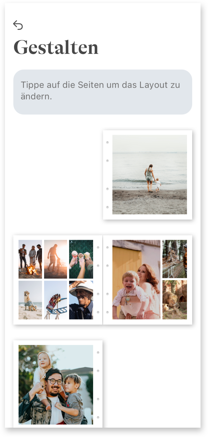
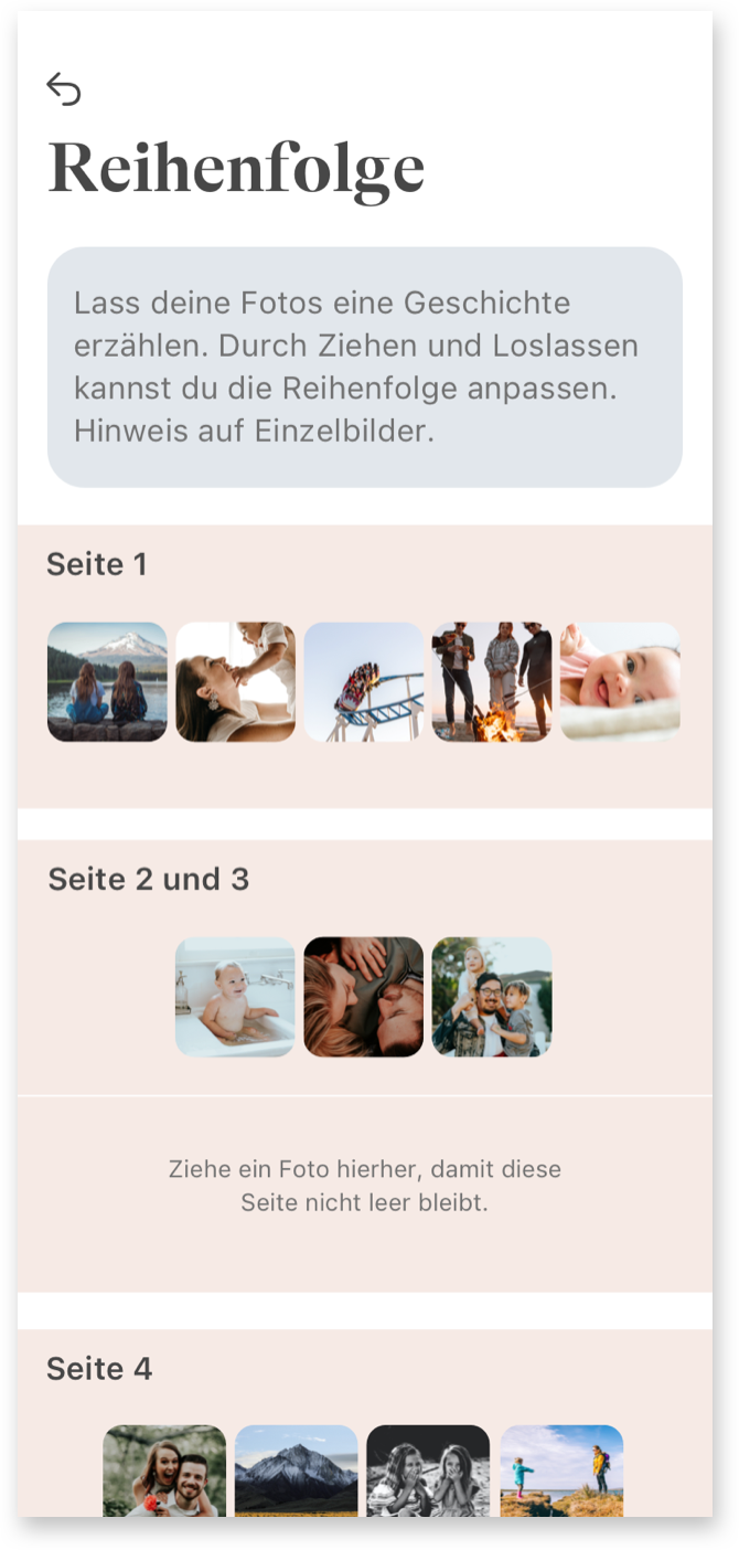
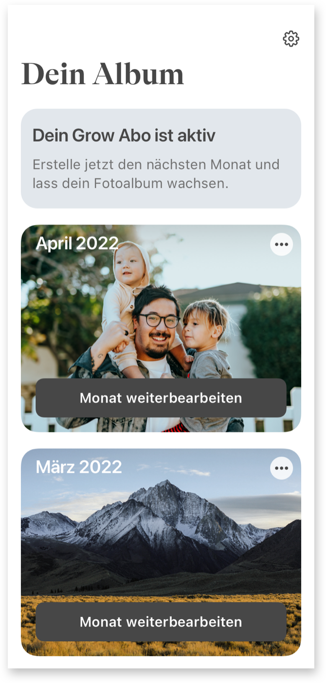
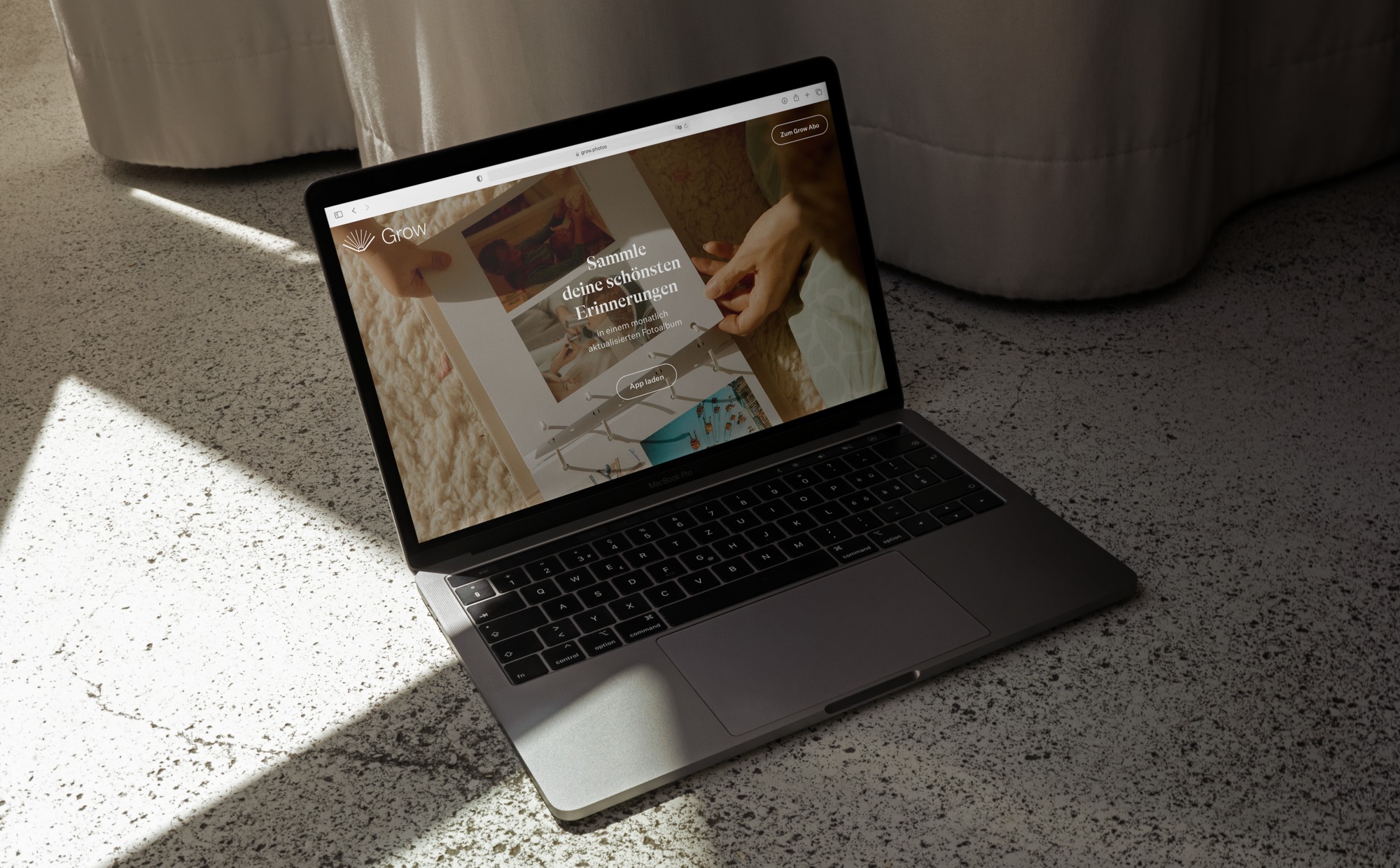
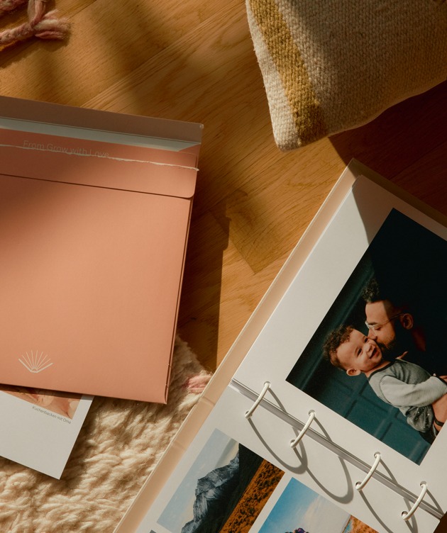
Studio VEH was commissioned to develop the strategy and full brand identity: from the app store and website, to the UX & UI design of an uncomplicated and motivating app, to the final print product sent by mail: A monthly growing photo album that preserves memories of moments with the greatest personal value forever. Clearer than ever: timeless design, top quality and lasting value were the key requirements.

Brand Creation

Brand Repositioning

ConTech

eCommerce

Brand Creation

Brand Repositioning

ConTech

eCommerce

For Grow, loving bonds are the most important thing in life. Studio VEH created a brand that reflects this brand essence not only in the communication and album design, but in the entire customer experience.

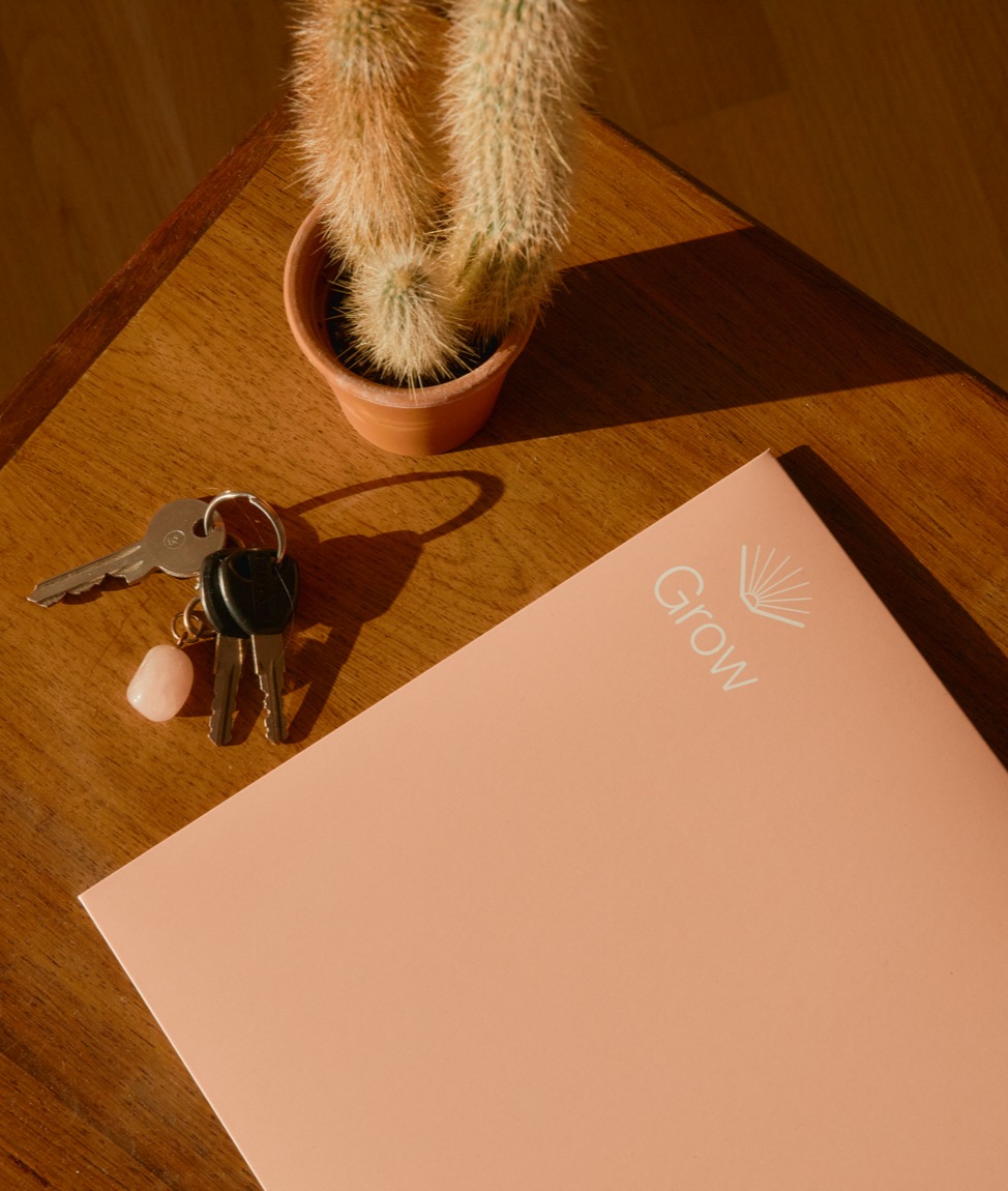
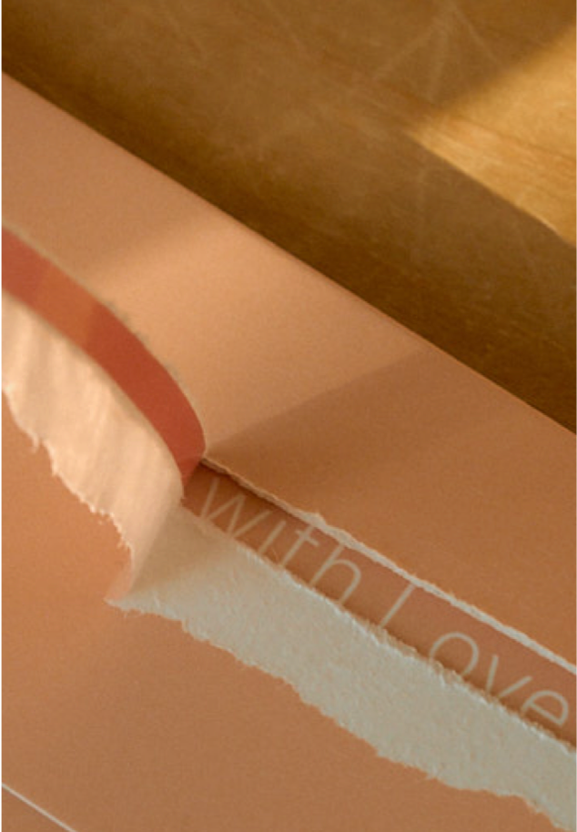
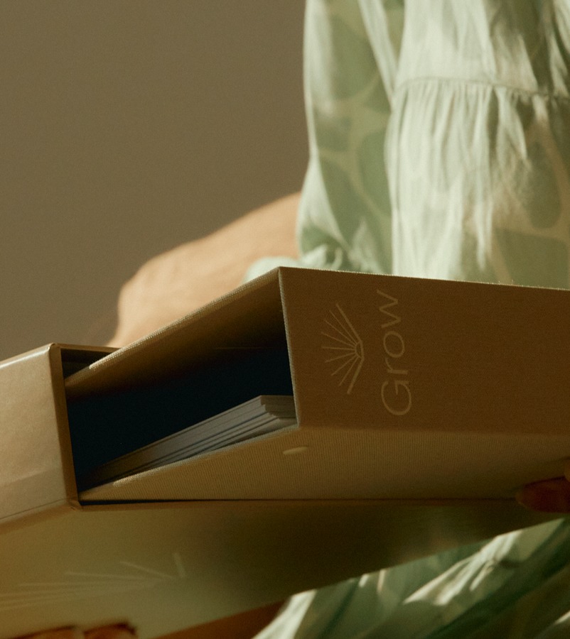
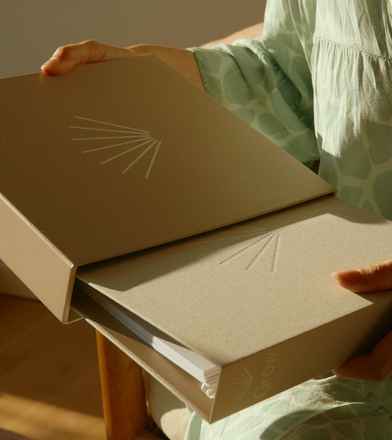
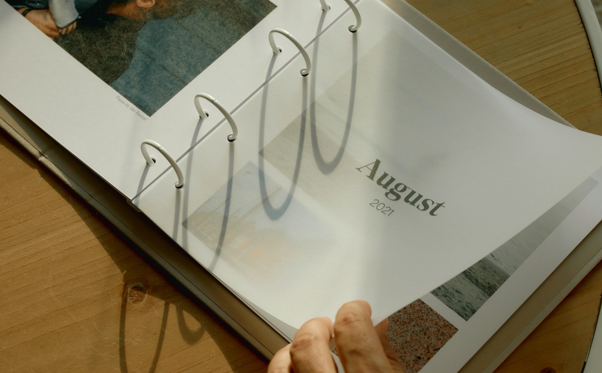
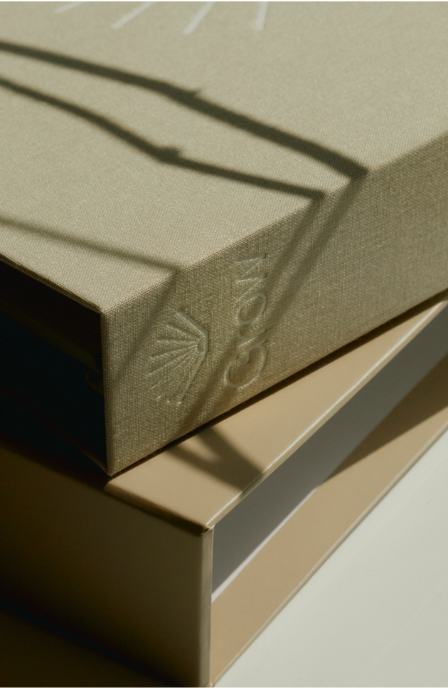
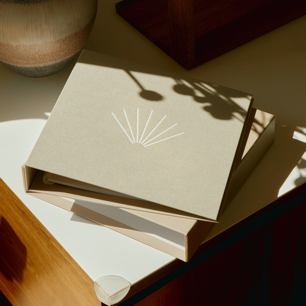
The album consists of a high-quality linen folder that is filled month after month with ever new loving moments on high-quality archival paper. The logo had to look elegant and classy on it. In the same breath, it had to create an emotional connection that anchors Grow as a permanent fixture in the user’s life.

The signet is reminiscent of a seashell — and at the same time represents the fan of a book opened upwards, its leaves captivating the viewer like the rays of a sunrise. It seems like a souvenir of a beach vacation with the family. It warms the heart, brightens our minds in everyday life and awakens a feeling of contentment and joy that never gets old.

The shell functions as a stand-alone in the app logo as well as in all communication — also in combination with the logo font below in a clear, sans-serif font.

The typographic concept for Grow is a reference to past memories and at the same time opens the view to the present as well as the life ahead. A serif typeface meets a modern sans serif. The playful combination of serifs and sans serifs connects yesterday and today — and focuses on subscribers as keepers of past moments and creators of ever new memories.

Brand Creation

Brand Repositioning

ConTech

eCommerce

Brand Creation

Brand Repositioning

ConTech

eCommerce

Brand Creation

Brand Repositioning

ConTech

eCommerce

Brand Creation

Brand Repositioning

ConTech

eCommerce

Brand Creation

Brand Repositioning

ConTech

eCommerce

Brand Creation

Brand Repositioning

ConTech

eCommerce

Brand Creation

Brand Repositioning

ConTech

eCommerce

Brand Creation

Brand Repositioning

ConTech

eCommerce

Brand Creation

Brand Repositioning

ConTech

eCommerce

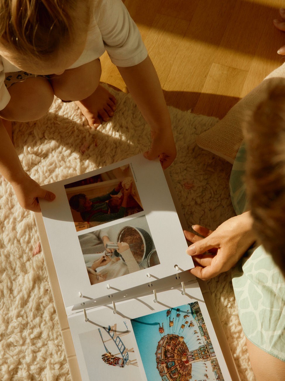
From the digital user interface to the haptic experience, the brand is brought to life in a holistic and detailed way. In the process, it naturally evokes memories of one’s own childhood and demonstrates how important loving relationships are in life. For all those involved, the development of Grow repeatedly gave rise to goosebump moments. Because of its great emotional significance, Studio VEH devoted itself to the final product with the utmost care at a very early stage, always keeping the coming generations in mind. That’s why the Grow folder, its accompanying slipcase, and the shipping packaging were designed with the environment in mind and produced with certified sustainable materials. In close communication with Axel Lilienblum and his family, Studio VEH was able to ensure that the result would meet the highest standards — and that even the youngest children would simply love it.

Brand Creation

Brand Repositioning

ConTech

eCommerce

Brand Creation

Brand Repositioning

ConTech

eCommerce

Brand Creation

Brand Repositioning

ConTech

eCommerce

Brand Creation

Brand Repositioning

ConTech

eCommerce

„The close collaboration with Studio VEH helped me to structure my initial ideas for both the brand and the product in a very efficient way. We are beyond happy with the result – from the app design to the final product – and are getting a lot of positive feedback from our customers.“

Axel, Founder of Grow

Brand Creation

Brand Repositioning

ConTech

eCommerce

Brand Creation

Brand Repositioning

ConTech

eCommerce

Team Credits

Creative Direction: Franziska Veh
Design: Lind Haugaard, Callum O’Neill
UI: Callum O’Neill
UX: Robert Siuda
Project Management: Kiyoshi Stelzner
Photography: Daniel Faro
Retouching: Alin Bosnoyan
Text: Mark-Marcel Müller

A soulful and fun way to work out together

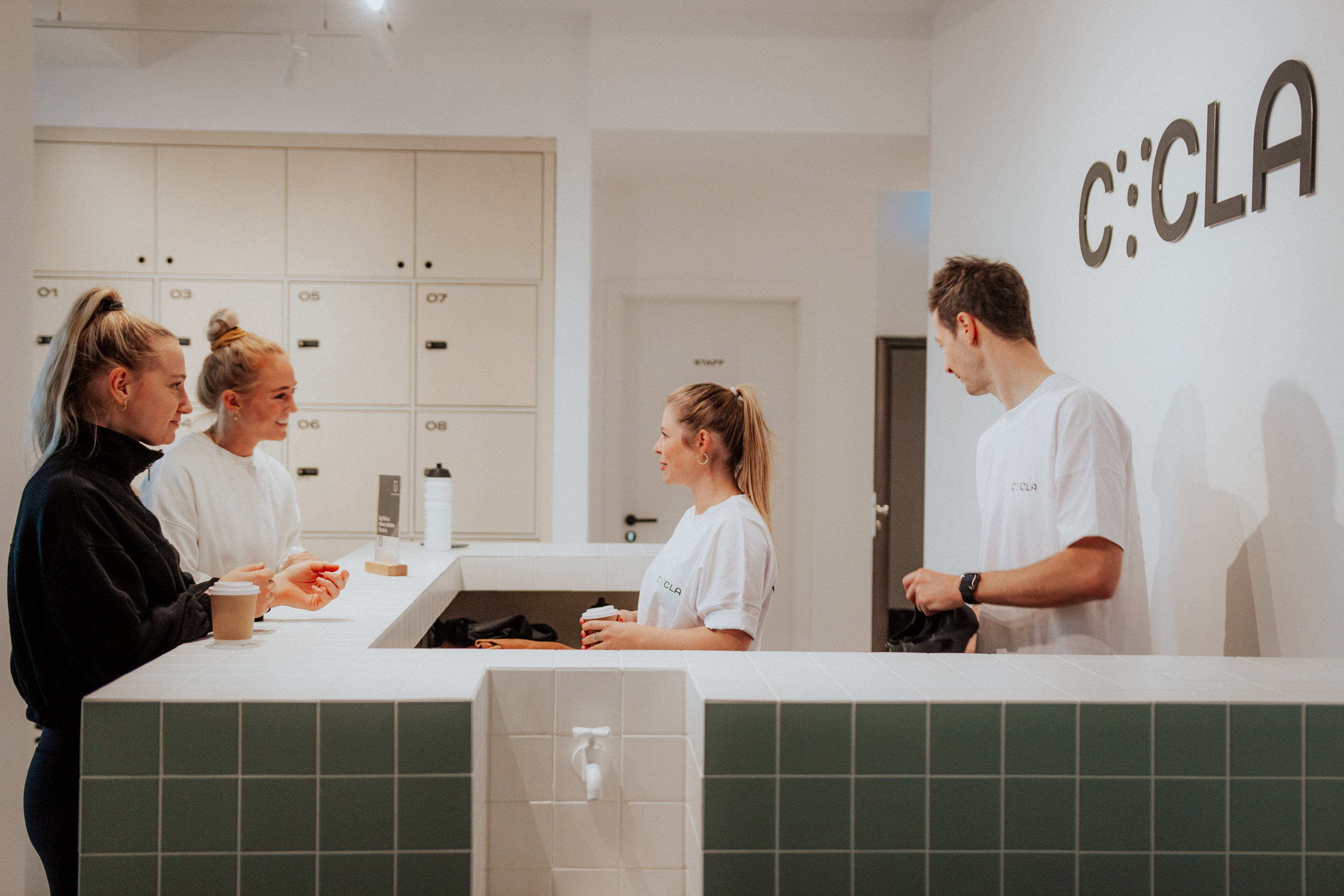
CYCLA is a new-age concept boutique sports studio that celebrates community, wellness of the body and mind, and doing it together in the most fun way possible.

Doing a series of exercises during the brand workshop together, Studio VEH arrived at key values and a strong brand belief that guided the team through the process of creating a visual identity, capturing the CYCLA’s brand essence.

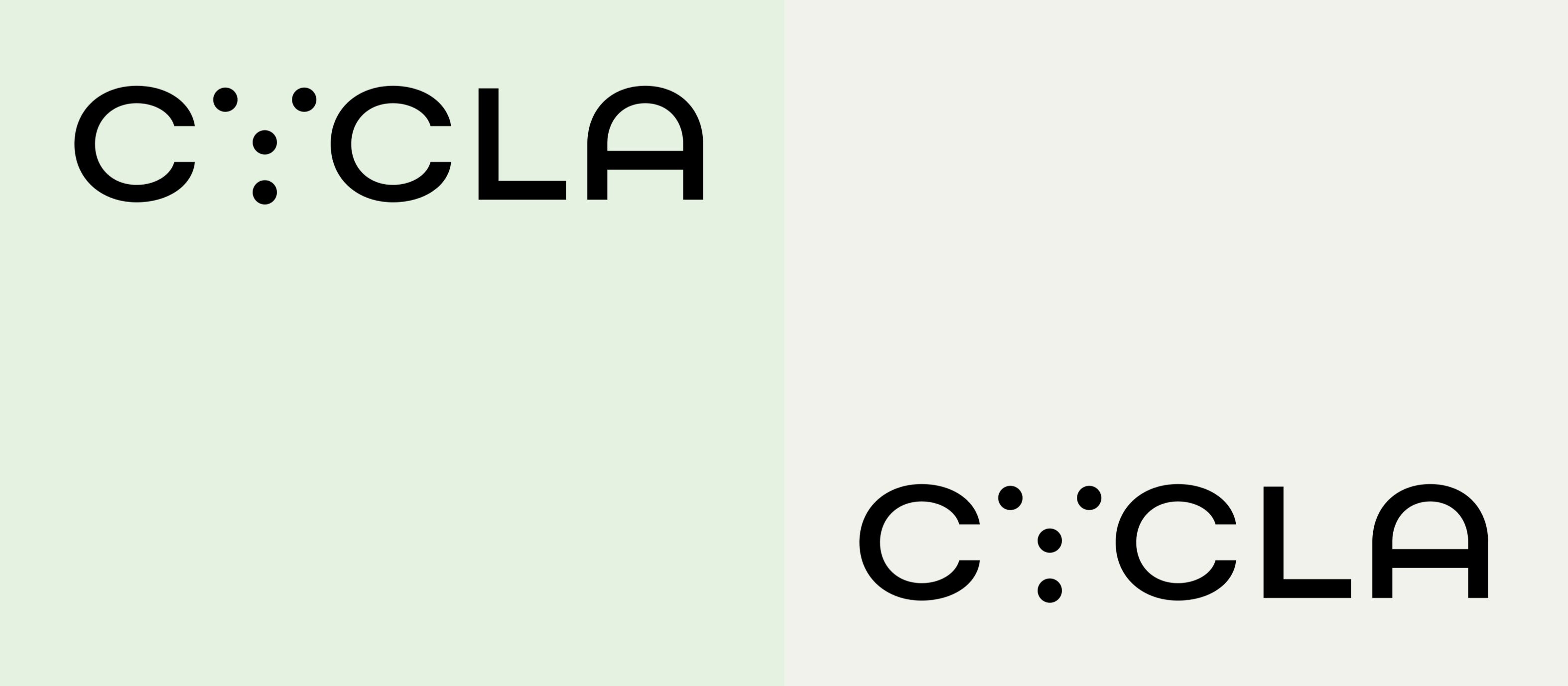
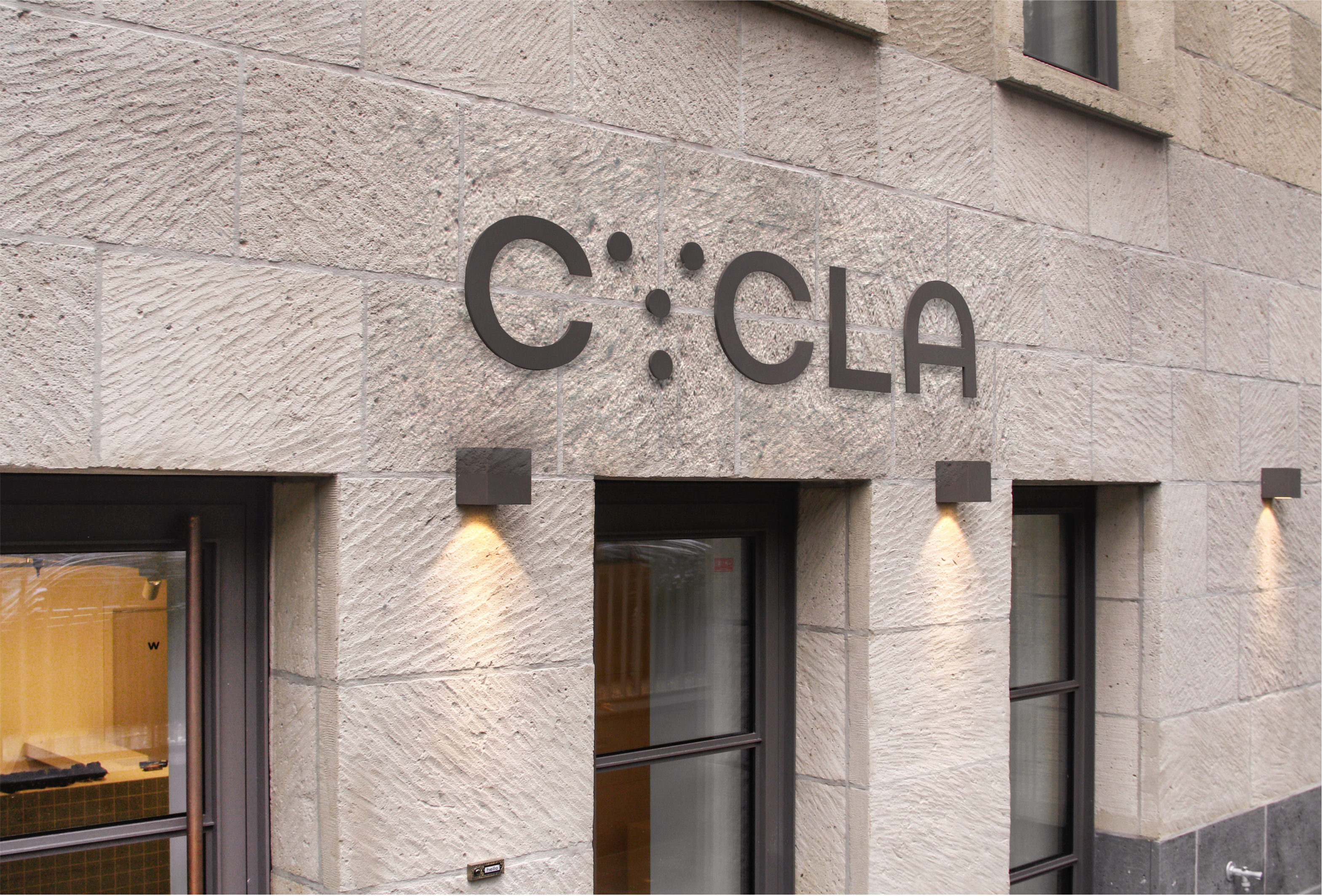
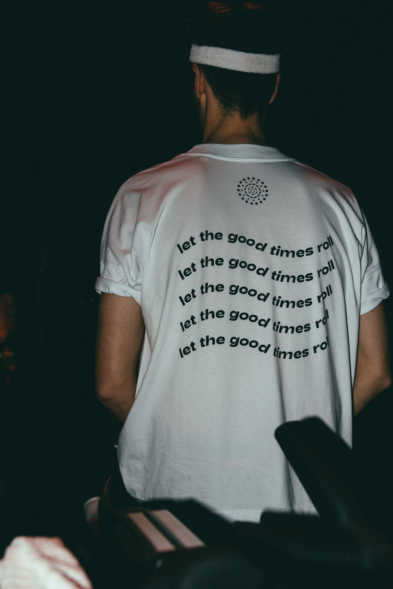
Since authenticity, openness, collaboration and fun are at the core of the brand personality, the team at the studio developed a circular symbol that symbolizes CYCLA’s dynamic and movement-oriented energy. This is also expressed in the new claim — Let the good times roll — also developed by Studio Veh. The dots in the word mark symbolize the fun and inclusive togetherness that CYCLA stands for.

“I found the collaboration with Franziska and Studio VEH to be absolutely professional and pleasant. During the creation of our sport studio brand CYCLA, Franziska and team were instrumental in helping us create an identity that fits us, our values and the industry. During the development process, they asked the right questions, which enabled us to sharpen our brand values and define them more precisely.”

Maren Bertram, Founder of CYCLA

Brand Creation

Sports

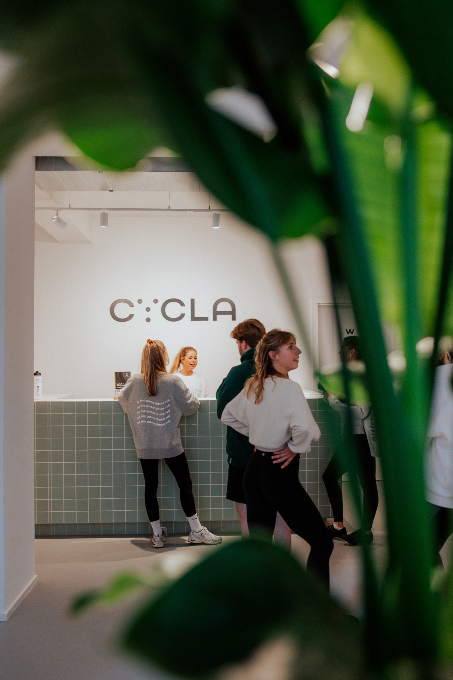
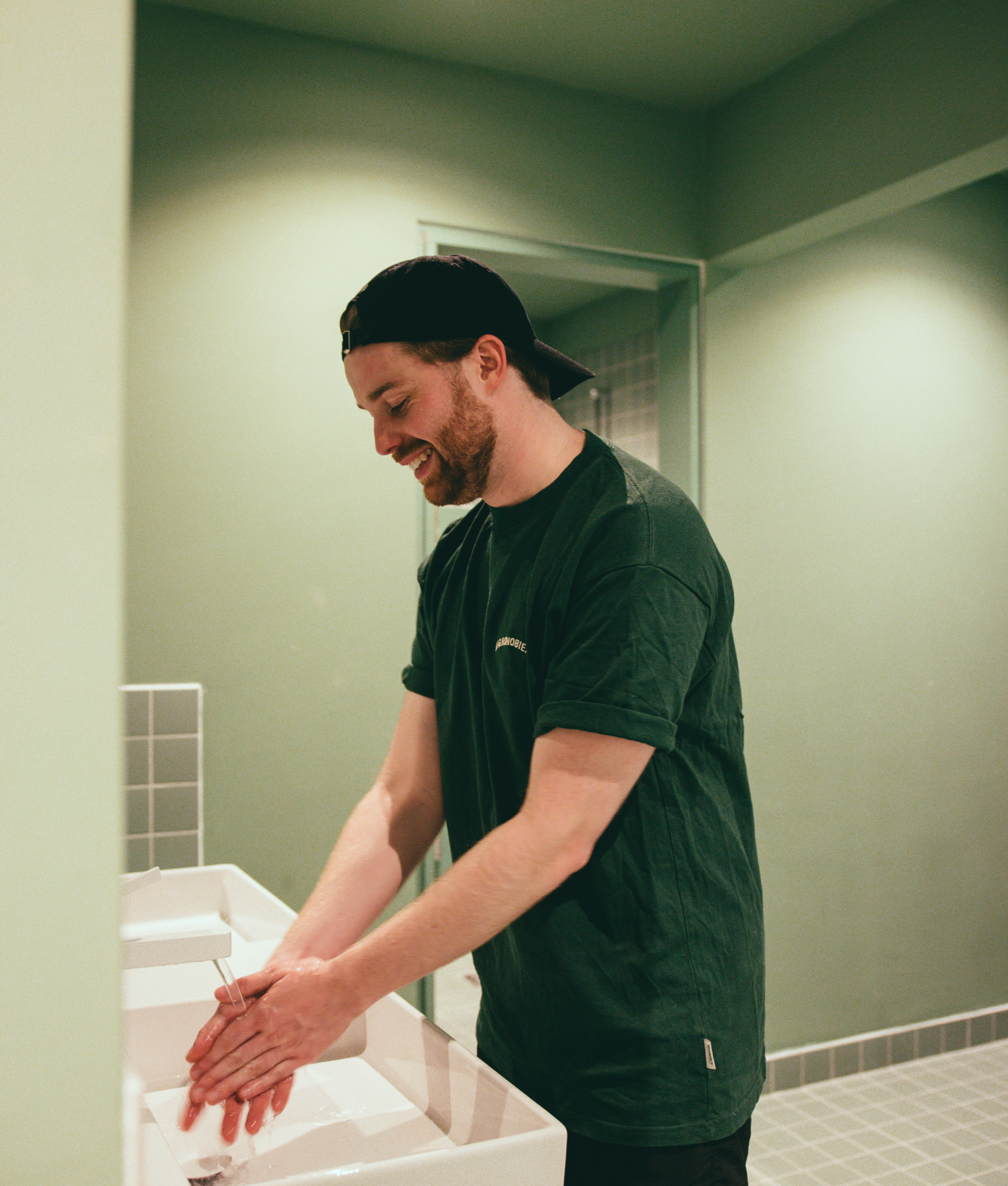
It was important for CYCLA to extend the brand values to the studio space. CYCLA customers needed to experience a comprehensive brand experience: When they visit, they don’t just feel welcome and comfortable, but experience themselves as part of a community that enriches their daily lives.

Brand Creation

Sports

Brand Creation

Sports

Brand Creation

Sports

Who is CYCLA talking to? Who is the place for? In the brand workshop, together we acknowledged that there is quite a gap between people who just need a release after their stressful day, without being judged, without having to look, feel or talk a certain way and can just be themselves and still feel part of a positive collective. Spaces and sport studios for these people and their needs are missing, they are often highly functional and mechanic or have become social status hotspots for people above a certain economic class fitting to a certain body type. CYCLA couldn’t be more different, it is proudly inclusive, welcoming and diverse.

Brand Creation

Sports

Brand Creation

Sports

Brand Creation

Sports

Brand Creation

Sports

With CYCLA’s sports studio, we were able to extend the feeling into a well-rounded and holistic spatial brand experience using the colour scheme, icons, typography and other interior design elements. We feel pleased to see all elements coming together and complimenting each other in a physical space.

Brand Creation

Sports

Brand Creation

Sports

Brand Creation

Sports

Brand Creation

Sports

Brand Creation

Sports

Team Credits

Creative Direction: Franziska Veh
Claim/Text: Franziska Veh
Design: Callum O’Neill
Development: Ralf Büsch
Project Management: Kiyoshi Stelzner
Interior Design: undplus
Photography / People: @jantitvs
Photography / Interior: undplus

Highest service

There are completely new pitfalls that can be made in the service industry today. So often, companies are quickly dismissed by their users after a few frustrating clicks that lead nowhere. The key, therefore, to new peaks in customer satisfaction lie precisely here: reduction.

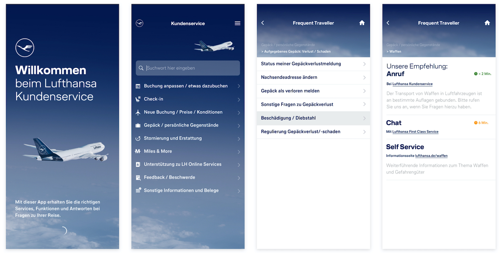
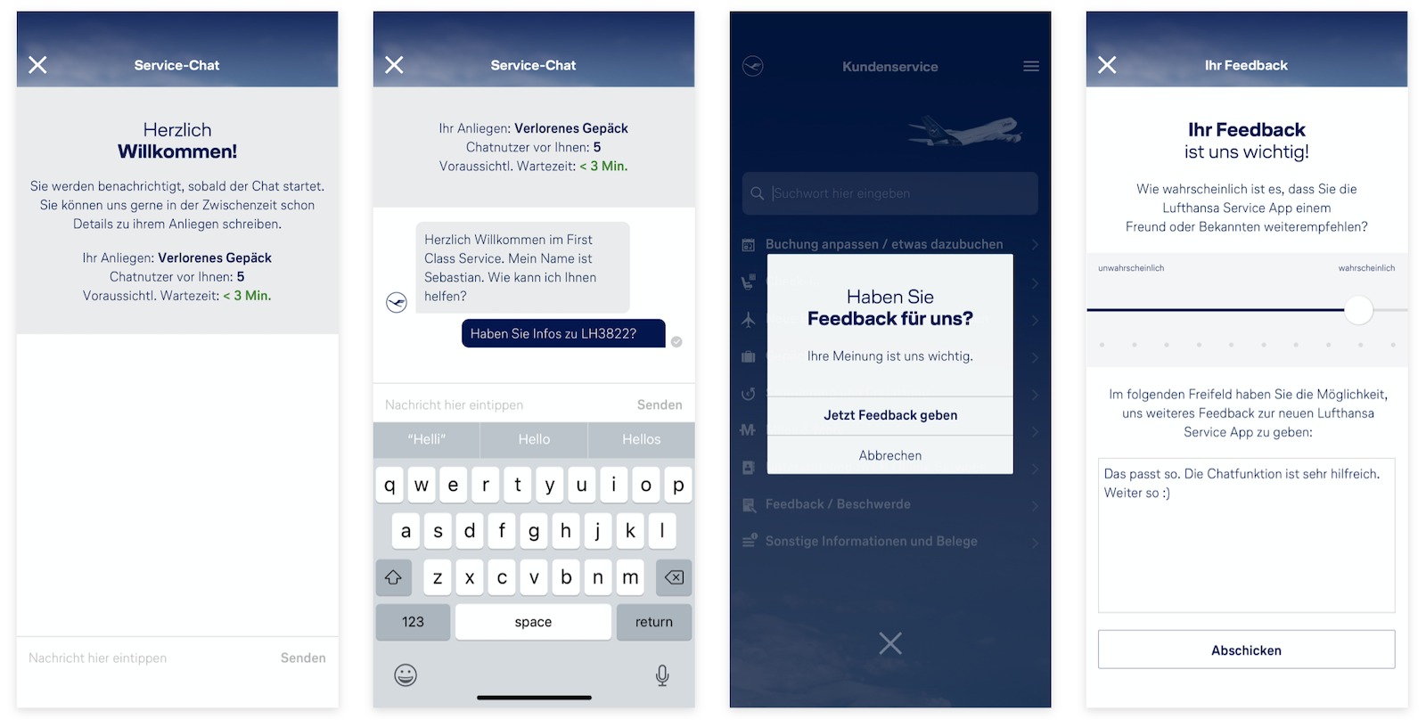
The UX design of the Lufthansa Service App was structured to ensure that customers are able to find the right solution to their problem in just three quick clicks. Lufthansa has seemingly countless contact options for a wide variety of problems, from lost luggage and terminal information to flight rebooking and the carrying of animals. In just three clicks, the app guides customers to an in-depth overview of the relevant contact options, and recommends the best way to get in touch, including providing information on contact availability and possible waiting times.

‘We have been working with Studio Veh and the CodeControl team for over 5 years: that speaks for itself. Franziska Veh and her team are always professional, flexible, innovative and extremely proactive.’

Thiemo Busch, Project Lead, Lufthansa

Large clients are often used to lengthy processes that exist at large agencies. Studio Veh, however, works as closely as possible with the team or client to significantly shorten the development time. Studio Veh is proud to collaborate with the developers at CodeControl who share the same mindset. Thus, the Lufthansa app went live just 10 weeks after the start of the UX conception.

The clarity and structure of Lufthansa’s new corporate design contributed significantly to the rapid development of the App. This brand identity provided an optimal basis for the development of the design and App logo. Studio Veh finally designed all user interfaces, from the splash screen to the feedback screen, as well as overseeing App Store Optimisation (ASO).

Whether packing a suitcase or downloading an app, the perfect outcome results from planning before you take off.

Team Credits

UX:
Robert Siuda

Design:
Franziska Veh

Project Mgmt & Development:
CodeControl

Hero Image:
© Deutsche Lufthansa AG

Do you have a project and need support? Let’s talk: get in touch via phone, through email or by visiting our studio! We look forward to hearing from you.

The community code

Every community uses its own language. For programmers, it’s binary code, even when discussing two fundamental subjects: the ‘Future of Work’, and genuine added value for customers.

The Berlin-based startup CodeControl connects companies with the best talents in programming, design and product development. CodeControl specialises in finding the perfect team and technology for each project – from Java, Python and Objective-C to Symfony and Ruby – always with the aim of creating the best solution for each client.

CodeControl’s vision is to form a large community of code and tech specialists. Their ethos is to transfer knowledge and exchange of ideas on a personal level, this is the philosophy Studio Veh has used at the core for the development of the design concept.

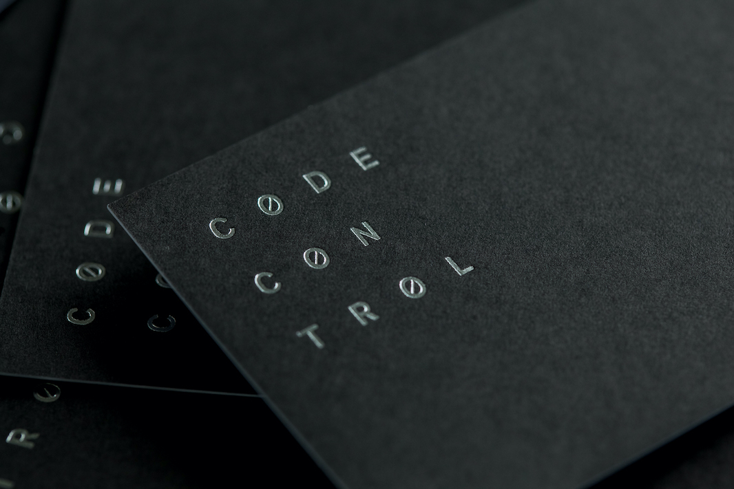
Binary code is the basis of digital information processing and is at the heart of the logo’s concept. Code is the language that everyone in the community understands; it symbolises a sense of community and a shared attitude in life. Anyone who simply sees random ones and zeros or, in programming languages, weird strings of slashes, dollar signs and brackets, is simply blind. Why? Because these characters reshape the world: they create universes in which nothing seems impossible. They not only saturate the night’s sky pink in a computer game, but they also ensure that houses are green in real life. They optimise logistic processes, reduce greenhouse gases and create autonomously driven taxis. Code is full of life, and its logic is fundamentally human.

In the brand concept developed by Studio Veh, this binary – the logical on one hand and the human on the other – runs throughout, from the business stationery to the brand’s external communications.

‘If you are looking for future-driven design thinkers: Call Studio Veh – stellar ideas and professional execution, guaranteed. Always a pleasure to work with.’

Marc Clemens, Founder CodeControl

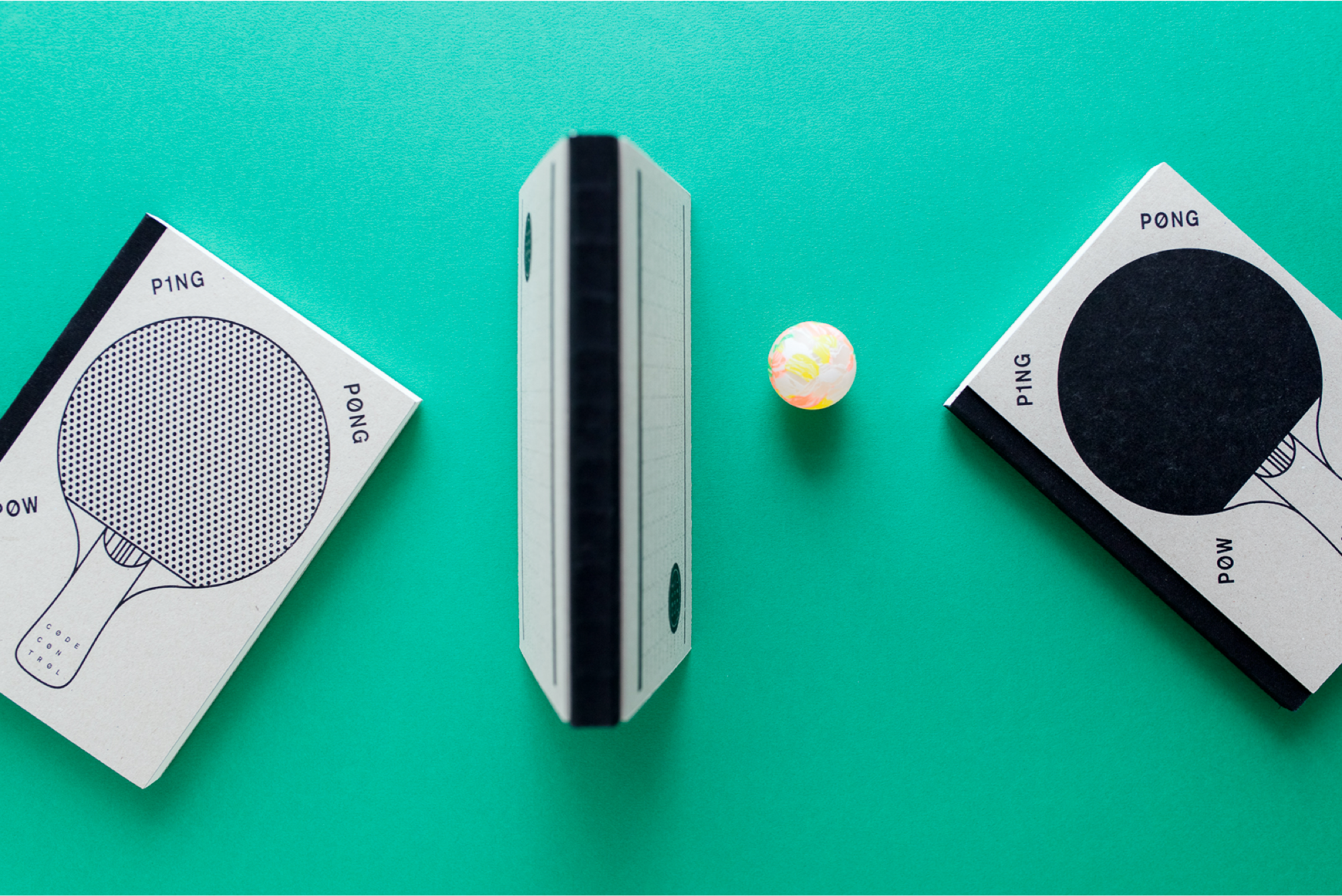
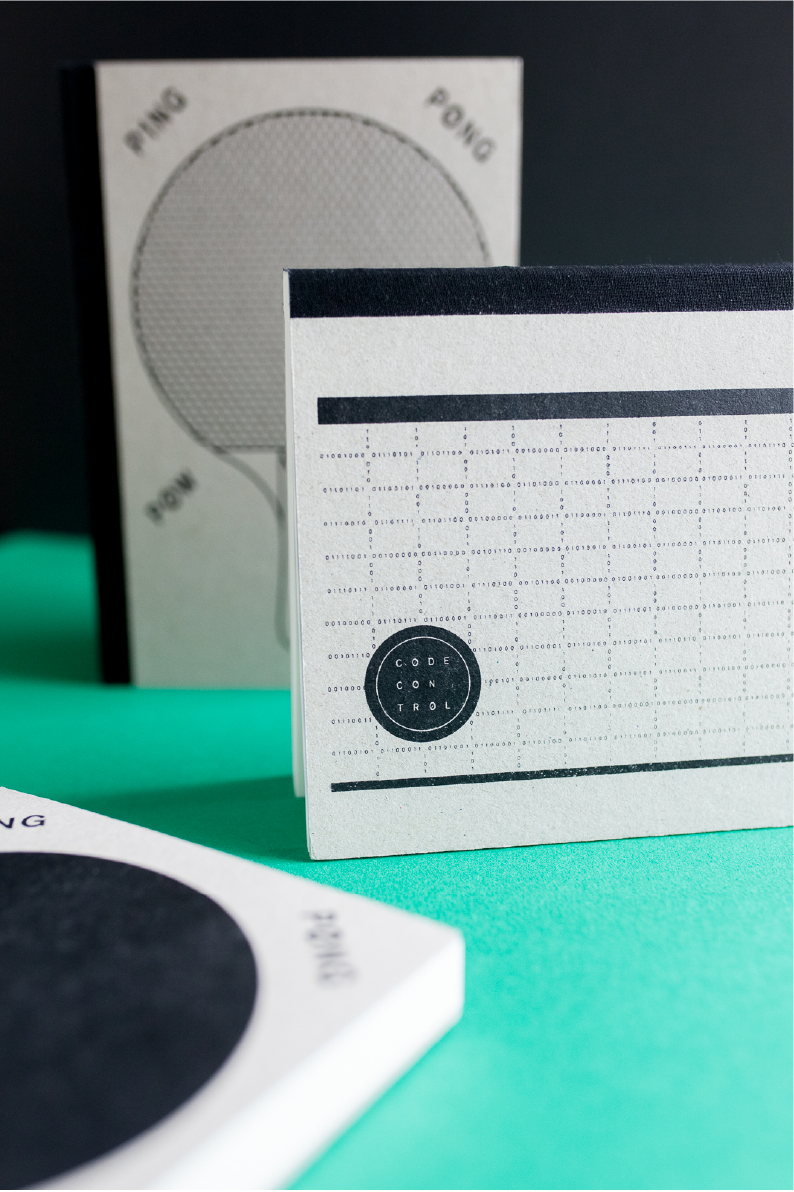
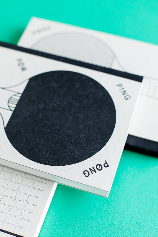
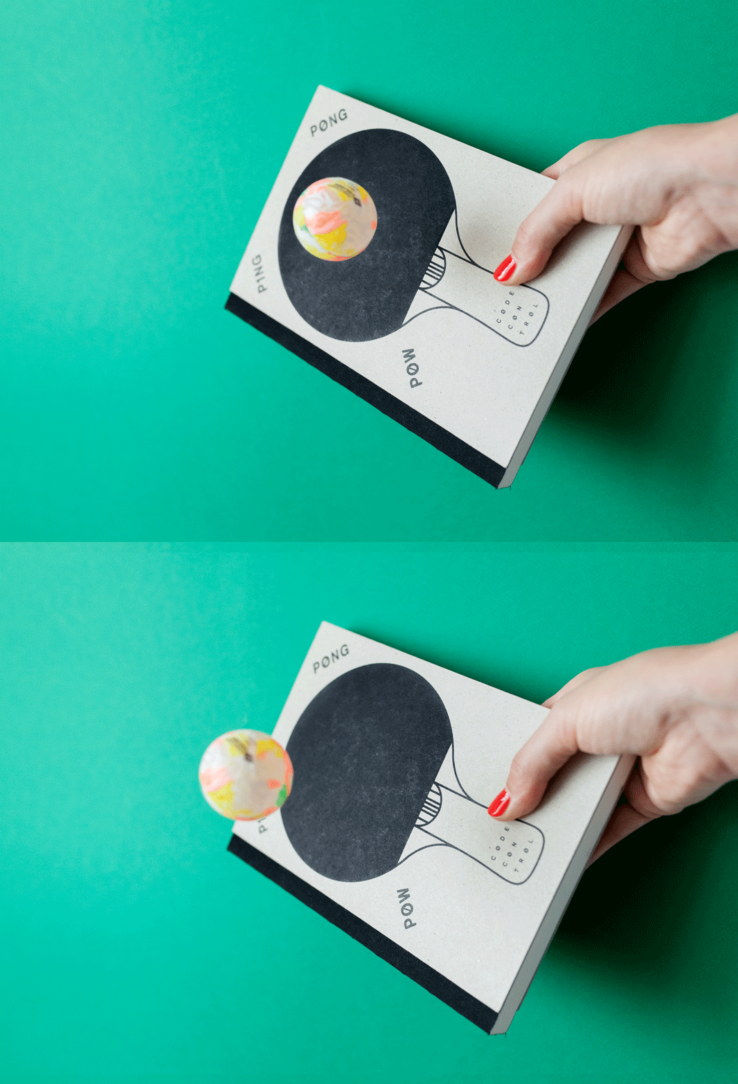
The giveaway idea of three notebooks for clients and partners underlined the personal exchange at CodeControl, and was a reminder of the importance of mental ‘ping-pong’ to achieve the best results. Two of the notebooks were printed with ping-pong paddles and the third with a net (including a hidden message in the net lines, made up of binary code).

Brand Creation

Brand Repositioning

ConTech

eCommerce

Brand Creation

Brand Repositioning

ConTech

eCommerce

Spreading awareness

Merchandise plays a vital role in strengthening and fostering a sense of community. It serves as a tangible representation of shared values, interests, and experiences. Having community merchandise allows members to proudly display their affiliation. It promotes a sense of belonging and camaraderie among individuals, forging connections and encouraging interactions. It also acts as a promotional tool, spreading awareness and attracting new members who resonate with the community’s ethos. This is why CodeControl started their own merchandise material.

Taking the idea of binary code of a common language to the next level, we used creative coding to create a tool that allows the CodeControl team to create static and animated graphics based on a binary code pattern. It is visually connected to the brand but doesn’t make the merch feel too branded. More merch articles coming soon!

Brand Creation

Brand Repositioning

ConTech

eCommerce

Brand Creation

Brand Repositioning

ConTech

eCommerce

Brand Creation

Brand Repositioning

ConTech

eCommerce

Brand Creation

Brand Repositioning

ConTech

eCommerce

Brand Creation

Brand Repositioning

ConTech

eCommerce

Brand Creation

Brand Repositioning

ConTech

eCommerce

Team Credits

Brand Workshop & Strategy:
Franziska Veh

Creative Direction:
Franziska Veh

Identity Design:
Lind Haugaard

Creative Coding:
Anatoly Grashchenko

Do you have a project and need support? Let’s talk: get in touch via phone, through email or by visiting our studio! We look forward to hearing from you.

The whole package

How do we identify a modern-day gentleman? By his name? His manners? His values? His sophistication? A certain appearance? None of these alone is enough, each is part of the formula.

The founders of Green + The Gent have always loved grooming rituals. But it wasn’t until they travelled the world that they realised what had been missing at home in Germany: frequent visits to a traditional barbershop. It became apparent that they were used to making do with the limited selection of products at local drug stores. Yes, the range of products available has been growing more and more, but not the ‘gentlemanly’ products, just those that are gaudy or following trends. The products required for a truly mindful daily ritual must be sustainable, organic and cruelty-free. Therefore the idea for a quality skincare line for men was born.

In the brand strategy workshop, Studio Veh and the Green + The Gent founders identified that the discrepancy between desire and reality was the company’s driving force. The big skincare providers promise an ideal world, but do little to achieve it. Their focus is on low-quality ingredients, unnecessary products, and high-profit margins.

For Green + The Gent, their brand mission is to fill the untouched gap in the market: mindfulness and reduction to the essential grooming products that empower today’s gentleman to enjoy life with a clear conscience.

While it may seem like a modern philosophy, one of the founder’s grandfathers cultivated a similar shaving ritual more than 100 years ago. Therefore the name of this grandfather was also the first idea for the company’s name. Now with strong brand values established and – in close coordination with the founders – Studio Veh began the brand’s naming process. The process considered all possible options, navigating which had emotion and which were legally possible, as there are complex copyright issues in the beauty industry.

The name Green + The Gent was ultimately the perfect blend of the product’s philosophy, which prioritises natural ingredients and the needs of the modern gentleman. Tradition meets modernity, old-fashion meets reclaimed naturalness, the man of today’s world meets values that have endured since razor blades were created.

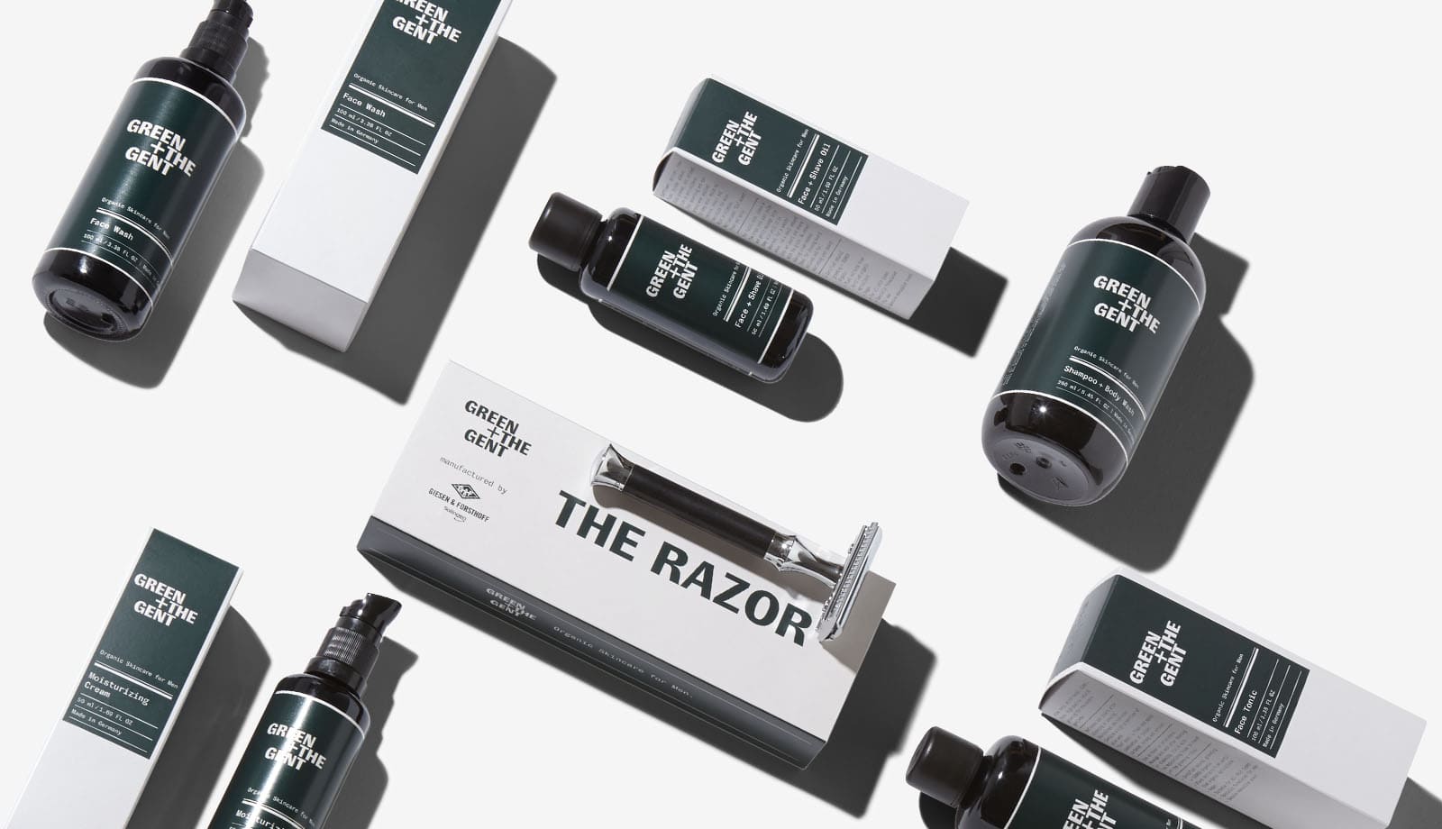
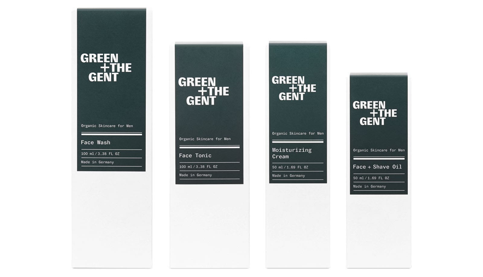
Based on the established and strategic brand positioning, Studio Veh then developed the packaging that celebrates the philosophy of the brand with every product, as well as the entire skincare range.

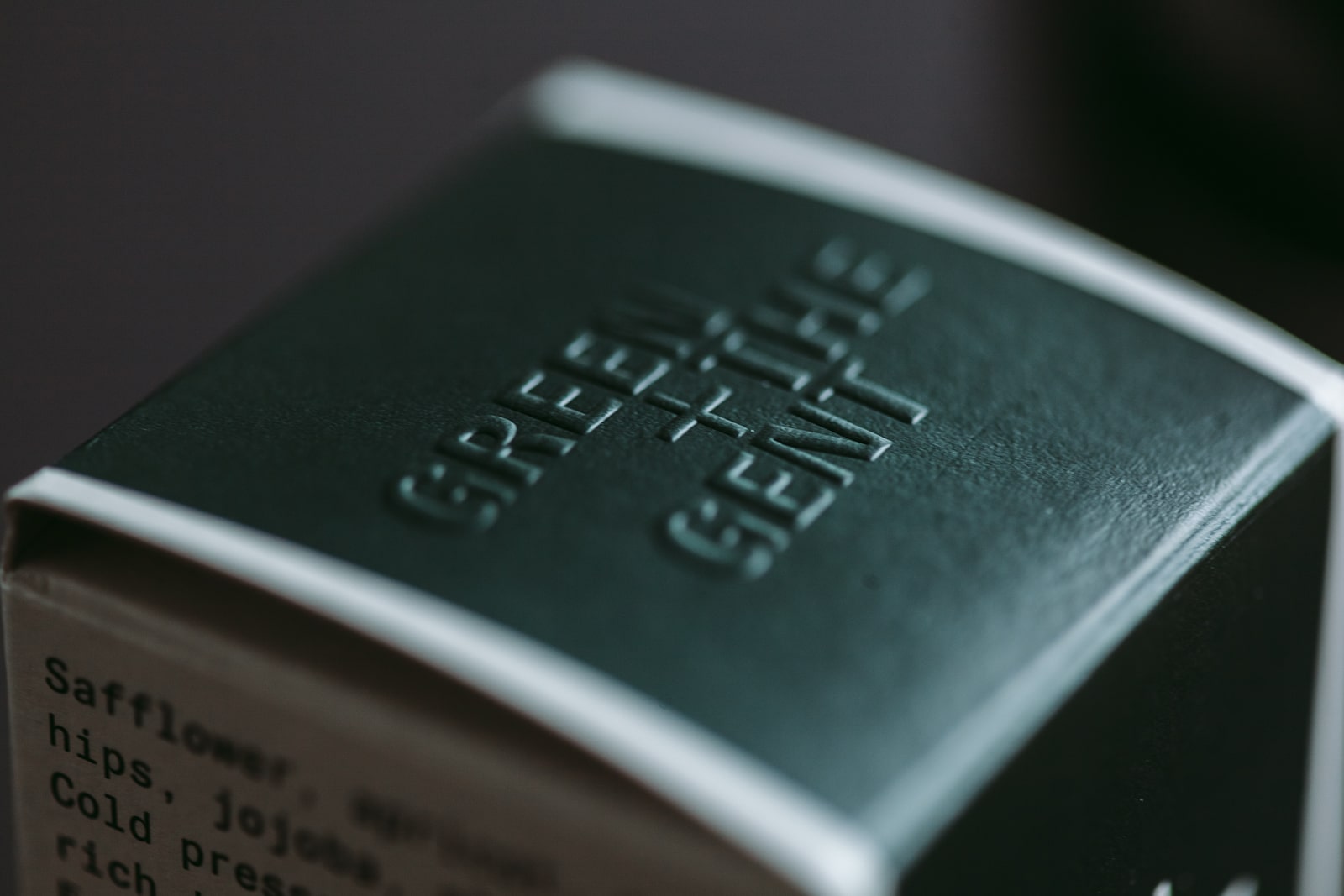
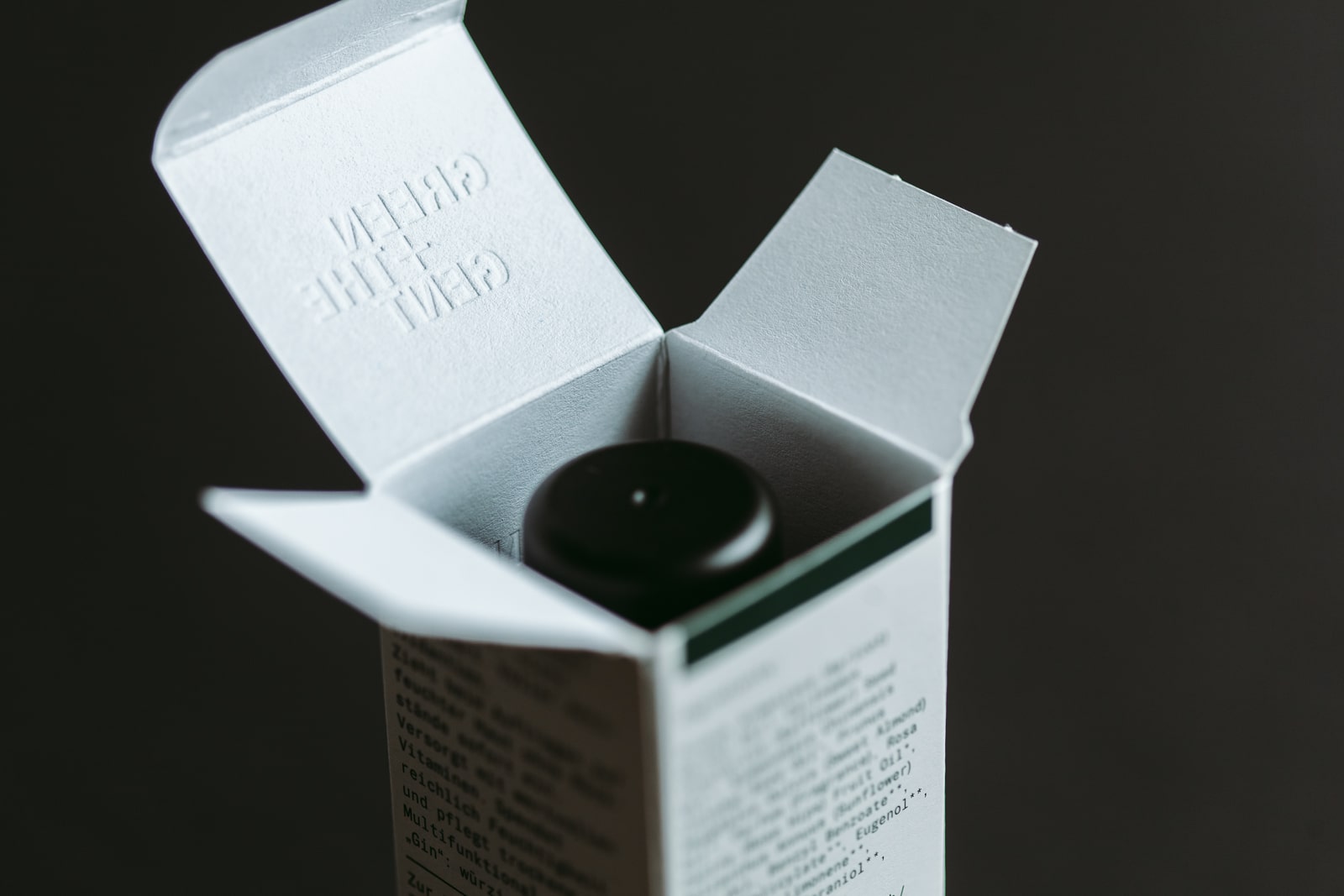
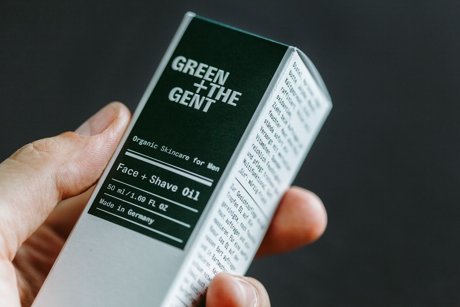
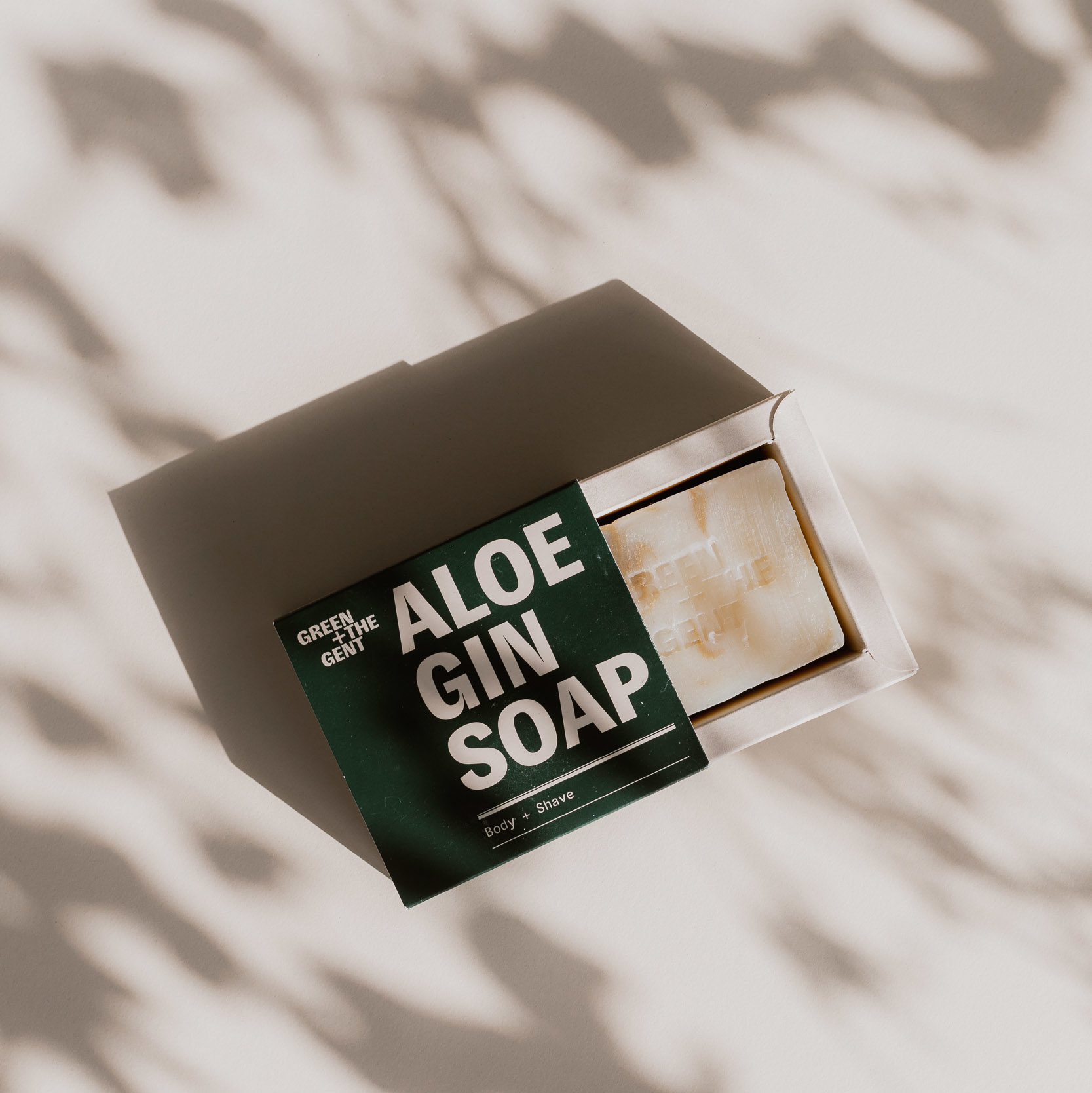
In addition, the brand’s sustainable conscience and high-quality ingredients become apparent through the high quality of the packaging. Dark, recyclable glass bottles and FSC-certified paper and cardboard have been combined with printed finishes such as blind embossing on the packaging.

Beauty

Brand Creation

Beauty

Brand Creation

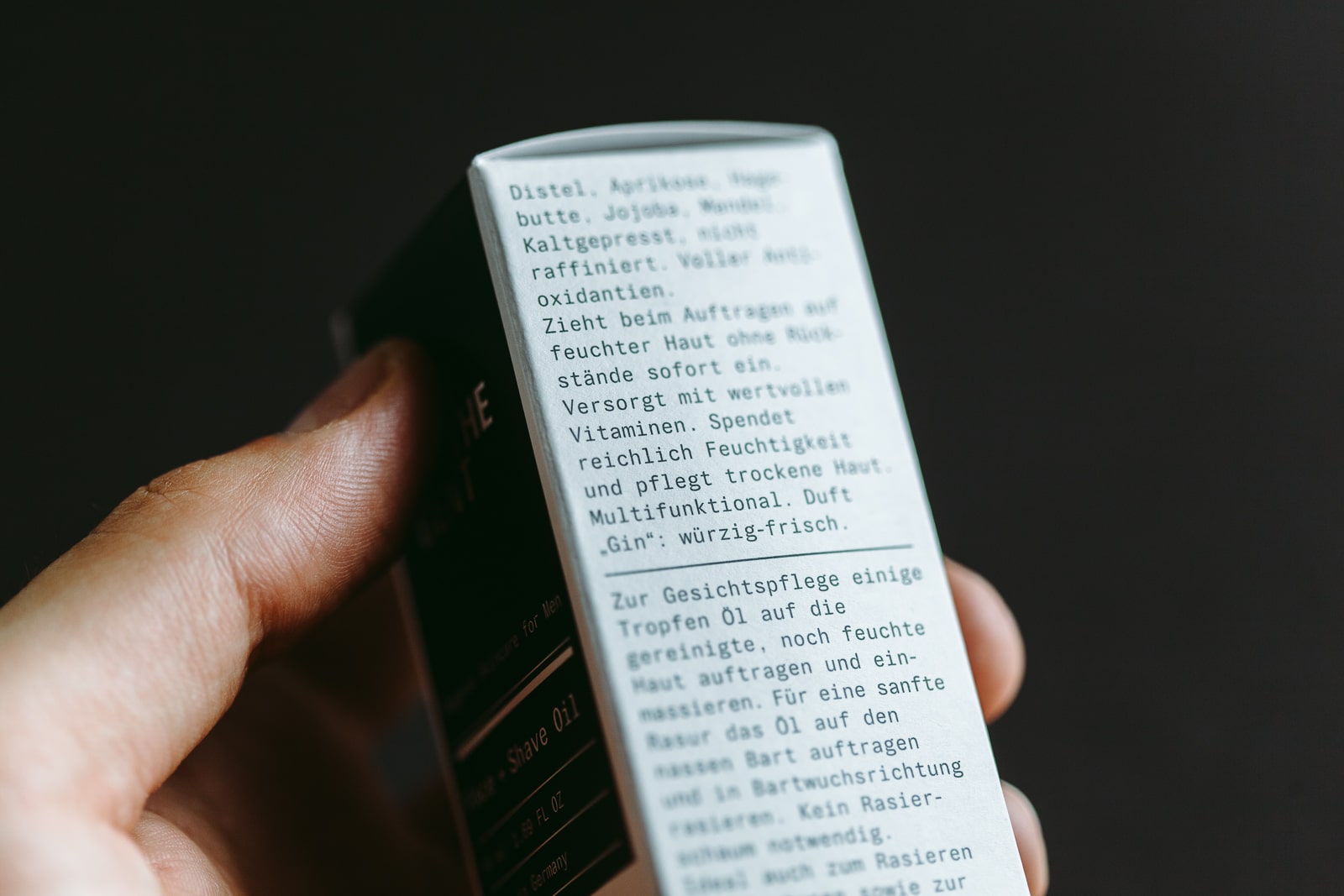
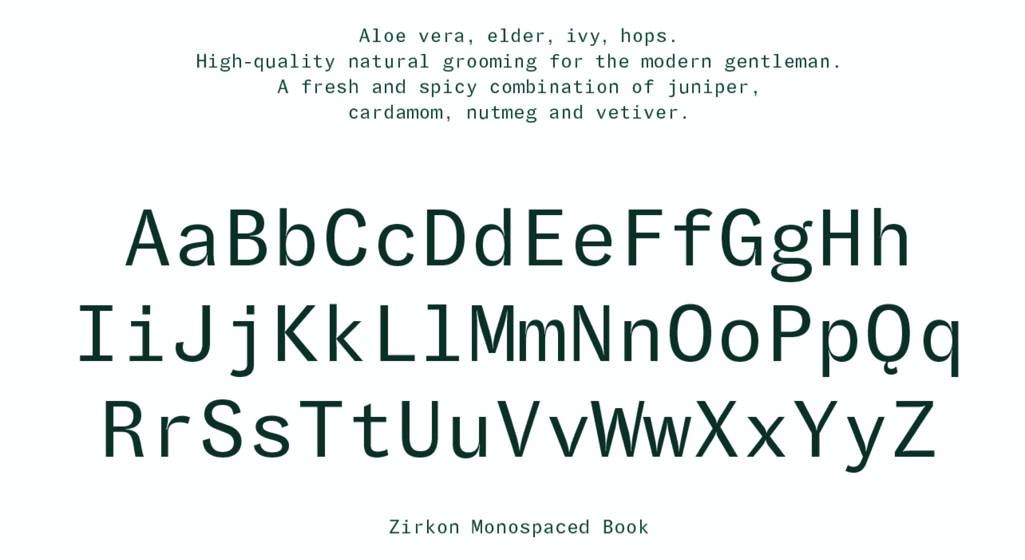
To do justice to the product’s mix of modern, certified-organic ingredients and vintage-look packaging reminiscent of old grooming products, Studio Veh developed a custom typeface for use on the packaging and in the entire brand identity. The mono-spaced execution showcases grooming as a structured ritual, and highlights the barbershop as an old-school shaving tradition.

Beauty

Brand Creation

Beauty

Brand Creation

Beauty

Brand Creation

Beauty

Brand Creation

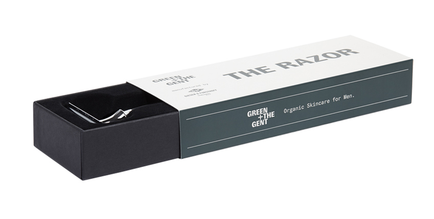
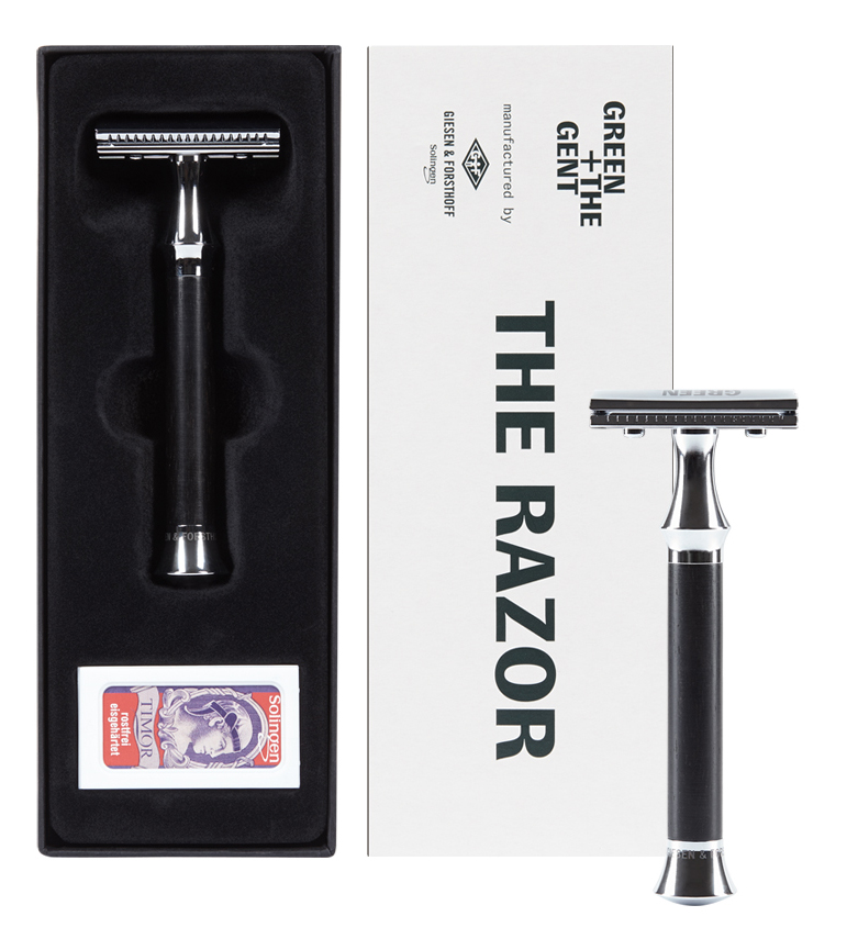
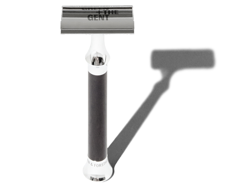
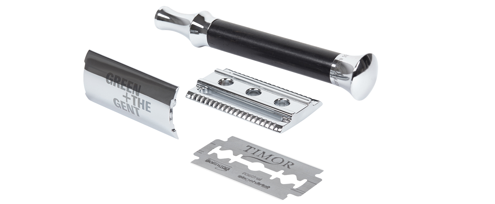
Green + The Gent’s product range includes shaving soap, facial tonic, moisturiser and shower products, as well as a razor with matching blades. This custom razor is made by the Solingen-based manufacturer Giesen & Forsthoff, and of course, comes engraved with Green + The Gent’s typeface.

Quality and gentlemen have a lot in common: they’re both an art form, and if you’ve got it, you’ve got it.

Beauty

Brand Creation

Beauty

Brand Creation

Team Credits

Brand Workshop & Strategy:
Franziska Veh + Mark-Marcel Müller

Creative Direction:
Franziska Veh

Design:
Lind Haugaard
, Callum O’Neill

Typedesign:
Tobias Rechsteiner

Project Management:
Kiyoshi Stelzner
Porfolio Photography:
Daniel Faró

Do you have a project and need support?
Let’s talk: get in touch via phone, through email or by visiting our studio!
We look forward to hearing from you.

Quality in energy

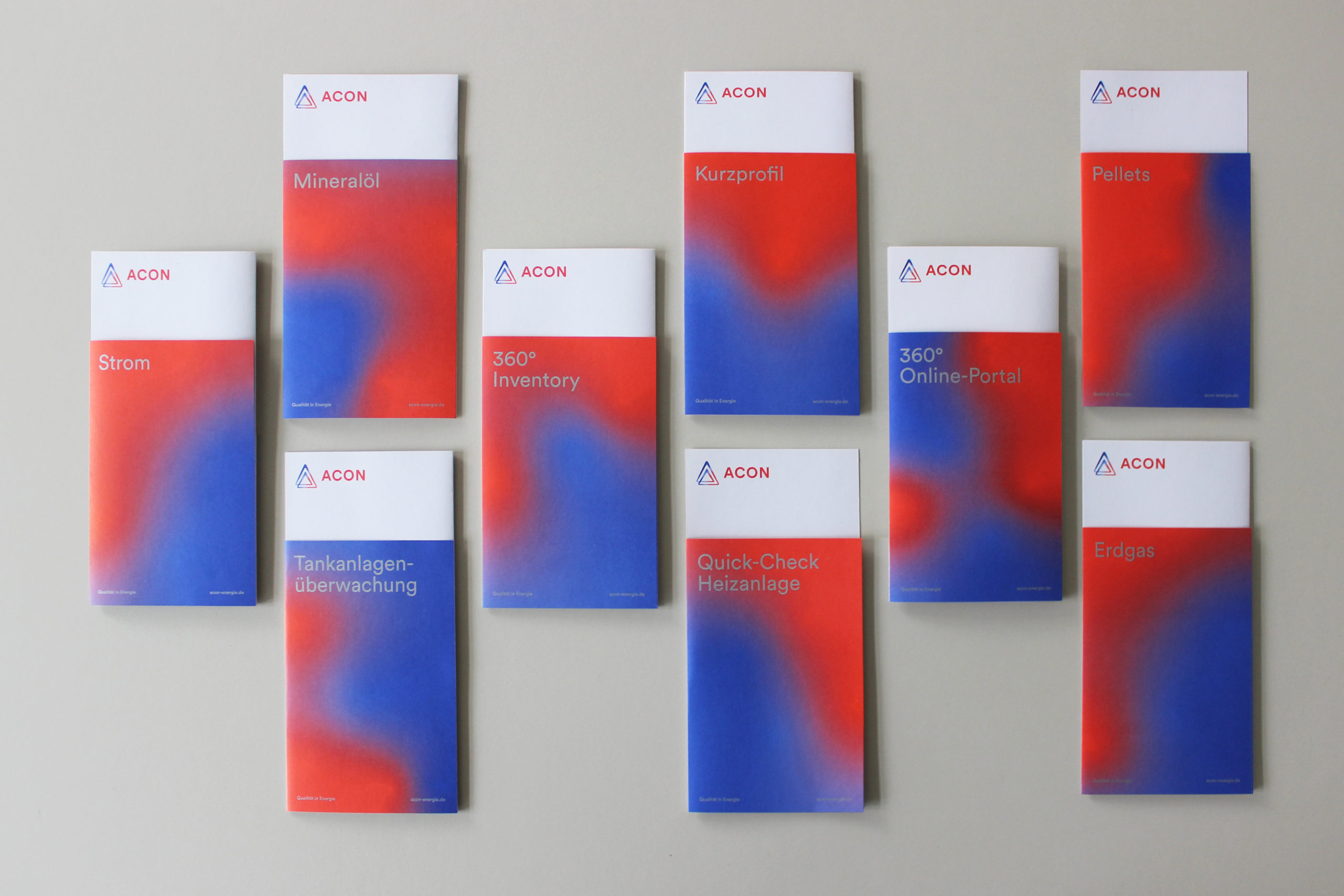
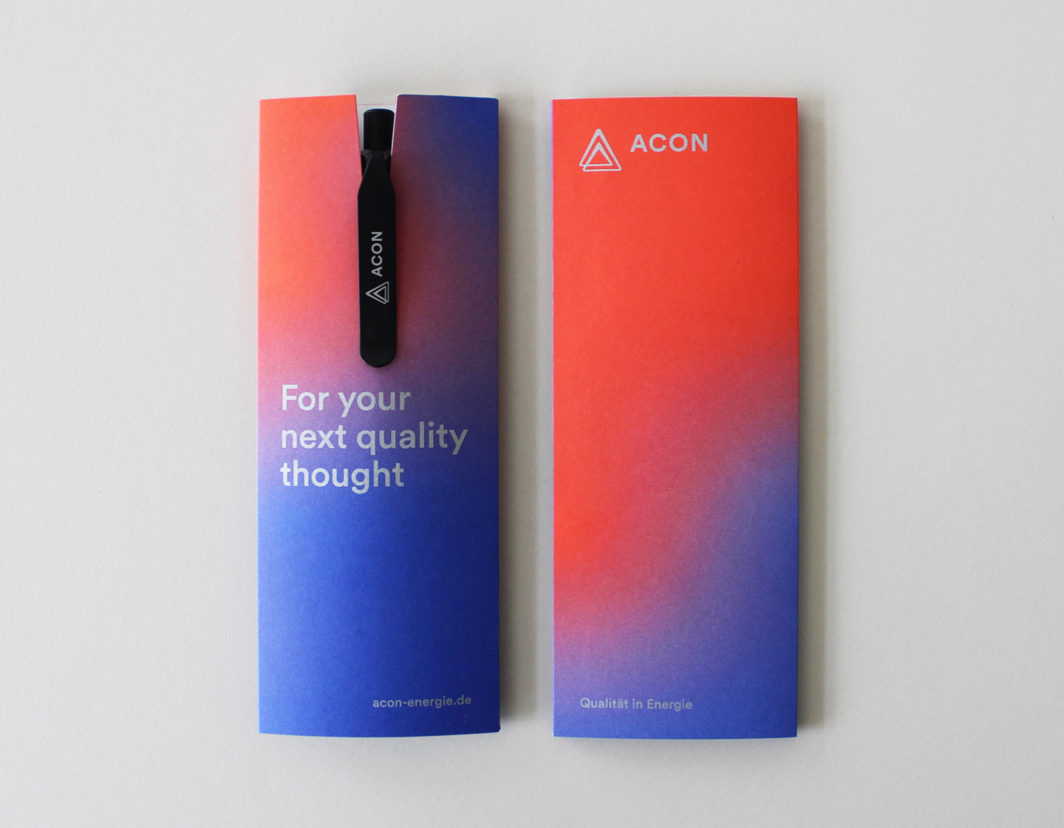
After 20 years of prioritising quality services with the aim of transforming the energy sector for the better, it seems only right to celebrate this milestone anniversary with the redevelopment of a clear strategy and redesign of the ACON brand.

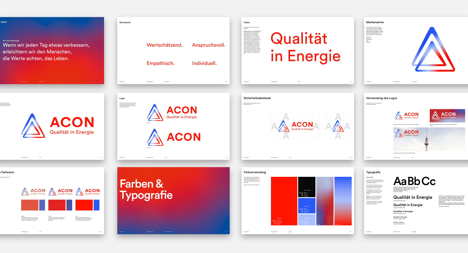
To mark its 20th anniversary, ACON Energie Management GmbH decided to collaborate with Studio Veh to update its image. The resulting brand look is modern yet timeless, and has been implemented across all channels. The starting point was a team workshop. This allowed Studio Veh to collect a wealth of knowledge from ACON’s team – including customer insights and engineering expertise, as well as recent major developments in the energy sector – in order to begin the process of distilling this information into the brand’s core essence.

The fact that ACON is a small team also quickly revealed the advantages of the brand: personal commitment, the highest quality standards, and empathy for customers’ needs, as well as a daily appreciation for everyone involved in the business.

Transparency starts with a clear statement

Quality comes first at ACON. And there’s a commitment to delivering this quality comprehensively throughout the energy management sector. As the topic of energy is so complex and there are frequent technological developments, it is especially important to have a strong brand that can be trusted. Studio Veh was easily able to identify that one of ACON’s biggest strengths is its ability to take responsibility for its work in a competent and transparent manner.

The new brand identity highlights the future-oriented straightforwardness of the in-house services provided in a modern, sleek form. The new brand statement summarises why the ACON team makes life easier for its customers.

Quality written in capitals

ACON has embodied the principle of quality for over 20 years. Therefore, it was about time to write the brand’s name with capital letters. The team earned the trust of its customers by continuously striving for higher quality and providing an extraordinary level of reliability. But praise is not a reason to be complacent, rather it is motivation to deliver more. Because everyone at ACON knows: quality is something you have to demonstrate daily. It’s only by doing so that customers will be assured that they will always receive the best results in the energy sector.

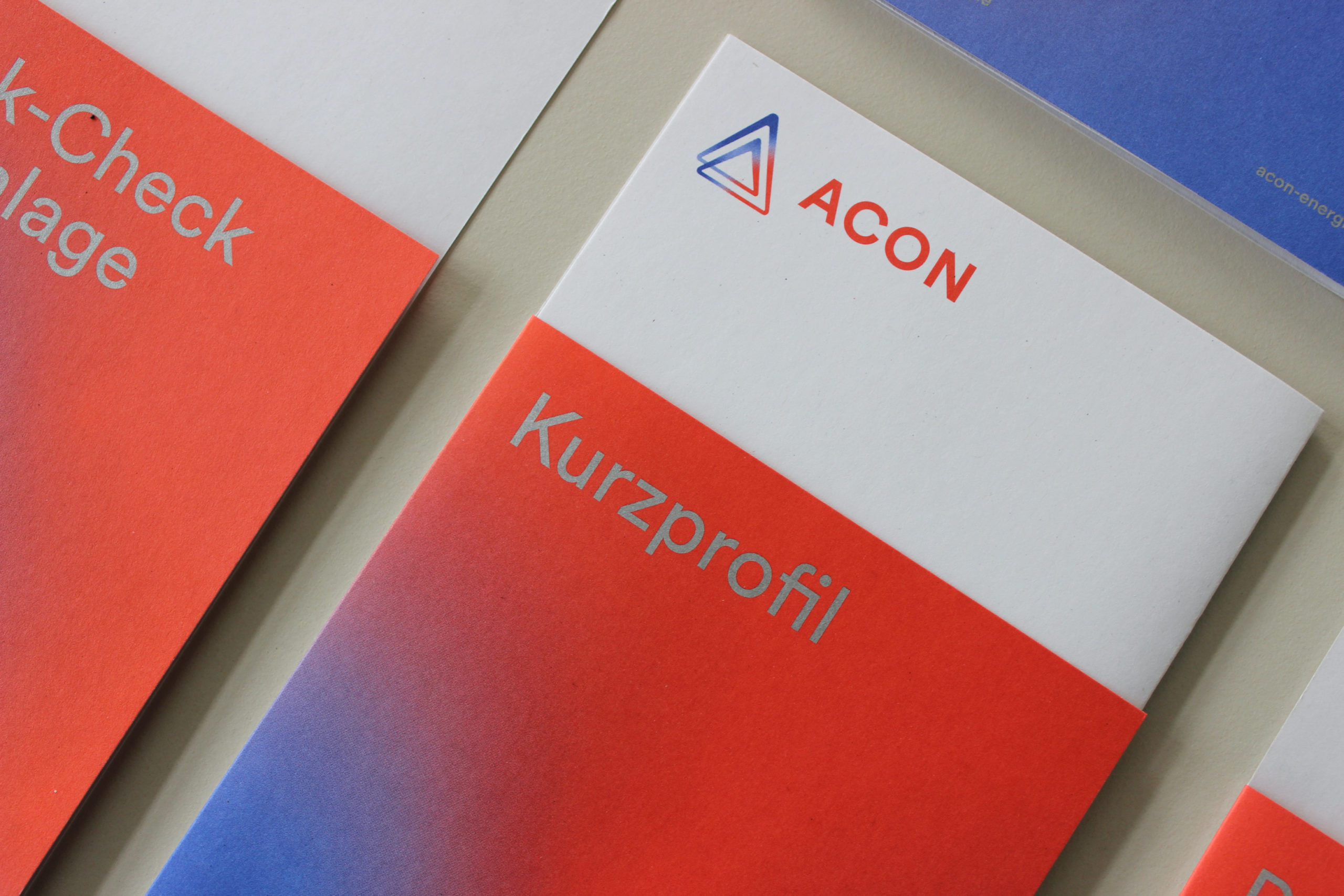
The shape of the newly developed logo – a triangle – not only reflects the initial letter of the brand name, but it also reflects this triad of team, customer and energy. It also shows that ACON works to push the quality standard to infinity and that the organisation is in a state of energetic flow. Consistency in client relations, always ensuring the quality of services, being proactive and always going the extra mile – in short: the symbolic power of the logo gives ACON a strength in all respects that is clear ​in the long term.

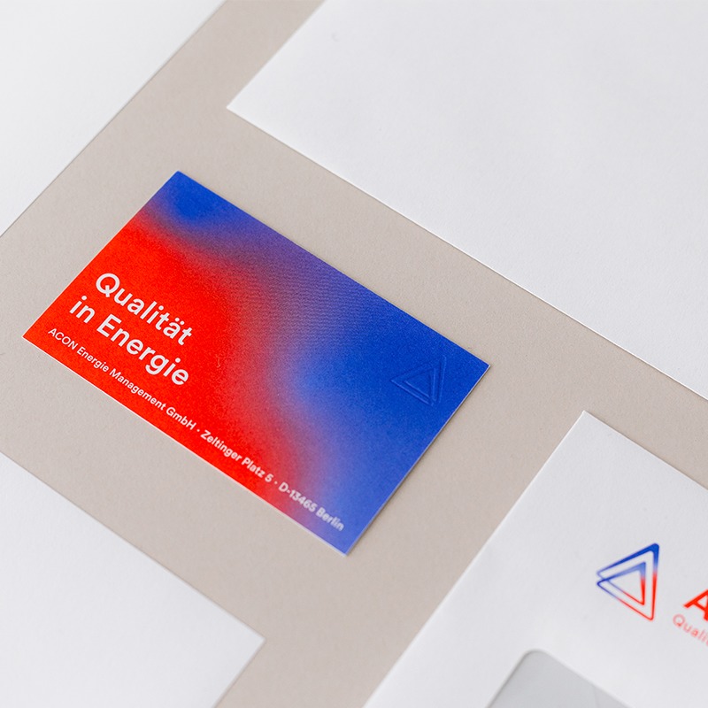
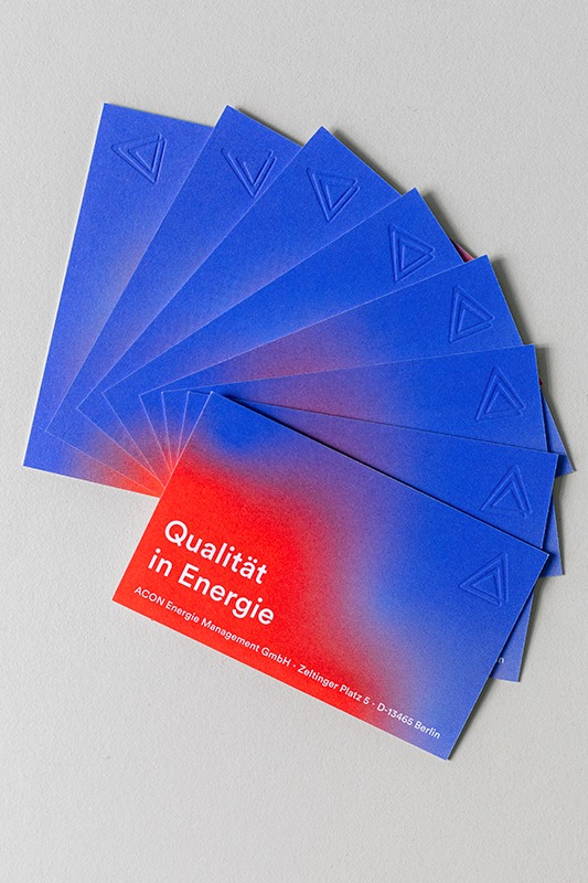
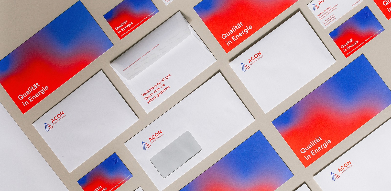
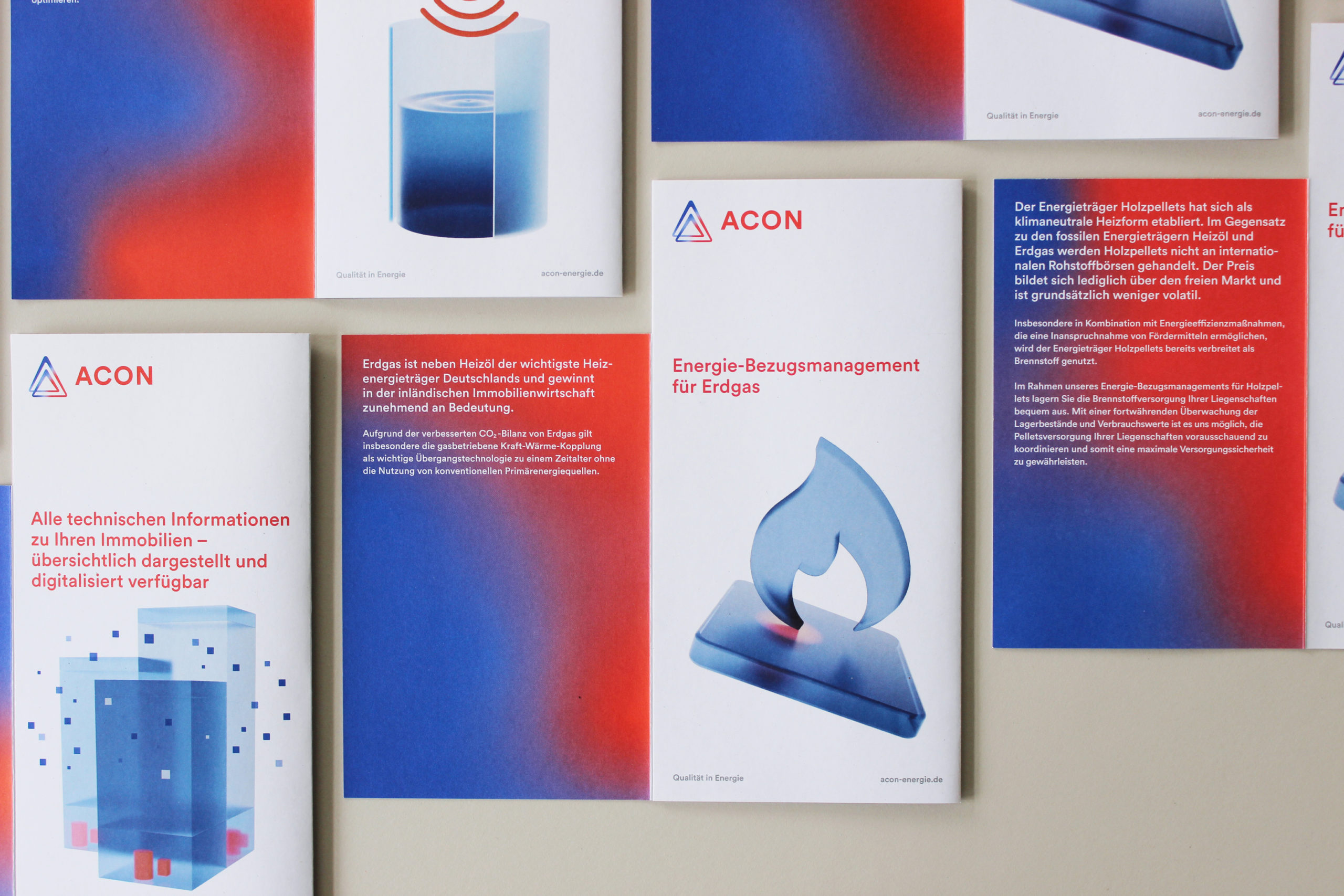
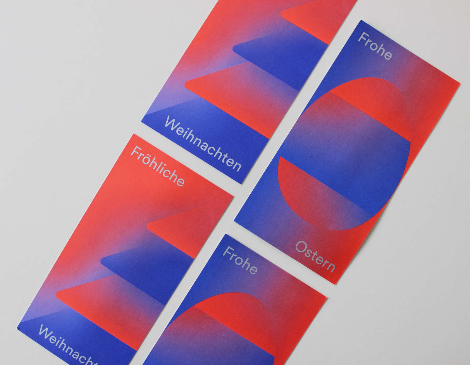
Energy is in constant flux. Thermal imaging reveals the interaction between warm and cold air. ACON recognises that energy is not static – and this is now reflected in their logo as well as in various design elements in their communication. Whether in the fixed background of an advertisement or animated in a digital presentation, the flow of energy becomes a recognisable feature of the brand.

‘Studio Veh works as our communication partner in a completely comprehensive way. Franziska Veh and her team are highly empathetic, think strategically and demonstrate entrepreneurial vision. Under her leadership, the brand core of ACON has been transformed and reshaped to be future-proof. Many thanks for the excellent work.’

Markus Conrad, Founder & Managing Director ACON

Studio Veh takes care of the entire ACON presence, from concept to copywriting and design to production, handling their advertising campaigns, direct mailings, flyers and business assets, including digital office templates.

Brand Creation

Brand Repositioning

ConTech

eCommerce

Brand Creation

Brand Repositioning

ConTech

eCommerce

Brand Creation

Brand Repositioning

ConTech

eCommerce

Brand Creation

Brand Repositioning

ConTech

eCommerce

Brand Creation

Brand Repositioning

ConTech

eCommerce

Brand Creation

Brand Repositioning

ConTech

eCommerce

Brand Creation

Brand Repositioning

ConTech

eCommerce

Brand Creation

Brand Repositioning

ConTech

eCommerce

Digitalisation with design ambition

Energy is not only in flux. It is also undergoing a major transformation. Studio Veh accompanies ACON as a strategic partner in the digitisation process and the needed reorientation of its services. This starts with the responsive website and leads to digital business cards and UX conception, as well as user-friendly interface design for apps for property management.

Whatever the future brings, the jointly developed, clear strategic anchor point – in addition to recognisability in design – will always ensure a return to what the team stands for: quality in energy.

Team Credits

Brand Workshop & Strategy:
Franziska Veh, Mark-Marcel Müller

Creative Direction:
Franziska Veh

Design:
Lind Haugaard

Project Management:
Kiyoshi Stelzner

Text:
Mark-Marcel Müller

Editing (DE):
Gesine Schröder
Translation (EN):
Emily McDonnell

Animation Brand:
Jonathan Nielsen

Animation App Visuals:
Björn Fiekert

UX:
Robert Siuda

Web Development:
Ralf Büsch

Retouching:
Alin Bosnoyan

Photography:
Daniel Faró

Do you have a project and need support? Let’s talk: get in touch via phone, through email or by visiting our studio! We look forward to hearing from you.

Timeless elegance that lasts

Most people think of time as linear. But imagine a world where time does not exist, when day and night, early and late, are irrelevant. Any resulting design would always be in the now.

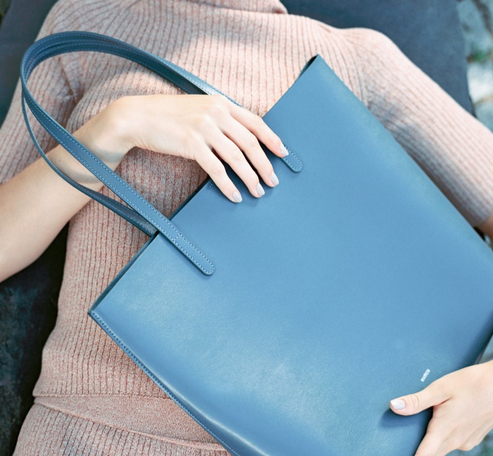
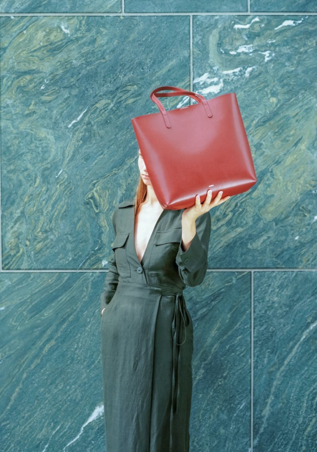
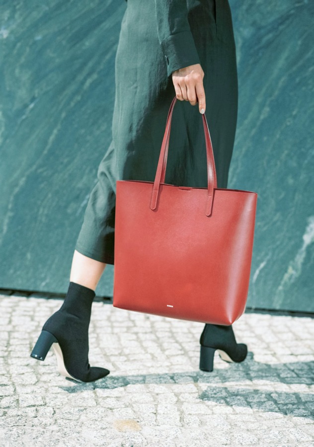
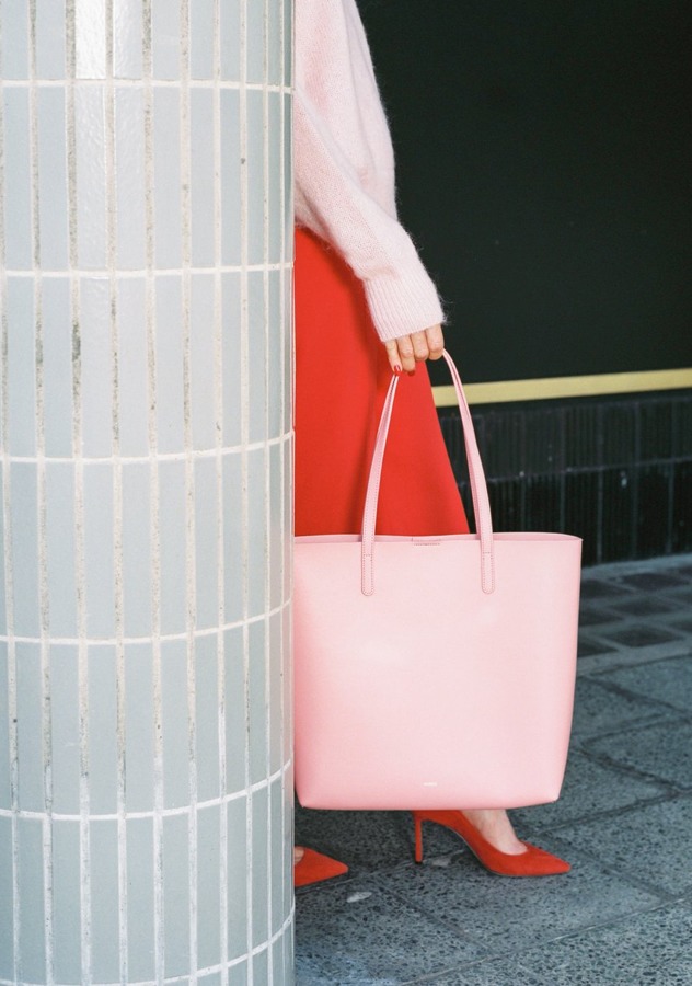
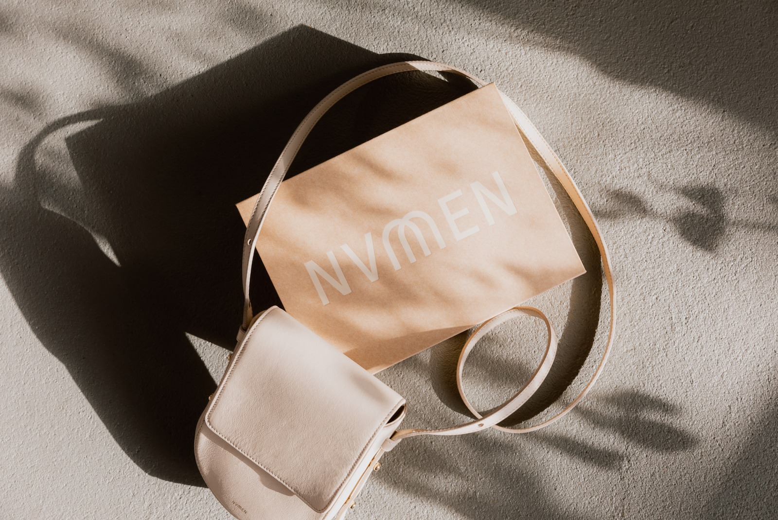
The NUMEN label had the goal of creating a bag that would be the perfect companion, combining everyday flexibility with evening elegance. In a brand workshop with the founder Nicola Cliemas, Studio Veh established a clear vision and gained clarity about the potential of this idea.
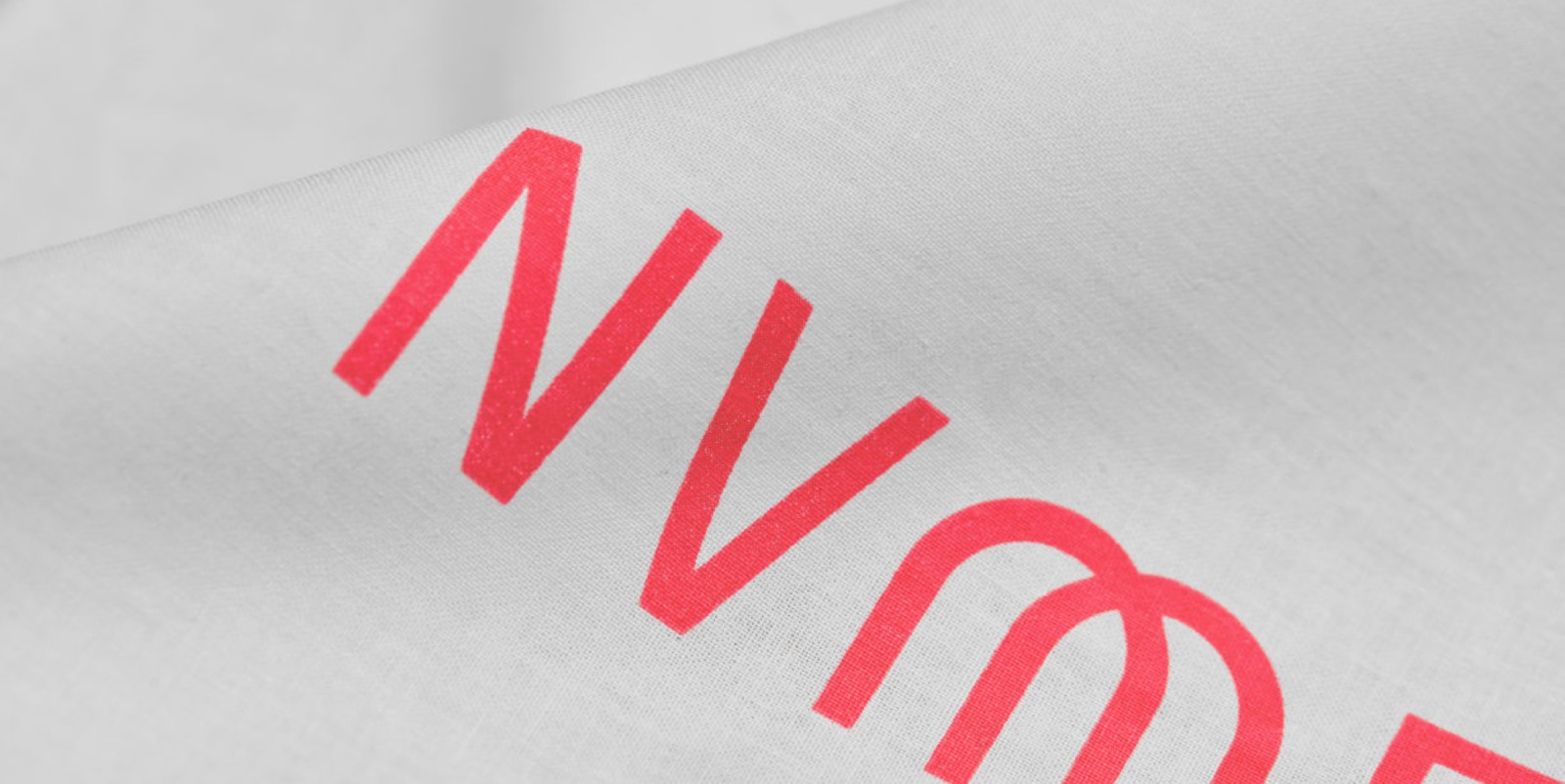

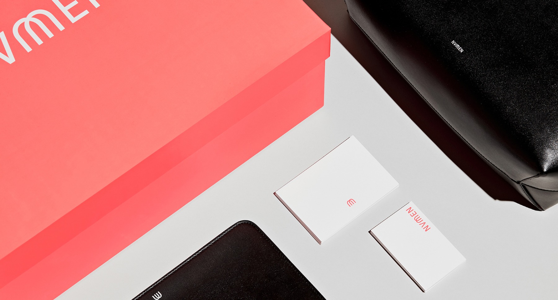
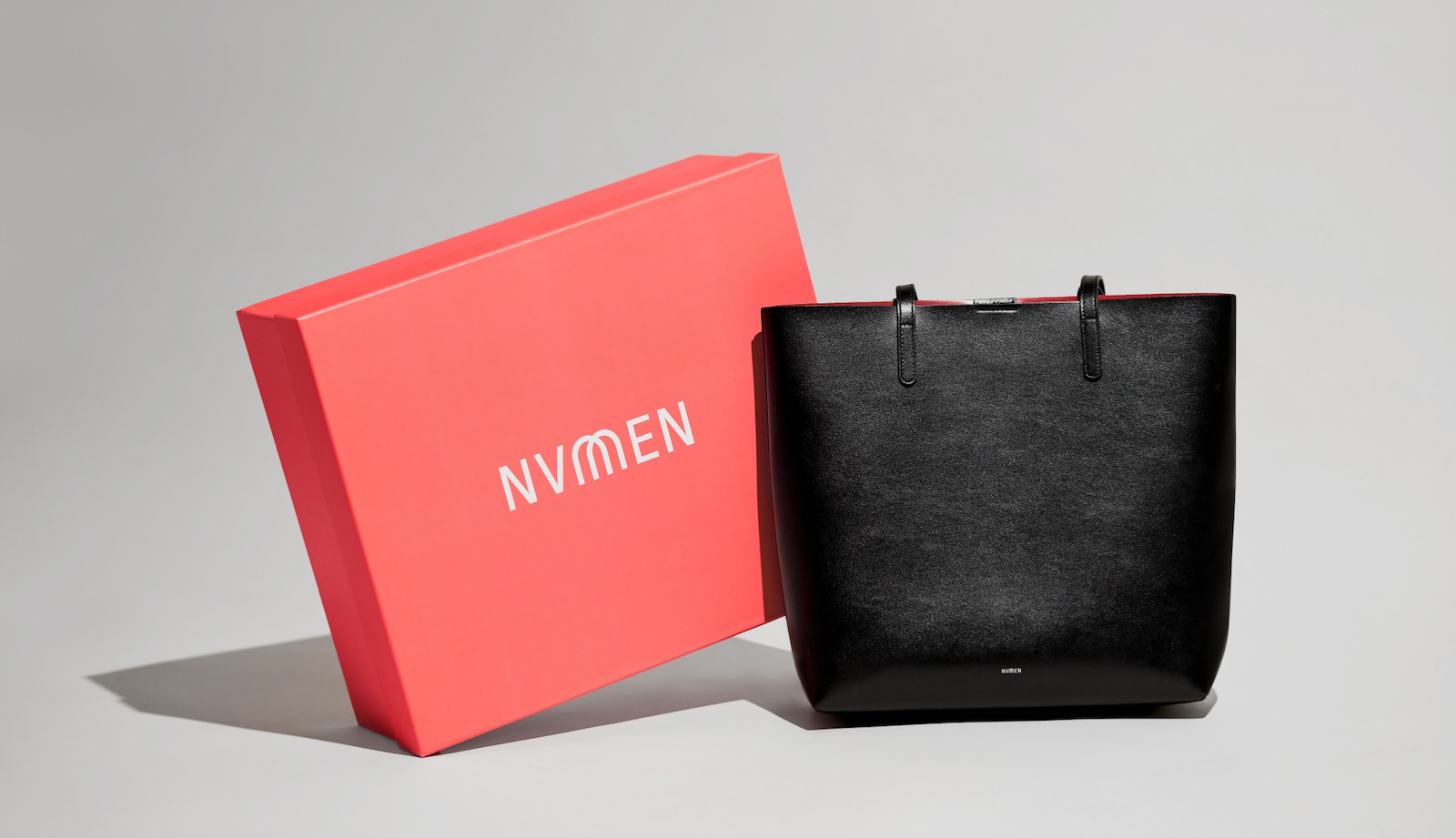
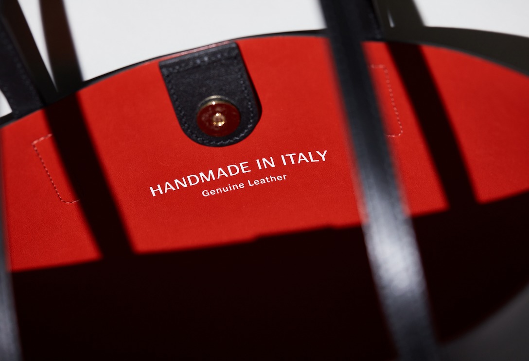
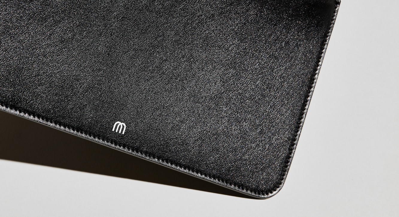
The biggest challenge within the branding process was the bag itself. Only a simple brand identity with a unique twist could do justice to the structure of the perfect bag: cuts and lines with a timeless aesthetic and an Italian attention to detail, paired with uncompromising functionality. The resulting design identity is an M in the brand name that is formed from the two straps of the bag. It is taken from the minimalist handbag’s design, something perfect in form. At the same time, its bold lines convey that the classic Numen bag is sturdy enough to hold all the on-the-go essentials. The signet symbolically weaves together the form and function of everyday life, with a hint of elegance, all of which is reflected in the Numen brand and its products.

Brand Creation

Brand Creation

‘The aim was to create a design that would endure and still be beloved in ten years’ time. We succeeded – both with the bags and the branding.’

Nicola Cliemas, Founder of Numen

Brand Creation

Brand Creation

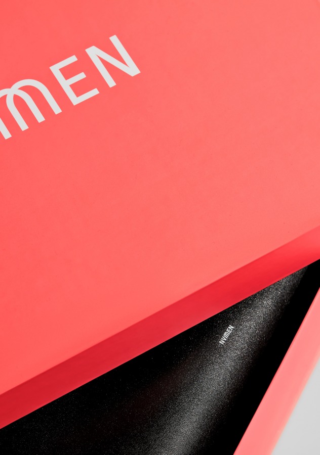
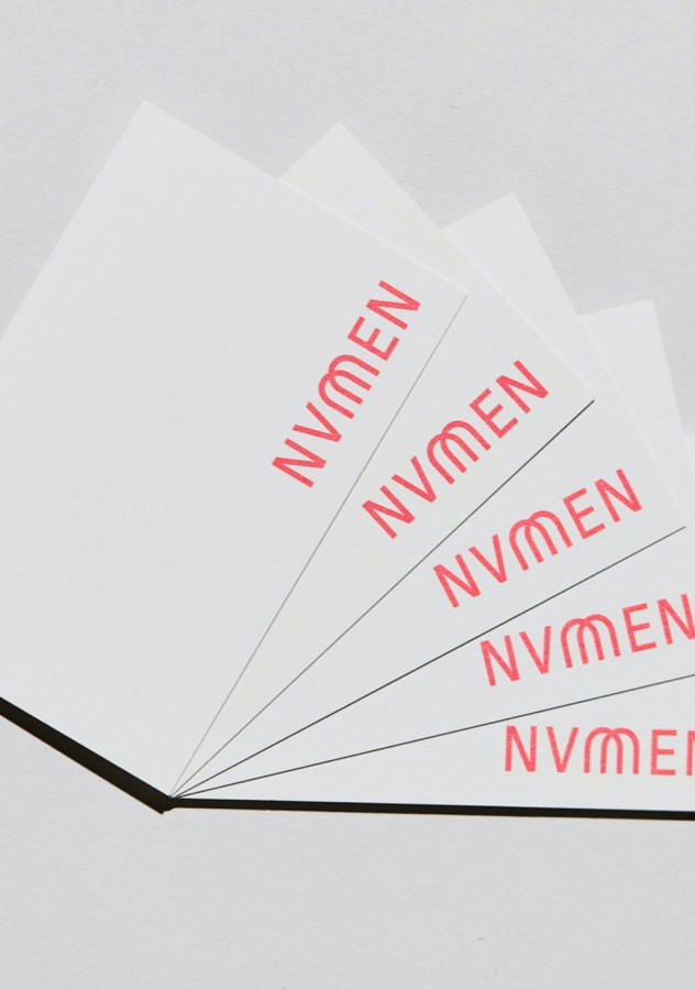
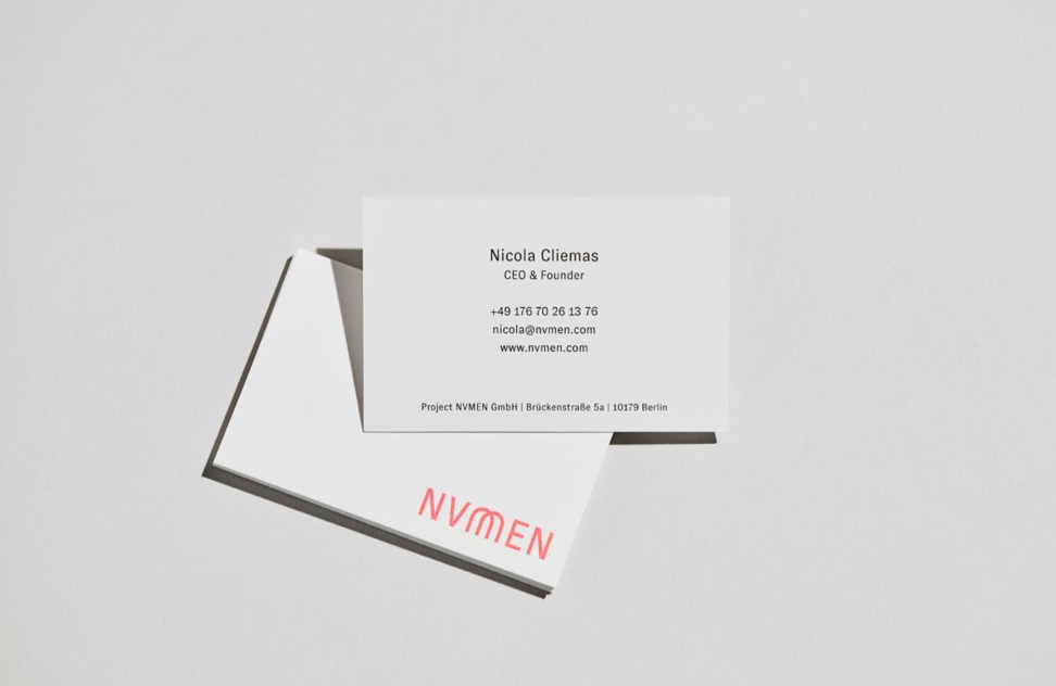
In addition to the bag’s branding, Studio Veh took on all of Numen’s print design, as well as the business stationery, marketing materials and packaging design.

The stylised M identity, made of two handbag straps, perfectly represents what Numen stands for: reduced, minimalistic elegance, no matter the time.

Brand Creation

Brand Creation

Brand Creation

Brand Creation

Brand Creation

Brand Creation

Team Credits

Brand Workshop & Strategy:
Franziska Veh & Mark-Marcel Müller

Art Direction:
Franziska Veh

Design:
Lind Haugaard


Portfolio Photography:
Zoe Noble

Campaign Photography:
Daniel Faró

Do you have a project and need support? Let’s talk: get in touch via phone, through email or by visiting our studio! We look forward to hearing from you.

Big words

A brand should have something to say. When it comes to a podcast studio, words carry an even greater weight and have the potential to ignite flames across social media.

Type meets talk

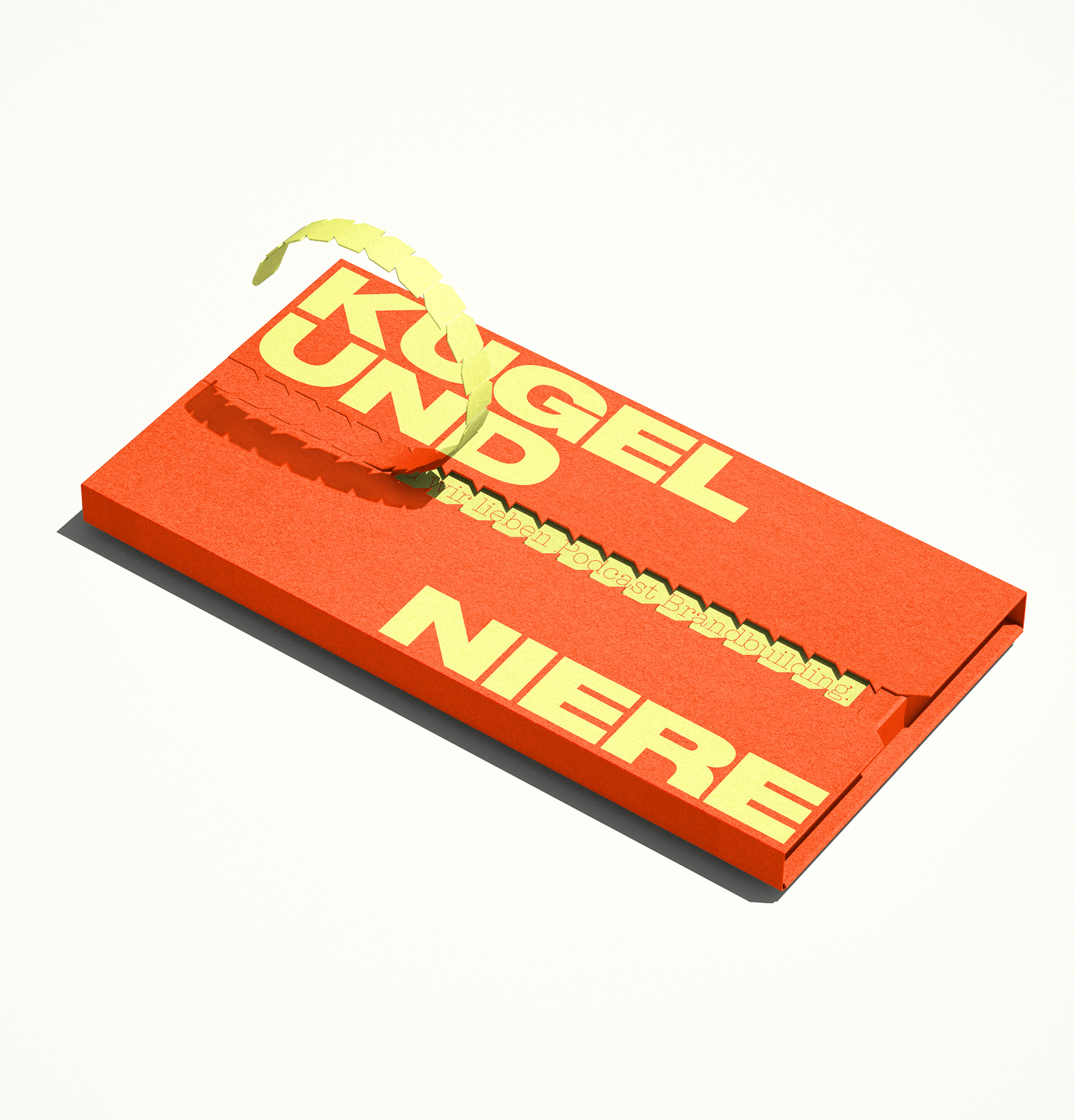
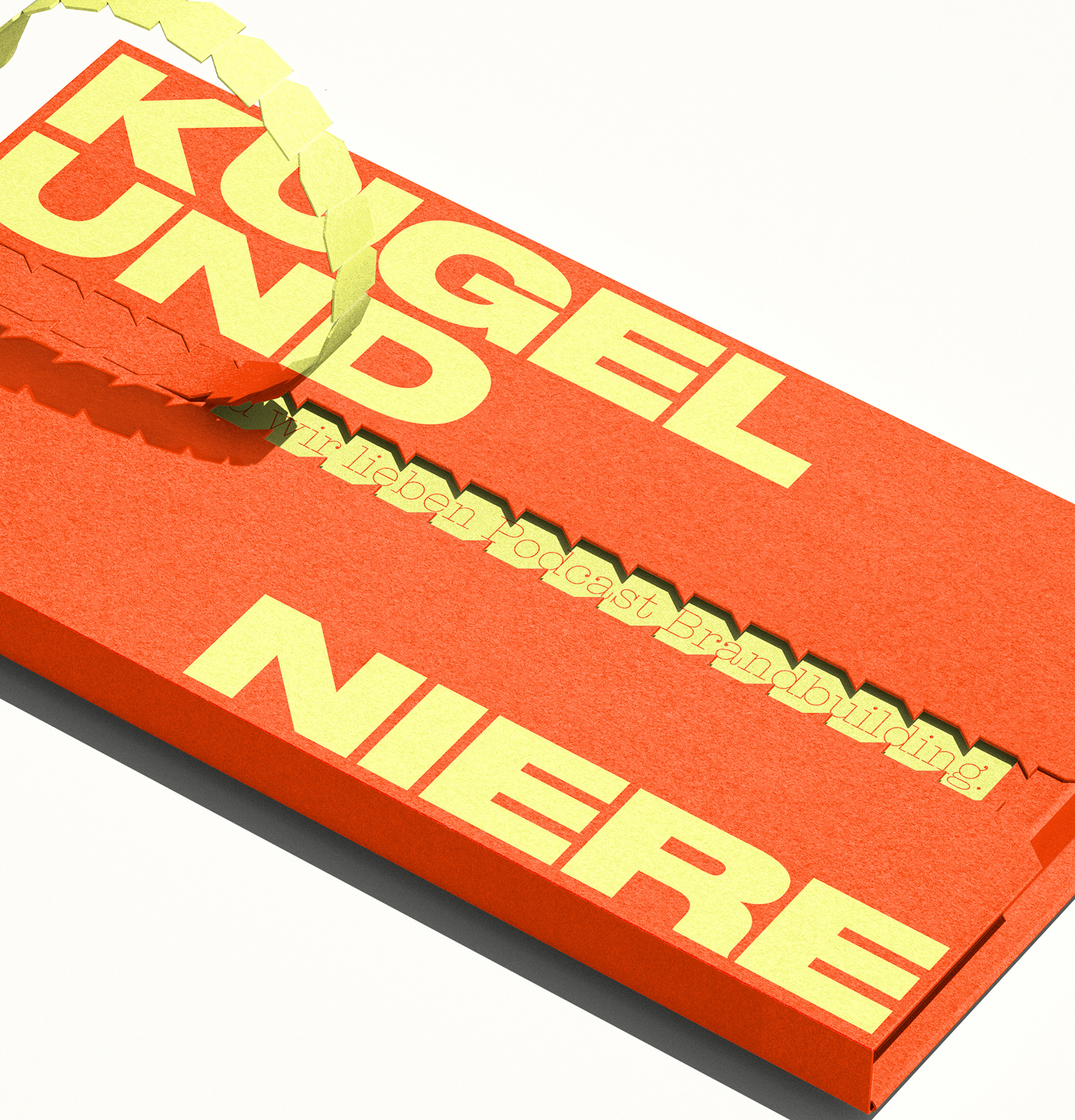
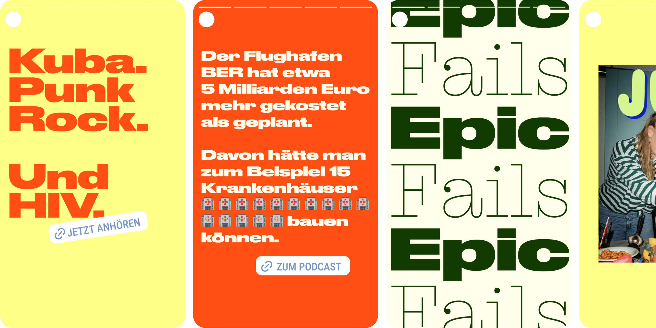
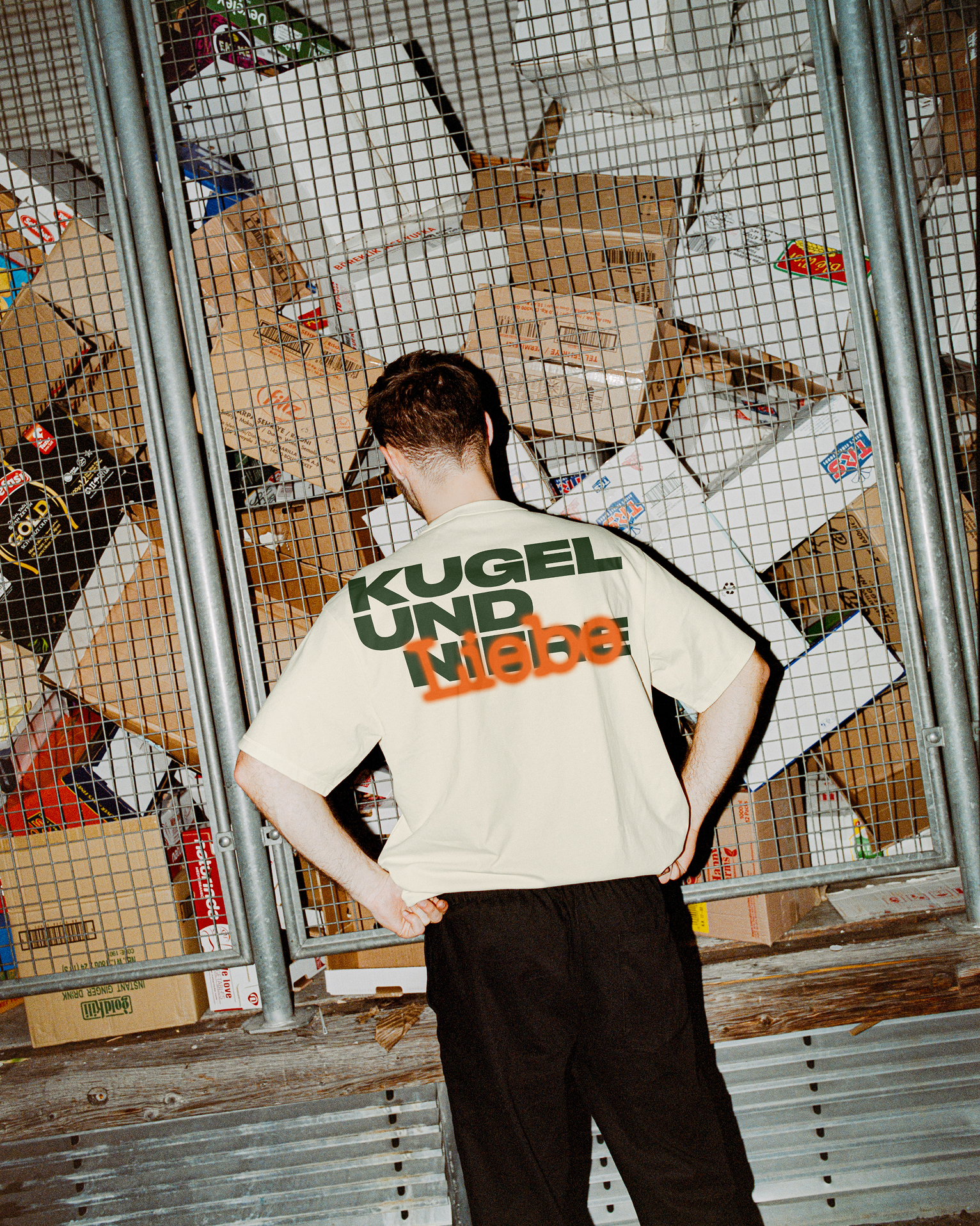
Kugel und Niere produce podcasts bursting with intimacy, wit and excitement, on topics ranging from the million-dollar airport BER to epic failures in the history of evolution and the peculiarities of modern dating.

For the development of their visual identity, it was important to keep the appearance neutral and adaptable for different podcast topics, while also ensuring that the brand stands out on both classic channels and social media with absolute confidence.

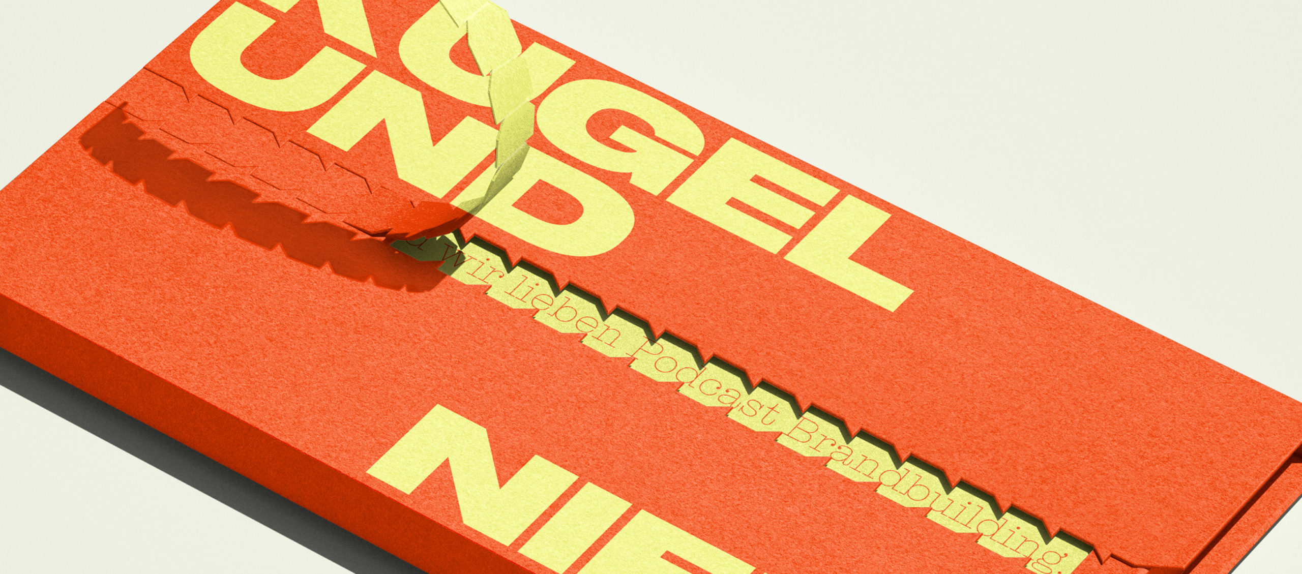
With words being the brand’s most important asset, Studio Veh delivered a typographic solution: a flexible type system using a wide typeface that not only emphasises the larger-than-life stories, but also the impact of the podcasts’ conversations.

Brand Creation

Media & Entertainment

Brand Creation

Media & Entertainment

Brand Creation

Media & Entertainment

Brand Creation

Media & Entertainment

A flexible system for content-first storytelling

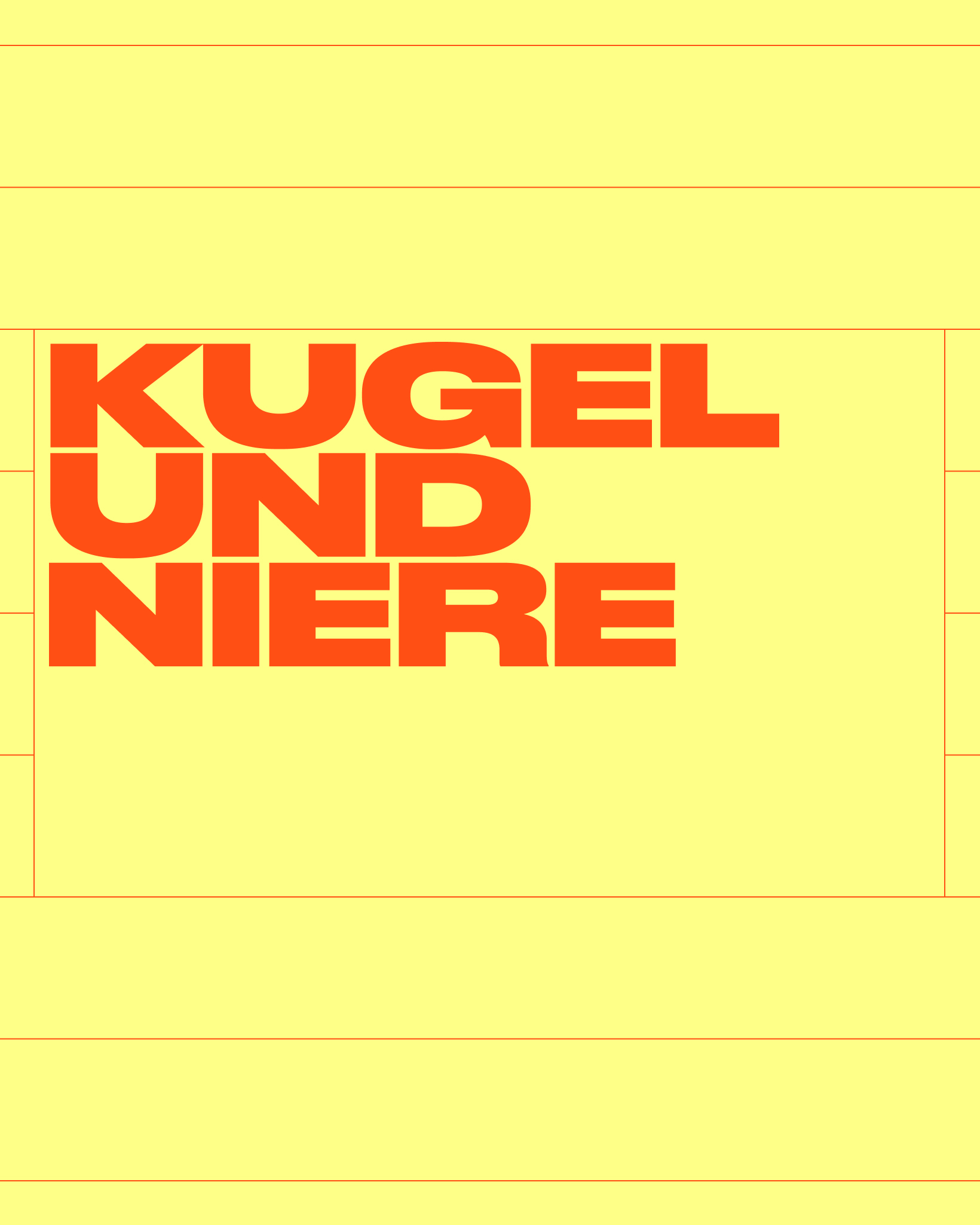
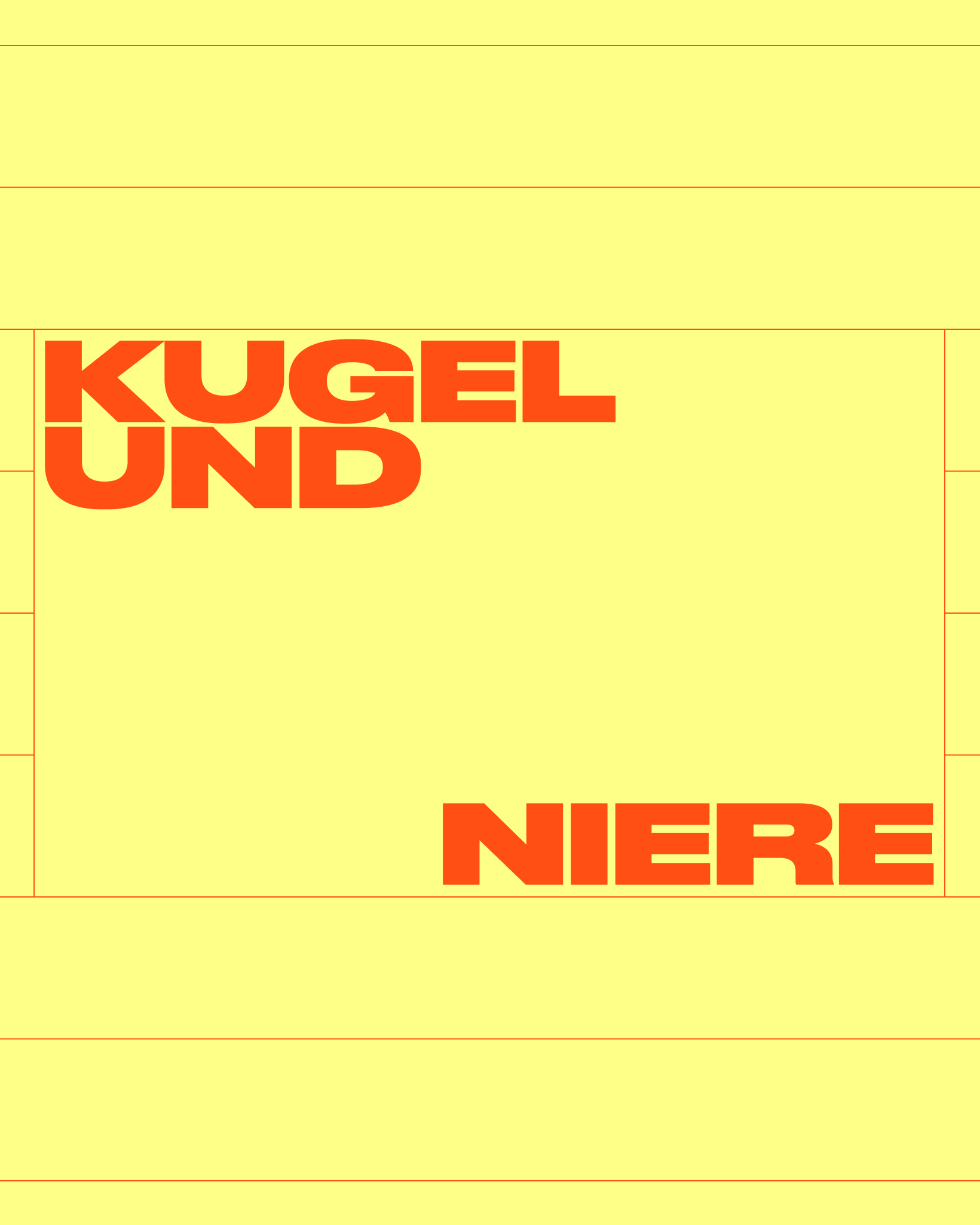
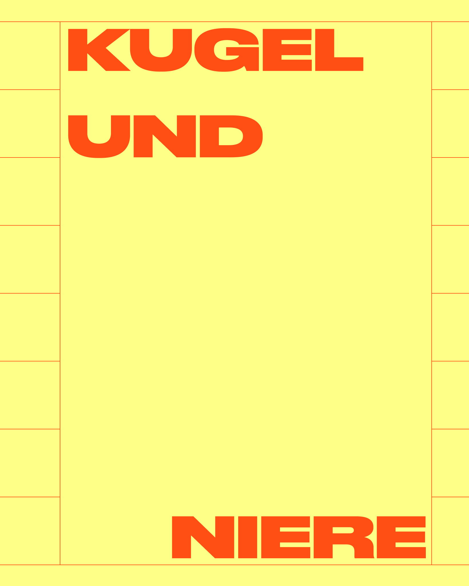
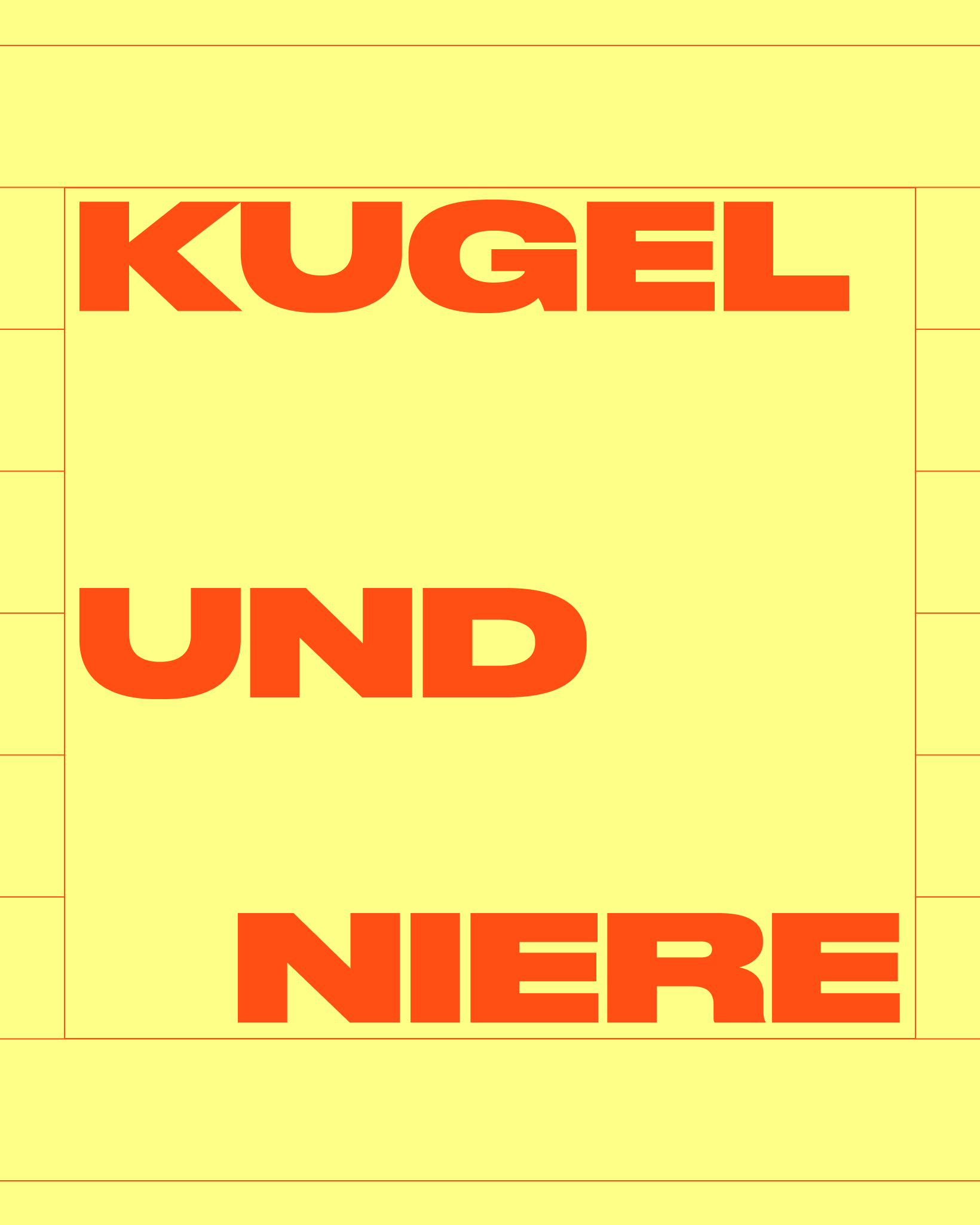
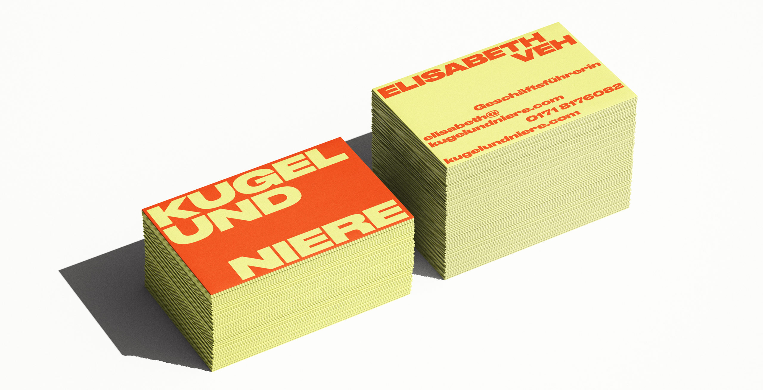
The logo system is built on three dynamic elements that seamlessly adapt to any format, whether in print or digital. ‘KUGEL’ always anchors the top left, ‘NIERE’ grounds the bottom right, and ‘UND’ is change its position, depending on the format.

This flexible structure ensures the logo remains instantly recognizable across all media—while smartly keeping the focus where it belongs: on the podcast content itself.

Brand Creation

Media & Entertainment

Brand Creation

Media & Entertainment

A sweet bite with a spicy kick that lingers

Podcasts that pack a punch deserve colours that pack a punch, too. Gripping stories, uncanny narratives, strong characters, confident adventurers, funny incidents and outrageous anecdotes: they all linger with you.

Kugel and Niere’s new color palette is taking inspiration from vintage food packaging as it evokes a sense of nostalgia and familiarity reminiscent: the comforting retro vibe draws listeners in with a sense of warmth and authenticity, while the content delivers sharp, modern commentary.

The juxtaposition amplifies the company’s bold message, making it feel both timeless and disruptive — like biting into something sweet and finding it surprisingly spicy.

Retro Vibes. Modern Reach.

The bold brand identity channels warmth and energy — reimagined for today’s social media landscape. It blends nostalgia with nuance, turning every post into a mood, a memory, a moment.

Top tier training with vintage studio vibes

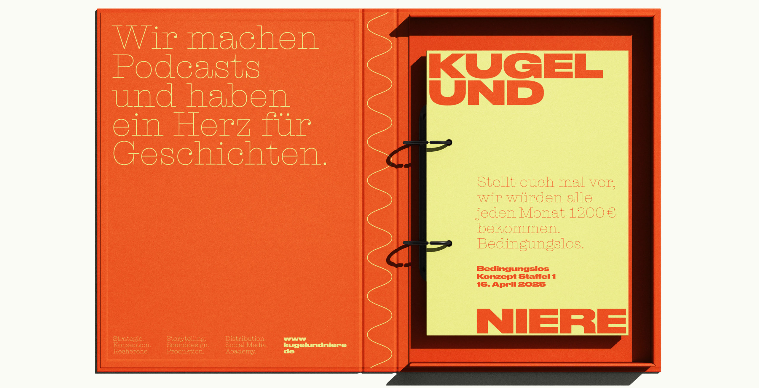
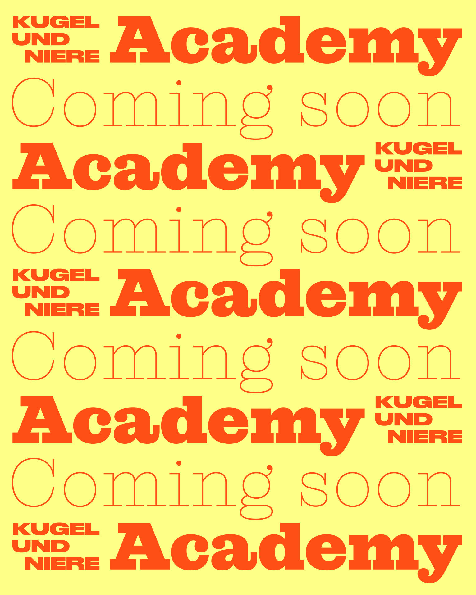
Kugel und Niere’s latest venture is their own podcast Academy: Drenched in retro flair and with vintage studio vibes, it blends nostalgia with top-tier training for the next wave of audio creators. Whether you’re new to the mic or ready to remix your skills, this is where your podcast dreams go full stereo.

Brand Creation

Media & Entertainment

Brand Creation

Media & Entertainment

Brand Creation

Media & Entertainment

Brand Creation

Media & Entertainment

Team Credits

Strategy & Creative Direction:
Franziska Veh

Design:
Lind Haugaard, Rebecca Baihaki

Website Development:
Ralf Büsch

Do you have a project and need support? Let’s talk: get in touch via phone, through email or by visiting our studio! We look forward to hearing from you.