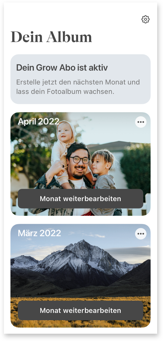
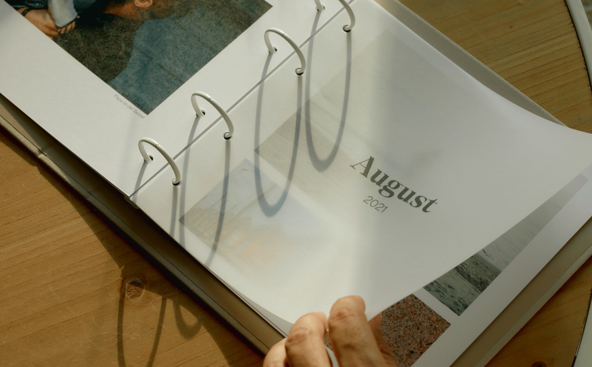
What happens to all the photos we take every day? And where are all the memories safe, even if the smartphone is broken or lost? The brand new answer: Simply collect the most beautiful pictures every month in a timelessly beautiful album.
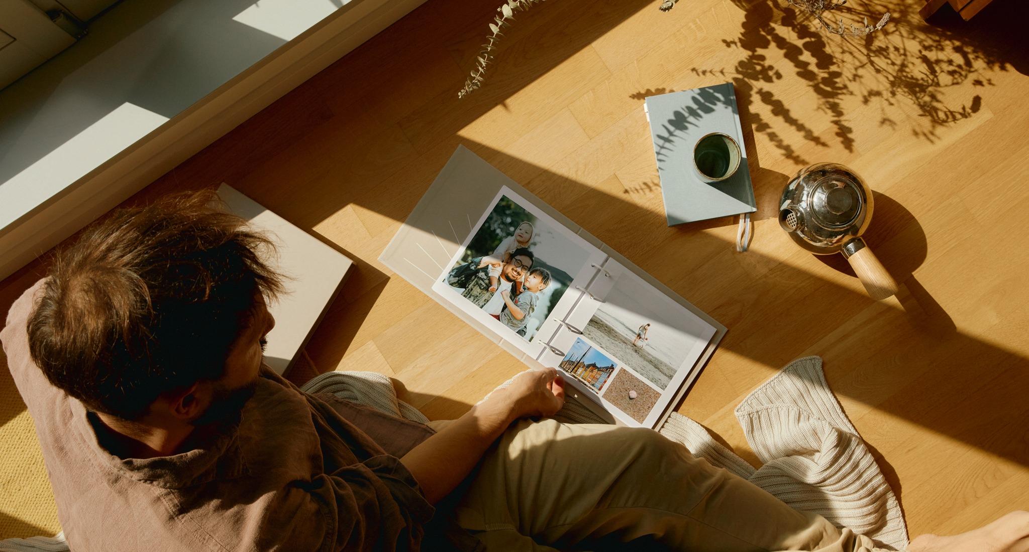
In the age of smartphone cameras and packed calendars, it is becoming increasingly difficult for families to preserve beautiful memories. Anyone who wants to create a classic photo album is faced with a truly mammoth task.
As a father of two young children, Axel Lilienblum, the founder of Grow, was faced with just that. Why hasn’t there been a photo album that simply grows by a few pages with the most beautiful pictures every month? Grow was born.
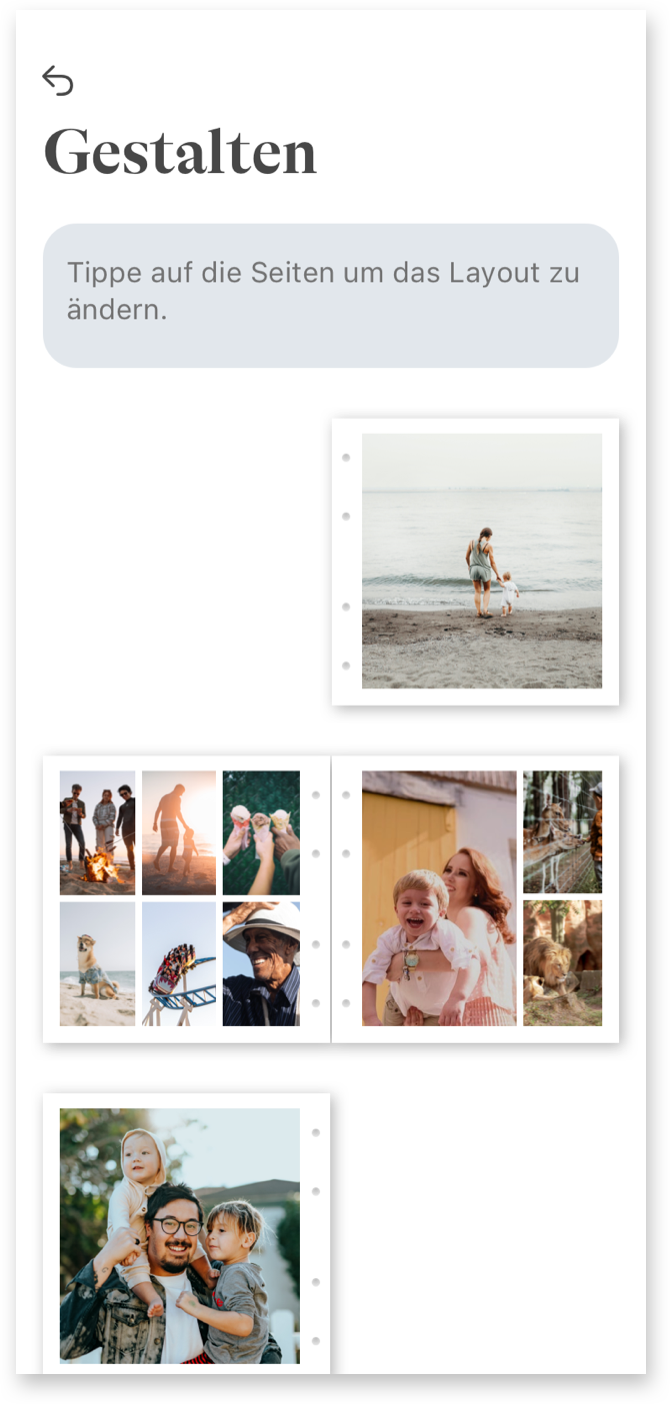
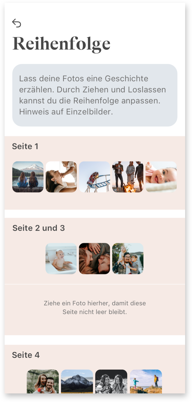
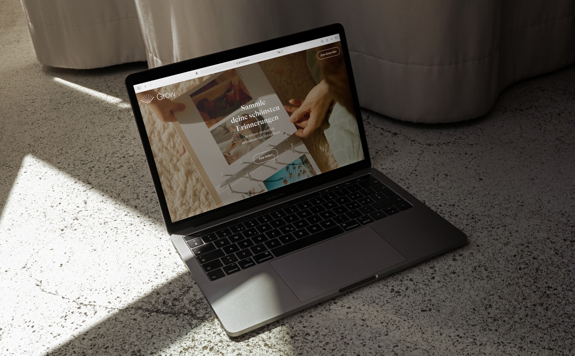
Studio VEH was commissioned to develop the strategy and full brand identity: from the app store and website, to the UX & UI design of an uncomplicated and motivating app, to the final print product sent by mail: A monthly growing photo album that preserves memories of moments with the greatest personal value forever. Clearer than ever: timeless design, top quality and lasting value were the key requirements.
Brand Creation
Brand Repositioning
ConTech
eCommerce

Brand Creation
Brand Repositioning
ConTech
eCommerce

For Grow, loving bonds are the most important thing in life. Studio VEH created a brand that reflects this brand essence not only in the communication and album design, but in the entire customer experience.
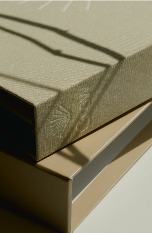
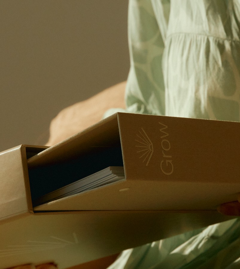
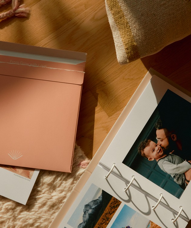
The album consists of a high-quality linen folder that is filled month after month with ever new loving moments on high-quality archival paper. The logo had to look elegant and classy on it. In the same breath, it had to create an emotional connection that anchors Grow as a permanent fixture in the user’s life.
The signet is reminiscent of a seashell — and at the same time represents the fan of a book opened upwards, its leaves captivating the viewer like the rays of a sunrise. It seems like a souvenir of a beach vacation with the family. It warms the heart, brightens our minds in everyday life and awakens a feeling of contentment and joy that never gets old.
The shell functions as a stand-alone in the app logo as well as in all communication — also in combination with the logo font below in a clear, sans-serif font.


The typographic concept for Grow is a reference to past memories and at the same time opens the view to the present as well as the life ahead. A serif typeface meets a modern sans serif. The playful combination of serifs and sans serifs connects yesterday and today — and focuses on subscribers as keepers of past moments and creators of ever new memories.

Brand Creation
Brand Repositioning
ConTech
eCommerce

Brand Creation
Brand Repositioning
ConTech
eCommerce

Brand Creation
Brand Repositioning
ConTech
eCommerce

Brand Creation
Brand Repositioning
ConTech
eCommerce

Brand Creation
Brand Repositioning
ConTech
eCommerce

Brand Creation
Brand Repositioning
ConTech
eCommerce
Brand Creation
Brand Repositioning
ConTech
eCommerce
Brand Creation
Brand Repositioning
ConTech
eCommerce
Brand Creation
Brand Repositioning
ConTech
eCommerce
From the digital user interface to the haptic experience, the brand is brought to life in a holistic and detailed way. In the process, it naturally evokes memories of one’s own childhood and demonstrates how important loving relationships are in life. For all those involved, the development of Grow repeatedly gave rise to goosebump moments. Because of its great emotional significance, Studio VEH devoted itself to the final product with the utmost care at a very early stage, always keeping the coming generations in mind. That’s why the Grow folder, its accompanying slipcase, and the shipping packaging were designed with the environment in mind and produced with certified sustainable materials. In close communication with Axel Lilienblum and his family, Studio VEH was able to ensure that the result would meet the highest standards — and that even the youngest children would simply love it.
Brand Creation
Brand Repositioning
ConTech
eCommerce

Brand Creation
Brand Repositioning
ConTech
eCommerce
Brand Creation
Brand Repositioning
ConTech
eCommerce

Brand Creation
Brand Repositioning
ConTech
eCommerce
„The close collaboration with Studio VEH helped me to structure my initial ideas for both the brand and the product in a very efficient way. We are beyond happy with the result – from the app design to the final product – and are getting a lot of positive feedback from our customers.“
Axel, Founder of Grow
Brand Creation
Brand Repositioning
ConTech
eCommerce

Brand Creation
Brand Repositioning
ConTech
eCommerce
Team Credits
Creative Direction: Franziska Veh
Design: Lind Haugaard, Callum O’Neill
UI: Callum O’Neill
UX: Robert Siuda
Project Management: Kiyoshi Stelzner
Photography: Daniel Faro
Retouching: Alin Bosnoyan
Text: Mark-Marcel Müller