After 20 years of prioritising quality services with the aim of transforming the energy sector for the better, it seems only right to celebrate this milestone anniversary with the redevelopment of a clear strategy and redesign of the ACON brand.
To mark its 20th anniversary, ACON Energie Management GmbH decided to collaborate with Studio Veh to update its image. The resulting brand look is modern yet timeless, and has been implemented across all channels. The starting point was a team workshop. This allowed Studio Veh to collect a wealth of knowledge from ACON’s team – including customer insights and engineering expertise, as well as recent major developments in the energy sector – in order to begin the process of distilling this information into the brand’s core essence.
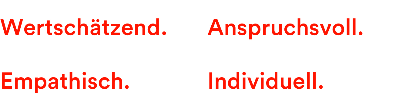
The fact that ACON is a small team also quickly revealed the advantages of the brand: personal commitment, the highest quality standards, and empathy for customers’ needs, as well as a daily appreciation for everyone involved in the business.
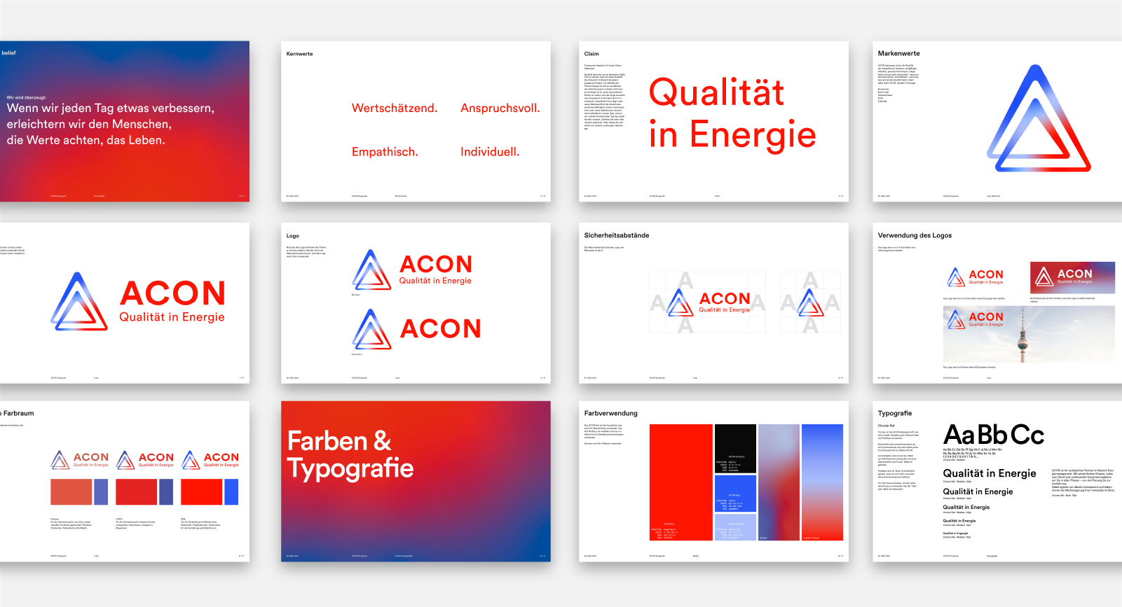
Transparency starts with a clear statement
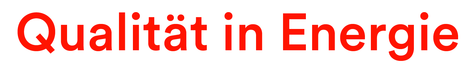
Quality comes first at ACON. And there’s a commitment to delivering this quality comprehensively throughout the energy management sector. As the topic of energy is so complex and there are frequent technological developments, it is especially important to have a strong brand that can be trusted. Studio Veh was easily able to identify that one of ACON’s biggest strengths is its ability to take responsibility for its work in a competent and transparent manner.
The new brand identity highlights the future-oriented straightforwardness of the in-house services provided in a modern, sleek form. The new brand statement summarises why the ACON team makes life easier for its customers.
Quality written in capitals
ACON has embodied the principle of quality for over 20 years. Therefore, it was about time to write the brand’s name with capital letters. The team earned the trust of its customers by continuously striving for higher quality and providing an extraordinary level of reliability. But praise is not a reason to be complacent, rather it is motivation to deliver more. Because everyone at ACON knows: quality is something you have to demonstrate daily. It’s only by doing so that customers will be assured that they will always receive the best results in the energy sector.
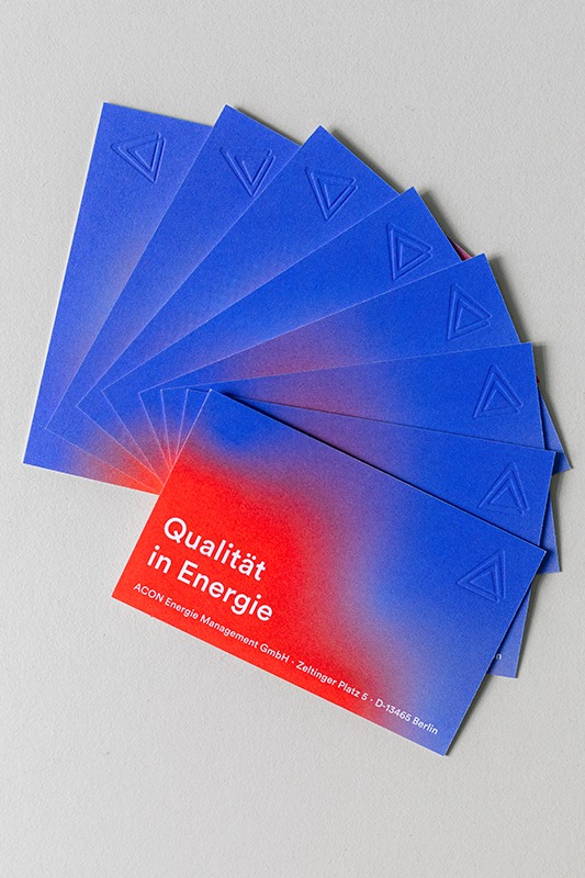
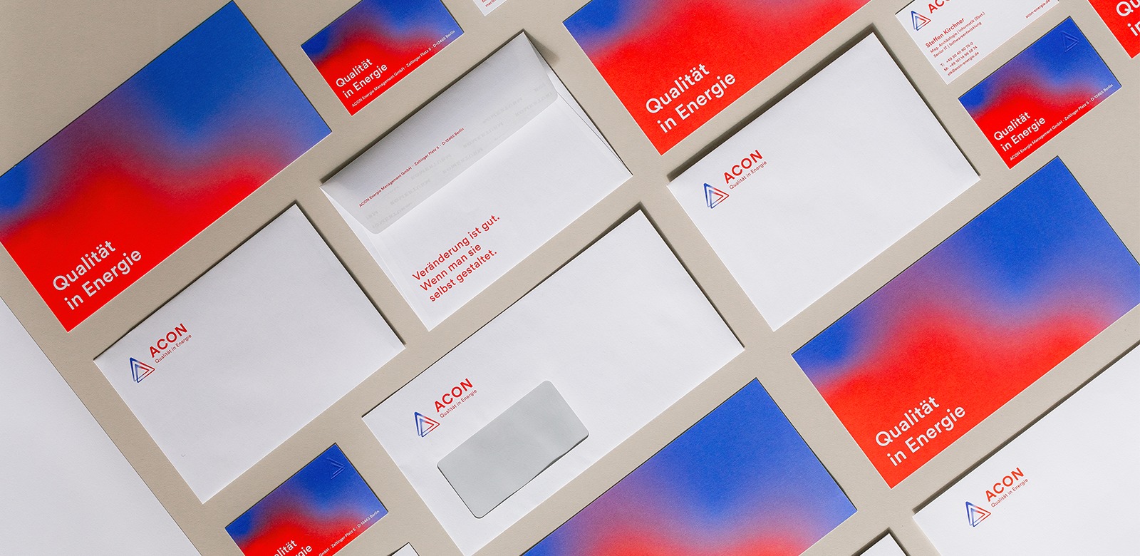
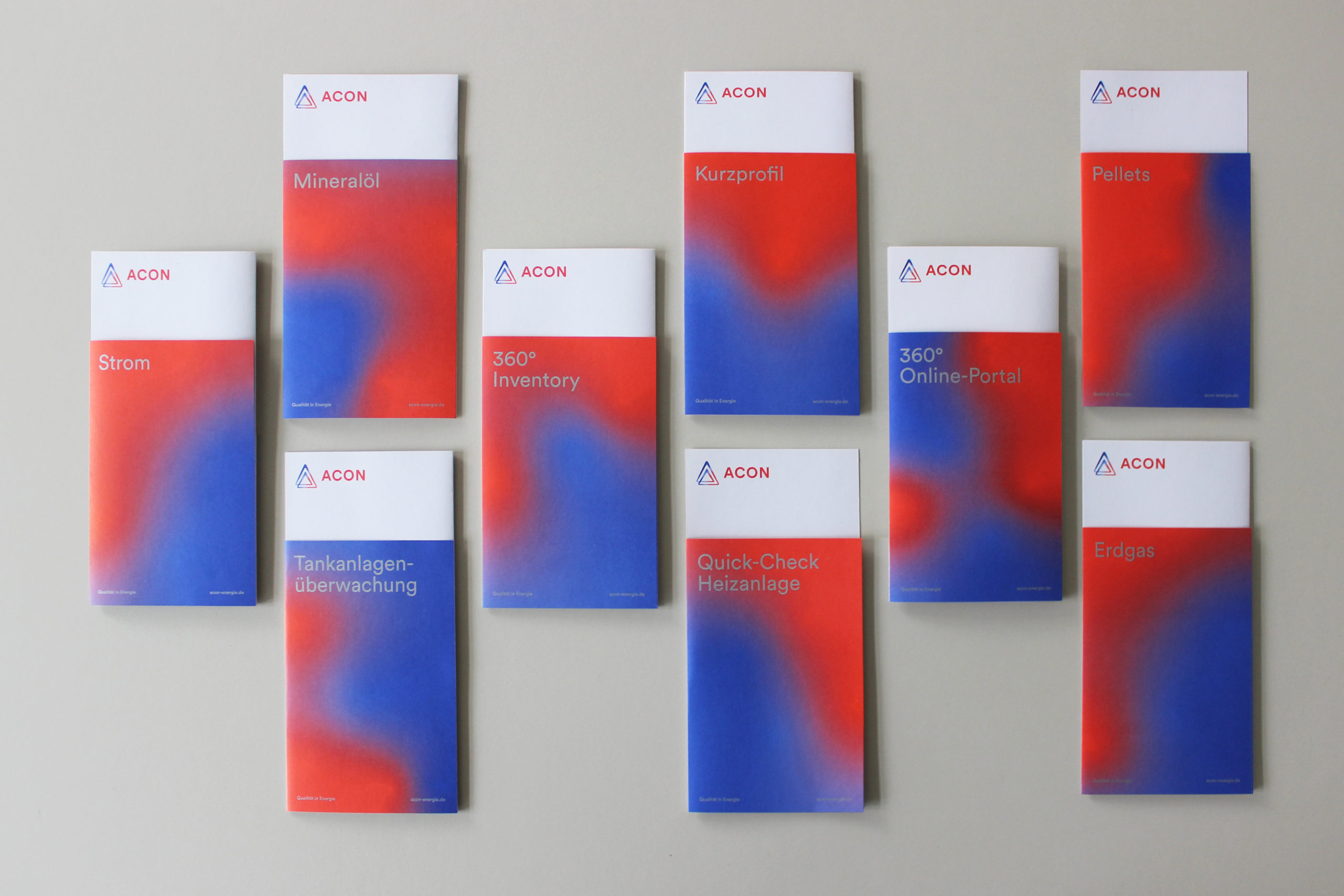
The shape of the newly developed logo – a triangle – not only reflects the initial letter of the brand name, but it also reflects this triad of team, customer and energy. It also shows that ACON works to push the quality standard to infinity and that the organisation is in a state of energetic flow. Consistency in client relations, always ensuring the quality of services, being proactive and always going the extra mile – in short: the symbolic power of the logo gives ACON a strength in all respects that is clear in the long term.
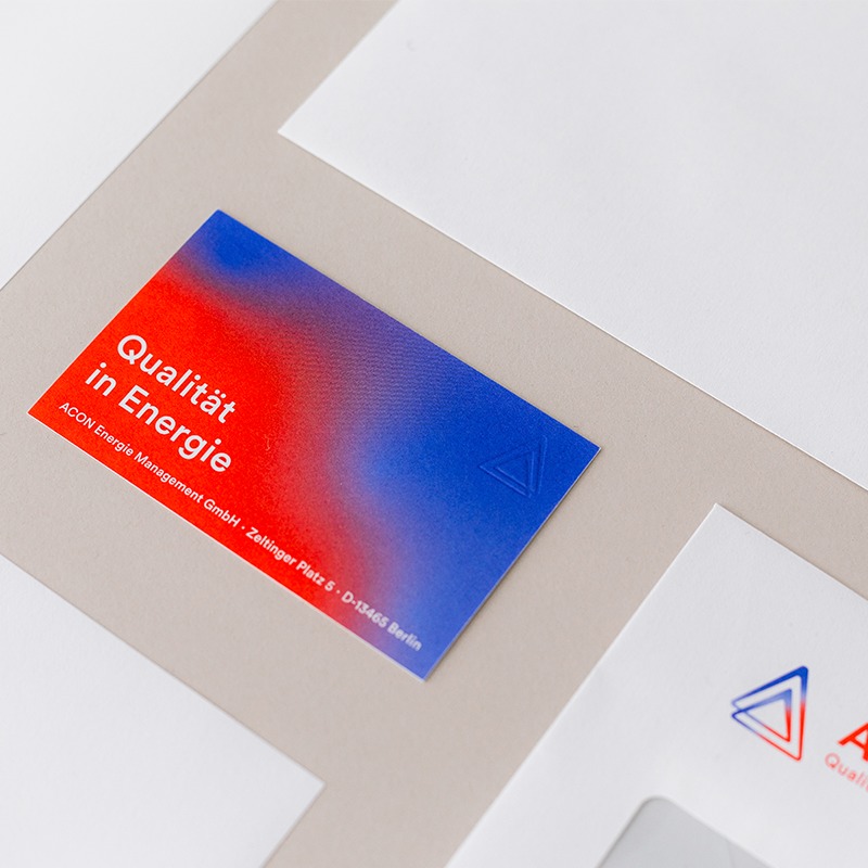
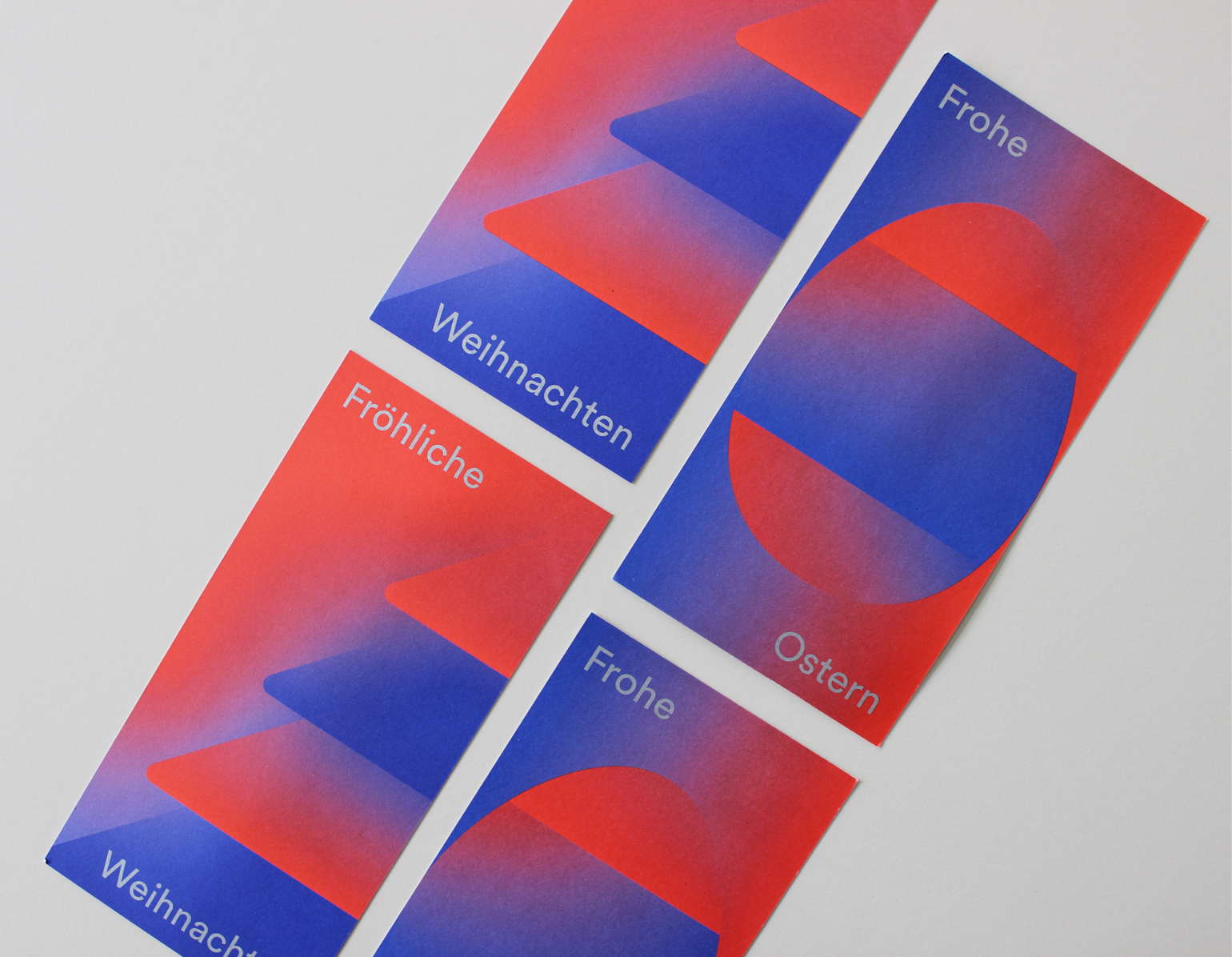
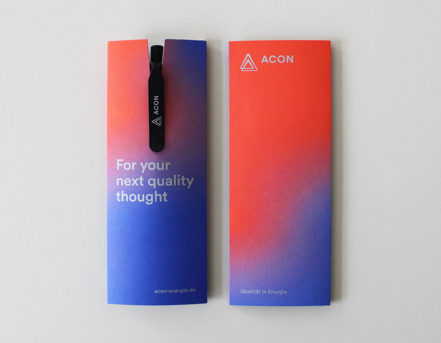
Energy is in constant flux. Thermal imaging reveals the interaction between warm and cold air. ACON recognises that energy is not static – and this is now reflected in their logo as well as in various design elements in their communication. Whether in the fixed background of an advertisement or animated in a digital presentation, the flow of energy becomes a recognisable feature of the brand.

‘Studio Veh works as our communication partner in a completely comprehensive way. Franziska Veh and her team are highly empathetic, think strategically and demonstrate entrepreneurial vision. Under her leadership, the brand core of ACON has been transformed and reshaped to be future-proof. Many thanks for the excellent work.’
Markus Conrad, Founder & Managing Director ACON
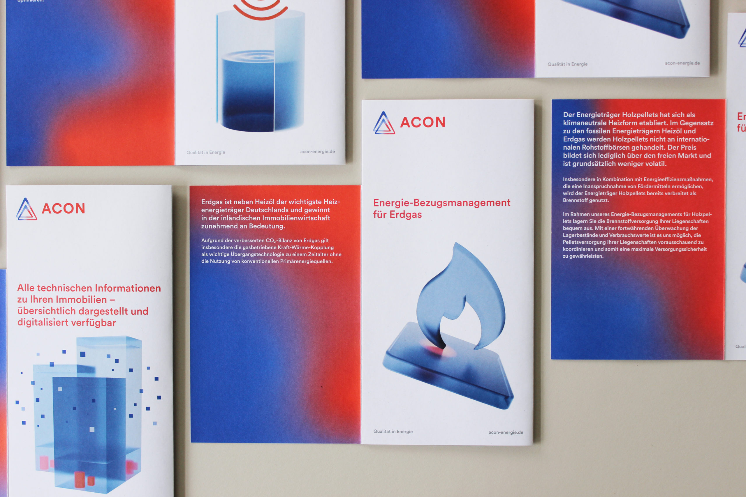
Studio Veh takes care of the entire ACON presence, from concept to copywriting and design to production, handling their advertising campaigns, direct mailings, flyers and business assets, including digital office templates.
Brand Creation
Brand Repositioning
ConTech
eCommerce
Brand Creation
Brand Repositioning
ConTech
eCommerce
Brand Creation
Brand Repositioning
ConTech
eCommerce

Brand Creation
Brand Repositioning
ConTech
eCommerce
Brand Creation
Brand Repositioning
ConTech
eCommerce
Brand Creation
Brand Repositioning
ConTech
eCommerce
Brand Creation
Brand Repositioning
ConTech
eCommerce
Brand Creation
Brand Repositioning
ConTech
eCommerce
Digitalisation with design ambition
Energy is not only in flux. It is also undergoing a major transformation. Studio Veh accompanies ACON as a strategic partner in the digitisation process and the needed reorientation of its services. This starts with the responsive website and leads to digital business cards and UX conception, as well as user-friendly interface design for apps for property management.
Whatever the future brings, the jointly developed, clear strategic anchor point – in addition to recognisability in design – will always ensure a return to what the team stands for: quality in energy.
Team Credits
Brand Workshop & Strategy:
Franziska Veh, Mark-Marcel Müller
Creative Direction:
Franziska Veh
Design:
Lind Haugaard
Project Management:
Kiyoshi Stelzner
Text:
Mark-Marcel Müller
Editing (DE):
Gesine Schröder
Translation (EN):
Emily McDonnell
Animation Brand:
Jonathan Nielsen
Animation App Visuals:
Björn Fiekert
UX:
Robert Siuda
Web Development:
Ralf Büsch
Retouching:
Alin Bosnoyan
Photography:
Daniel Faró