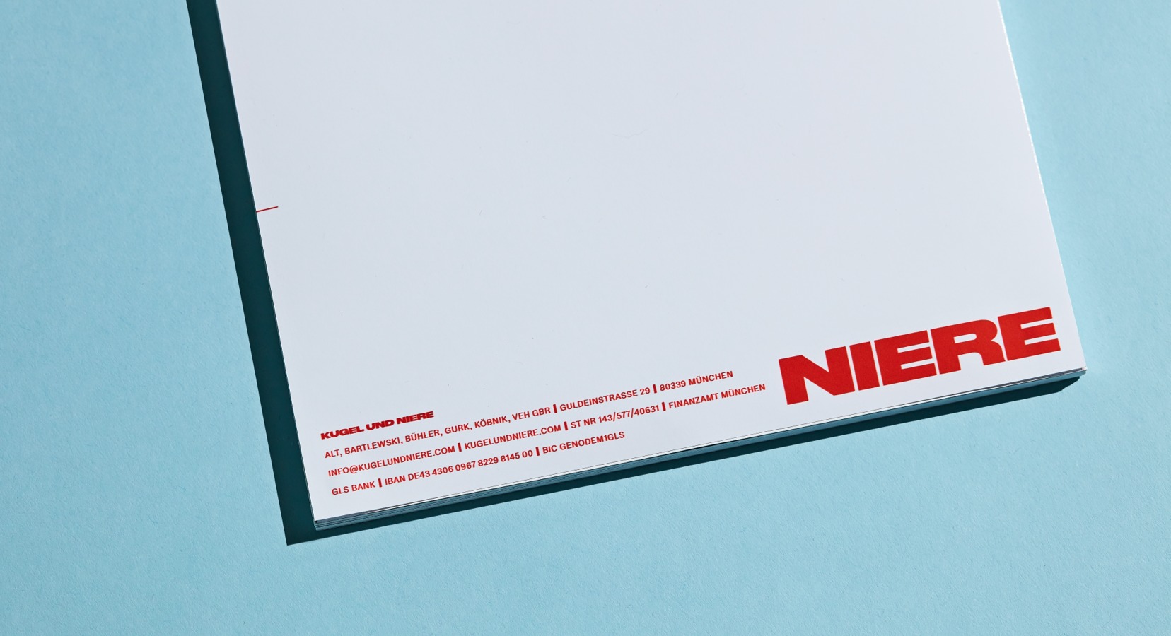
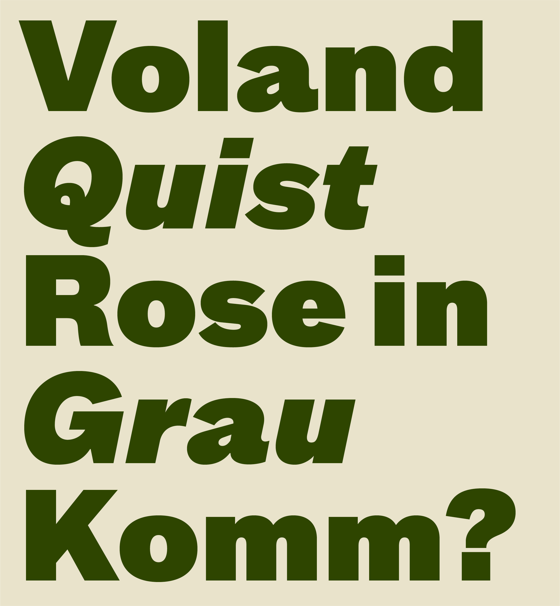
Voland, the devil from the Russian novel ‘The Master and Margarita’, and Quinten Quist from Harry Mulisch’s ‘The Discovery of Heaven’ were the inspiration for the name of the publishing house as opposing novel characters: Voland & Quist was founded on the principle that embracing polarities creates voices that you recognize among hundreds: powerful, unusual, experimental.
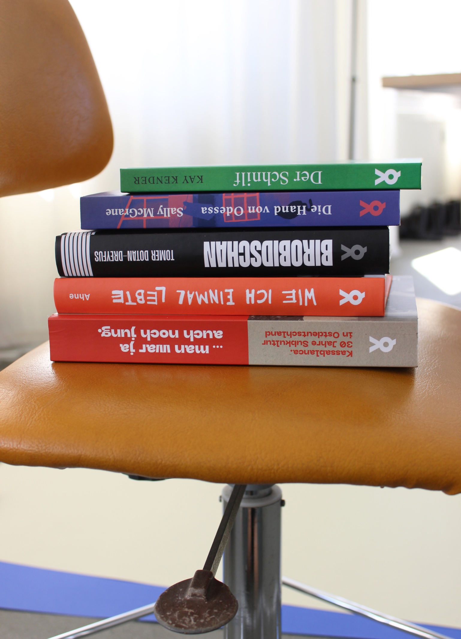
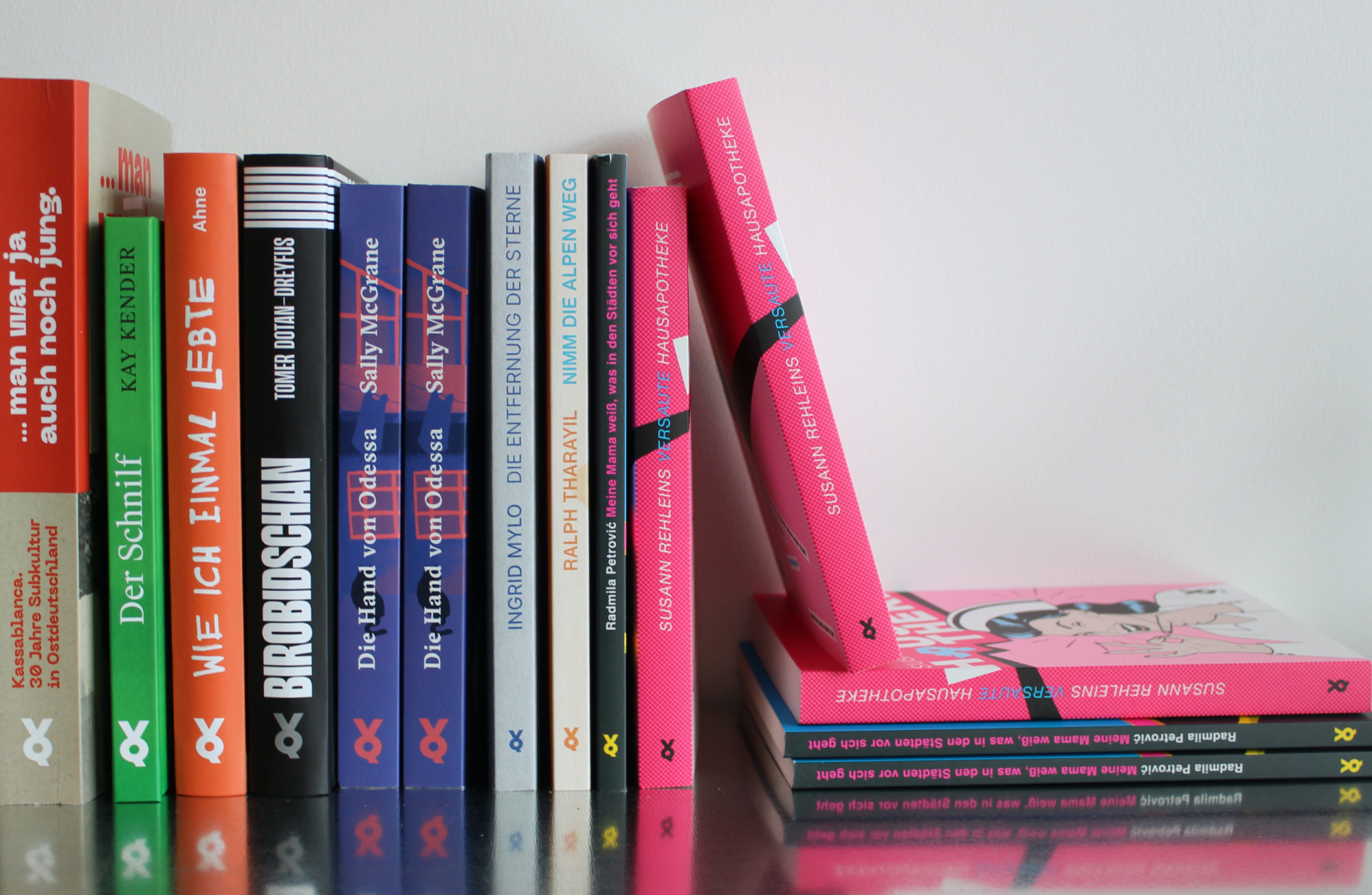
By encouraging the integration of seemingly contradictory thoughts and ideas, Voland & Quist creates a dynamic environment where diverse perspectives converge to drive breakthrough stories. With a broad range of publications from the recent literary scene of South-Eastern and Central Europe to multivolume picture books for children since it’s foundation in 2004, the publishing house today stands for courageous, emancipated, fresh literature that does not fit into any moulds or stereotypes. On the occasion of their 18th birthday, the publishing house teamed up with Studio VEH to take their brand identity to the next level and to give all publications a consistent appearance with high recognition value.
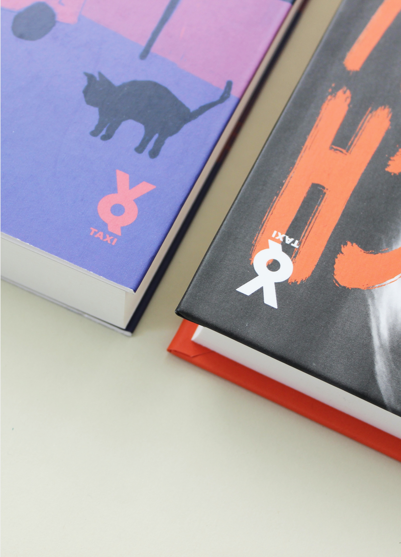
It’s better to cry in a cab
than in a streetcar
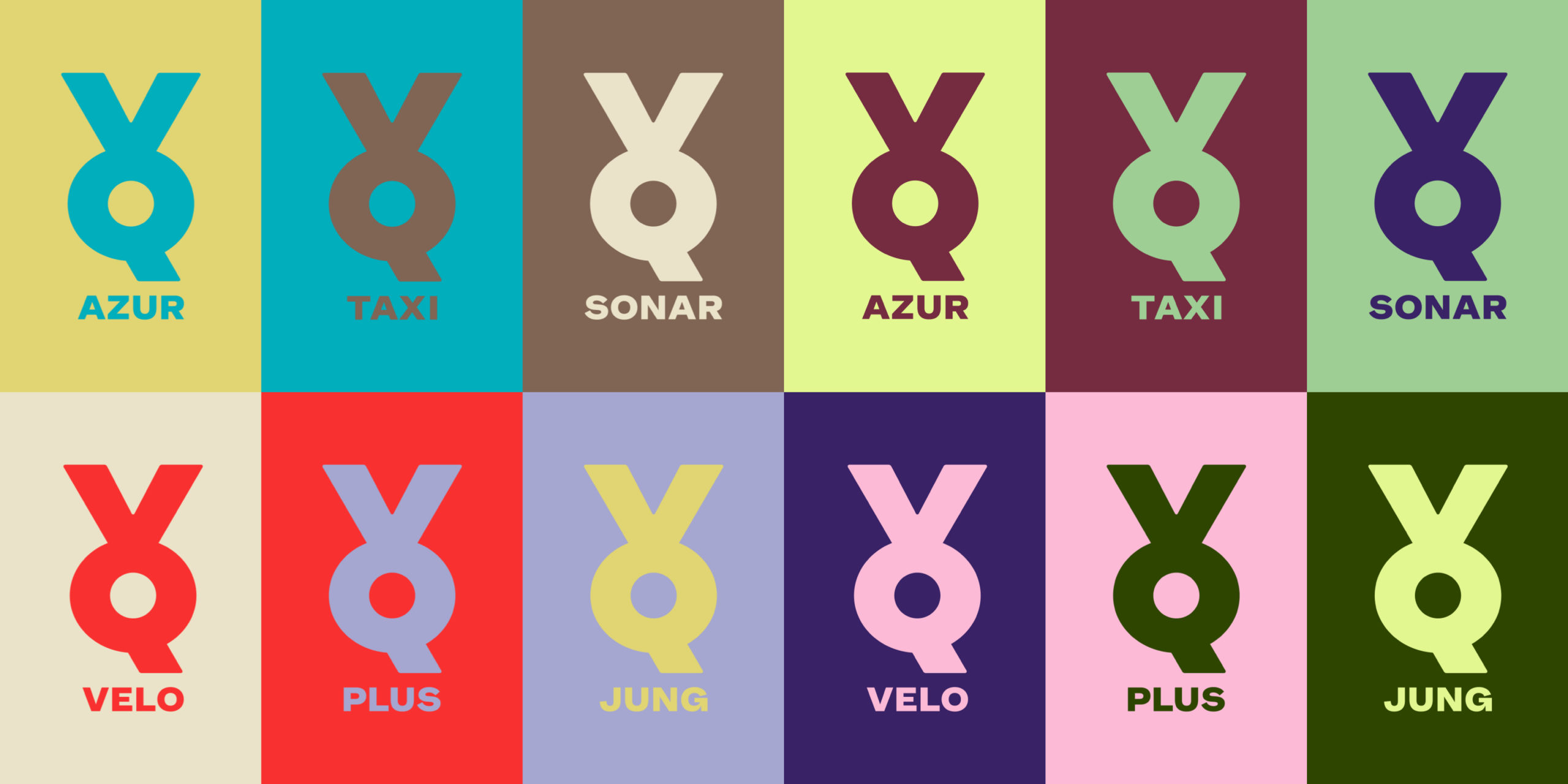
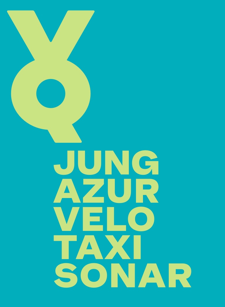
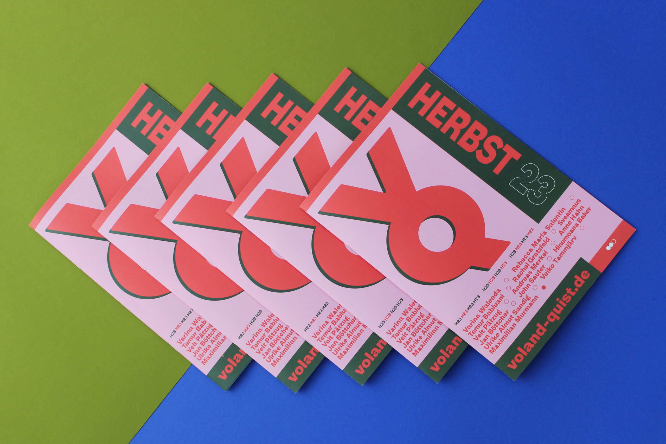
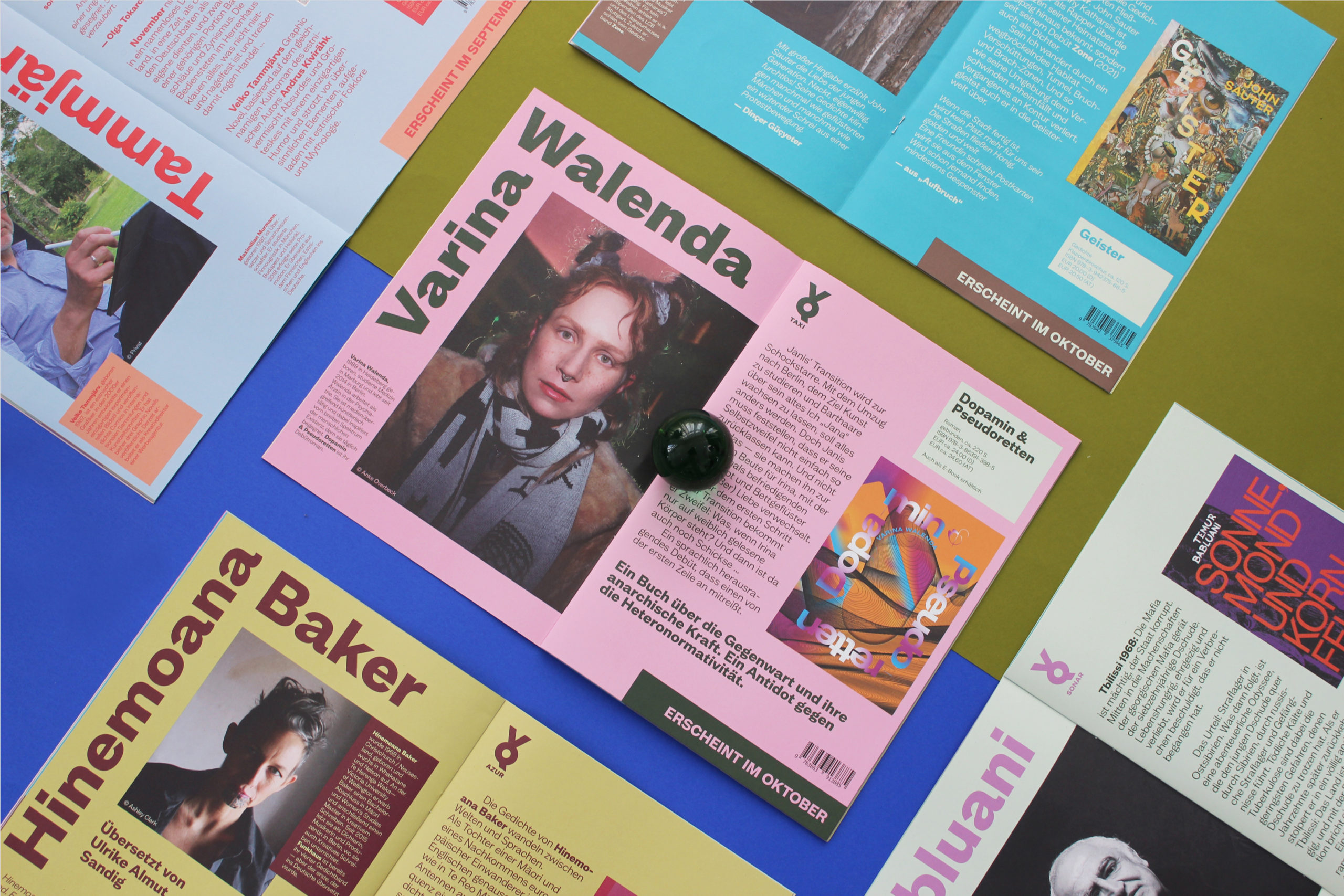
The first strategic task to address was the restructuring of all editions and publications Voland & Quist maintained over the years, in order to enable them to continue to grow. As a solution, Studio VEH developed an umbrella brand system that can house all existing and future publications in equal subcategories. This brand system consisted of VQ as the umbrella brand for general brand communication, and VQSONAR, VQAZUR, VQJUNG, VQVELO and VQTAXI as sub brands:
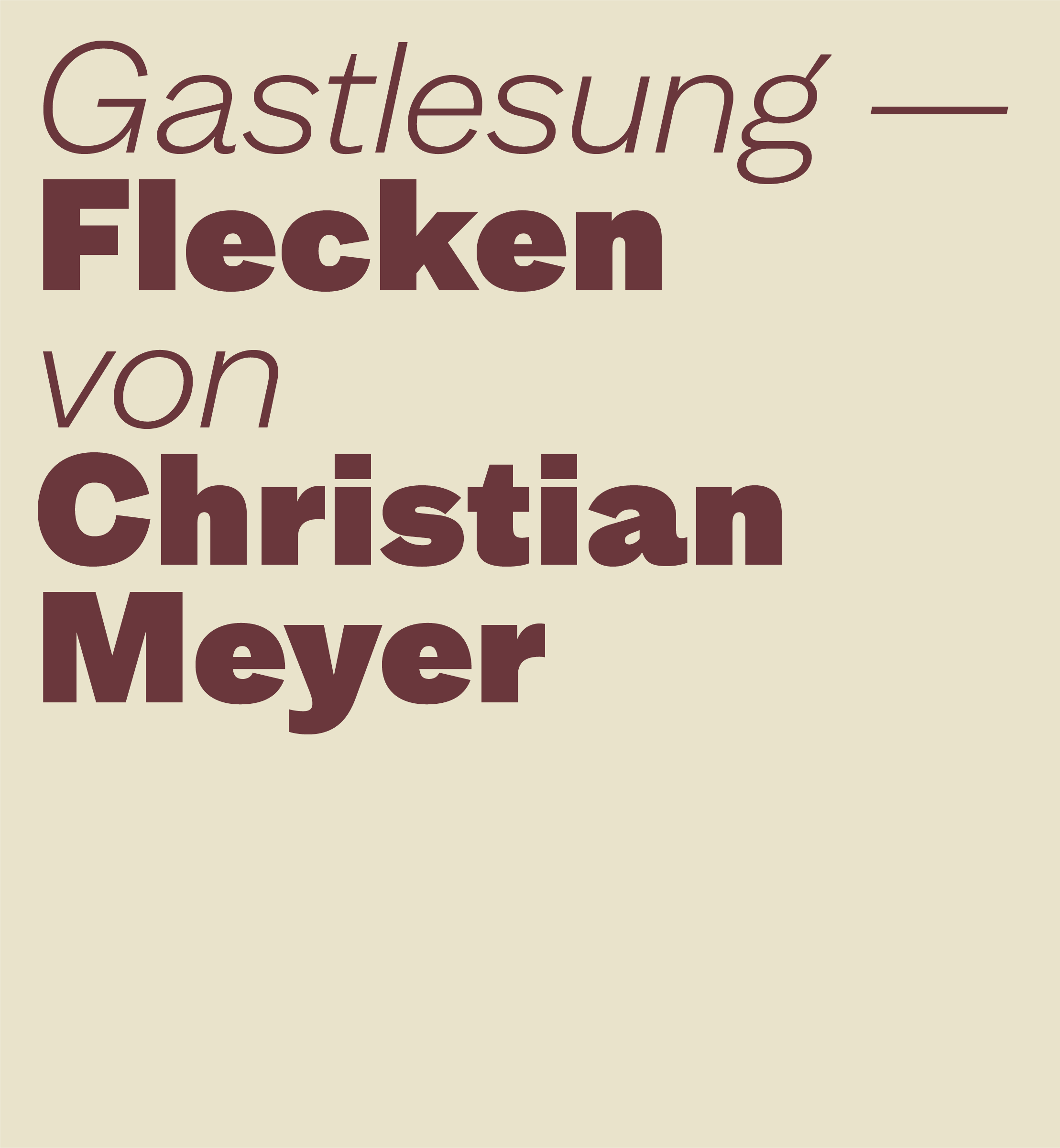
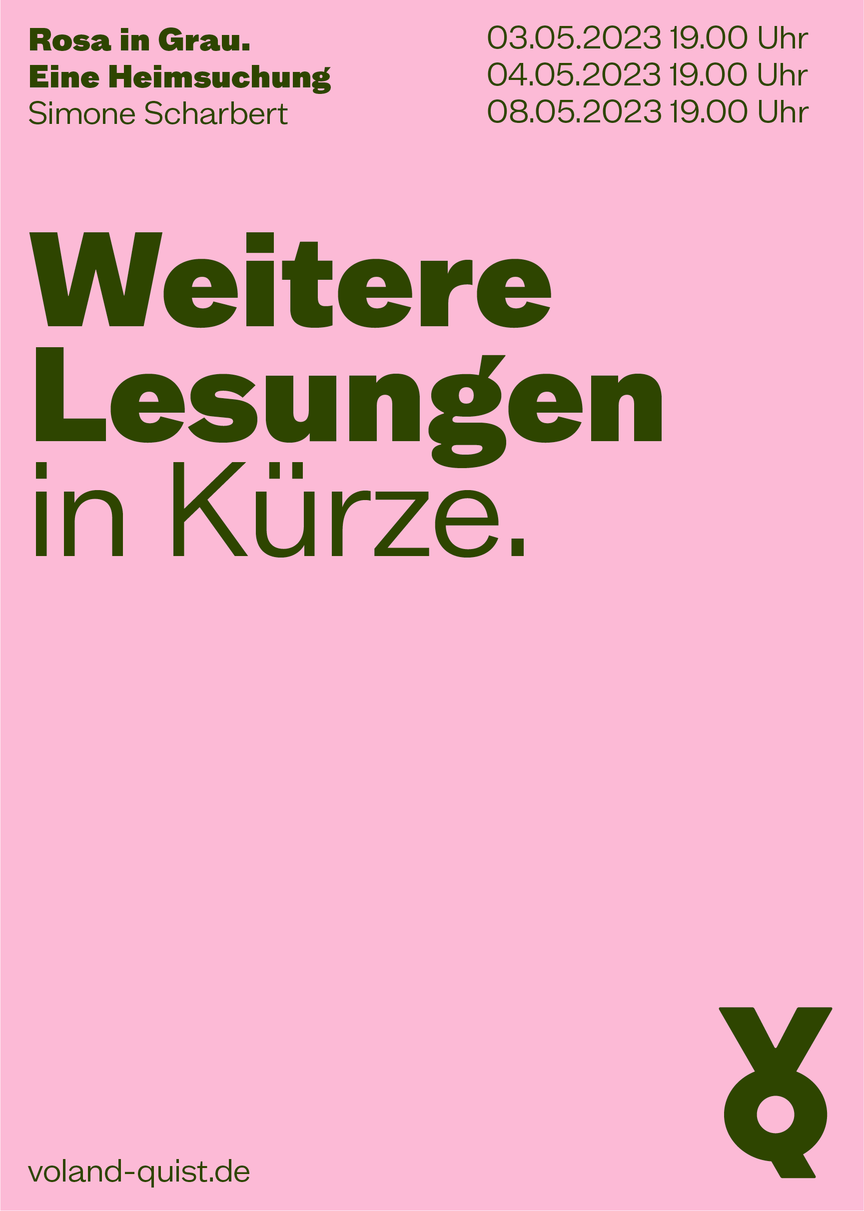
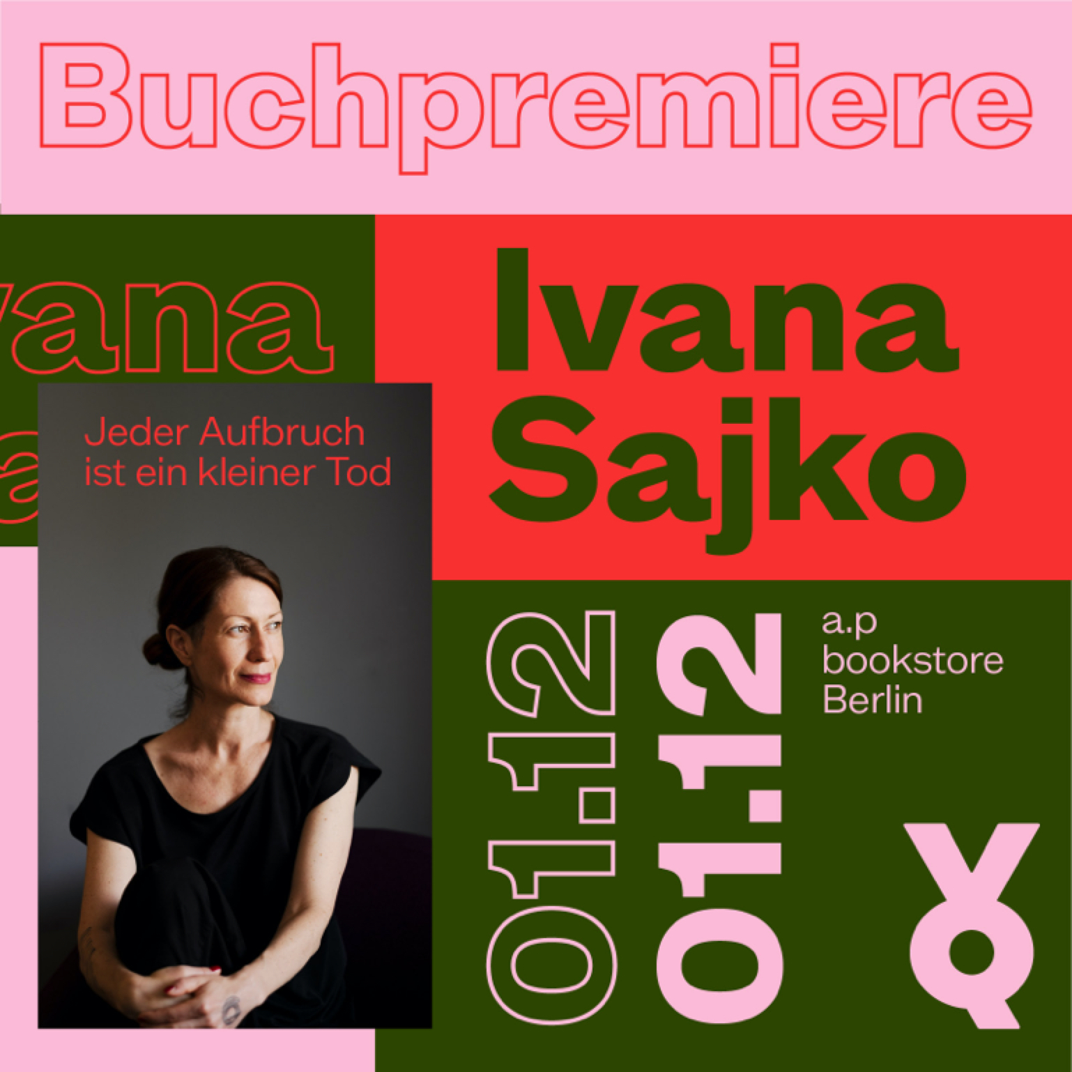
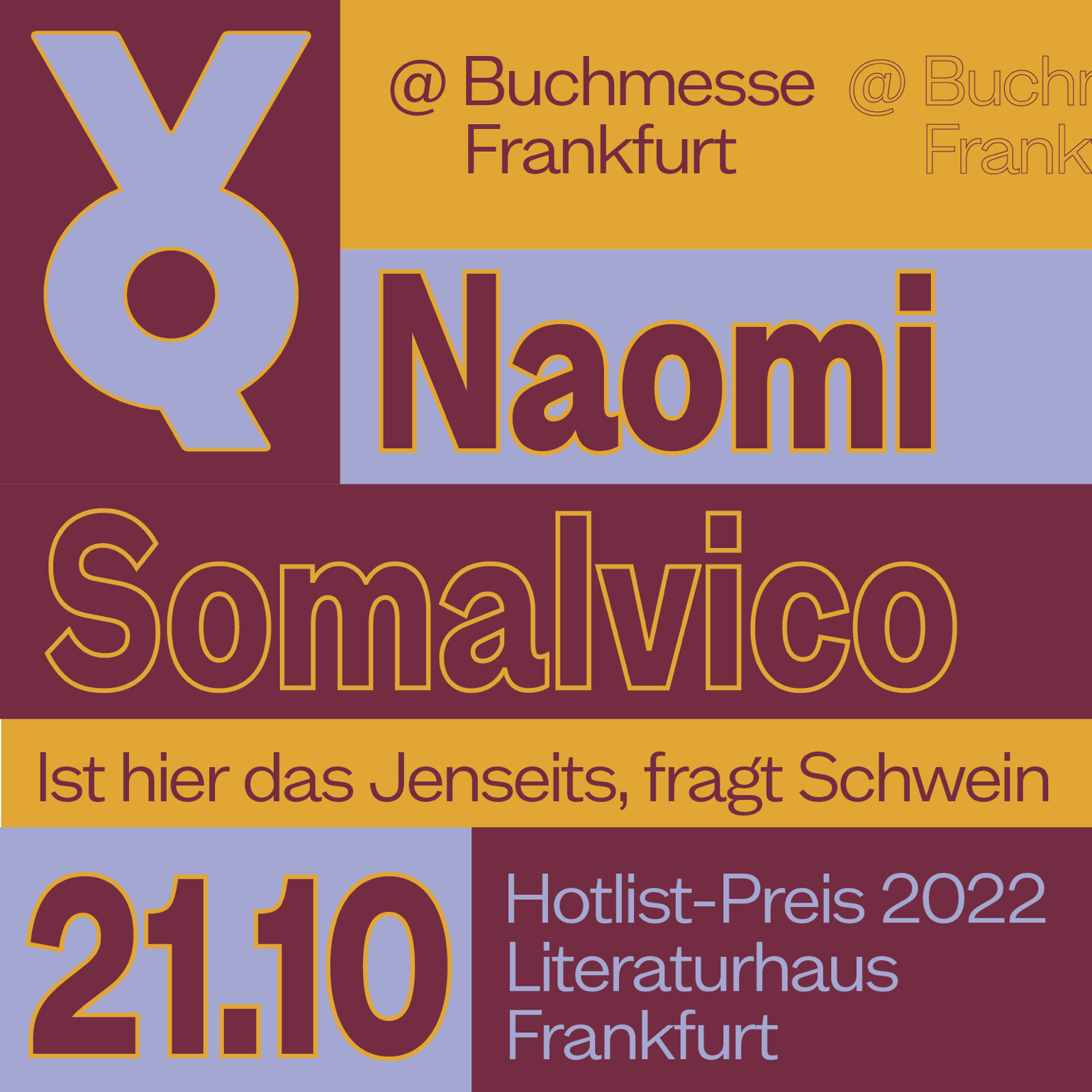
VQSONAR includes first translations from the younger literary scene of Southern, Eastern, and Central Europe.
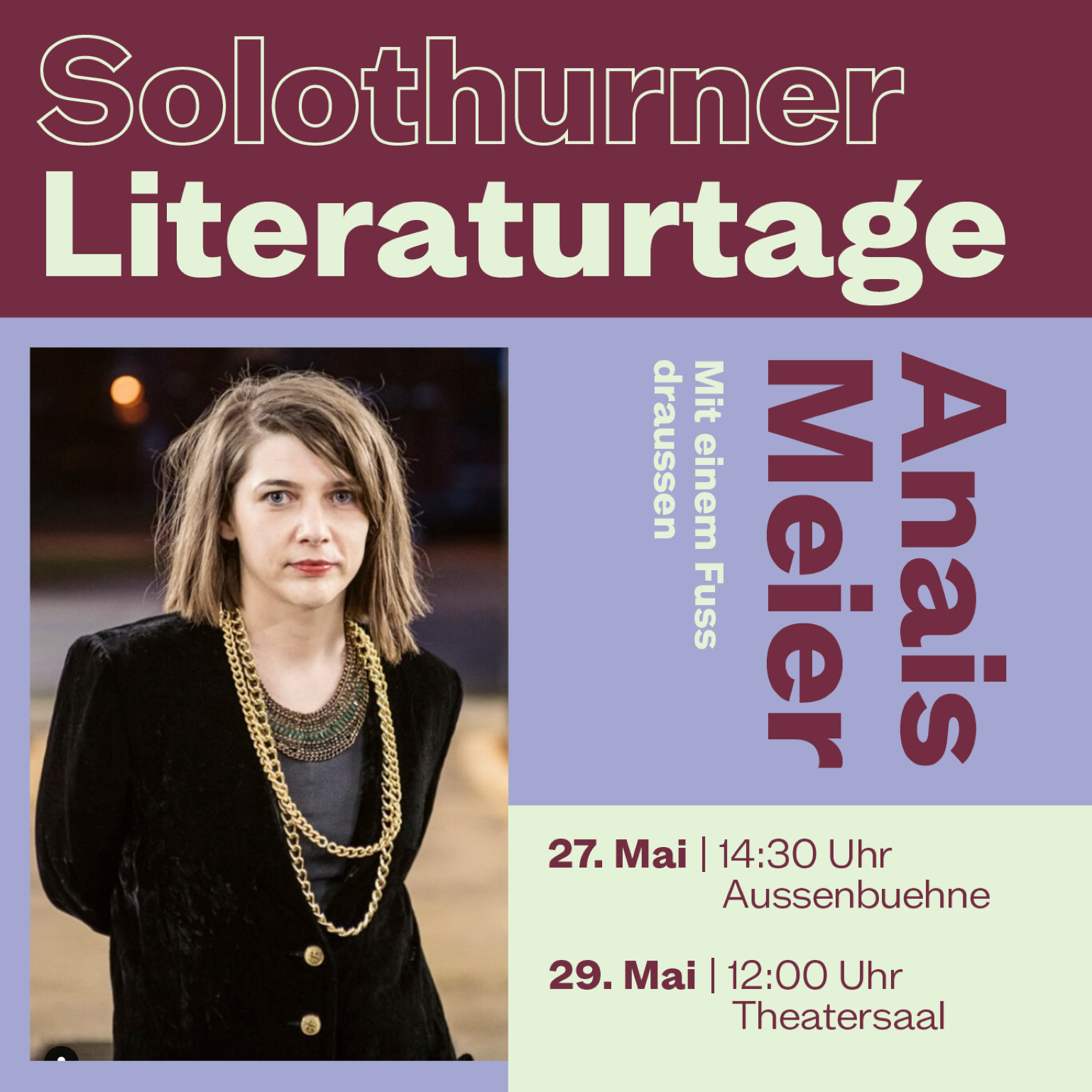
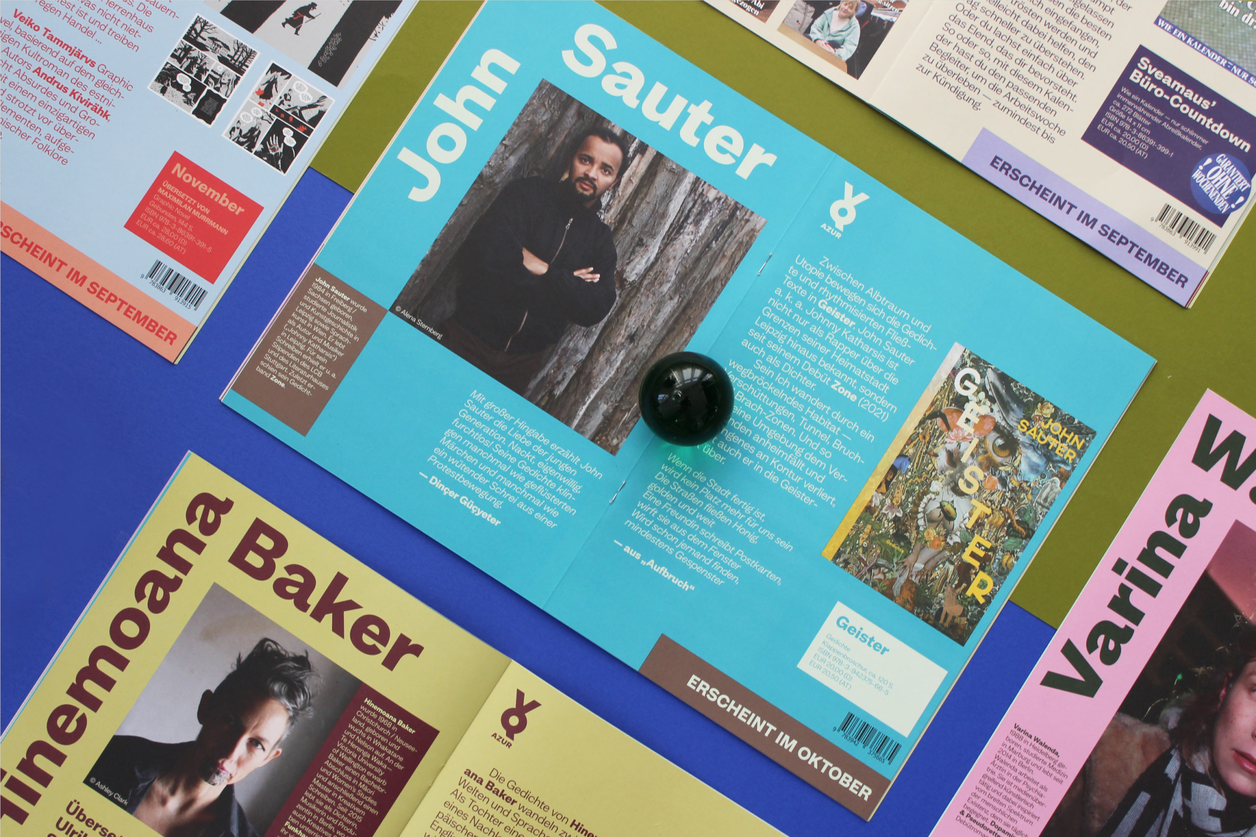
VQAZUR gathers the selection of the former edition AZUR.
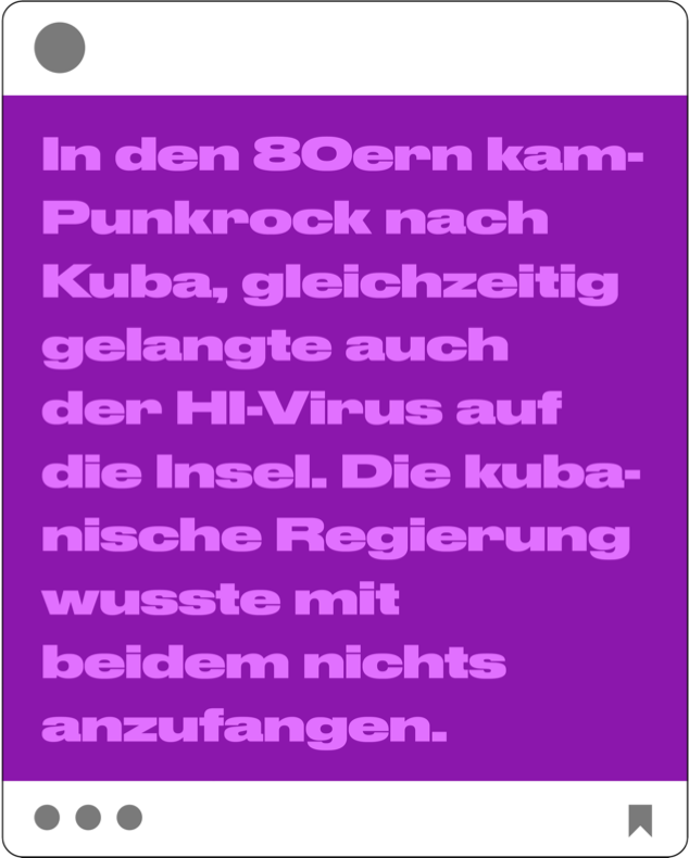
VQJUNG — the name gives it away — is the label for a younger audience featuring multi-volume picture books.
VQVELO hosts all publications keeping with the motto “Nothing compares to the simple joy of riding a bicycle.” (John F Kennedy), including calendars and graphic novels.
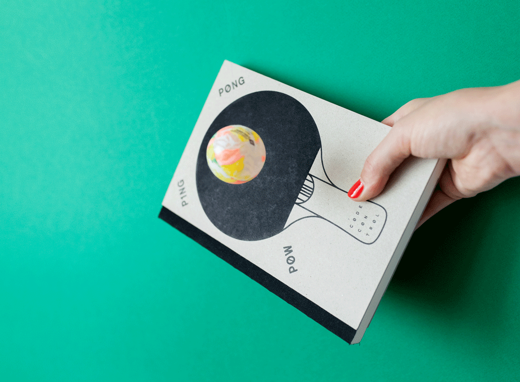
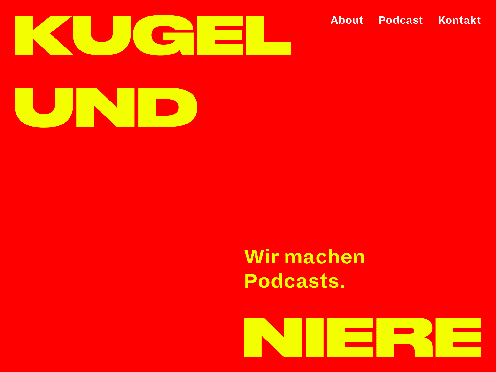
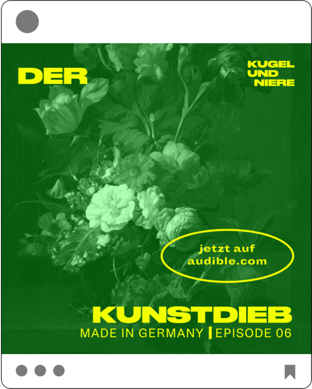
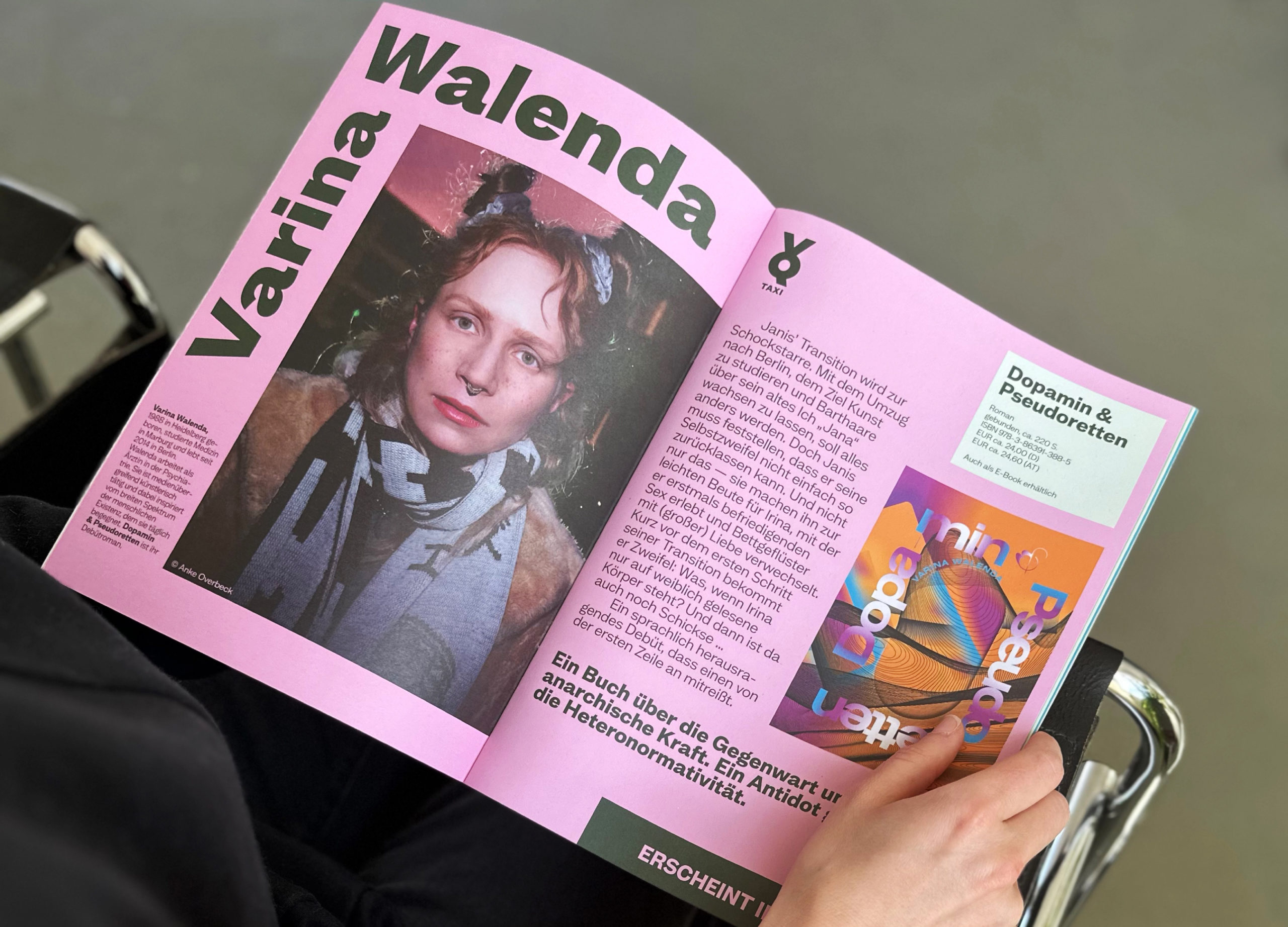
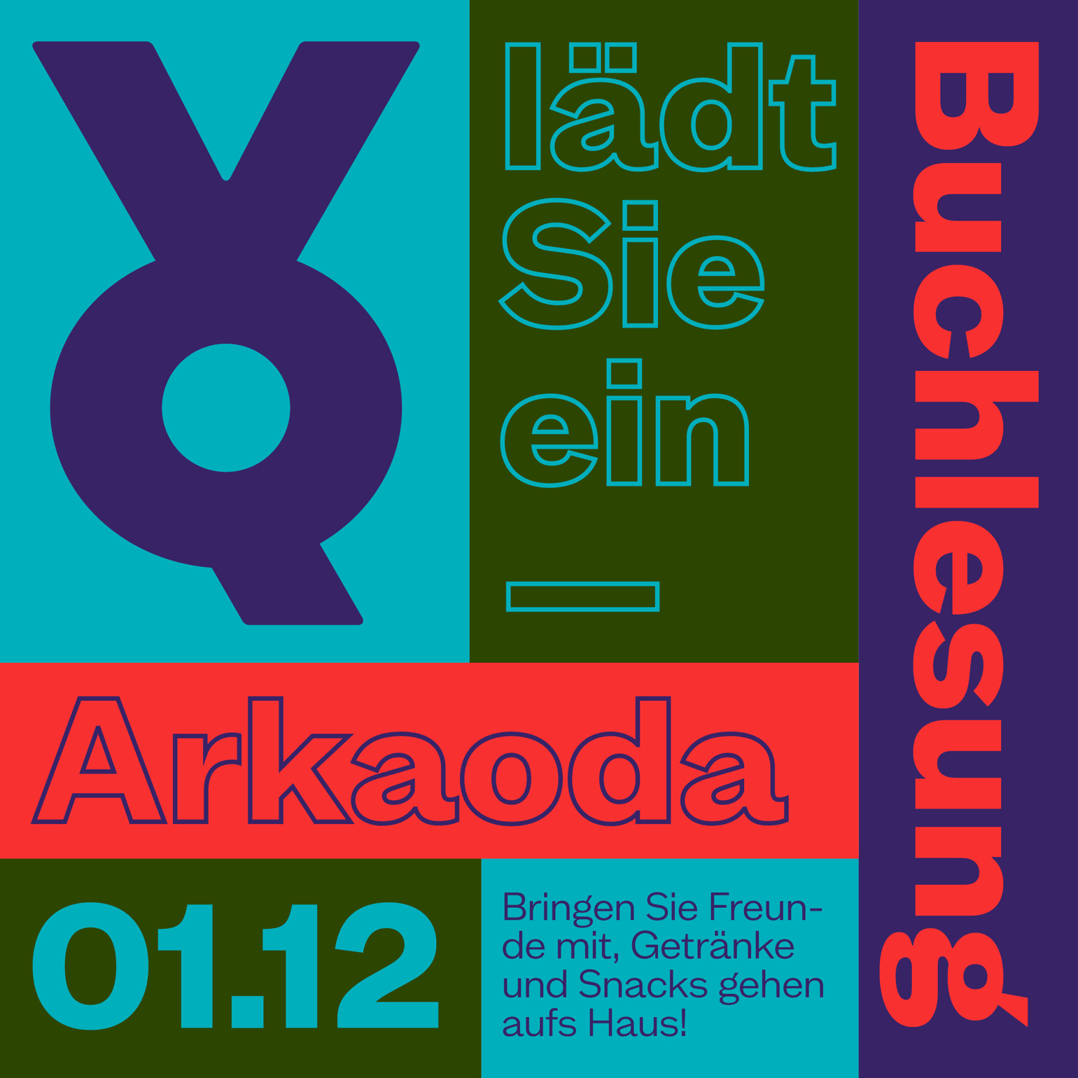
For VQTAXI, Marcel Reich-Ranicki’s statement „It’s better to cry in a cab than in a streetcar” gave it its name.
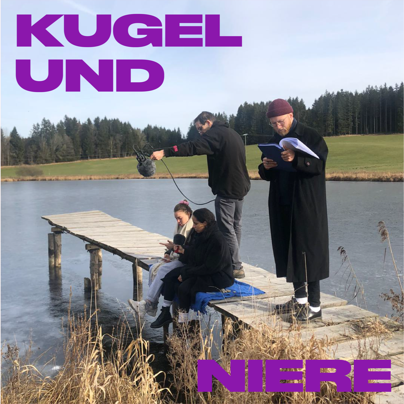
The in-house artist management, managing and booking events and projects by artists with an affinity for literature, is now called VQPlus.
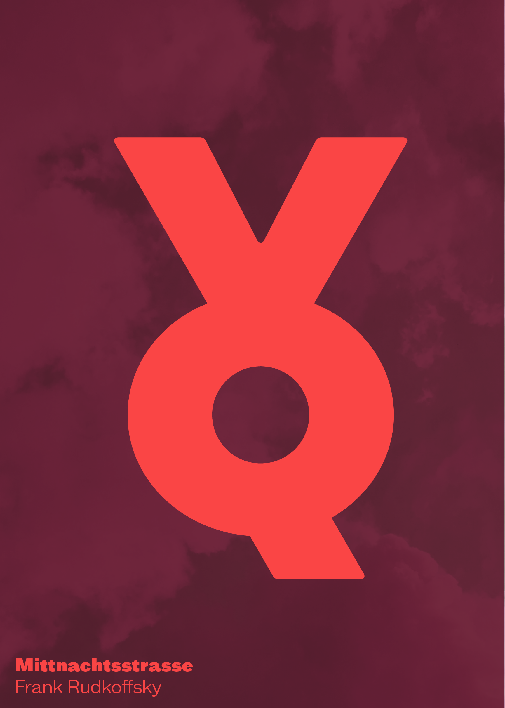
A powerful sum
But how can it work to unify all these full-bodied personalities into a powerful sum of all its parts and at the same time express an openminded and cosmopolitan attitude?
By combining the significance of symbolism and inherent playfulness in the new identity, which also represents a unique position in the direct market environment.
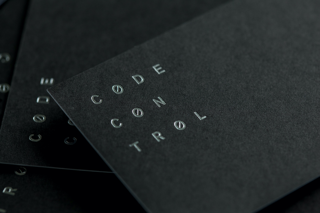
Merging the company’s initials V and Q into one iconic, visually striking and memorable yet simple symbol – it celebrates the bold and independent legacy of the publishing house with all its polarities and dualities dancing together – good and evil, order and chaos, fate and free will — yet opens up a new, more seasoned chapter with a clear brand message.
The devil is in the details
Creating a striking symbol requires several rounds of typographic detail work: First, testing a typeface with angular Q tail, flattened Q tail and bottom-aligned flattened Q tail. For comparison, testing another more geometric typeface, matching the width of the V with the Q tail and aligning it.
After several rounds of refinement with line heights, spacing between the letters and the alignment of the V and Q stem’s diagonals, Studio VEH arrived on this final system for umbrella brand and subbrands, based on the same sign.
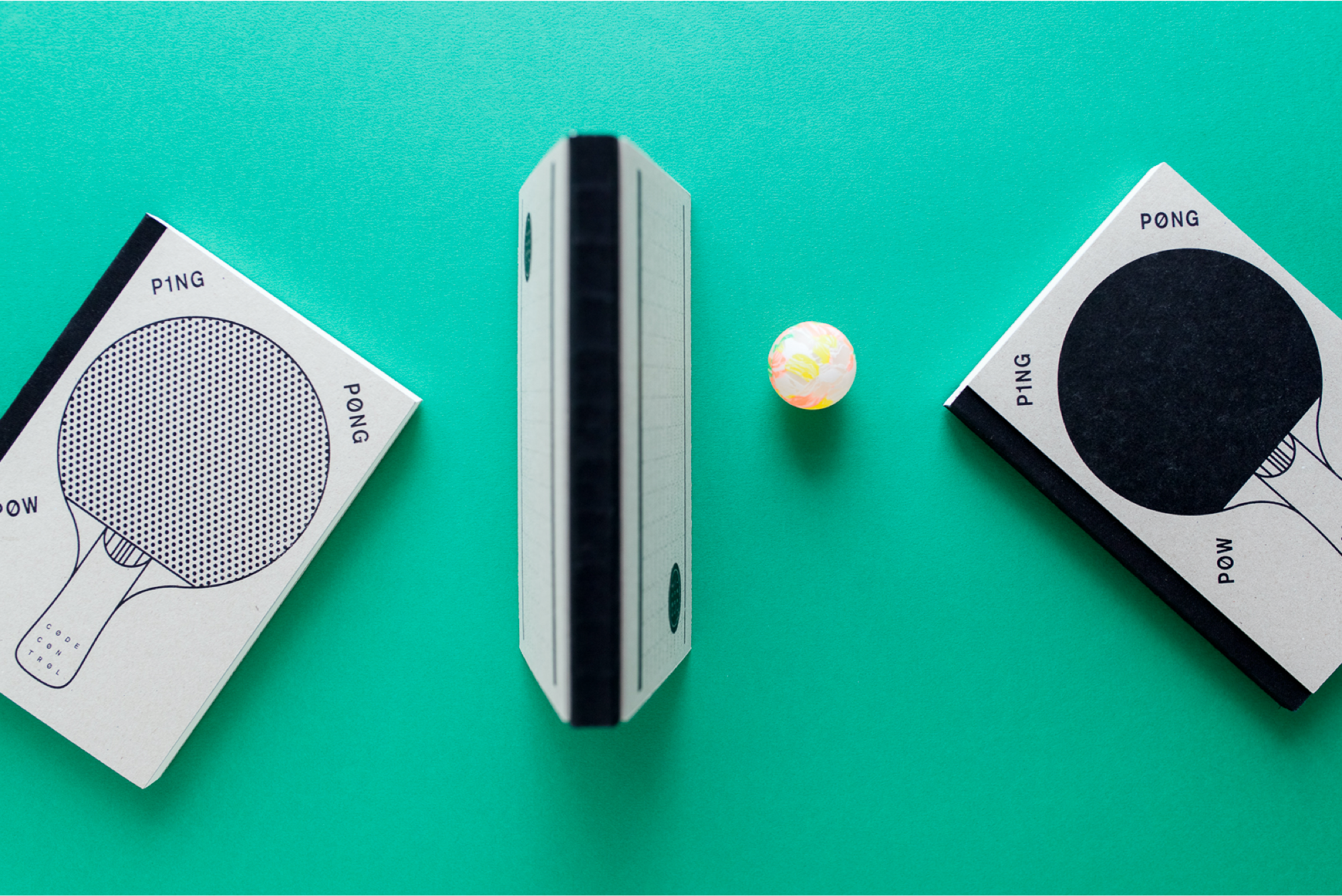
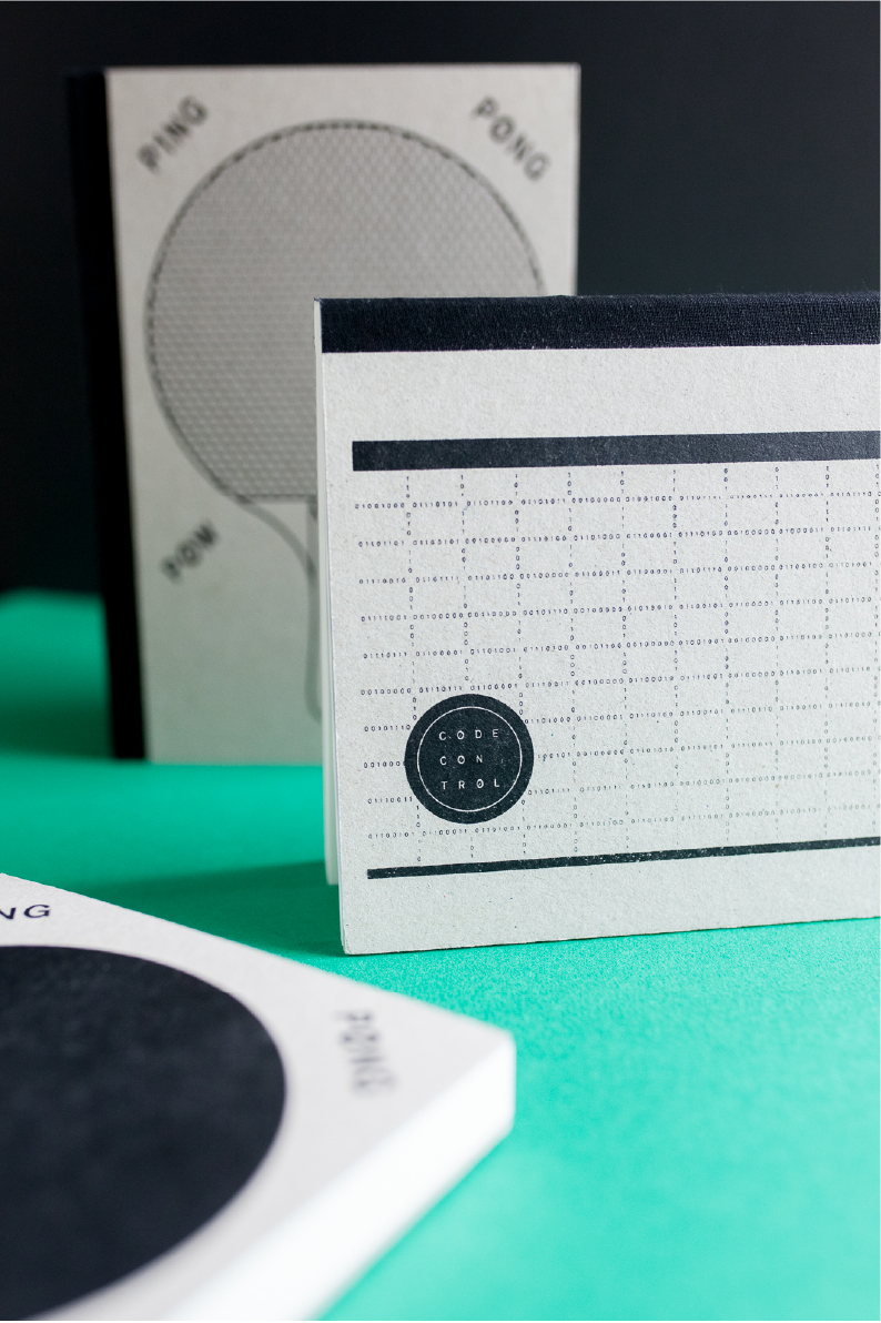
To express the brand’s core values – young and contemporary, imaginative and aware, colourful and always evolving — and to communicate the unconventional attitude of Voland & Quist with all its multifacetedness, a broad palette of brand colors was created that is as bold and unconventional as the publishing house itself.
Putting even more emphasis on the unique and far-reaching personality, Studio VEH selected the typeface Mint Grotesk for the visual identity. It is a Grotesk typeface with a super fresh, almost eccentric nature that when used in its many weights and cuts, accentuates the charming personality of the brand identity quite perfectly. It’s a match made in heaven!
In the second phase of the project, the full visual identity was developed based on the wide-randing color scheme, and the very generous family of the typeface Mint Grotesk.
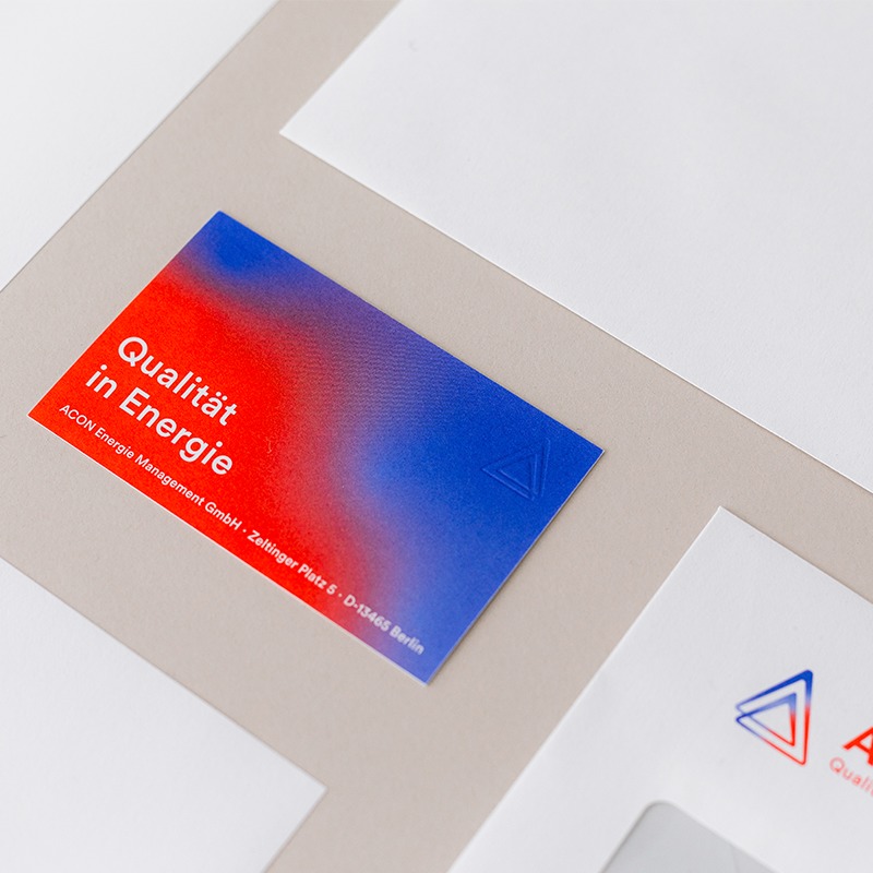
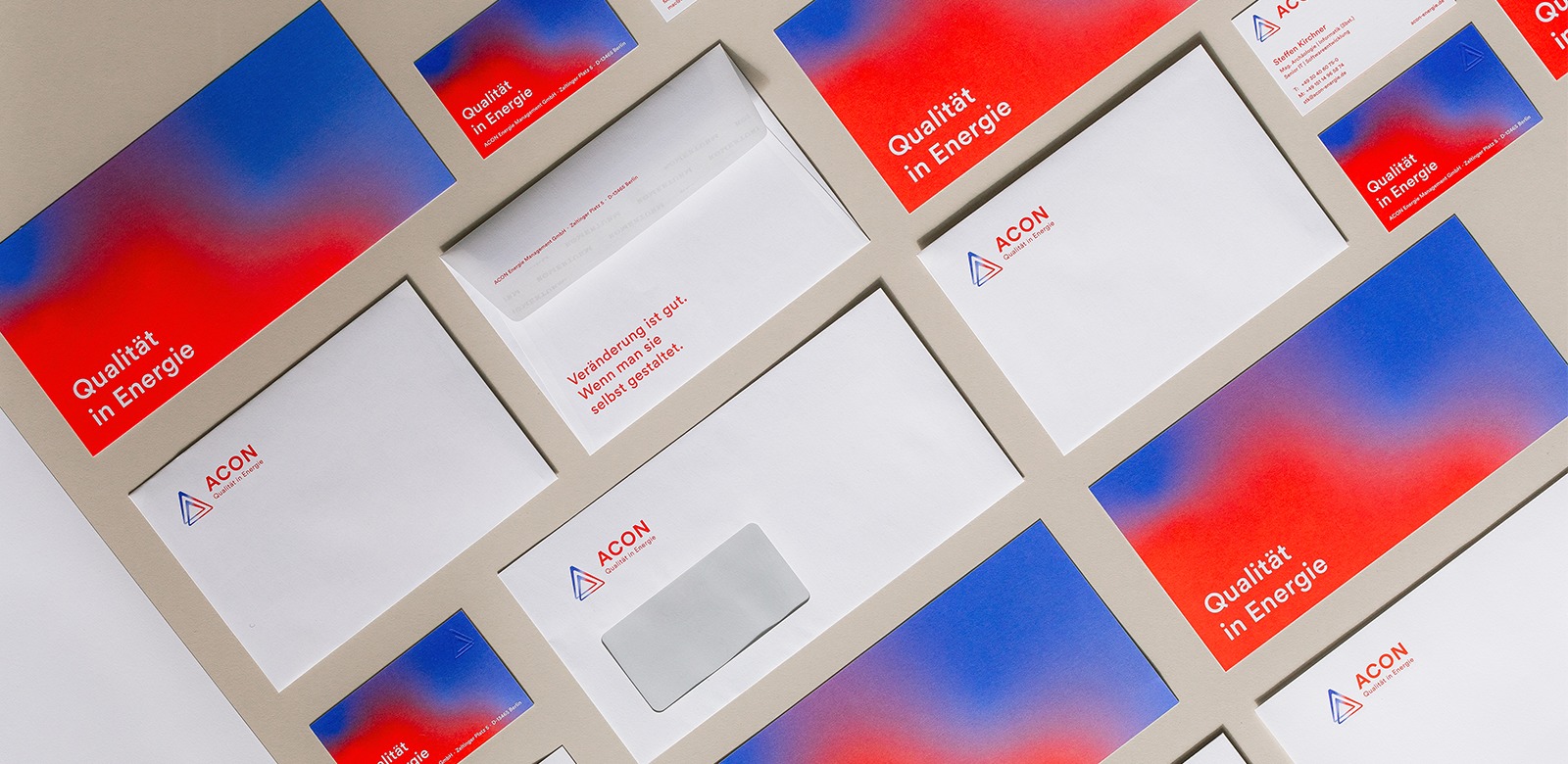
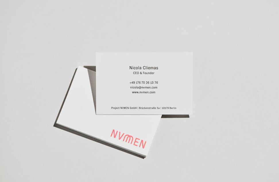
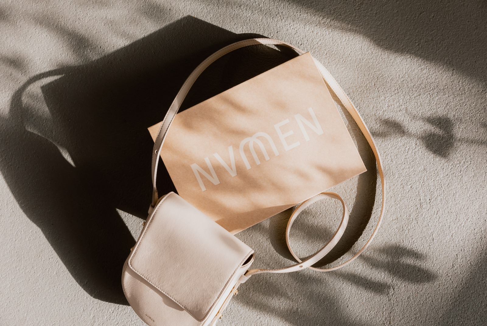
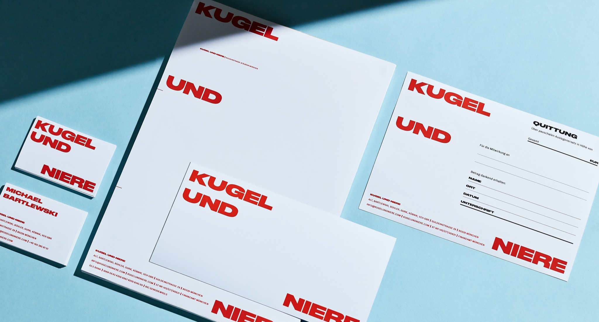
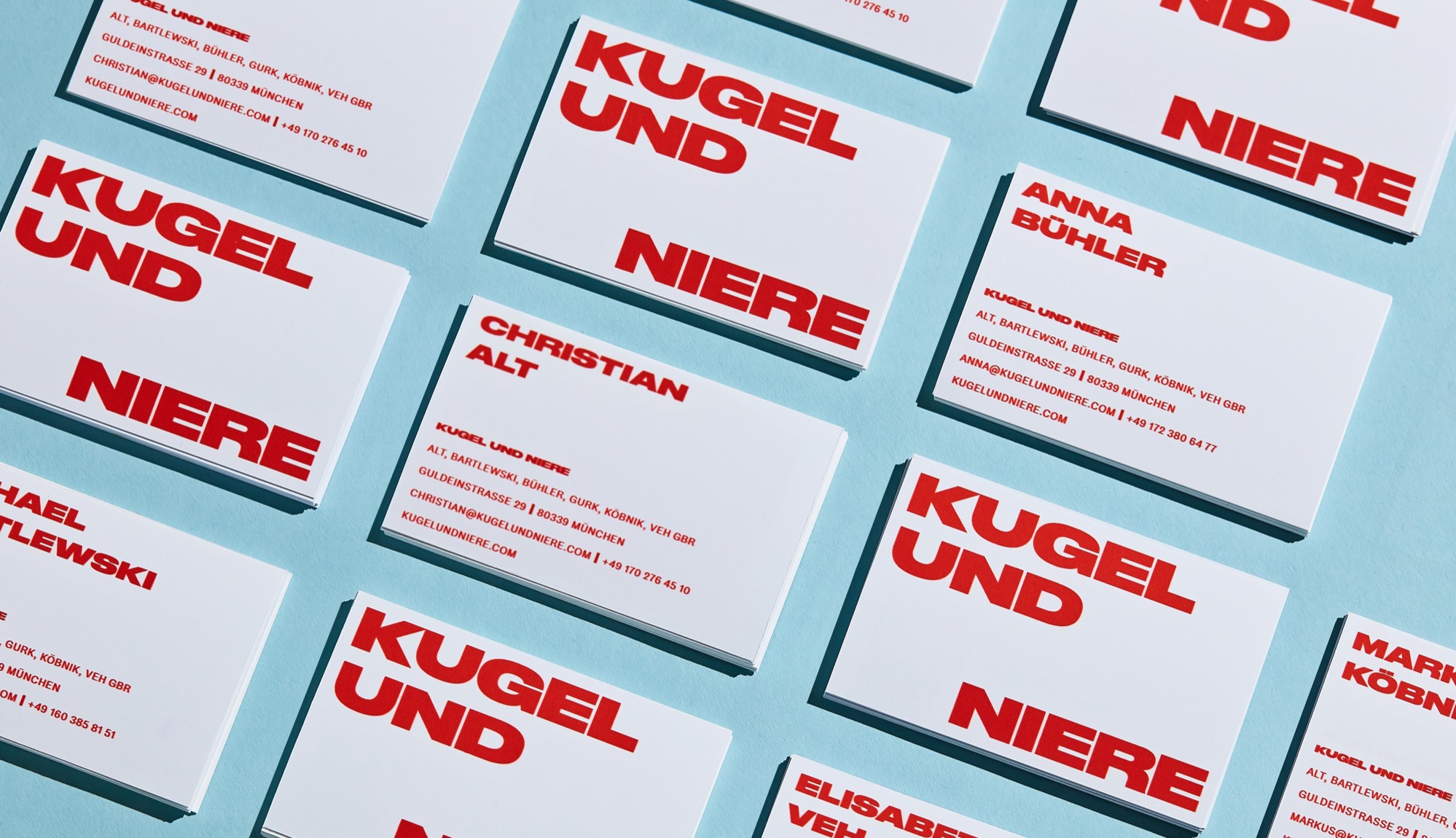
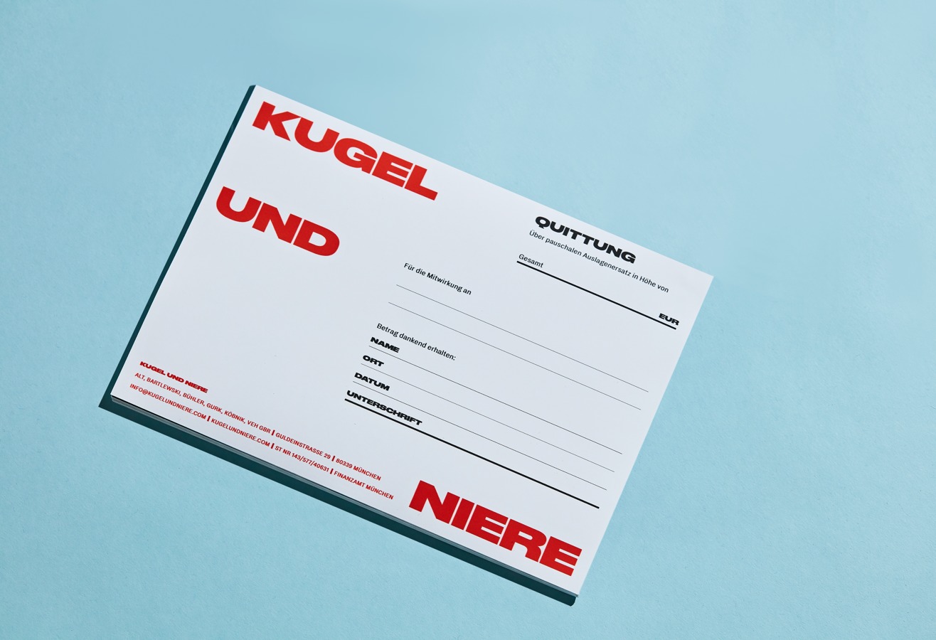
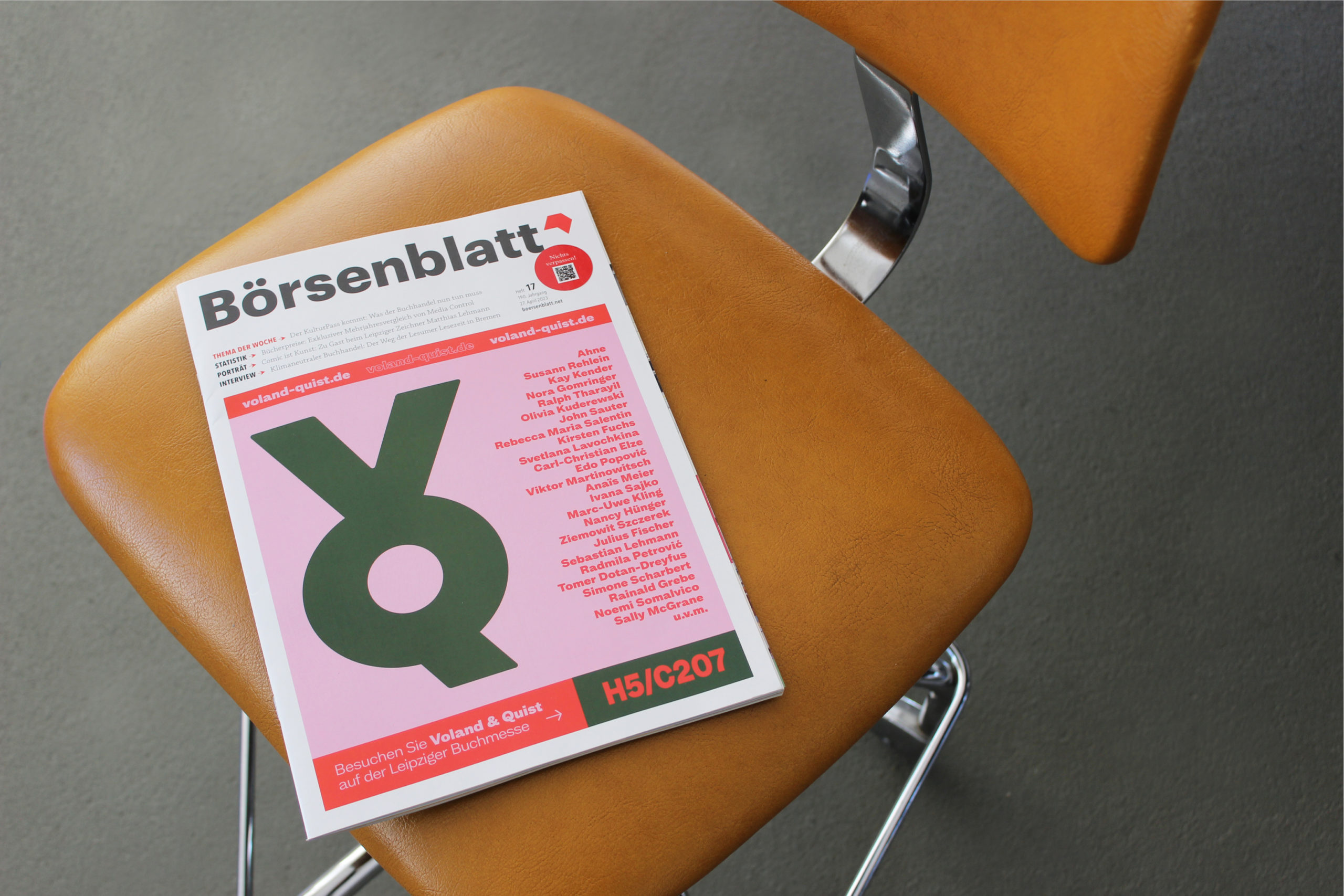
Preparing for the big identity launch at Leipziger Buchmesse 2023, Studio VEH created various brand collaterals such as business cards, paper bags, rollups, the preview magazine for fall 2023, enamel pins and elements for their fair booth. To announce and celebrate the new identity at Leipziger Buchmesse — the place to be for VQ’s target group — we booked the full cover of Börsenblatt, the magazine with the widest reach for book trade and publishing houses in Germany.
Credits
Strategy: Franziska Veh
Creative Direction: Franziska Veh
Design: Aditi Kapur
Motion Design: Lind Haugaard
Portfolio Photography: Aditi Kapur