Moving people is at the core of any brand. If, as in the case of S-Bahn Berlin Brandenburg, it is the literal reason for existing, branding needs to move people.
The S-Bahn Berlin Brandenburg is the symbol for connecting the city and countryside within the region. However, Studio Veh’s brief exceeded the simple representation of both worlds; a symbol was needed that would inspire people to discover new destinations within the S-Bahn network.
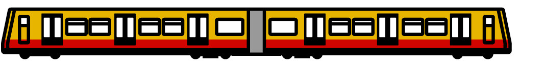
The result is a more playful and approachable illustrated logo that combines recognisable symbols from both sides, with an urban railway as the unifying element.
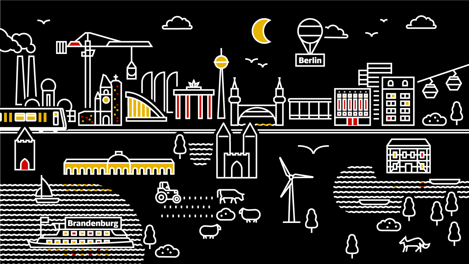
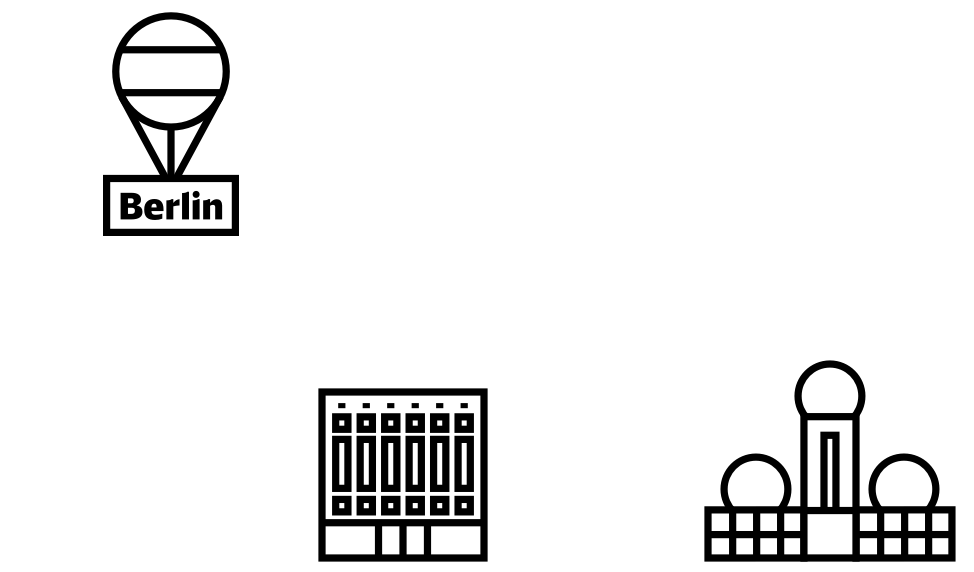
After the successful launch of the new logo across different platforms, another commission quickly followed. Studio Veh developed and created an illustrated world, in which Berlin and Brandenburg’s uniquenesses were to be brought to life. The most important sights, buildings and objects were drawn individually so they could be flexibly and playfully used across different media. Included are the Sanssouci Palace, the Brandenburg Eagle, Teufelsberg and Berghain. In combination, they created a diverse cityscape that encourages the exploration of both Berlin and Brandenburg.

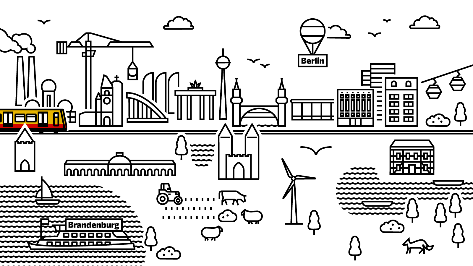
It’s worth noting that the illustrated cityscape was created with both a day and a night view. In the Youtube series “Das Netz”, which involves the new S-Bahn model B483 amongst other things, the animated landscapes act as the end titles of the episodes.
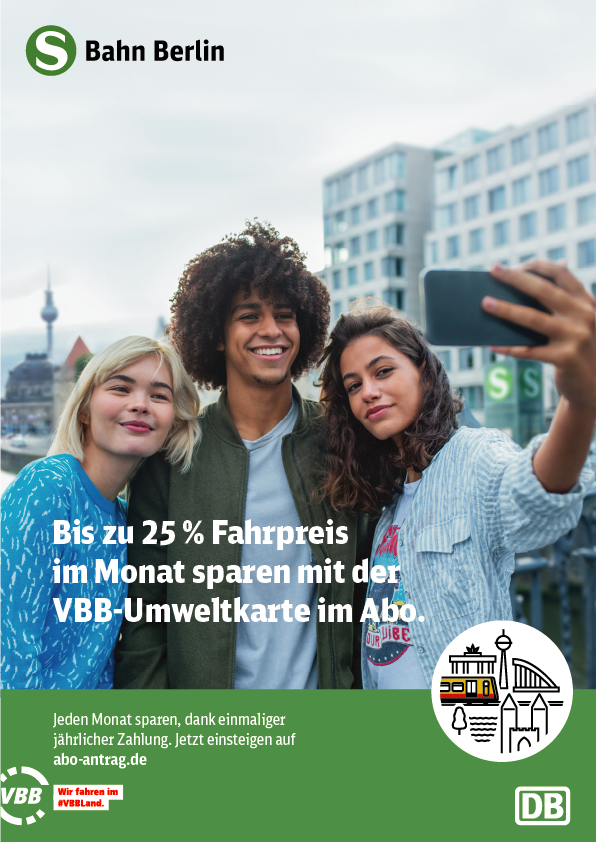
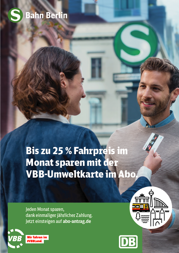
In motion, also printed.
The logo for the S-Bahn Berlin Brandenburg is, of course, used in line with the original brief as a logo for various communication touchpoints, for example in their poster campaigns. Studio Veh’s work proves that brand recognition across many platforms is possible, even when using intricate illustrations. These images not only broaden the horizons in our minds, but they also open up whole new worlds, helping drive us forward.
Team Credits
Creative Direction:
Franziska Veh
Design:
Franziska Veh, Lind Haugaard
Animation:
Till Pötzl