bigger 1900
1900
1600
1440
1280
1160
1024
940
850
767
600
480
360
320
portrait ipad
landscape ipad

Who is applying to whom?

In today’s fiercely competitive job market, the war for talents rages on as organizations vie for the most skilled and qualified individuals to join their ranks. With the success of businesses increasingly reliant on attracting top talent: What is the best strategy to win the battle for the best and brightest?

HR in transition

On average, a job is unfilled for 131 days: Companies in the SME sector in particular have problems filling their vacancies.

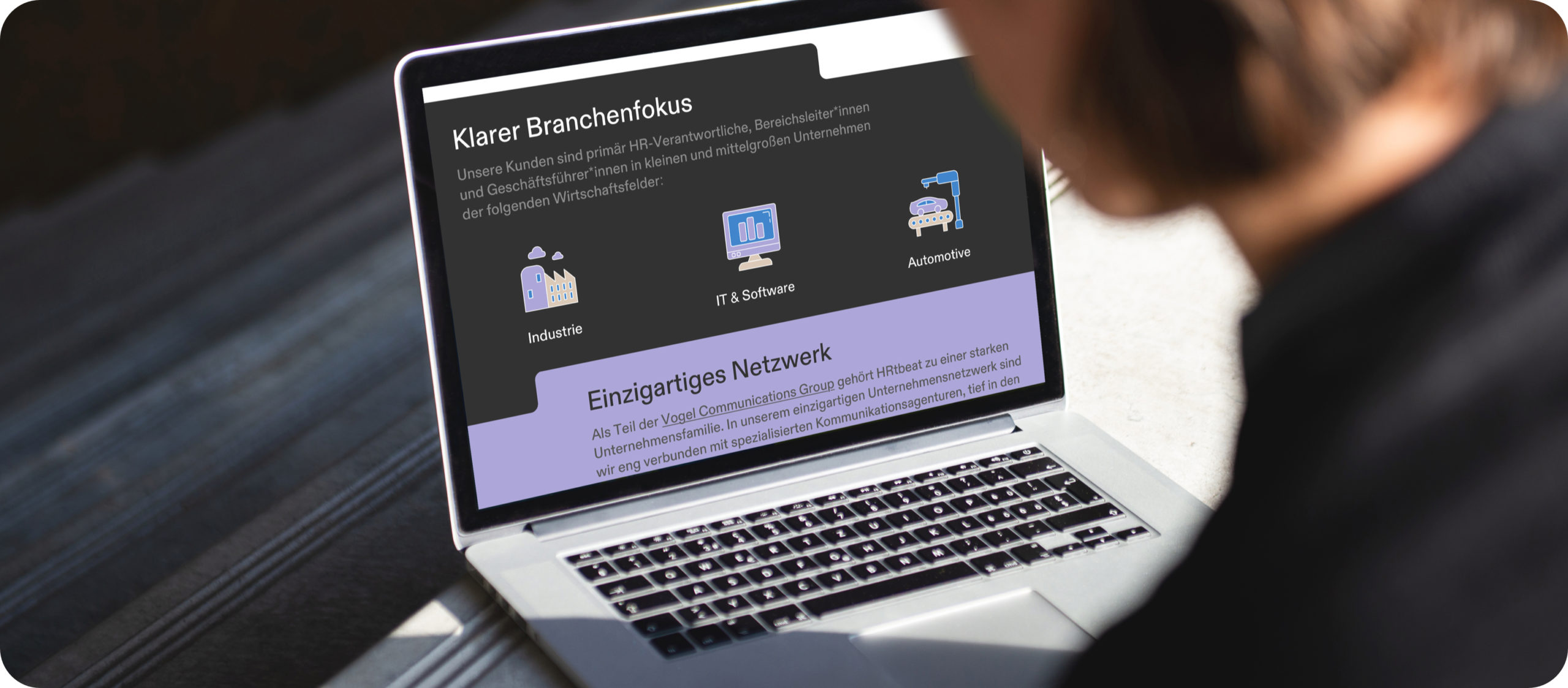
The newly founded agency HRtbeat leaves the classic path of recruiting and combines marketing with HR to make employers attractive and credible — with a clear focus on the automotive, industrial and IT sectors.

Digital recruiting, encompassing online marketing strategies and tools, has revolutionized the way companies find and attract potential candidates. Leveraging digital platforms such as social media, job boards, and company websites, organizations can reach a wider pool of candidates, irrespective of geographical boundaries.

By utilizing targeted marketing techniques, tailored content, and employer branding, HRtbeat enhances an organization’s visibility and appeal to potential hires.

This approach also streamlines the recruitment process, reducing time-to-hire and enabling HR teams to identify and engage with the most suitable candidates efficiently.

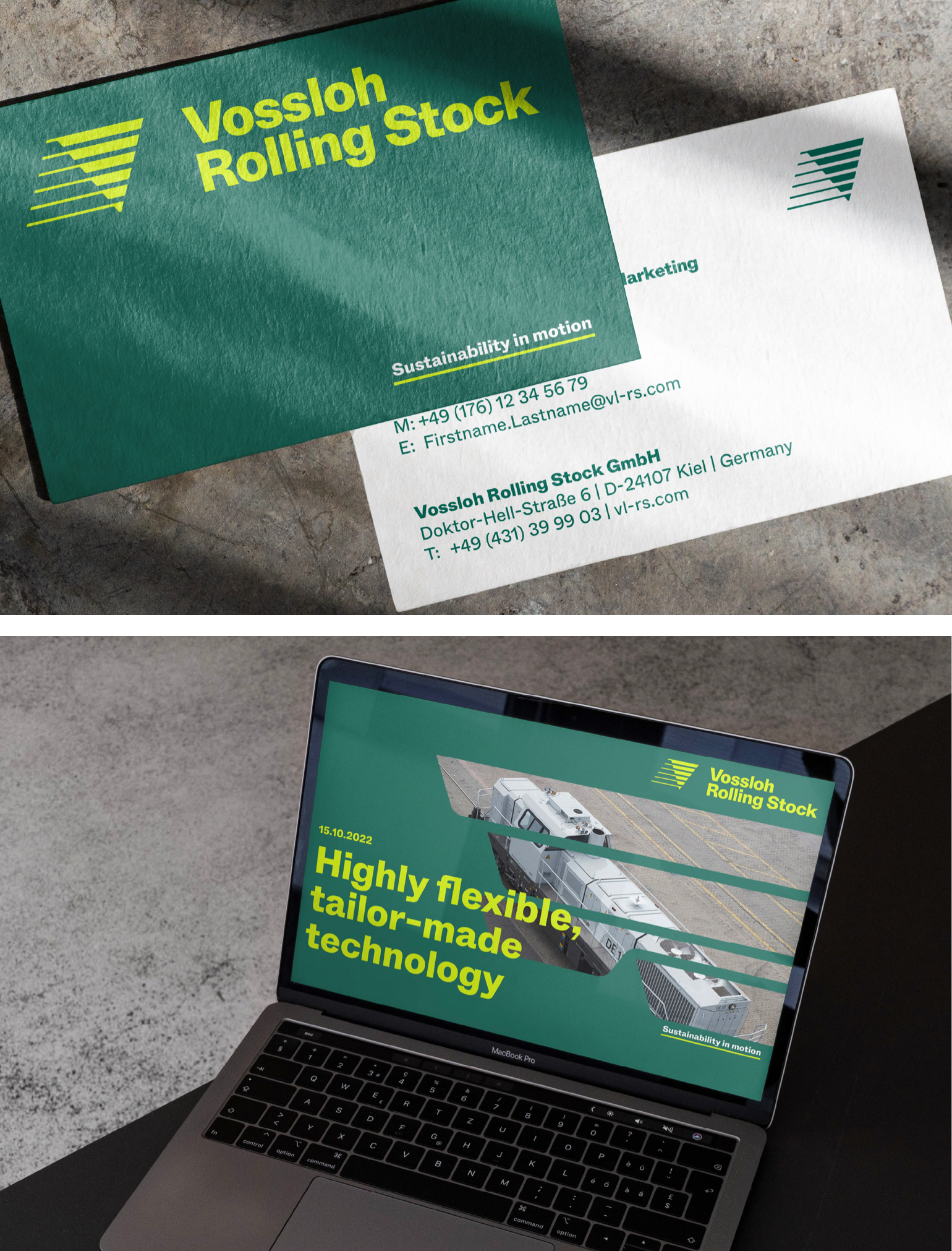
Before founding the company, the HRtbeat team turned to Studio VEH to develop the brand strategy and visual identity.

Behind every lead is a person

“What does their heart beat for?” This question was decisive for the company name, HRtbeat: with the intention to make recruiting completely digital, but still 100% personal — because behind every lead is a person, with an individual profile.

In a joint brand workshop with the founding team, Studio VEH developed the complete brand platform and defined brand values, brand belief and brand purpose, as well as a claim based on the positioning in the market:
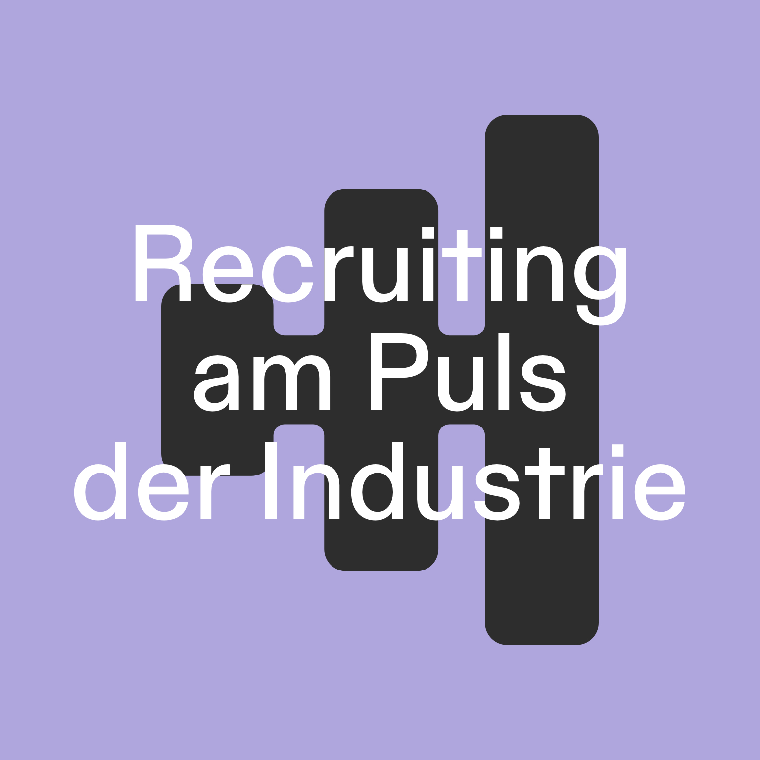
Recruiting am Puls der Industrie (=Recruiting on the pulse of the industry).

Hi purple squirrel!

Based on the idea of the „purple squirrel“ — a term used in the recruiting industry to describe a candidate that is so perfect for a job that they are almost impossible to find — Studio VEH developed a full visual system for the brand with the goal that the whole HRtbeat team can use and work with in on their own for creating all future digital HR campaigns, including templates for campaign landing pages.

Team Credits

Strategy: Franziska Veh, Mark-Marcel Müller
Creative Direction: Franziska Veh
Claim/Text: Mark-Marcel Müller
Art Direction: Anna Lind Haugaard
Design: Callum O’Neill
Development: Ralf Büsch
Project Management: Kiyoshi Stelzner

Do you have a project and need support? Let’s talk: get in touch via phone, through email or by visiting our studio! We look forward to hearing from you.

Thinking ahead for the future — Tester Ralf (EN).

The world is ever evolving, but how does a corporate with 150 years of company history stay current on the international market? Studio VEH’s answer: through a decisive realignment and a strong, independent positioning.

A new chapter

Vossloh Rolling Stock is building rail vehicles and platform concepts that constantly set new standards in their respective fields of application. With the new partnership with CRRC ZELC, new opportunities to make an important contribution to safe and eco-friendly freight transportation throughout Europe are presenting themselves.

Therefore, Vossloh Rolling Stock partnered up with Studio VEH: Over the period of 12 months, Studio VEH created everything from the new brand strategy, claim, product naming to a full visual identity including an extensive brand guide for both the brand Vossloh Rolling Stock and their europe wide service network, IMATEQ. In the next step, Studio VEH also developed and planned the full launch communication across all communication channels for the big launch at Germany’s biggest railway fair — InnoTrans.

A new strategy

We believe it is important not only to anticipate what lies ahead, but to grasp how what is coming may change the context of our lives and work. Hence, it was consequential for us to ask the question: What does Vossloh Rolling Stock want to stand for?

After an extended competitor analysis and the development of a market matrix through various workshop sessions, we identified two strong trends in the market: Sustainability and adaptability. Both two strong aspects to help define the image territority and positioning of the brand.

Looking at the recent major developments in the railway transportation sector and the expertise of Vossloh Rolling Stock, the positioning became quite clear: Vossloh Rolling Stock is the specialist in sustainable adaptability.

A new commitment

Vossloh Rolling Stock pride themselves on working closely with their clients to design customised solutions. Individual and adaptable to their needs. They believe that only consistently expandable and flexible engines are sustainable and future-oriented in our ever-changing times.

This commitment is now expressed in their new claim: Sustainability in motion.

Intelligent rail logistics stands for climate protection and low-emission economic growth. This requires not only a more efficient infrastructure. At the same time, the Europe-wide renewal of locomotives is on the agenda.

Vossloh Rolling Stock comitted themselves to play a significant role in shaping this development and thus actively contribute to climate protection.

This claim is embodied in their new brand vision and mission and led to the company’s core values:

Visual Identity

After defining the brand values, Studio Veh started developing the visual identity. Like Vossloh Rolling Stocks brand values, the brand’s design ethos and principles must be palpable in everything produced, internal and external.

The new Vossloh Rolling Stock mark reflects a steady, grounded yet modern take on a brand that has not only existed for over a century with a rich history, but has thrived and become stronger overtime.

The figurative mark represents the flexibility and versatility experienced with a Vossloh Rolling Stock locomotive or service. It embodies a consistent and smooth transition and emphasizes a uniting force that is moving forward with confidence.

To convey Vossloh Rolling Stock‘s brand values as reliable yet adaptable and to maintain a consistent brand appearance across all media and channels, we developed a customized corporate font: VosslohRollingStock Whyte.

The new corporate typeface from Vossloh Rolling Stock is a customized version of ABC Whyte, created by the type foundry Dinamo. The typeface, VosslohRollingStock Whyte, has a strong horizontal approach and caters towards the horizontal alignment of the new identity.

For all layout applications, Studio VEH developed a consistent yet flexible design system to ensure the brand’s consistent appearance across all media and channels.

For details, please visit their digital brand guide:
https://brand.vossloh-rs.com

The big launch

After the development of the visual system and the creation of the digital brand guide, we were responsible for the full launch communication around the international fair InnoTrans, where the new identity of Vossloh Rolling Stock and IMATEQ was officially presented for the first time. Planning all channels for internal and external communication – for employees, customers, press – pre and post launch, Studio VEH created a full roadmap for the rollout and various applications such as memos, presentations and the official press video for the kickoff event at InnoTrans.

Credits

Strategy: Franziska Veh, Mark-Marcel Müller
Creative Direction: Franziska Veh
Brand Culture: Jens Hofmayer
Claim/Text: Mark-Marcel Müller
Design: Lind Haugaard, Aditi Kapur, Felicia Usinto, Callum O’Neill
Motion Design Brand: Stefan Sperner
Motion Design Social Media: Andryanto Wijaya
3D Renderings: muellerromca
Project Monitoring: Nea Kosma
Booth Design: undplus
Photography Booth: undplus

Thinking ahead for the future — Europe-wide.

The world is ever evolving, but how does a corporate with 150 years of company history stay current on the international market? Studio VEH’s answer: through a decisive realignment and a strong, independent positioning.

A new chapter

Vossloh Rolling Stock is building rail vehicles and platform concepts that constantly set new standards in their respective fields of application. With the new partnership with CRRC ZELC, new opportunities to make an important contribution to safe and eco-friendly freight transportation throughout Europe are presenting themselves.

Therefore, Vossloh Rolling Stock partnered up with Studio VEH: Over the period of 12 months, Studio VEH created everything from the new brand strategy, claim, product naming to a full visual identity including an extensive brand guide for both the brand Vossloh Rolling Stock and their europe wide service network, IMATEQ. In the next step, Studio VEH also developed and planned the full launch communication across all communication channels for the big launch at Germany’s biggest railway fair — InnoTrans.

A new strategy

We believe it is important not only to anticipate what lies ahead, but to grasp how what is coming may change the context of our lives and work. Hence, it was consequential for us to ask the question: What does Vossloh Rolling Stock want to stand for?

After an extended competitor analysis and the development of a market matrix through various workshop sessions, we identified two strong trends in the market: Sustainability and adaptability. Both two strong aspects to help define the image territority and positioning of the brand.

Looking at the recent major developments in the railway transportation sector and the expertise of Vossloh Rolling Stock, the positioning became quite clear: Vossloh Rolling Stock is the specialist in sustainable adaptability.

A new commitment

Vossloh Rolling Stock pride themselves on working closely with their clients to design customised solutions. Individual and adaptable to their needs. They believe that only consistently expandable and flexible engines are sustainable and future-oriented in our ever-changing times.

This commitment is now expressed in their new claim: Sustainability in motion.

Intelligent rail logistics stands for climate protection and low-emission economic growth. This requires not only a more efficient infrastructure. At the same time, the Europe-wide renewal of locomotives is on the agenda.

Vossloh Rolling Stock comitted themselves to play a significant role in shaping this development and thus actively contribute to climate protection.

This claim is embodied in their new brand vision and mission and led to the company’s core values:

Visual Identity

After defining the brand values, Studio Veh started developing the visual identity. Like Vossloh Rolling Stocks brand values, the brand’s design ethos and principles must be palpable in everything produced, internal and external.

The new Vossloh Rolling Stock mark reflects a steady, grounded yet modern take on a brand that has not only existed for over a century with a rich history, but has thrived and become stronger overtime.

The figurative mark represents the flexibility and versatility experienced with a Vossloh Rolling Stock locomotive or service. It embodies a consistent and smooth transition and emphasizes a uniting force that is moving forward with confidence.

To convey Vossloh Rolling Stock‘s brand values as reliable yet adaptable and to maintain a consistent brand appearance across all media and channels, we developed a customized corporate font: VosslohRollingStock Whyte.

The new corporate typeface from Vossloh Rolling Stock is a customized version of ABC Whyte, created by the type foundry Dinamo. The typeface, VosslohRollingStock Whyte, has a strong horizontal approach and caters towards the horizontal alignment of the new identity.

For all layout applications, Studio VEH developed a consistent yet flexible design system to ensure the brand’s consistent appearance across all media and channels.

For details, please visit their digital brand guide:
https://brand.vossloh-rs.com

The big launch

After the development of the visual system and the creation of the digital brand guide, we were responsible for the full launch communication around the international fair InnoTrans, where the new identity of Vossloh Rolling Stock and IMATEQ was officially presented for the first time. Planning all channels for internal and external communication – for employees, customers, press – pre and post launch, Studio VEH created a full roadmap for the rollout and various applications such as memos, presentations and the official press video for the kickoff event at InnoTrans.

Credits

Strategy: Franziska Veh, Mark-Marcel Müller, Jens Hofmayer
Creative Direction: Franziska Veh
Claim/Text: Mark-Marcel Müller
Design: Lind Haugaard, Aditi Kapur, Felicia Usinto, Callum O’Neill
Motion Design Brand: Stefan Sperner
Motion Design Social Media: Andryanto Wijaya
3D Renderings: muellerromca
Project Monitoring: Nea Kosma
Booth Design: undplus
Photography Booth: undplus

Growing memories

What happens to all the photos we take every day? And where are all the memories safe, even if the smartphone is broken or lost? The brand new answer: Simply collect the most beautiful pictures every month in a timelessly beautiful album.

In the age of smartphone cameras and packed calendars, it is becoming increasingly difficult for families to preserve beautiful memories. Anyone who wants to create a classic photo album is faced with a truly mammoth task.

As a father of two young children, Axel Lilienblum, the founder of Grow, was faced with just that. Why hasn’t there been a photo album that simply grows by a few pages with the most beautiful pictures every month? Grow was born.

Studio VEH was commissioned to develop the strategy and full brand identity: from the app store and website, to the UX & UI design of an uncomplicated and motivating app, to the final print product sent by mail: A monthly growing photo album that preserves memories of moments with the greatest personal value forever. Clearer than ever: timeless design, top quality and lasting value were the key requirements.

For Grow, loving bonds are the most important thing in life. Studio VEH created a brand that reflects this brand essence not only in the communication and album design, but in the entire customer experience.

The album consists of a high-quality linen folder that is filled month after month with ever new loving moments on high-quality archival paper. The logo had to look elegant and classy on it. In the same breath, it had to create an emotional connection that anchors Grow as a permanent fixture in the user’s life.

The signet is reminiscent of a seashell — and at the same time represents the fan of a book opened upwards, its leaves captivating the viewer like the rays of a sunrise. It seems like a souvenir of a beach vacation with the family. It warms the heart, brightens our minds in everyday life and awakens a feeling of contentment and joy that never gets old.

The shell functions as a stand-alone in the app logo as well as in all communication — also in combination with the logo font below in a clear, sans-serif font.

The typographic concept for Grow is a reference to past memories and at the same time opens the view to the present as well as the life ahead. A serif typeface meets a modern sans serif. The playful combination of serifs and sans serifs connects yesterday and today — and focuses on subscribers as keepers of past moments and creators of ever new memories.

From the digital user interface to the haptic experience, the brand is brought to life in a holistic and detailed way. In the process, it naturally evokes memories of one’s own childhood and demonstrates how important loving relationships are in life. For all those involved, the development of Grow repeatedly gave rise to goosebump moments. Because of its great emotional significance, Studio VEH devoted itself to the final product with the utmost care at a very early stage, always keeping the coming generations in mind. That’s why the Grow folder, its accompanying slipcase, and the shipping packaging were designed with the environment in mind and produced with certified sustainable materials. In close communication with Axel Lilienblum and his family, Studio VEH was able to ensure that the result would meet the highest standards — and that even the youngest children would simply love it.

„The close collaboration with Studio VEH helped me to structure my initial ideas for both the brand and the product in a very efficient way. We are beyond happy with the result – from the app design to the final product – and are getting a lot of positive feedback from our customers.“

Axel, Founder of Grow

Team Credits

Creative Direction: Franziska Veh
Design: Lind Haugaard, Callum O’Neill
UI: Callum O’Neill
UX: Robert Siuda
Project Management: Kiyoshi Stelzner
Photography: Daniel Faro
Retouching: Alin Bosnoyan
Text: Mark-Marcel Müller

A soulful and fun way to work out together

CYCLA is a new-age concept boutique sports studio that celebrates community, wellness of the body and mind, and doing it together in the most fun way possible.

Doing a series of exercises during the brand workshop together, Studio VEH arrived at key values and a strong brand belief that guided the team through the process of creating a visual identity, capturing the CYCLA’s brand essence.

Since authenticity, openness, collaboration and fun are at the core of the brand personality, the team at the studio developed a circular symbol that symbolizes CYCLA’s dynamic and movement-oriented energy. This is also expressed in the new claim — Let the good times roll — also developed by Studio Veh. The dots in the word mark symbolize the fun and inclusive togetherness that CYCLA stands for.

“I found the collaboration with Franziska and Studio VEH to be absolutely professional and pleasant. During the creation of our sport studio brand CYCLA, Franziska and team were instrumental in helping us create an identity that fits us, our values and the industry. During the development process, they asked the right questions, which enabled us to sharpen our brand values and define them more precisely.”

Maren Bertram, Founder of CYCLA

It was important for CYCLA to extend the brand values to the studio space. CYCLA customers needed to experience a comprehensive brand experience: When they visit, they don’t just feel welcome and comfortable, but experience themselves as part of a community that enriches their daily lives.

Who is CYCLA talking to? Who is the place for? In the brand workshop, together we acknowledged that there is quite a gap between people who just need a release after their stressful day, without being judged, without having to look, feel or talk a certain way and can just be themselves and still feel part of a positive collective. Spaces and sport studios for these people and their needs are missing, they are often highly functional and mechanic or have become social status hotspots for people above a certain economic class fitting to a certain body type. CYCLA couldn’t be more different, it is proudly inclusive, welcoming and diverse.

With CYCLA’s sports studio, we were able to extend the feeling into a well-rounded and holistic spatial brand experience using the colour scheme, icons, typography and other interior design elements. We feel pleased to see all elements coming together and complimenting each other in a physical space.

Team Credits

Creative Direction: Franziska Veh
Claim/Text: Franziska Veh
Design: Callum O’Neill
Development: Ralf Büsch
Project Management: Kiyoshi Stelzner
Interior Design: undplus
Photography / People: @jantitvs
Photography / Interior: undplus

Uniting polarities

Voland, the devil from the Russian novel ‘The Master and Margarita’, and Quinten Quist from Harry Mulisch’s ‘The Discovery of Heaven’ were the inspiration for the name of the publishing house as opposing novel characters: Voland & Quist was founded on the principle that embracing polarities creates voices that you recognize among hundreds: powerful, unusual, experimental.

By encouraging the integration of seemingly contradictory thoughts and ideas, Voland & Quist creates a dynamic environment where diverse perspectives converge to drive breakthrough stories. With a broad range of publications from the recent literary scene of South-Eastern and Central Europe to multivolume picture books for children since it’s foundation in 2004, the publishing house today stands for courageous, emancipated, fresh literature that does not fit into any moulds or stereotypes. On the occasion of their 18th birthday, the publishing house teamed up with Studio VEH to take their brand identity to the next level and to give all publications a consistent appearance with high recognition value.

It’s better to cry in a cab
than in a streetcar

The first strategic task to address was the restructuring of all editions and publications Voland & Quist maintained over the years, in order to enable them to continue to grow. As a solution, Studio VEH developed an umbrella brand system that can house all existing and future publications in equal subcategories. This brand system consisted of VQ as the umbrella brand for general brand communication, and VQSONAR, VQAZUR, VQJUNG, VQVELO and VQTAXI as sub brands:

VQSONAR includes first translations from the younger literary scene of Southern, Eastern, and Central Europe.

VQAZUR gathers the selection of the former edition AZUR.

VQJUNG — the name gives it away — is the label for a younger audience featuring multi-volume picture books.

VQVELO hosts all publications keeping with the motto “Nothing compares to the simple joy of riding a bicycle.” (John F Kennedy), including calendars and graphic novels.

For VQTAXI, Marcel Reich-Ranicki’s statement „It’s better to cry in a cab than in a streetcar” gave it its name.

The in-house artist management, managing and booking events and projects by artists with an affinity for literature, is now called VQPlus.

A powerful sum

But how can it work to unify all these full-bodied personalities into a powerful sum of all its parts and at the same time express an openminded and cosmopolitan attitude?

By combining the significance of symbolism and inherent playfulness in the new identity, which also represents a unique position in the direct market environment.

Merging the company’s initials V and Q into one iconic, visually striking and memorable yet simple symbol – it celebrates the bold and independent legacy of the publishing house with all its polarities and dualities dancing together – good and evil, order and chaos, fate and free will — yet opens up a new, more seasoned chapter with a clear brand message.

The devil is in the details

Creating a striking symbol requires several rounds of typographic detail work: First, testing a typeface with angular Q tail, flattened Q tail and bottom-aligned flattened Q tail. For comparison, testing another more geometric typeface, matching the width of the V with the Q tail and aligning it.

After several rounds of refinement with line heights, spacing between the letters and the alignment of the V and Q stem’s diagonals, Studio VEH arrived on this final system for umbrella brand and subbrands, based on the same sign.

To express the brand’s core values – young and contemporary, imaginative and aware, colourful and always evolving — and to communicate the unconventional attitude of Voland & Quist with all its multifacetedness, a broad palette of brand colors was created that is as bold and unconventional as the publishing house itself.

Putting even more emphasis on the unique and far-reaching personality, Studio VEH selected the typeface Mint Grotesk for the visual identity. It is a Grotesk typeface with a super fresh, almost eccentric nature that when used in its many weights and cuts, accentuates the charming personality of the brand identity quite perfectly. It’s a match made in heaven!

In the second phase of the project, the full visual identity was developed based on the wide-randing color scheme, and the very generous family of the typeface Mint Grotesk.

Preparing for the big identity launch at Leipziger Buchmesse 2023, Studio VEH created various brand collaterals such as business cards, paper bags, rollups, the preview magazine for fall 2023, enamel pins and elements for their fair booth. To announce and celebrate the new identity at Leipziger Buchmesse — the place to be for VQ’s target group — we booked the full cover of Börsenblatt, the magazine with the widest reach for book trade and publishing houses in Germany.

Credits

Strategy: Franziska Veh
Creative Direction: Franziska Veh
Design: Aditi Kapur
Motion Design: Lind Haugaard
Portfolio Photography: Aditi Kapur

Mindfulness, on point.

Less is more. This concept applies both to mindfulness and inner balance, as well as to good design. When both come together, the result is a perfect representation of the pure essentials.

To celebrate the opening of a second studio, the founders of Lotos Yoga wanted to revitalise their brand. The unique feature of their approach is the integration of a café into their new studio, allowing tradition and modernity to meet, all while ensuring one doesn’t lose their inner focus. The new brand logo echoes the idea of concentration and inner balance by referencing ‘the third eye’ through a subtle, minimalist design identity.

One might think that, with a simple dot floating above the T, the logo simply showcases the bringing together of body and spirit in brand form. But this brand identity does so much more. The central element of the new identity is the individual, shown through the custom typeface that Studio Veh developed for Lotos Yoga. The interplay between strong serifs and clean sans serif within headlines reflects the harmonious union of old yoga tradition with the modern approach in Lotos’ yoga classes as well as in their teacher training programme.

‘Thanks to the clear design specifications and guidelines Studio Veh created for us, we can now independently design and post to our social media feeds, with guaranteed brand consistency.’

Federico Mesa Althabe, Founder Lotos Yoga Berlin

‘One Spiritual Warrior and a scoop of chocolate, please.’

Studio Veh conceptualised and created a variety of print media for both studio locations, including the course calendars for yoga classes, printed material for the new café (including the ice cream counter), as well as the shop’s product packaging. Additionally, Studio Veh handled the design of the window fronts, the gateway to inner balance so to speak. Therefore it was essential for the brand image to be front and centre; the window’s design almost makes you want to create more balance and equilibrium throughout the world … but hey: don’t lose focus.

Team Credits

Strategy:
Franziska Veh

Creative Direction:
Franziska Veh

Design:
Lind Haugaard

Typedesign:
Tobias Rechsteiner

Photography:
© Grit Siwonia

Do you have a project and need support? Let’s talk: get in touch via phone, through email or by visiting our studio! We look forward to hearing from you.

Highest service

There are completely new pitfalls that can be made in the service industry today. So often, companies are quickly dismissed by their users after a few frustrating clicks that lead nowhere. The key, therefore, to new peaks in customer satisfaction lie precisely here: reduction.

The UX design of the Lufthansa Service App was structured to ensure that customers are able to find the right solution to their problem in just three quick clicks. Lufthansa has seemingly countless contact options for a wide variety of problems, from lost luggage and terminal information to flight rebooking and the carrying of animals. In just three clicks, the app guides customers to an in-depth overview of the relevant contact options, and recommends the best way to get in touch, including providing information on contact availability and possible waiting times.

‘We have been working with Studio Veh and the CodeControl team for over 5 years: that speaks for itself. Franziska Veh and her team are always professional, flexible, innovative and extremely proactive.’

Thiemo Busch, Project Lead, Lufthansa

Large clients are often used to lengthy processes that exist at large agencies. Studio Veh, however, works as closely as possible with the team or client to significantly shorten the development time. Studio Veh is proud to collaborate with the developers at CodeControl who share the same mindset. Thus, the Lufthansa app went live just 10 weeks after the start of the UX conception.

The clarity and structure of Lufthansa’s new corporate design contributed significantly to the rapid development of the App. This brand identity provided an optimal basis for the development of the design and App logo. Studio Veh finally designed all user interfaces, from the splash screen to the feedback screen, as well as overseeing App Store Optimisation (ASO).

Whether packing a suitcase or downloading an app, the perfect outcome results from planning before you take off.

Team Credits

UX:
Robert Siuda

Design:
Franziska Veh

Project Mgmt & Development:
CodeControl

Hero Image:
© Deutsche Lufthansa AG

Do you have a project and need support? Let’s talk: get in touch via phone, through email or by visiting our studio! We look forward to hearing from you.

The community code

Every community uses its own language. For programmers, it’s binary code, even when discussing two fundamental subjects: the ‘Future of Work’, and genuine added value for customers.

The Berlin-based startup CodeControl connects companies with the best talents in programming, design and product development. CodeControl specialises in finding the perfect team and technology for each project – from Java, Python and Objective-C to Symfony and Ruby – always with the aim of creating the best solution for each client.

CodeControl’s vision is to form a large community of code and tech specialists. Their ethos is to transfer knowledge and exchange of ideas on a personal level, this is the philosophy Studio Veh has used at the core for the development of the design concept.

Binary code is the basis of digital information processing and is at the heart of the logo’s concept. Code is the language that everyone in the community understands; it symbolises a sense of community and a shared attitude in life. Anyone who simply sees random ones and zeros or, in programming languages, weird strings of slashes, dollar signs and brackets, is simply blind. Why? Because these characters reshape the world: they create universes in which nothing seems impossible. They not only saturate the night’s sky pink in a computer game, but they also ensure that houses are green in real life. They optimise logistic processes, reduce greenhouse gases and create autonomously driven taxis. Code is full of life, and its logic is fundamentally human.

In the brand concept developed by Studio Veh, this binary – the logical on one hand and the human on the other – runs throughout, from the business stationery to the brand’s external communications.

‘If you are looking for future-driven design thinkers: Call Studio Veh – stellar ideas and professional execution, guaranteed. Always a pleasure to work with.’

Marc Clemens, Founder CodeControl

The giveaway idea of three notebooks for clients and partners underlined the personal exchange at CodeControl, and was a reminder of the importance of mental ‘ping-pong’ to achieve the best results. Two of the notebooks were printed with ping-pong paddles and the third with a net (including a hidden message in the net lines, made up of binary code).

Spreading awareness

Merchandise plays a vital role in strengthening and fostering a sense of community. It serves as a tangible representation of shared values, interests, and experiences. Having community merchandise allows members to proudly display their affiliation. It promotes a sense of belonging and camaraderie among individuals, forging connections and encouraging interactions. It also acts as a promotional tool, spreading awareness and attracting new members who resonate with the community’s ethos. This is why CodeControl started their own merchandise material.

Taking the idea of binary code of a common language to the next level, we used creative coding to create a tool that allows the CodeControl team to create static and animated graphics based on a binary code pattern. It is visually connected to the brand but doesn’t make the merch feel too branded. More merch articles coming soon!

Team Credits

Brand Workshop & Strategy:
Franziska Veh

Creative Direction:
Franziska Veh

Identity Design:
Lind Haugaard

Creative Coding:
Anatoly Grashchenko

Do you have a project and need support? Let’s talk: get in touch via phone, through email or by visiting our studio! We look forward to hearing from you.

The whole package

How do we identify a modern-day gentleman? By his name? His manners? His values? His sophistication? A certain appearance? None of these alone is enough, each is part of the formula.

The founders of Green + The Gent have always loved grooming rituals. But it wasn’t until they travelled the world that they realised what had been missing at home in Germany: frequent visits to a traditional barbershop. It became apparent that they were used to making do with the limited selection of products at local drug stores. Yes, the range of products available has been growing more and more, but not the ‘gentlemanly’ products, just those that are gaudy or following trends. The products required for a truly mindful daily ritual must be sustainable, organic and cruelty-free. Therefore the idea for a quality skincare line for men was born.

In the brand strategy workshop, Studio Veh and the Green + The Gent founders identified that the discrepancy between desire and reality was the company’s driving force. The big skincare providers promise an ideal world, but do little to achieve it. Their focus is on low-quality ingredients, unnecessary products, and high-profit margins.

For Green + The Gent, their brand mission is to fill the untouched gap in the market: mindfulness and reduction to the essential grooming products that empower today’s gentleman to enjoy life with a clear conscience.

While it may seem like a modern philosophy, one of the founder’s grandfathers cultivated a similar shaving ritual more than 100 years ago. Therefore the name of this grandfather was also the first idea for the company’s name. Now with strong brand values established and – in close coordination with the founders – Studio Veh began the brand’s naming process. The process considered all possible options, navigating which had emotion and which were legally possible, as there are complex copyright issues in the beauty industry.

The name Green + The Gent was ultimately the perfect blend of the product’s philosophy, which prioritises natural ingredients and the needs of the modern gentleman. Tradition meets modernity, old-fashion meets reclaimed naturalness, the man of today’s world meets values that have endured since razor blades were created.

Based on the established and strategic brand positioning, Studio Veh then developed the packaging that celebrates the philosophy of the brand with every product, as well as the entire skincare range.

In addition, the brand’s sustainable conscience and high-quality ingredients become apparent through the high quality of the packaging. Dark, recyclable glass bottles and FSC-certified paper and cardboard have been combined with printed finishes such as blind embossing on the packaging.

To do justice to the product’s mix of modern, certified-organic ingredients and vintage-look packaging reminiscent of old grooming products, Studio Veh developed a custom typeface for use on the packaging and in the entire brand identity. The mono-spaced execution showcases grooming as a structured ritual, and highlights the barbershop as an old-school shaving tradition.

Green + The Gent’s product range includes shaving soap, facial tonic, moisturiser and shower products, as well as a razor with matching blades. This custom razor is made by the Solingen-based manufacturer Giesen & Forsthoff, and of course, comes engraved with Green + The Gent’s typeface.

Quality and gentlemen have a lot in common: they’re both an art form, and if you’ve got it, you’ve got it.

Team Credits

Brand Workshop & Strategy:
Franziska Veh + Mark-Marcel Müller

Creative Direction:
Franziska Veh

Design:
Lind Haugaard
, Callum O’Neill

Typedesign:
Tobias Rechsteiner

Project Management:
Kiyoshi Stelzner

Porfolio Photography:
Daniel Faró

Do you have a project and need support?
Let’s talk: get in touch via phone, through email or by visiting our studio!
We look forward to hearing from you.