bigger 1900
1900
1600
1440
1280
1160
1024
940
850
767
600
480
360
320
portrait ipad
landscape ipad

From nature. Since 1927.

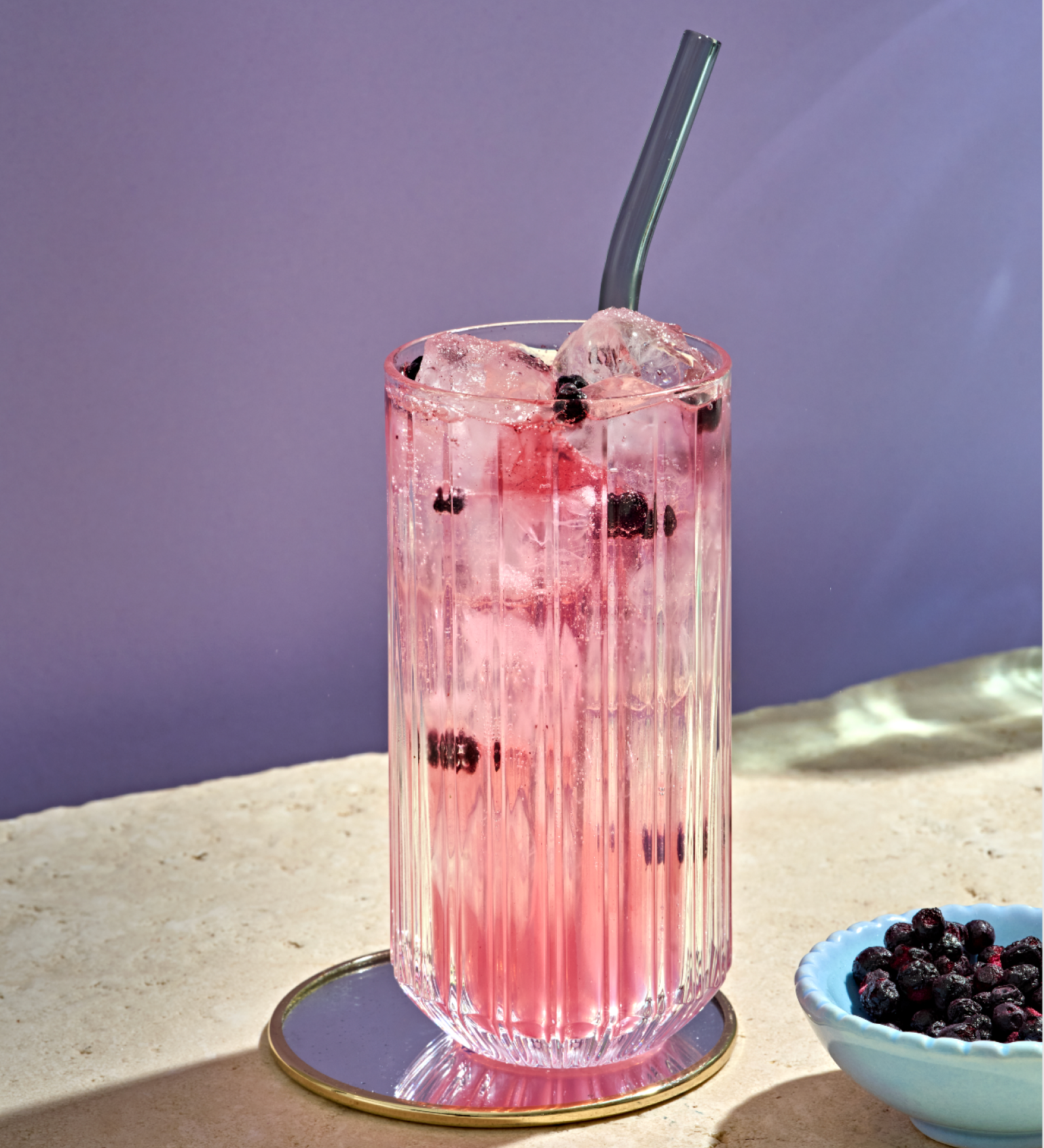
How do you redesign an iconic brand that has been a symbol of clean eating for over 90 years? With a sophisticated balance of tradition and innovation that makes access to new target groups a reality.

Conscious nutrition.
For all.

The company Schneekoppe has stood for naturally conscious nutrition with selected products for over 90 years. Founded at the foot of the Krkonoše Mountains, the company was named after the highest peak, Sněžka, in German: Schneekoppe. The idea: to use selected raw materials to produce products that are not only organic but also delicious – without any genetic engineering or chemical-synthetic pesticides.

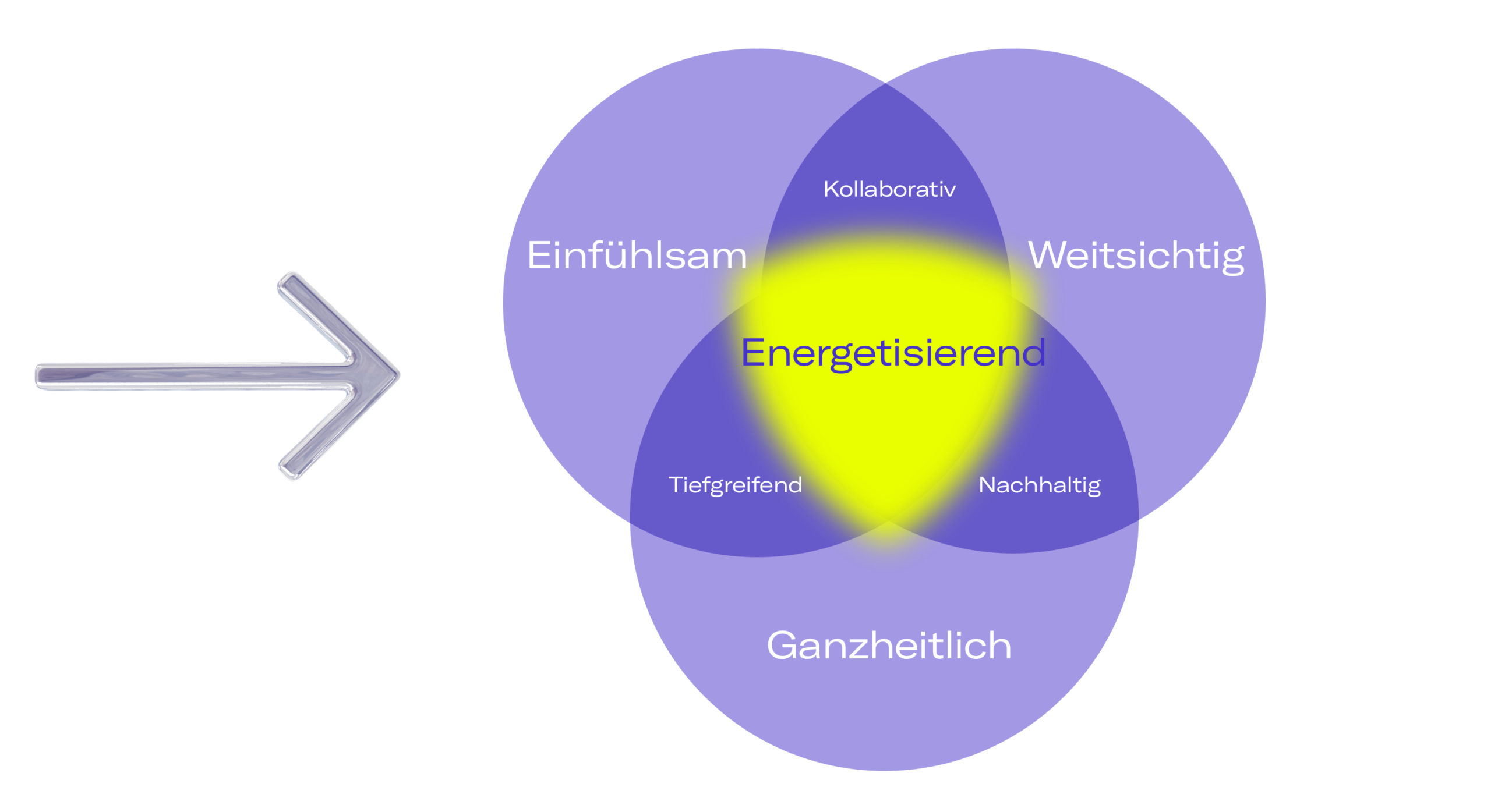
Conscious nutrition for everyone – that is the goal of the brand. The belief and motivation: Everyone can be healthy. Health and fitness are for Philipp Lahm, world champion captain and healthcare entrepreneur, the most important capital. As a former top athlete, family man and entrepreneur, he knows that the many large and small tasks in everyday life can only be managed permanently if the body gets what it needs. The owner of Schneekoppe is convinced that everyone can do something for their own health within their means: conscious nutrition, sufficient exercise and relaxation should be integrated into every daily routine.

Growing new potential

With the realignment as an exclusive brand for budni, the largest drugstore in the Hamburg metropolitan region with a further 195 branches in the north and southwest of Germany, the brand Schneekoppe is faced with the task of revising its brand appearance in order to open itself up to a broader target group.

Schneekoppe commissioned Studio VEH to redesign the brand identity and the visual conception of the new, budni-exclusive product line.

But how do you properly redesign such a traditional brand? The goal for Studio Veh right from the beginning: to preserve the brand’s core values ​​and heritage while modernizing its visual identity and messaging to resonate with contemporary audiences.

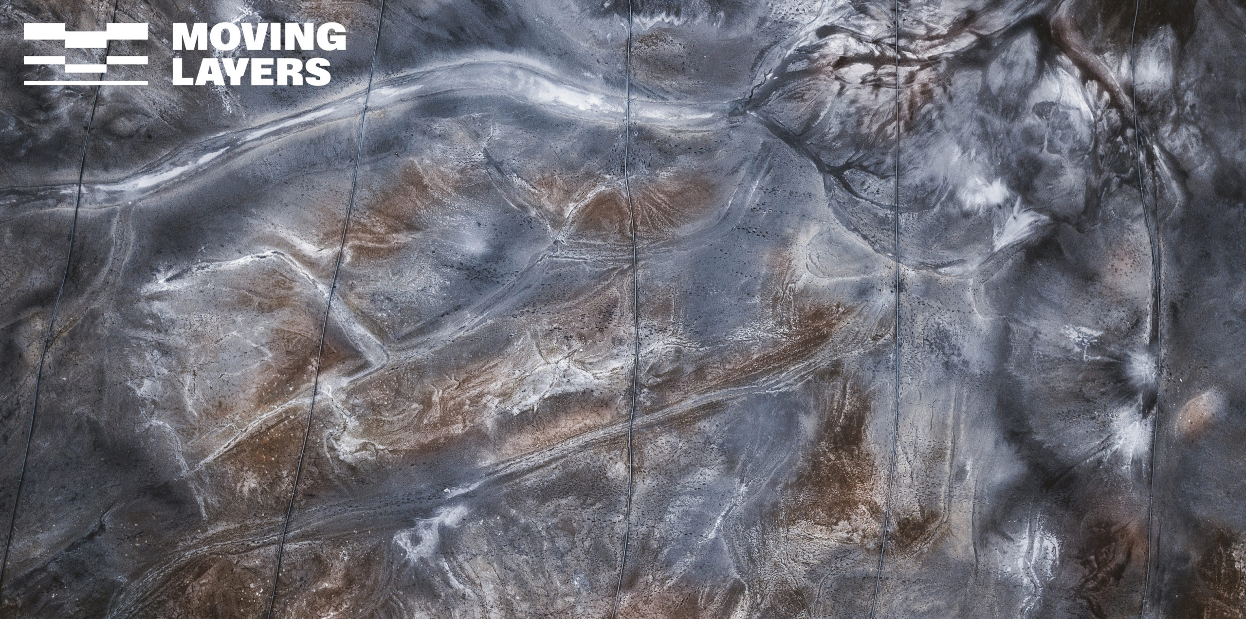
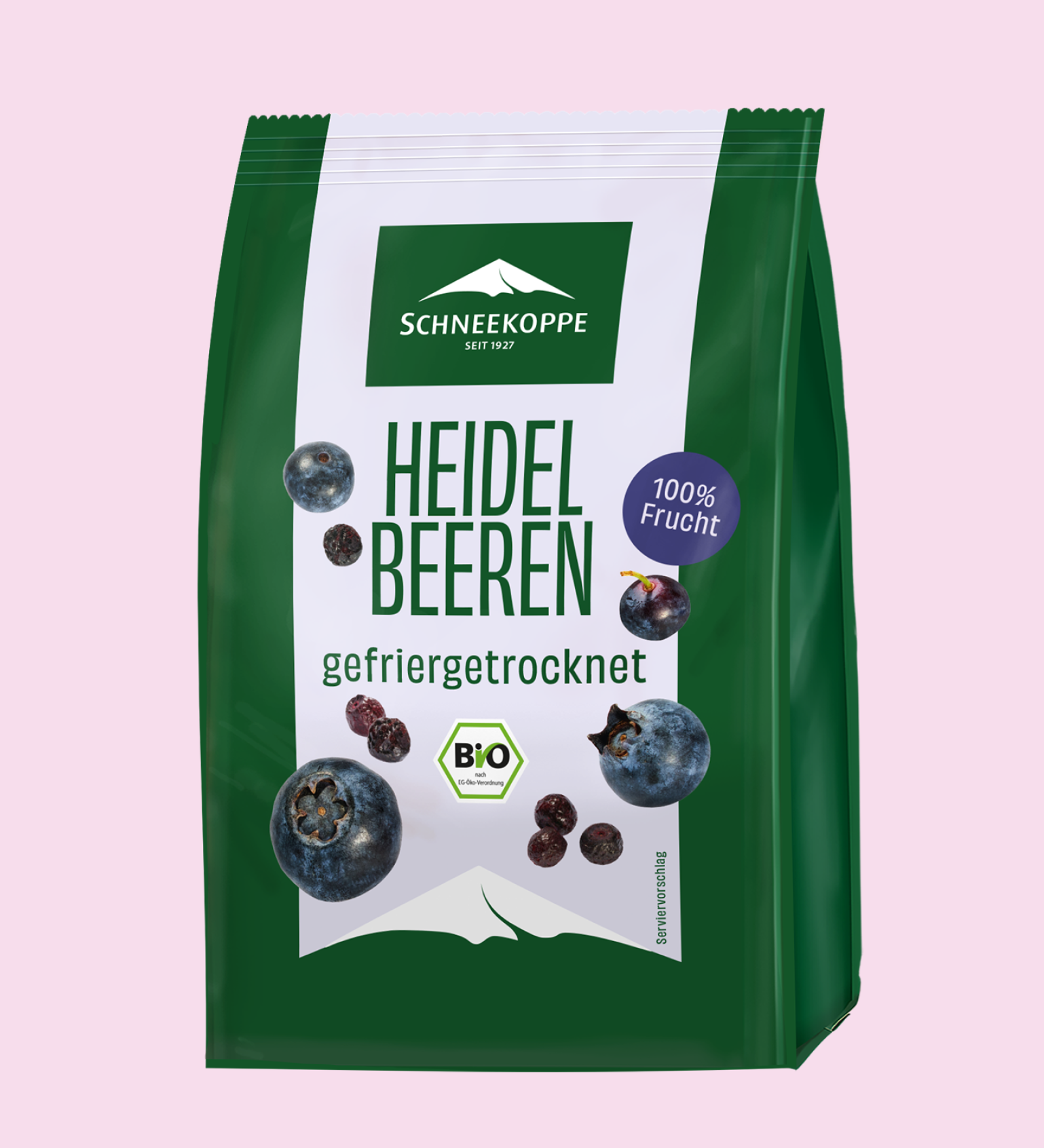
The trademark, the snow-covered mountain peak of Sněžka, has been a symbol of the company since its founding. Reason for Studio Veh to adapt the logo only minimally. The Schneekoppe company also enjoys highest brand awareness: 72% of all Germans associate the Schneekoppe brand with healthy products and natural quality. Another reason to modernize the trademark just slightly.

View of nature

In order to appeal to a younger target group with the packaging design, but not to lose its positioning as a clean eating brand, Studio VEH went back to the early days of the brand – the moment in which Fritz Klein looked out of the window at the Sněžka choosing its name for the company.

The concept with a look into nature was born.

The basic concept of the new packaging design celebrates the beauty and diversity of our environment and natural resources.

The image mark is prominently presented as an illustrative element and thus forms the optical frame for the view of nature, as if through a window. The product images and information are arranged in and on this frame.
The basic tone of all packaging is the iconic Schneekoppe Green as a sign of appreciation for nature in all its splendor and untouchedness.

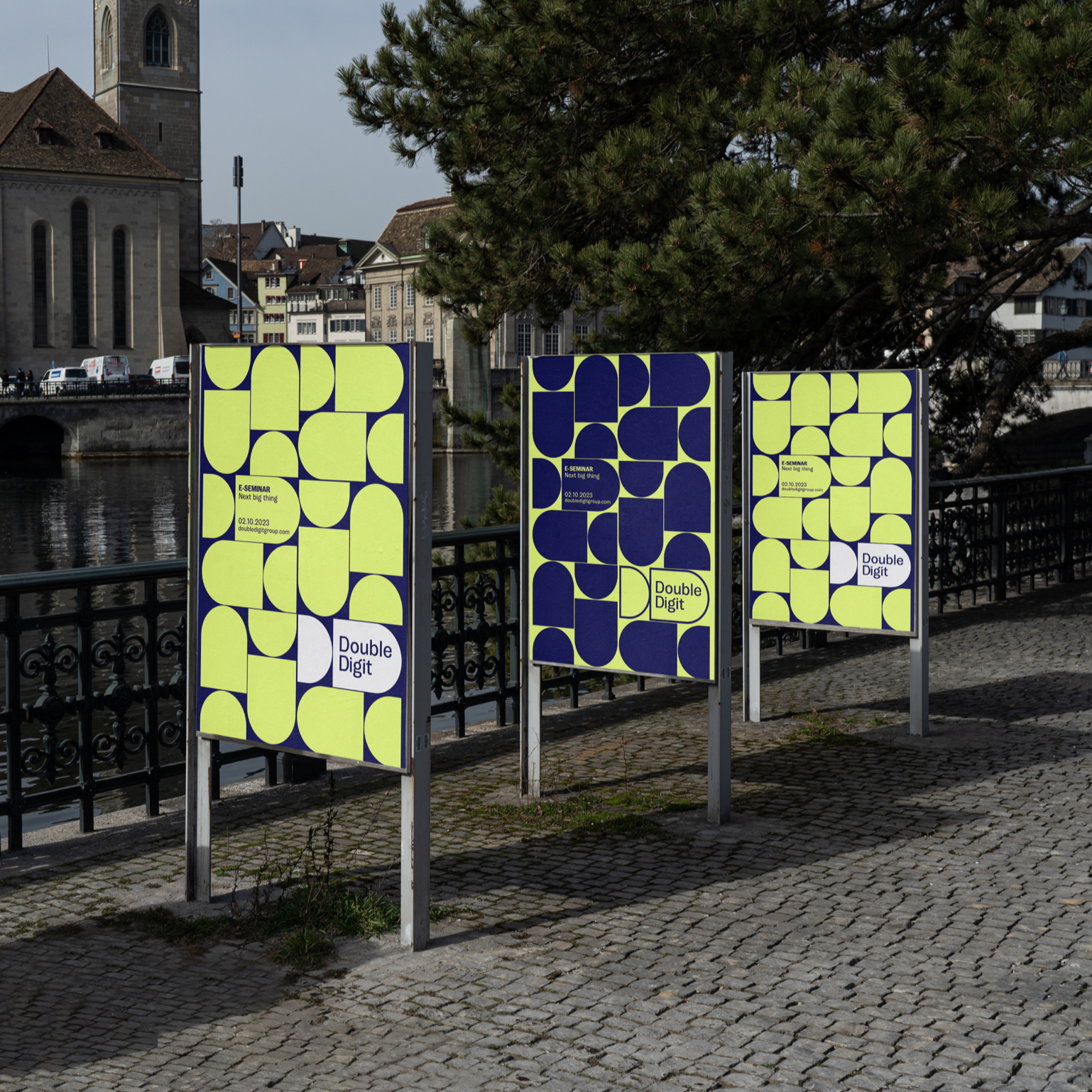
Visual orientation for customers

Important in the FMCG sector: easy orientation on the market shelf. Studio VEH has therefore developed a color system that gives each product its own color combination and thus offers both a clear indicator for taste patterns such as “leicht gesalzen” (= lightly salted) and also enables consumers to easily, yet clearly and quickly distinguish between the same basic products – for example “Mandelmus blanchiert” or “Mandelmus geröstet” (= blanched almond butter or roasted almond butter).

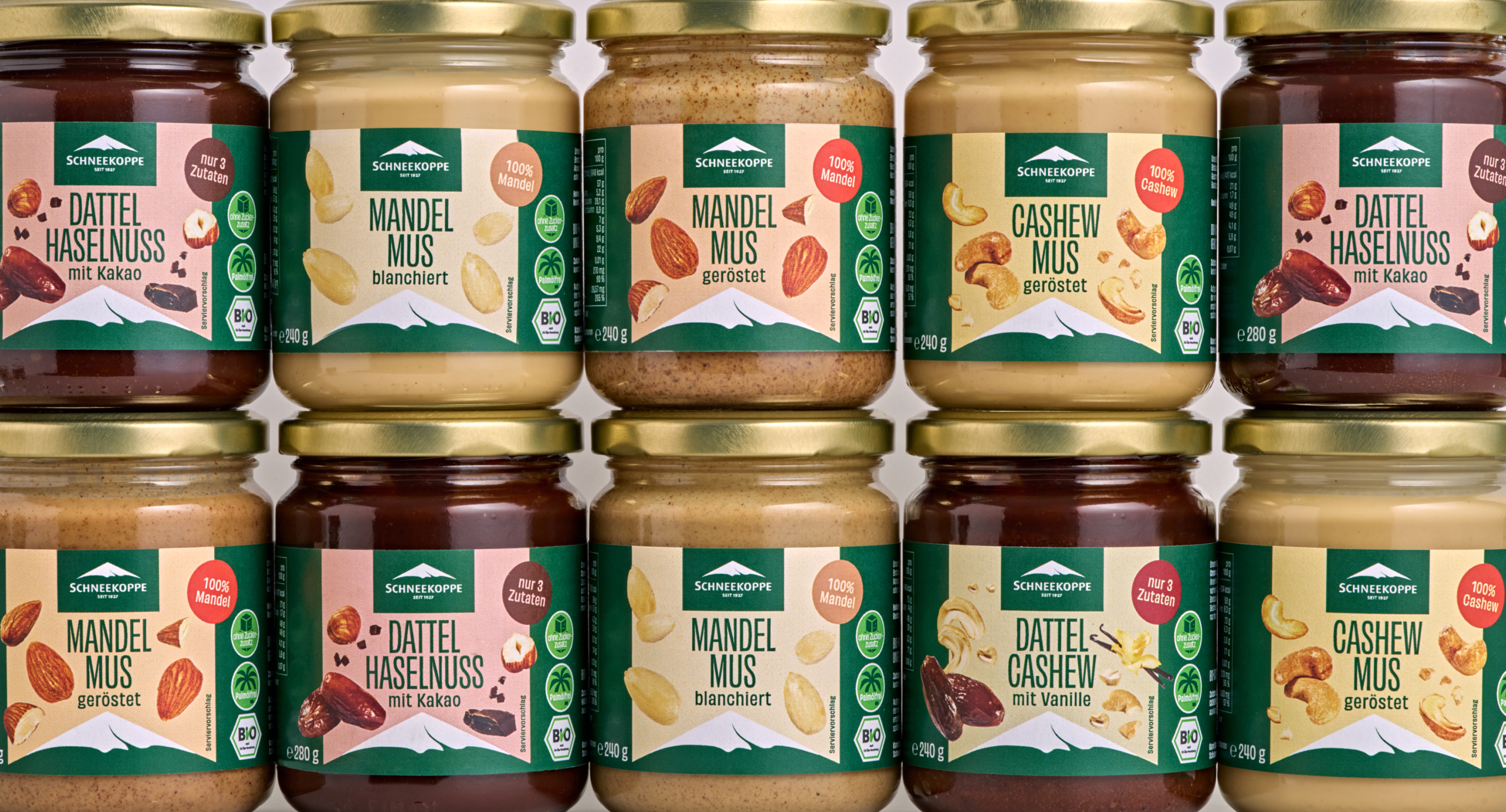
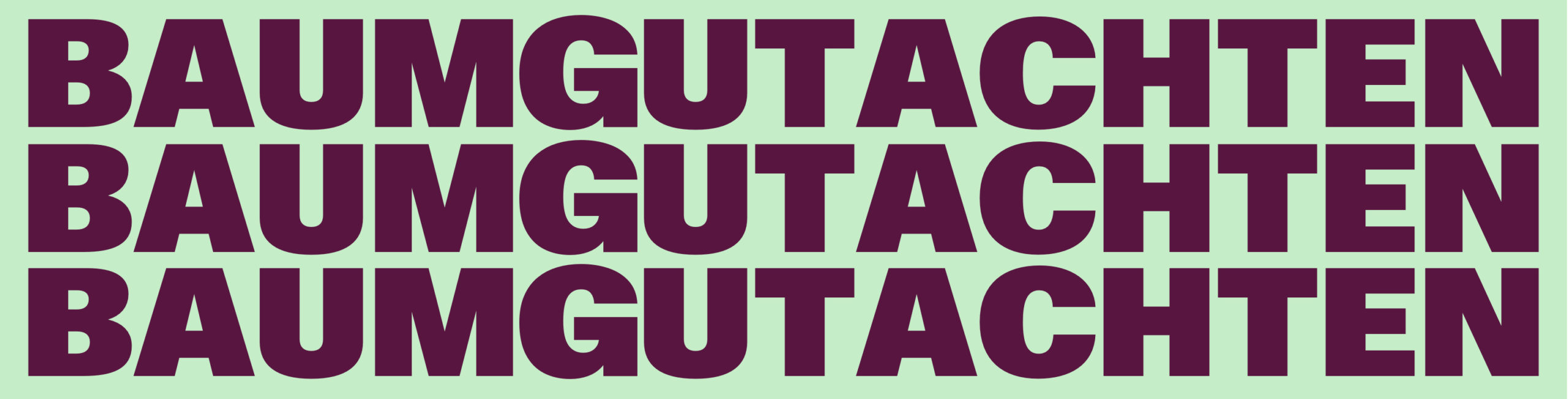
The clear, elegant packaging design is rounded off by simple typography: As a bridge between tradition and modernity, the new font Obviously gets to the heart of the topic of clean eating with its large, slim elegance and underlines the company’s approach: as few additives and ingredients as possible for a natural, full-bodied taste.

The typeface is dynamically displayed in further communication within the framework of the specified color system in order to underline the credo of the brand and its founder, Philipp Lahm:

Healthy eating and an active lifestyle are fun and ensure inner balance.

All brand guidelines were defined in a custom made Online Brand Guide and handed over to the core team:

https://brandguide2024.studioveh.com

Credits

Strategy & Creative Direction: Franziska Veh
Art Direction: Lind Haugaard
Design: Lind Haugaard, Laura Kjer Christiansen
Photography: Jule Felice Frommelt

Diversity defined

Progress on gender equality has been very low despite efforts in the last years. Better data presentation and verification of correlation is needed: Say hi to Gendex, Europe’s first Gender and Diversity Index, increasing access to women and diverse talents within the EU innovation ecosystem. 💥

The mission:
To be the B Corp for Diversity 🌟

Only 30% of all leadership positions are covered by women. Only 15% of European VC fund partners are women. And only 1% of VC funding in Europe goes to women-only teams. This is why Gendex is building Europe’s first Gender & Diversity index, in order to become the B Corp for Diversity.

Why is this important? Because there is a direct relationship between diversity and financial returns. For example, there’s a 2x revenue per dollar invested in startups with women founders, and a 9.7% uplift in profitability of exit VC firms with 10% more women partners.

The new index is based on agreed definitions and indicators that can be applied to startups / SMEs and to innovation investments actors in the EU.

Data on diversity categories other than gender, especially as regards discrimination based on ethnicity, sexual orientation, political beliefs, etc. are almost inexistent or very difficult to obtain. The goal is to generate new data thanks to primary research, to help stakeholders make evidence-based decisions – and to have as many companies as possible on the index, striving for inclusivity.

The founding team of Gendex, with Stephanie from Founderland as the project leader, reached out to Studio Veh to create an identity for Gendex. The desired outcome was a flexible identity with simple yet strong guidelines, that could be implemented and used by all project partners.

Studio Veh came up with a concept that visualizes the index and embodies the aim to continually expand the list of companies included. 
It represents constant movement, development and the commitment to fostering change by promoting continuous growth and progress.

The logo adapts this concept and is opening up for content and visuals, symbolizing the every-expanding space for diversity, inclusivity and innovation.

A bold type for
a bold message

Given our brand’s emphasis on presenting clear, understandable facts, we prioritize readability and precision. Simultaneously, our typography captures the bold, impactful essence of Gendex, mirroring a brand that is both steadfast and dynamic.

Respect & innovation

The brand’s color palette is fundamental to the brand identity and perception. The goal is to attract attention with a modern and inclusive color scheme that conveys the brand values.

Purple, often associated with knowledge and respect, stands for diverse perspectives and experiences within an organization. It underscores the importance of treating all individuals with respect and fairness, fostering an environment where everyone’s contributions are valued and appreciated. Yellow, symbolizing positivity and innovation, underscores the importance of thinking outside the box to address diversity challenges and create inclusive environments.
A little sprinkle of a vibrant green suggests a sense of innovation, progress, and forward-thinking perspectives.

With those brand colors, we strive for Gendex to be recognized as a professional and trustworthy brand – one that is capable of changing the status quo.

Celebrating Confidence

Gendex is a reflection of the people it represents, so showcasing them is essential. Without the individuals it serves, Gendex wouldn’t exist. The images we choose play a significant role in shaping how Gendex is perceived: We celebrate confidence, diversity, professional growth and individual strength.

Empowerment from every angle

To cultivate a strong and professional brand presence, we’ve developed templates for presentations and reports that are in alignment with the brand’s mission and values. By providing these templates, we empower our team to effectively communicate our message while maintaining a cohesive and unified brand identity.

All templates and guidelines can be found on their online brand guide:
https://gendex.studioveh.com

Sparkling a conversation

Our promotional products are a strategic way for us to connect with our targeted audience. These items are free and accessible, ensuring that people encounter our brand without any obligation to purchase. By distributing these products around the city or at events, we increase our visibility in a subtle and engaging manner. This approach allows us to spark curiosity and interest in our mission without being intrusive or pushy, creating organic opportunities for people to learn about and support Gendex.

Credits

Strategy: Franziska Veh
Creative Direction: Franziska Veh
Art Direction: Lind Haugaard
Design: Lind Haugaard, Laura Kjer Christiansen
Animation: Laura Kjer Christiansen

Energy concepts for the day after tomorrow

Everything is becoming more complex. Especially the energy supply of buildings. Nevertheless, it is energy management that determines their value. ARIO Engineering is countering this development and planning forward-looking strategies for increasing the value of real estate.

Buildings are living spaces and meeting places. They unite a lot of requirements and needs for those who manage or own them, as well as the people who live or work in them. Energy supply plays a prominent role in this: it influences the comfort of living in buildings and contributes to man-made climate change. In view of increasing climate protection regulations and global crises, the energy supply of buildings is becoming increasingly complex.

The few companies that can offer sound advice on energy management are often large corporations with process-oriented working methods that leave little scope for flexible measures.

That’s why the ARIO team, with over 20 years of experience, starts exactly where it can have a lasting effect: at the beginning.

Perceive mindfully,
empower without bias.

ARIO is a boutique consulting and planning agency for building energy.

Together with Studio VEH, ARIO has developed the vision to establish ARIO as THE premium standard when it comes to developing holistic strategies to continuously increase energy efficiency in real estate by consistently committing to their quality standards.

Their daily actions are driven by the mission to encourage property managers and owners to drive forward the development of their energy efficiency step by step.

Every cubic meter offers the opportunity to make a difference.

ARIO therefore encourages its customers to act with foresight and contribute to the energy efficiency of their buildings and in general by thinking today about the day after tomorrow. “Energizing” thus forms the core value of the company: ARIO’s greatest value lies in the release of activation energy, which encourages its customers to consistently implement their plans.

An inspiring spirit

ARIO is a visionary brand that combines the brand archetypes “the wise” and “the creator” in perfect harmony – to inspire companies and the people who work there to evolve.

As “the sage”, ARIO embodies a deep understanding of the world and the importance of energy in particular, offering its clients knowledge and insightful guidance and outlook for the future. ARIO empowers organizations to broaden their horizons and strive for continuous learning and improvement. At the same time, as “the creator”, ARIO celebrates the limitless power of innovation and new thinking. The concepts they create
think outside the box, have real value and thus inspire customers.

By intertwining these two archetypes, ARIO becomes a catalyst for knowledge, growth and development and thus manages to sustainably improve and increase value.

Efficient navigation

ARIO’s interdisciplinary team of experts works with its customers to identify potential for their building energy and helps to remove any blockages that are holding the company back from forward-looking development.

The continuous development of energy efficiency sometimes requires unconventional solutions.

In the form of an abstract flock of birds, ARIO’s new logo symbolizes the team’s ability to pay attention to individual circumstances and react flexibly.

A flock of birds reacts flexibly to events because it has a well-developed communication system and is highly sensitive to its surroundings. Close cooperation and coordination within the flock enables it to navigate efficiently and achieve set goals. This flexibility enables the swarm to successfully adapt to different situations and act as a unit.

The new figurative mark is complemented by an individually developed word mark.

The aim to not only maintain but also increase the value of real estate is also expressed in the new claim:

“Die Wertverbesserer” (A neologism in German – an approximate translation would be “The value improvers”).

It shows the team’s hands-on approach of acting actively and holistically and thus making a contribution to a future worth living.

The strategic positioning of the company was summarized in an identity manual, supplemented by design guidelines for the visual appearance of the brand: On 60 pages you have all the guidelines for the external communication of the ARIO brand at your fingertips.

Energizing means adding or reviving energy. Energy from which ARIO’s customers draw the strength to act as well as courage, confidence and trust.

We have also visualized this energy in the brand’s visual identity: Dynamic, moving shapes in bright yellow symbolize the energy and the guiding principle of ARIO Engineering: We actively shape development.

The claim to inspire new ideas with knowledge is reflected the brand’s external communication. We have derived meta-themes from the brand values that ARIO talks about: individualization, development, change of perspective, inspiration. These include, for example, social media posts on property-specific solutions, market assessments, sustainable building management and investment security.

Credits

Strategy: Franziska Veh, Jens Hofmayer
Creative Direction: Franziska Veh
Claim & Text: Mark-Marcel Müller
Art Direction: Lind Haugaard
Design: Lind Haugaard, Aditi Kapur, Beren Tezcanli
3D Art: Alexis M. Varga
Development: Ruben Meines

Solar energy. Used twice.

Increased energy prices are not the only reason why it is difficult find affordable commercial space these days. Symbiosol® is not only transforming the way we think about renewable energy,
but also creating eco-friendly and sustainable spaces for businesses and communities to thrive — for a brighter future.

Using the sun as a source of energy is not new; even the ancient Egyptians used mirrors to channel sunlight into the interior of their pyramids for brightness and warmth.

The use of solar energy via photovoltaic systems took off in Germany at the end of the 1990s. The company Symbiosol has developed the idea further and uses solar energy twice: With the specially developed “Duo-Solarparks”, electricity is generated and commercial space is created at the same time — 100% sustainable, of course.

Since the first park was built in 2008, the company has now created 21 projects that give tradespeople a home with sustainable space.

This emerging symbiosis and the associated continuous cycle were the starting point for the brand’s corporate identity, developed by Studio VEH in 2007: an infinity sign connects the two aspects and stands for continuous energy generation and supply, as well as friendly and respectful coexistence in the respective communities of the „Duo-Solarparks“.

Brand rebrush

14 years after the founding and expansion of the Duo-Solarpark on the island of Rügen, the company has decided to give its brand appearance an update – not least because the trademark has now been protected.

The tagline “Der Duo-Solarpark” is now used more freely and detached from the logo, especially in digital applications. The brand colors have been refreshed to underline the new projects in planning with even more radiance.

Sunshine meets high-tech

The increasingly rapid development of technology in the field of solar and photovoltaics is also reflected in the adapted visual identity of the brand: Blue in gradations stands for technology, reliability and stability. The newly used steel blue also conveys a sense of clarity and purity, representing clean energy generation through solar power.

This is complemented by a new, distinctive house font: Grilli Type’s GT Cinetype perfectly underscores the brand’s technical approach.

The vibrant yellow is used in combination with the blue shades for all brand communication, creating a fresh, modern appearance: The combination evokes positive associations such as bright sunshine, blue skies and the sea — filling the premises of the Duo-Solarparks with a friendly and positive atmosphere. This positive mood runs through all communication applications.

The implementation of the print and digital communication is currently still in progress — attached are first examples, an addition of further communication examples will follow soon.

Team Credits

Strategy and Creative Direction: Franziska Veh
Art Direction: Lind Haugaard
Design: Callum O’Neill
Project Management: Kiyoshi Stelzner
Development: Ralf Büsch

Do you have a project and need support? Let’s talk: get in touch via phone, through email or by visiting our studio! We look forward to hearing from you.

Celebrating unique radiance

In a world where beauty standards are ever-evolving, it’s essential to recognize and celebrate the uniqueness and radiance of each woman.

Like precious gems, every woman possesses her own brilliance, facets, and exquisite qualities that make her truly one-of-a-kind. Just as gemstones are treasured for their distinct hues, clarity, and luster, the beauty of each woman emanates from within, reflecting her inner strength, confidence, and individuality.

Embracing this perspective, Lena Barclay-Steuart has transformed her passion for beauty into a thriving empire. From the humble beginnings of her working as a one-woman-show offering a mobile beauty service, Lena’s impeccable skills and unwavering dedication to her craft have propelled her into opening her own physical beauty salon in Potsdam.

With this bold move, she has not only expanded her clientele but also taken her personal brand, Lena Schleweis, to new heights. Lena’s private salon now offers a wide range of services, attracting clients seeking her signature touch. Her exceptional talent, coupled with a luxurious and inviting atmosphere, has set a new standard for beauty services.

Shining bright

Inspired by Lena honoring the diverse beauty that exists in the world, we created the new identity for Lena Schleweis around the concept of gemstones: recognizing that each woman shines bright like a precious or glowing gem in her own remarkable way, the identity plays with various gem stone shapes to underline the high class and very individual beauty consultancy Lena offers her clients.

Combining these bold and edgy gemstone shapes with arch shapes inspired by the salon’s shop windows, we balance the visual identity with different facettes – edgy and soft.
Like an open window, the arch shapes transport the warm and inviting atmosphere that is awaiting the clients in the salon.

The various shapes can be used overlaid with images, on its own, working as a plain background carrying type, or paired with the logotype.

A hidden gem

Like her new private salon is like a hidden gem in the heart of Potsdam, we incorporated a gem stone shape in the new wordmark: Therefore we customized the typeface GT Ultra, a typeface created by Grilli Type, for the wordmark.

A captivating experience

The key components of the visual identity, the arch and gem stone shapes, were also incorporated into the salon space, to give the customers of Lena Schleweis a holistic and captivating brand experience.

Keeping the lit up salon light and neutral, it leaves room for a personalities and styles created by Lena and her team.

Transformative beauty

With her new salon, Lena is also about to embark on another exciting new venture: planning her very own beauty product line.

Drawing inspiration from her years of experience in the industry, Lena envisions a collection that encapsulates her vision of authentic and transformative beauty. From innovative skincare formulations to captivating makeup essentials, her upcoming line aims to empower individuals to enhance their natural radiance. With meticulous attention to detail and a commitment to using high-quality, ethically sourced ingredients and materials. Stay tuned as Lena sets out to revolutionize the beauty landscape with her captivating creations.

Team Credits

Creative Direction: Franziska Veh
Art Direction: Lind Haugaard
Design: Felicia Usinto
3D Rendering: Alexis M. Varga
Photography Salon Opening: Farina Deutschmann

Do you have a project and need support? Let’s talk: get in touch via phone, through email or by visiting our studio! We look forward to hearing from you.

Making geo data speak

Geo data holds an extraordinary power to unlock a wealth of insights and possibilities. From urban planning and logistics optimization to environmental analysis and market research, the impact of geo data extends across diverse industries. A Vienna based company is breaking new ground by visualizing geo data that tell stories beyond business purposes.

Uncovering hidden patterns

Leveraging geo data and real-time location-based information, businesses and organizations can make informed decisions, predict trends, and tailor services to meet specific needs.

By harnessing the power of advanced technology and data visualization, MovingLayers, former GISolutions, are transforming those raw geographical information into dynamic and immersive experiences.

They invite their clients on a journey of discovery, uncovering hidden patterns and connecting the dots that help shape our world in ways previously unimaginable.

In a joint brand workshop in their Vienna office, we developed the brand’s positioning and strategy: MovingLayers enable businesses to make sustainable business decisions by unifying geo data and bringing data collectors, data users, and decision makers on the same page.

We connect all touch points from data collecting to operations,
individually and process-focused — under the mission of actively shaping the energy transition and the associated societal changes, thus making the world sustainable for future generations.

To support that, they always visualize the data with maps and digital tools.

Claim

Based on their five core values, Studio VEH developed a claim that reflects the company’s aspiration to inspire their clients to think in new directions and to enable their clients making future business decisions indepently — by revealing hidden patterns in their geo data.

Superimposed layers

Through the brand workshop, it became clear that the company’s name should change for differentiation reasons and to make the complex field of geo data management easier to understand for their customers:

Geographic maps are built according to scientific principles: Layer by layer, information is superimposed until a coherent overall picture emerges.

The new company name, „MovingLayers“, also developed by Studio VEH, thus expresses the company’s way of working: Their team is moving layer by layer to filter out the information relevant to their customers and visualize it in a comprehensible way.

This very visual description of the work process was also the starting point for the new brand mark and visual identity.

Visualizing impact

As the impact of geo data extends across diverse industries, the new color scheme adapts to different topics. To express this strong impact, the identity features bold and confident typography.

Concealed patterns

As the maps MovingLayers create for their clients reveal concealed patterns and redefine how we interact with and understand the world around us, a dynamic brand pattern is putting emphasis on those patterns.

Using creative code, Studio VEH built an online tool for MovingLayers that helps them create an unlimited range of static and moving patterns based on any geographic image.

Embracing the impact of strict grid systems

Derriving from the new figurative mark, Studio VEH developed a strict grid system for both print and digital applications, to give the dynamic data a solid, visual frame.

Movers Survey

To empower data collectors in the process, MovingLayers developed a white label app, the „Movers Survey“, that helps to collect, manage and transfer the collected data digitally in a simple way and in a uniform format.

Team Credits

Strategy: Franziska Veh, Mark-Marcel Müller
Creative Direction: Franziska Veh
Claim/Text: Mark-Marcel Müller
Art Direction: Anna Lind Haugaard
Design: Anna Lind Haugaard, Julia Kuc-Mikłaszewicz
Creative Code: Anatoly Grashchenko
Web Development: Ruben Meines

Do you have a project and need support? Let’s talk: get in touch via phone, through email or by visiting our studio! We look forward to hearing from you.

Why walk when you can ride?

Investment rounds can be a time-consuming process, often involving extensive due diligence and negotiations, leading to delays in funding for promising startups. Saddle up for a refreshing and efficient experience for entrepreneurs seeking capital to fuel their ventures!

Cavalry is a Berlin based VC firm investing in companies that are on the path forward to effect positive change. With their early-stage venture fund they invest in software businesses across Europe in an “as early as it makes sense for the company” stage – often pre-product and pre-revenue.

Cavalry reached out to Studio VEH to sharpen their brand identity with a focus on their tone of voice. The aim: reflecting their attitude of keeping things simple and upfront without unnecessary due diligence – and, thus, reflect the brand name Cavalry:
In the fast-paced world of technology and entrepreneurship, Cavalry stands out as the prominent force in the realm of venture capitalism, that rushes in and fights the battle hands-on alongside you like a true cavalry.

Saddle up for an amazing brand!

Cavalry exists to actively support founders in tech by providing capital, through operational support, and by activating an extensive network of entrepreneurs, scientists, industry experts, and specialists.

After having sharpened the above vision and mission of the company, the next task was to define their tone of voice as the core element of the brand.

Tone of voice

We try to write like we talk. That’s our kind of professionality. It’s authentic. It comes from the heart and is shot from the hip.

Writing like you speak will help to establish a rhythm. For example, after a gunfire of words, a reader needs a little pause.
Right?

Let’s have a look at our brand character, and the language to convey it:

We’re fun! 🥳 Because success is fun. And success is easier to reach if you have fun doing so.

Thus, we speak enthusiastically (but not overly cheery). So we use words like yay!, Friyay, and amazing. 🙌

We are supportive (but not overbearing), we celebrate success, we are inspired by achievements and we try to encourage
new ideas. 🚀

Howdy, little problem!

As the team rides forth as the modern-day cavalry, standing tall, upfront, and unyielding in the commitment to champion honesty and transparency, this also reflects in their brand manifesto:

To every changemaker, dreamer, idealist, yeasayer and pioneer who steps up to a challenge:

We’ve got your back – all along the wild ride ahead of you.

We will share with you lessons learned from our past battles so that you can be even better with us. Your tech product is going to make life easier for others? We will stand by you with our vast network of expertise, our hands-on experience, and our quickly established funding scheme.

So, stop counting tumbleweeds.
Saddle up to ride with us and – once and for all – take it easy.

We’re not a mirage. We are the hard working, setbacks toughened bunch of riders with quite a few war stories in tow. We’re the good so you can achieve great.

We’re the reinforcement.

We are Cavalry! 🤠

Vibrant Green and Yeehaw Yellow

This powerful brand reinforcement also had also to be reflected in the visual identity. We gave their existing word mark a little makeover and made it move. In addition, we defined a vibrant green as the main brand color to reflect both the brand’s bold attitude and its focus on tech businesses.

From there, we developed a full design system, starting with the social media appearance, resulting in a full brand identity manual with detailed guidelines in order to enable the Cavalry team to create future brand assets independently.

Team Credits

Strategy: Franziska Veh, Mark-Marcel Müller
Creative Direction: Franziska Veh
Text: Mark-Marcel Müller
Art Direction: Anna Lind Haugaard
Design: Aditi Kapur, Callum O’Neill
Project Management: Kiyoshi Stelzner

Do you have a project and need support? Let’s talk: get in touch via phone, through email or by visiting our studio! We look forward to hearing from you.

Exceeding expectations

Mergers & acquisitions represent much more than mere numbers and figures. For the people involved, it embodies the culmination of a lifetime of hard work, dedication, and passion poured into building a successful business. How to live up to this as an M&A firm?

People-driven and hands-on

DoubleDigit Group, a boutique M&A company, is setting new standards in the industry with its unconventional and innovative approach.

Recognizing that selling a business is not just a financial transaction, DDG prioritizes a people-driven and hands-on strategy. They understand that entrepreneurs have poured their heart and soul into their ventures, and thus, the process of a merger or even letting go is often deeply personal.

With a dedicated team of experienced advisors, DDG goes beyond traditional methods, taking the time to connect with entrepreneurs on a personal level, understanding their aspirations and concerns. Through tailored solutions, creative negotiations, and genuine care for their clients, they guide entrepreneurs towards the perfect match for their business, ensuring that the sale not only maximizes financial gains but also honors the lifetime achievement of the entrepreneurs.

Pinoeering a new path forward

Together with the core team of DoubleDigit Group, Studio VEH developed a brand strategy and visual identity for the company over the course of several brand workshop sessions.

The essence: Always trying to exceed the expectations of every single client, DDG is empowering entrepreneurs to embark on the next chapter of their lives with confidence and fulfillment — and inspiring them to a new path forward.

Every transaction is based on the following values:


🡒 DDG is ambitious.
With every project, we try anew to far exceed the expectations of our customers.

🡒 DDG is curious.
We love challenges and think outside the box. We are inspiring and proactively shape things. We are never satisfied with the status quo, but create new ideas, ways and solutions through close collaboration at eye level.

🡒 DDG is hands-on.
We don’t just work to, we become part of the companies we serve.

🡒 DDG is passionate.
Our work is not a 9-to-5 job. We always give 100%.

🡒 DDG is direct.
We always give our honest opinion to our clients.

Always one step further

The new figurative mark symbolizes the ambition of the whole team at DoubleDigit Group: They always go one step further than others — to exceed sales and follow-up expectations even beyond closing a deal.

DoubleDigit Group’s goal to exceed valuation expectations is also expressed in their new claim which we developed together with the client in a collaborative ideation process: Thinking your business bigger.
Because of the ambition to be able to negotiate even existing offers further up, DDG often exceeds the value for the company than the entrepreneur himself or herself expects.

Flexible solutions, flexible identity

Taking into account that DDG always comes up with flexible and often out of the box solutions, we translated their values into a flexible design system. The new DDG logo can adjust in width, symbolizing the tailor-made hands-on approach towards unconventional solutions and the brand’s aspiration to always go the extra mile for making each transaction a true success.

Team Credits

Strategy: Franziska Veh, Mark-Marcel Müller
Creative Direction: Franziska Veh
Claim/Text: Mark-Marcel Müller
Art Direction: Anna Lind Haugaard
Design: Callum O’Neill, Aditi Kapur
Project Management: Kiyoshi Stelzner

Do you have a project and need support? Let’s talk: get in touch via phone, through email or by visiting our studio! We look forward to hearing from you.

Who is applying to whom?

In today’s fiercely competitive job market, the war for talents rages on as organizations vie for the most skilled and qualified individuals to join their ranks. With the success of businesses increasingly reliant on attracting top talent: What is the best strategy to win the battle for the best and brightest?

HR in transition

On average, a job is unfilled for 131 days: Companies in the SME sector in particular have problems filling their vacancies.

The newly founded agency HRtbeat leaves the classic path of recruiting and combines marketing with HR to make employers attractive and credible — with a clear focus on the automotive, industrial and IT sectors.

Digital recruiting, encompassing online marketing strategies and tools, has revolutionized the way companies find and attract potential candidates. Leveraging digital platforms such as social media, job boards, and company websites, organizations can reach a wider pool of candidates, irrespective of geographical boundaries.

By utilizing targeted marketing techniques, tailored content, and employer branding, HRtbeat enhances an organization’s visibility and appeal to potential hires.

This approach also streamlines the recruitment process, reducing time-to-hire and enabling HR teams to identify and engage with the most suitable candidates efficiently.

Before founding the company, the HRtbeat team turned to Studio VEH to develop the brand strategy and visual identity.

Behind every lead is a person

“What does their heart beat for?” This question was decisive for the company name, HRtbeat: with the intention to make recruiting completely digital, but still 100% personal — because behind every lead is a person, with an individual profile.

In a joint brand workshop with the founding team, Studio VEH developed the complete brand platform and defined brand values, brand belief and brand purpose, as well as a claim based on the positioning in the market:
Recruiting am Puls der Industrie (=Recruiting on the pulse of the industry).

Hi purple squirrel!

Based on the idea of the „purple squirrel“ — a term used in the recruiting industry to describe a candidate that is so perfect for a job that they are almost impossible to find — Studio VEH developed a full visual system for the brand with the goal that the whole HRtbeat team can use and work with in on their own for creating all future digital HR campaigns, including templates for campaign landing pages.

Team Credits

Strategy: Franziska Veh, Mark-Marcel Müller
Creative Direction: Franziska Veh
Claim/Text: Mark-Marcel Müller
Art Direction: Anna Lind Haugaard
Design: Callum O’Neill
Development: Ralf Büsch
Project Management: Kiyoshi Stelzner

Do you have a project and need support? Let’s talk: get in touch via phone, through email or by visiting our studio! We look forward to hearing from you.

Thinking ahead for the future — Tester Ralf (EN).

The world is ever evolving, but how does a corporate with 150 years of company history stay current on the international market? Studio VEH’s answer: through a decisive realignment and a strong, independent positioning.

A new chapter

Vossloh Rolling Stock is building rail vehicles and platform concepts that constantly set new standards in their respective fields of application. With the new partnership with CRRC ZELC, new opportunities to make an important contribution to safe and eco-friendly freight transportation throughout Europe are presenting themselves.

Therefore, Vossloh Rolling Stock partnered up with Studio VEH: Over the period of 12 months, Studio VEH created everything from the new brand strategy, claim, product naming to a full visual identity including an extensive brand guide for both the brand Vossloh Rolling Stock and their europe wide service network, IMATEQ. In the next step, Studio VEH also developed and planned the full launch communication across all communication channels for the big launch at Germany’s biggest railway fair — InnoTrans.

A new strategy

We believe it is important not only to anticipate what lies ahead, but to grasp how what is coming may change the context of our lives and work. Hence, it was consequential for us to ask the question: What does Vossloh Rolling Stock want to stand for?

After an extended competitor analysis and the development of a market matrix through various workshop sessions, we identified two strong trends in the market: Sustainability and adaptability. Both two strong aspects to help define the image territority and positioning of the brand.

Looking at the recent major developments in the railway transportation sector and the expertise of Vossloh Rolling Stock, the positioning became quite clear: Vossloh Rolling Stock is the specialist in sustainable adaptability.

A new commitment

Vossloh Rolling Stock pride themselves on working closely with their clients to design customised solutions. Individual and adaptable to their needs. They believe that only consistently expandable and flexible engines are sustainable and future-oriented in our ever-changing times.

This commitment is now expressed in their new claim: Sustainability in motion.

Intelligent rail logistics stands for climate protection and low-emission economic growth. This requires not only a more efficient infrastructure. At the same time, the Europe-wide renewal of locomotives is on the agenda.

Vossloh Rolling Stock comitted themselves to play a significant role in shaping this development and thus actively contribute to climate protection.

This claim is embodied in their new brand vision and mission and led to the company’s core values:

Visual Identity

After defining the brand values, Studio Veh started developing the visual identity. Like Vossloh Rolling Stocks brand values, the brand’s design ethos and principles must be palpable in everything produced, internal and external.

The new Vossloh Rolling Stock mark reflects a steady, grounded yet modern take on a brand that has not only existed for over a century with a rich history, but has thrived and become stronger overtime.

The figurative mark represents the flexibility and versatility experienced with a Vossloh Rolling Stock locomotive or service. It embodies a consistent and smooth transition and emphasizes a uniting force that is moving forward with confidence.

To convey Vossloh Rolling Stock‘s brand values as reliable yet adaptable and to maintain a consistent brand appearance across all media and channels, we developed a customized corporate font: VosslohRollingStock Whyte.

The new corporate typeface from Vossloh Rolling Stock is a customized version of ABC Whyte, created by the type foundry Dinamo. The typeface, VosslohRollingStock Whyte, has a strong horizontal approach and caters towards the horizontal alignment of the new identity.

For all layout applications, Studio VEH developed a consistent yet flexible design system to ensure the brand’s consistent appearance across all media and channels.

For details, please visit their digital brand guide:
https://brand.vossloh-rs.com

The big launch

After the development of the visual system and the creation of the digital brand guide, we were responsible for the full launch communication around the international fair InnoTrans, where the new identity of Vossloh Rolling Stock and IMATEQ was officially presented for the first time. Planning all channels for internal and external communication – for employees, customers, press – pre and post launch, Studio VEH created a full roadmap for the rollout and various applications such as memos, presentations and the official press video for the kickoff event at InnoTrans.

Credits

Strategy: Franziska Veh, Mark-Marcel Müller
Creative Direction: Franziska Veh
Brand Culture: Jens Hofmayer
Claim/Text: Mark-Marcel Müller
Design: Lind Haugaard, Aditi Kapur, Felicia Usinto, Callum O’Neill
Motion Design Brand: Stefan Sperner
Motion Design Social Media: Andryanto Wijaya
3D Renderings: muellerromca
Project Monitoring: Nea Kosma
Booth Design: undplus
Photography Booth: undplus