A brand should have something to say. When it comes to a podcast studio, words carry an even greater weight and have the potential to ignite flames across social media.
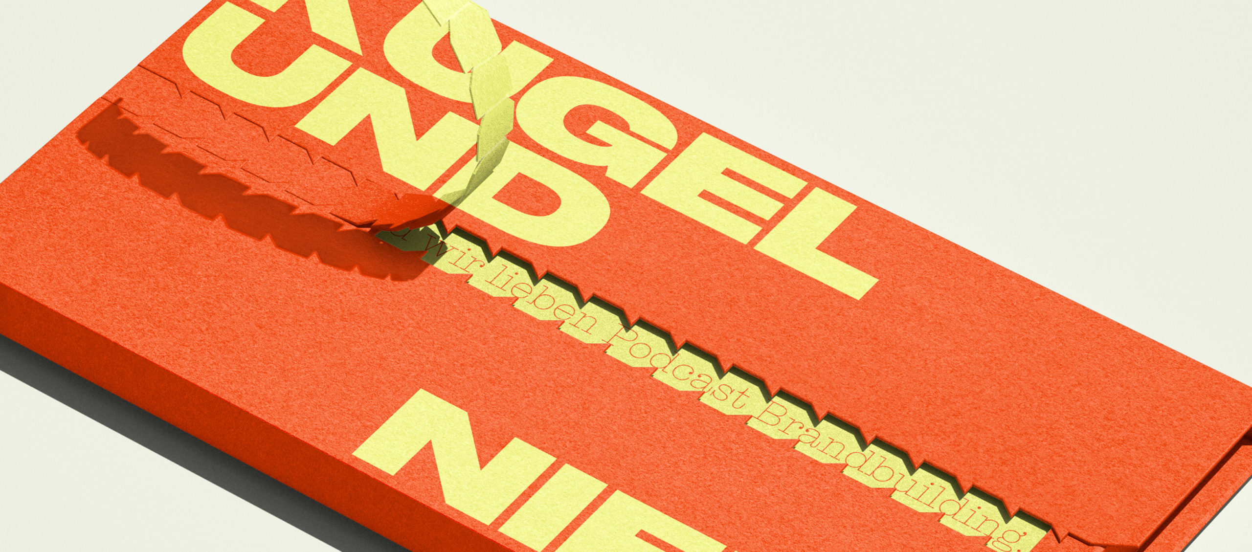
Type meets talk
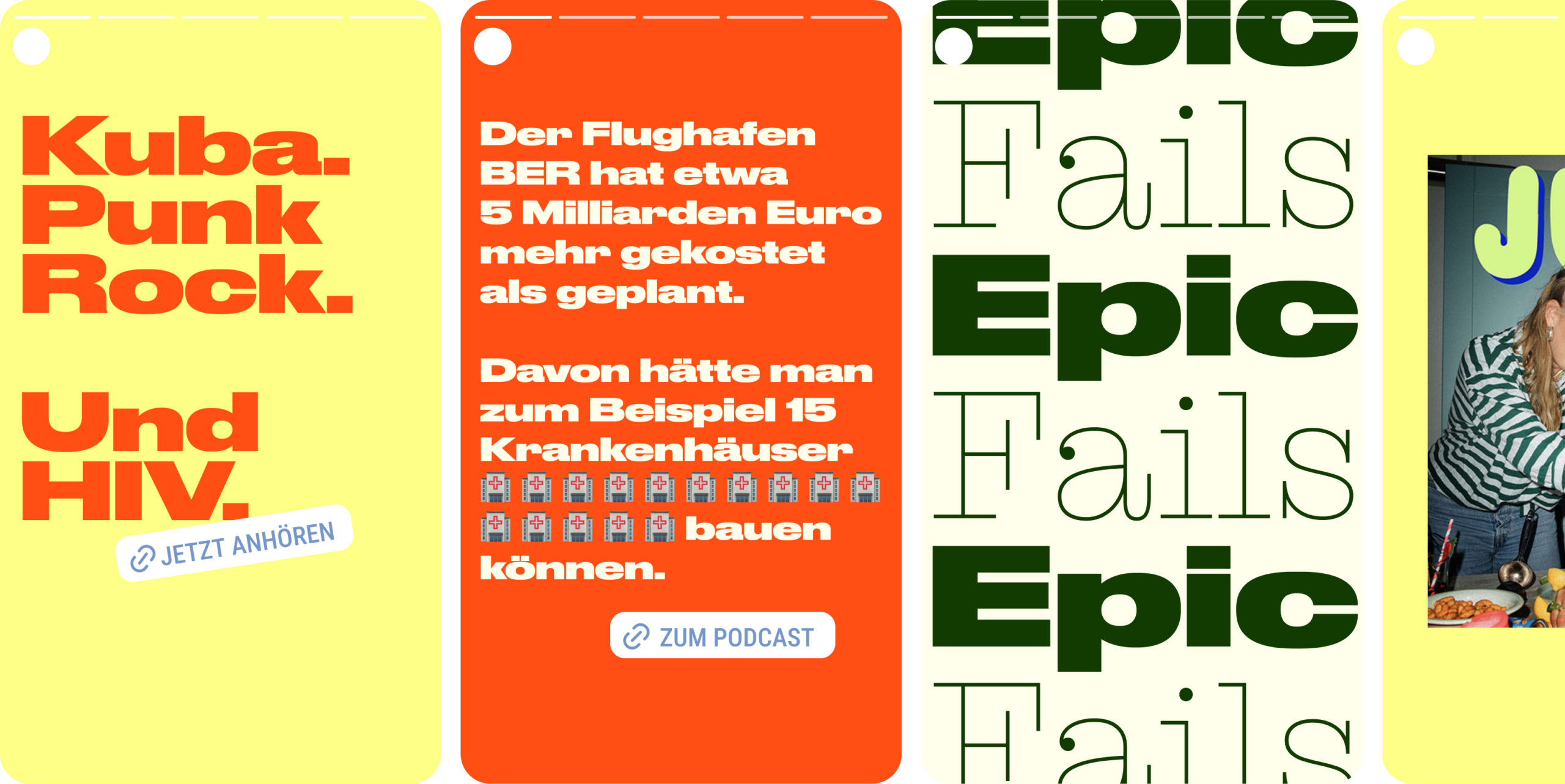
Kugel und Niere produce podcasts bursting with intimacy, wit and excitement, on topics ranging from the million-dollar airport BER to epic failures in the history of evolution and the peculiarities of modern dating.
For the development of their visual identity, it was important to keep the appearance neutral and adaptable for different podcast topics, while also ensuring that the brand stands out on both classic channels and social media with absolute confidence.
With words being the brand’s most important asset, Studio Veh delivered a typographic solution: a flexible type system using a wide typeface that not only emphasises the larger-than-life stories, but also the impact of the podcasts’ conversations.
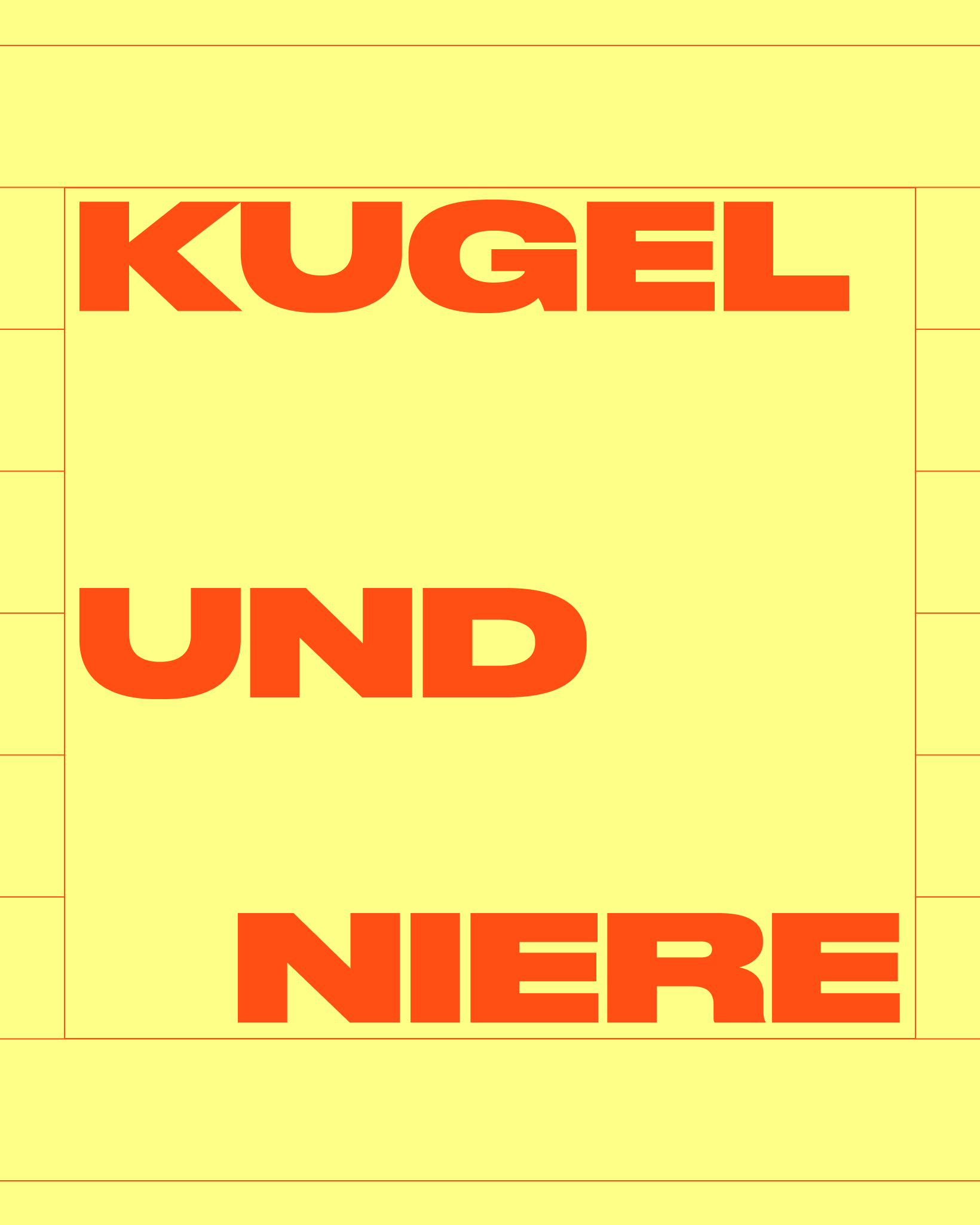
A flexible system for content-first storytelling
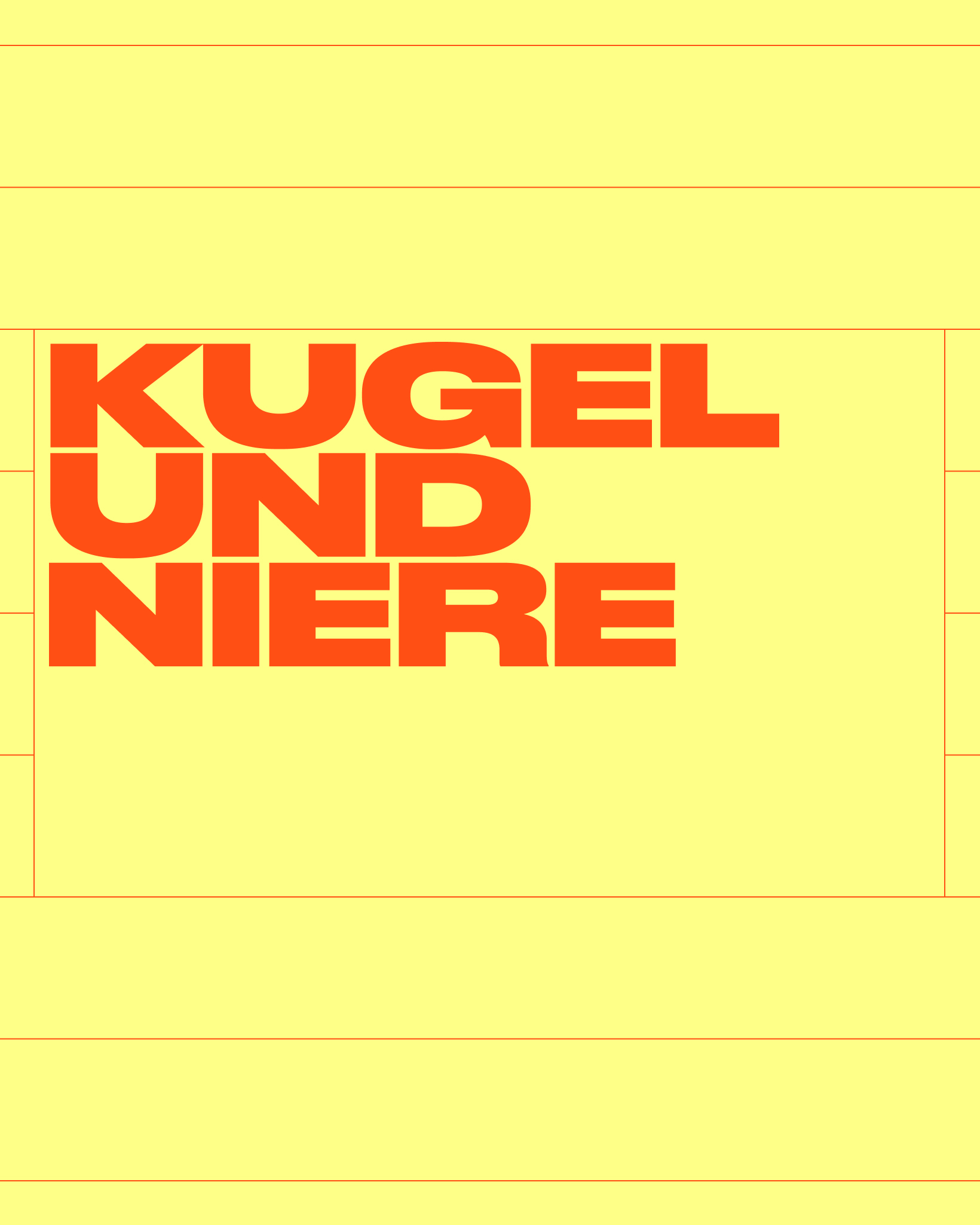
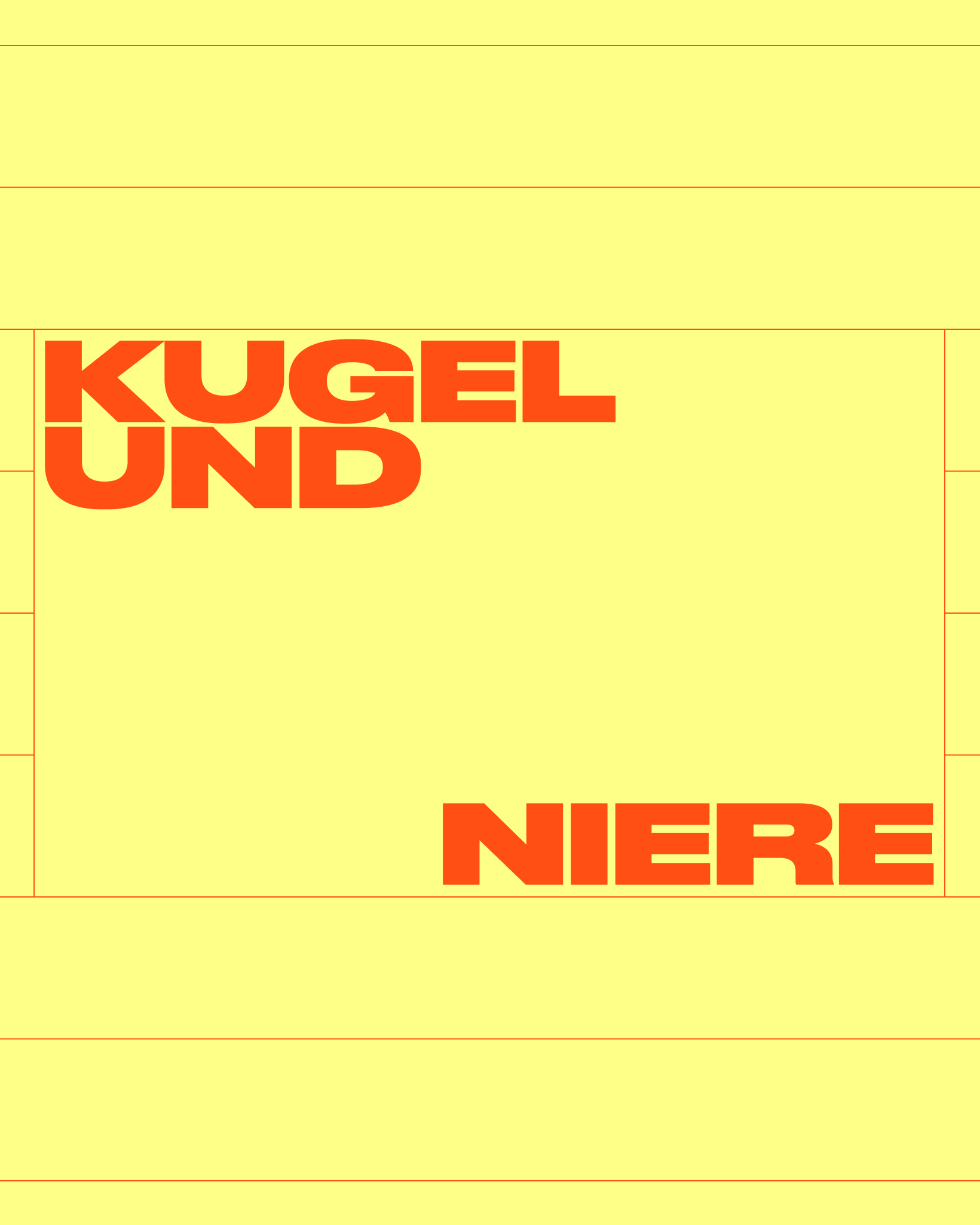
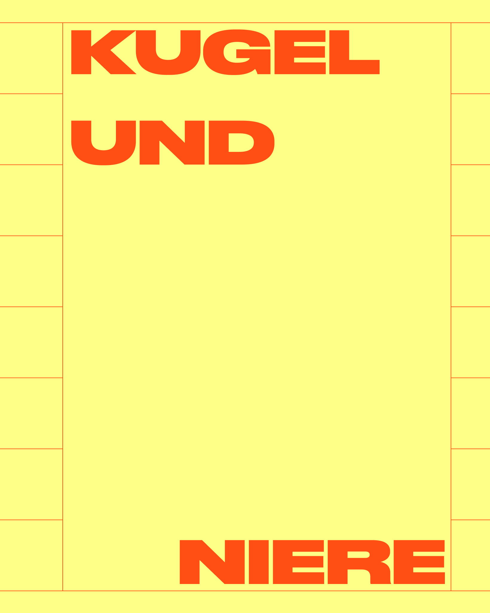
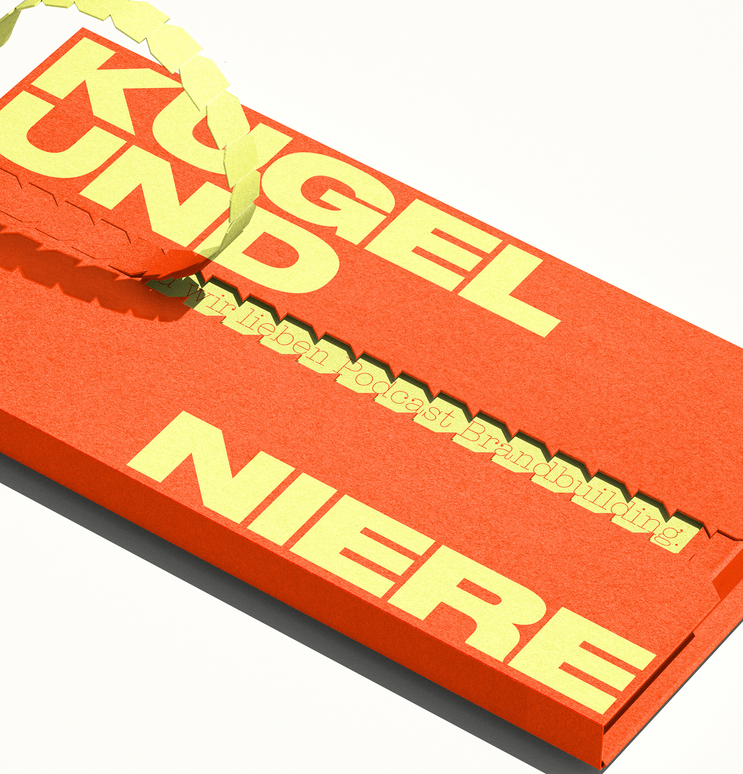
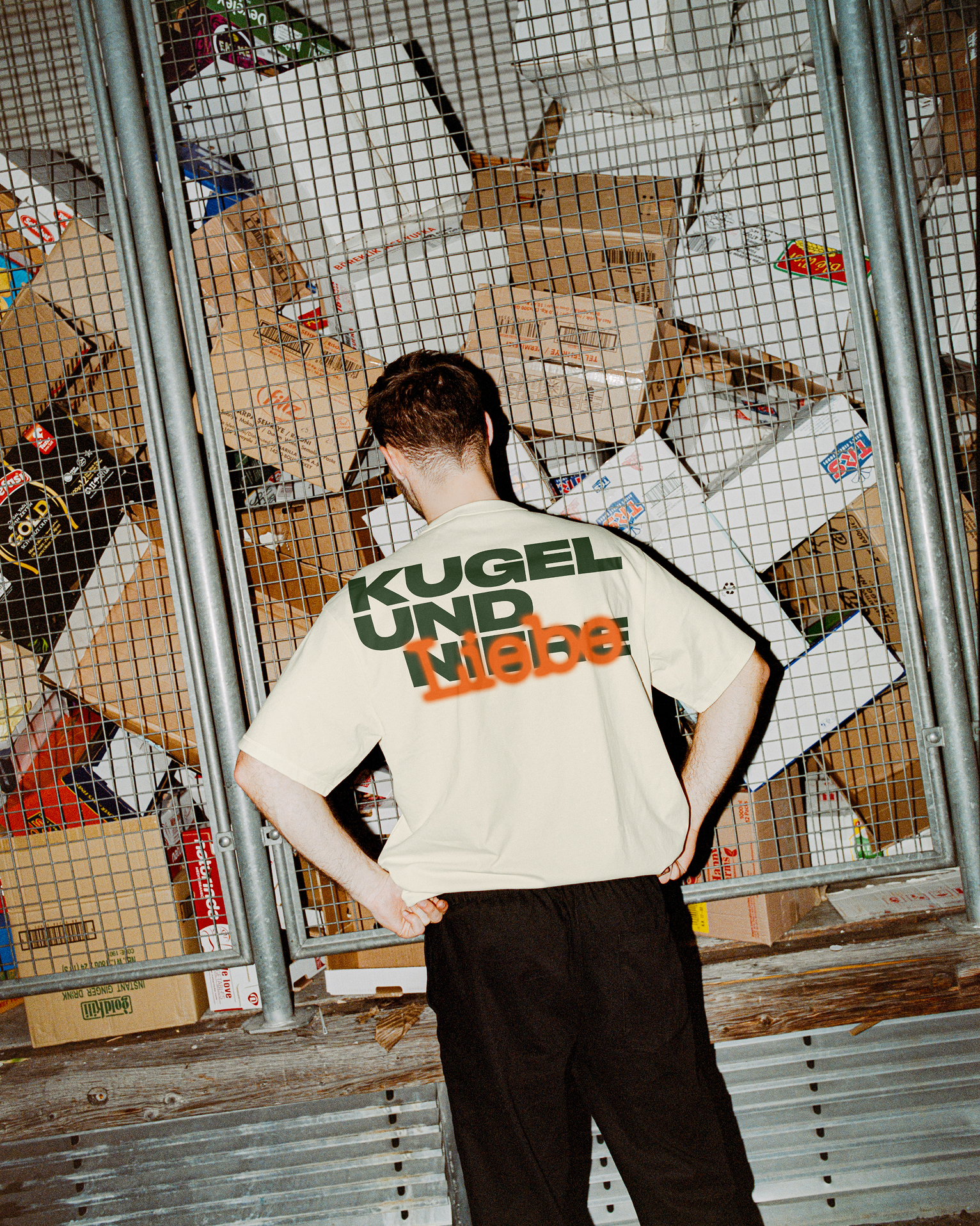
The logo system is built on three dynamic elements that seamlessly adapt to any format, whether in print or digital. ‘KUGEL’ always anchors the top left, ‘NIERE’ grounds the bottom right, and ‘UND’ is change its position, depending on the format.
This flexible structure ensures the logo remains instantly recognizable across all media—while smartly keeping the focus where it belongs: on the podcast content itself.
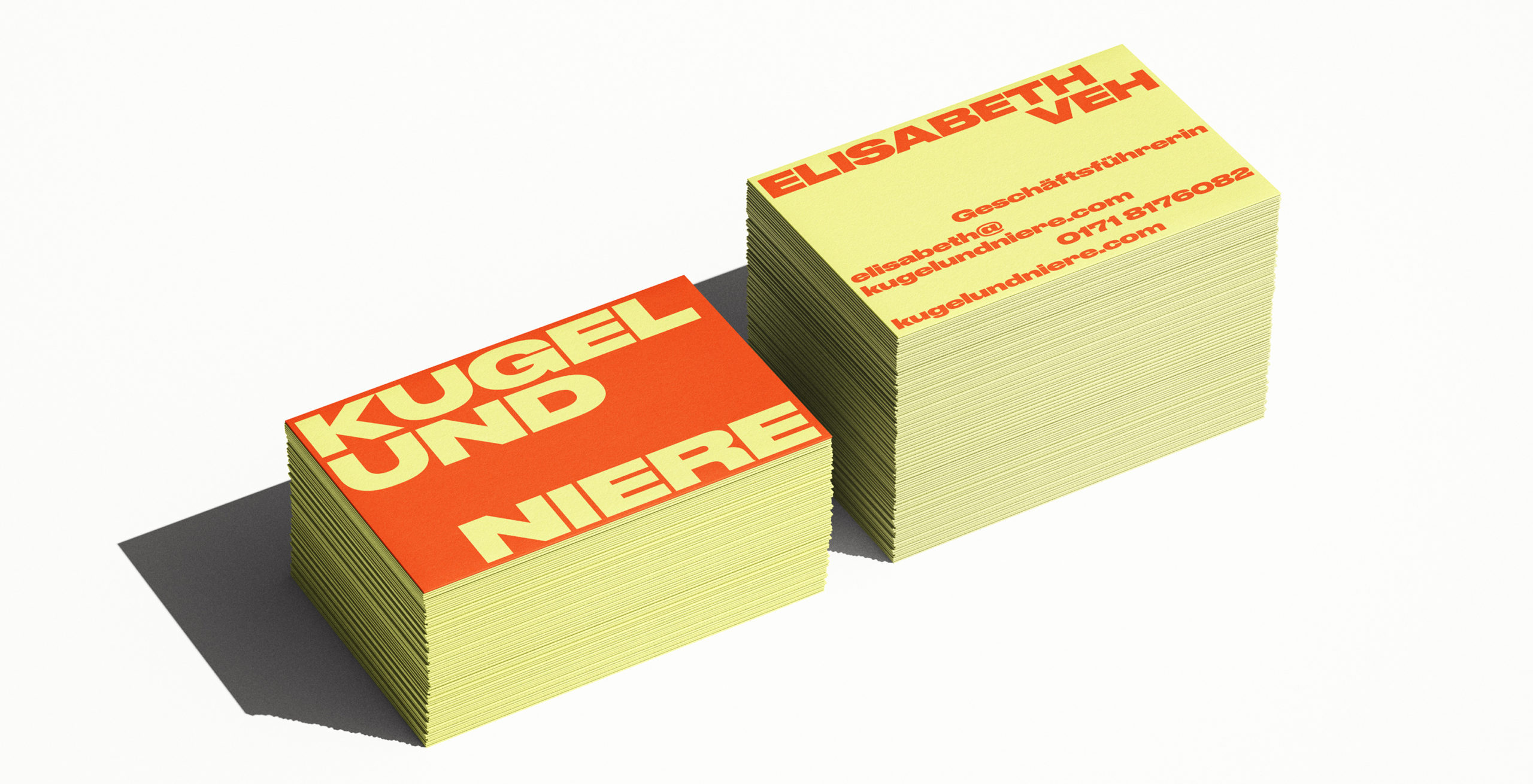
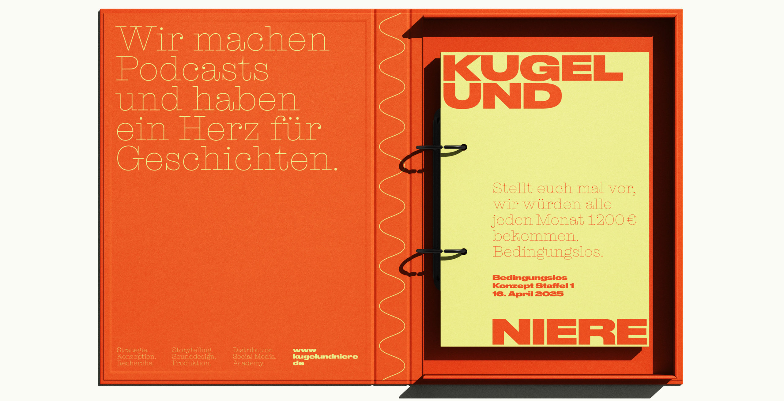
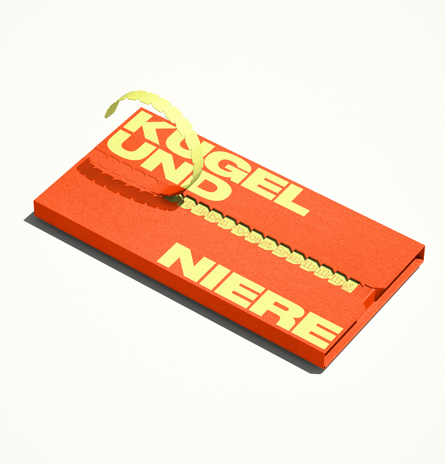
A sweet bite with a spicy kick that lingers
Podcasts that pack a punch deserve colours that pack a punch, too. Gripping stories, uncanny narratives, strong characters, confident adventurers, funny incidents and outrageous anecdotes: they all linger with you.
Kugel and Niere’s new color palette is taking inspiration from vintage food packaging as it evokes a sense of nostalgia and familiarity reminiscent: the comforting retro vibe draws listeners in with a sense of warmth and authenticity, while the content delivers sharp, modern commentary.
The juxtaposition amplifies the company’s bold message, making it feel both timeless and disruptive — like biting into something sweet and finding it surprisingly spicy.
Retro Vibes. Modern Reach.
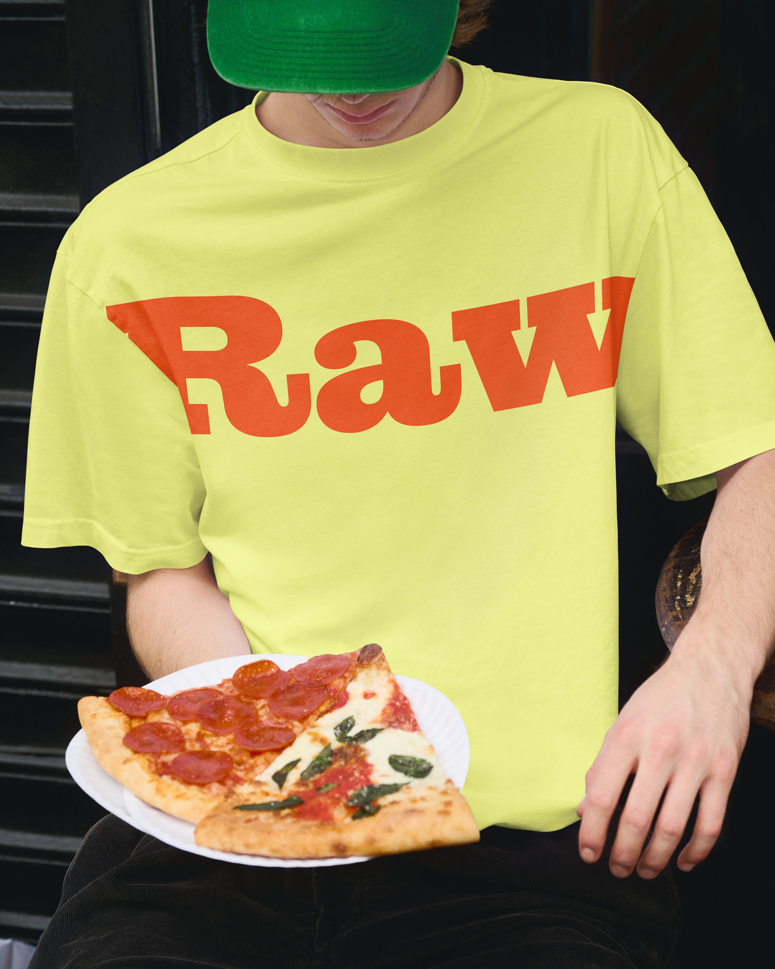
The bold brand identity channels warmth and energy — reimagined for today’s social media landscape. It blends nostalgia with nuance, turning every post into a mood, a memory, a moment.
Top tier training with vintage studio vibes
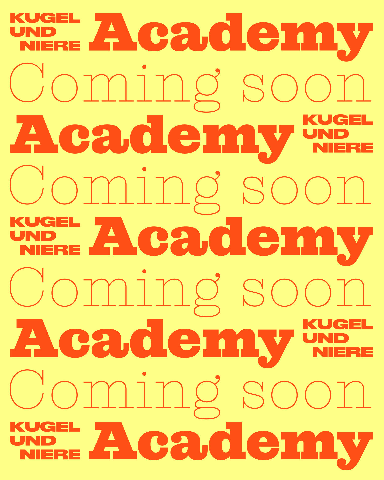
Kugel und Niere’s latest venture is their own podcast Academy: Drenched in retro flair and with vintage studio vibes, it blends nostalgia with top-tier training for the next wave of audio creators. Whether you’re new to the mic or ready to remix your skills, this is where your podcast dreams go full stereo.

Team Credits
Strategy & Creative Direction:
Franziska Veh
Design:
Lind Haugaard, Rebecca Baihaki
Website Development:
Ralf Büsch