template-parts/blocks/detail/single-logo.php

Celebrating unique radiance

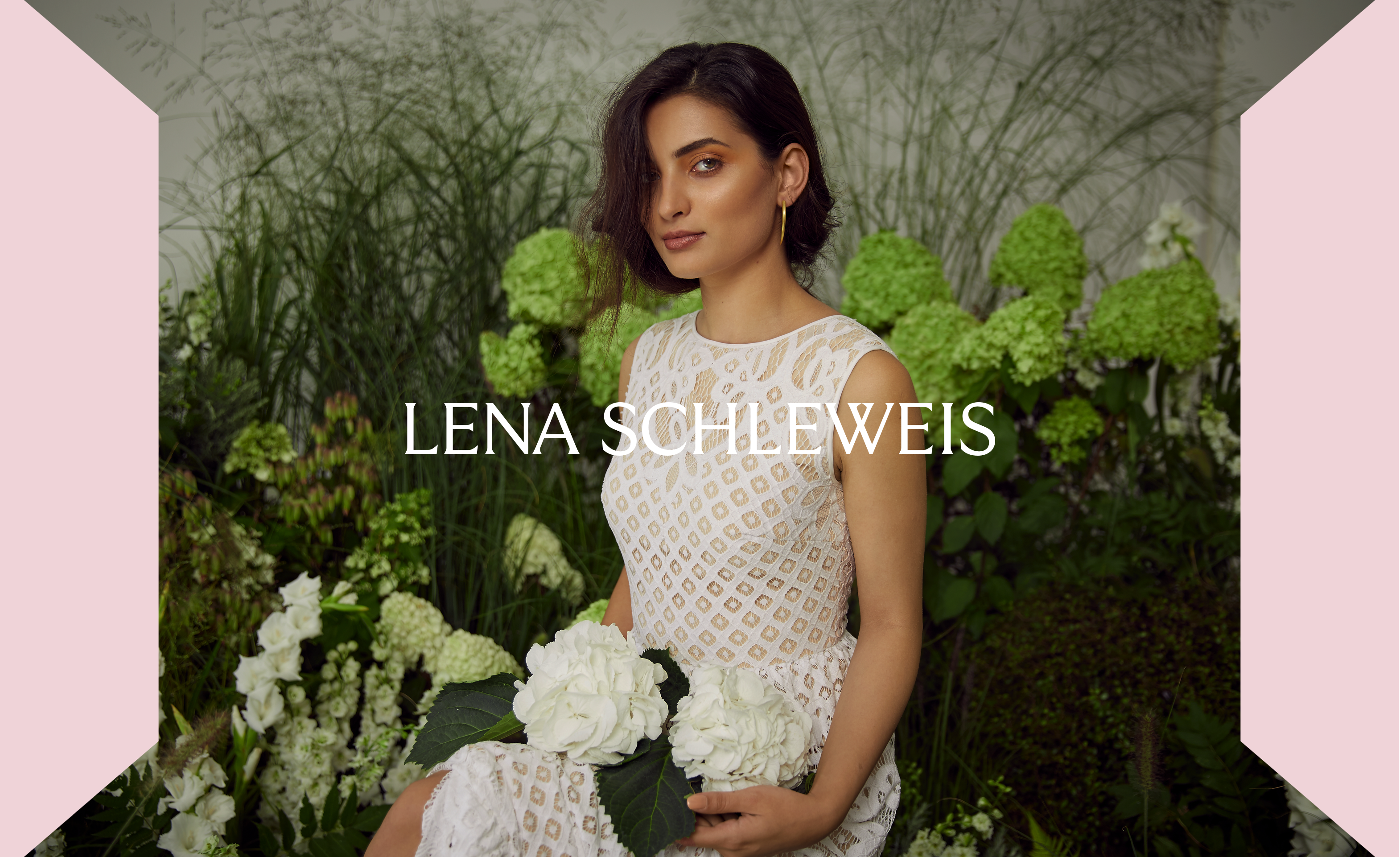
In a world where beauty standards are ever-evolving, it’s essential to recognize and celebrate the uniqueness and radiance of each woman.

Like precious gems, every woman possesses her own brilliance, facets, and exquisite qualities that make her truly one-of-a-kind. Just as gemstones are treasured for their distinct hues, clarity, and luster, the beauty of each woman emanates from within, reflecting her inner strength, confidence, and individuality.

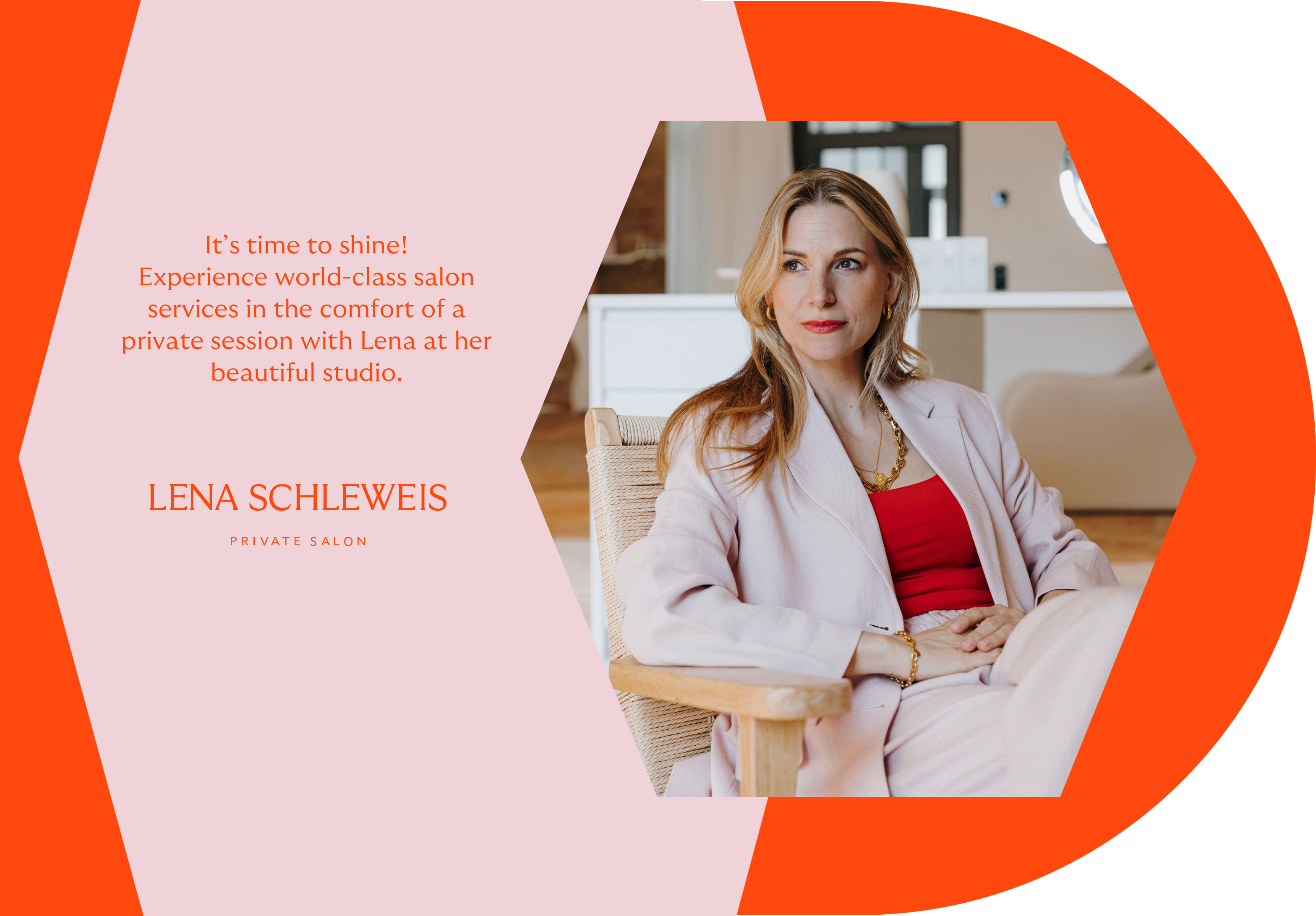
Embracing this perspective, Lena Barclay-Steuart has transformed her passion for beauty into a thriving empire. From the humble beginnings of her working as a one-woman-show offering a mobile beauty service, Lena’s impeccable skills and unwavering dedication to her craft have propelled her into opening her own physical beauty salon in Potsdam.

With this bold move, she has not only expanded her clientele but also taken her personal brand, Lena Schleweis, to new heights. Lena’s private salon now offers a wide range of services, attracting clients seeking her signature touch. Her exceptional talent, coupled with a luxurious and inviting atmosphere, has set a new standard for beauty services.

Shining bright

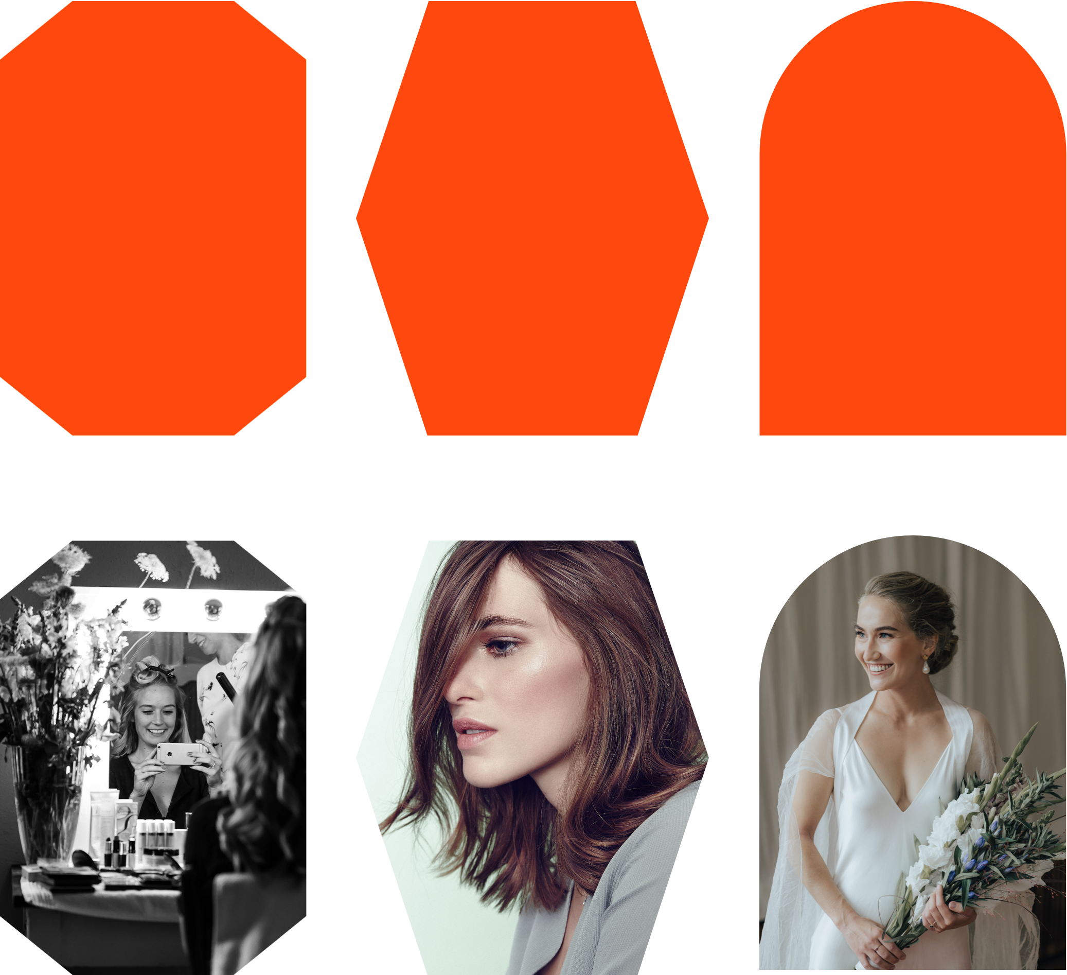
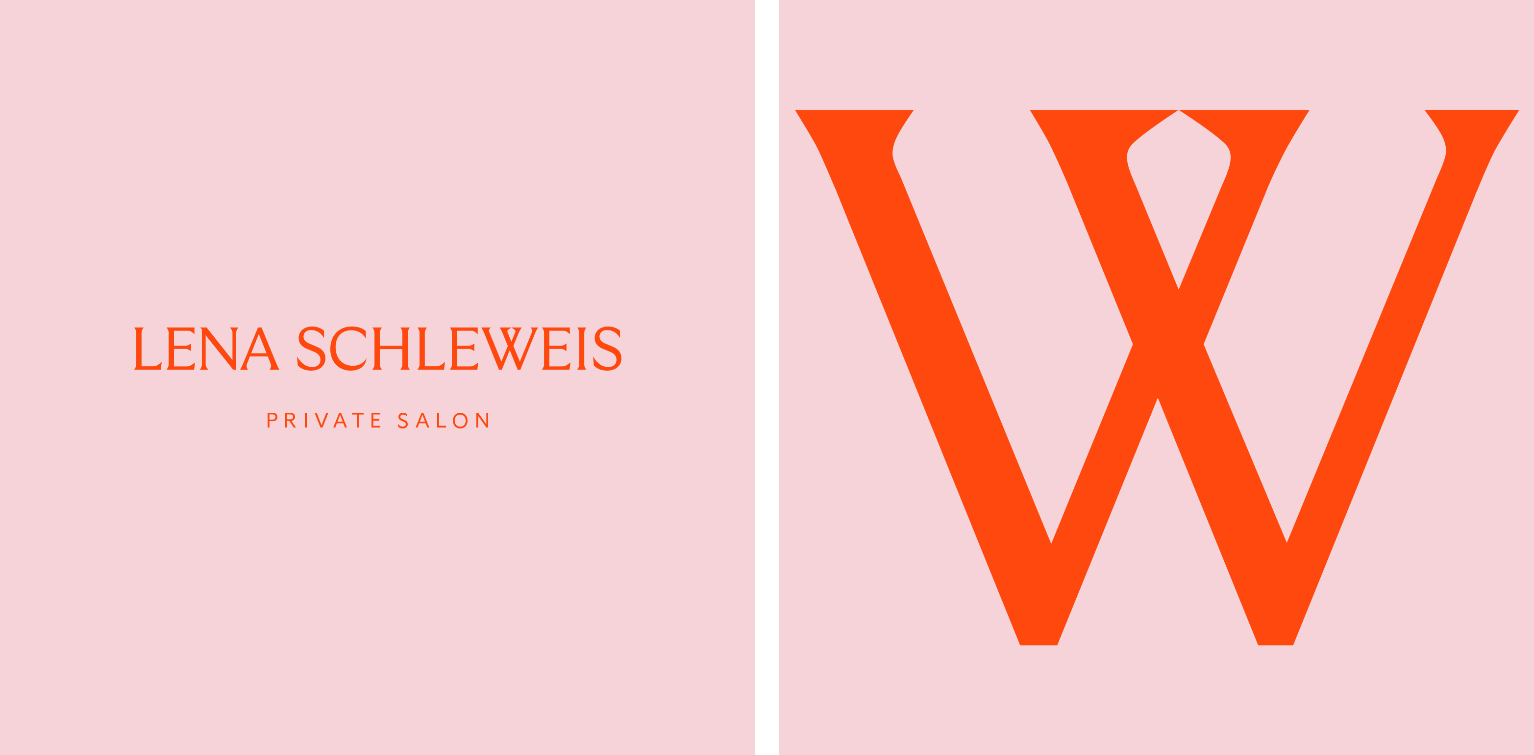
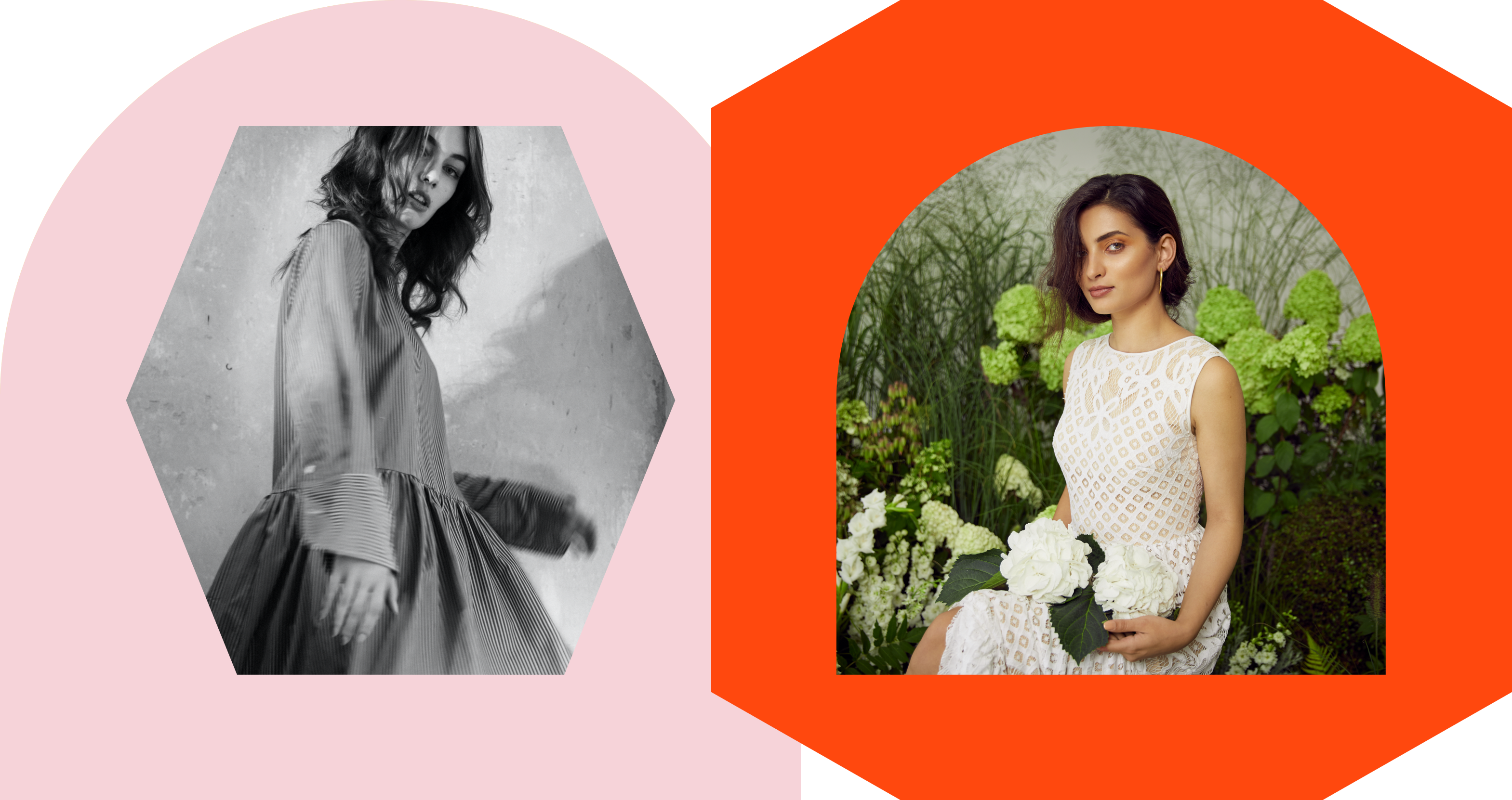
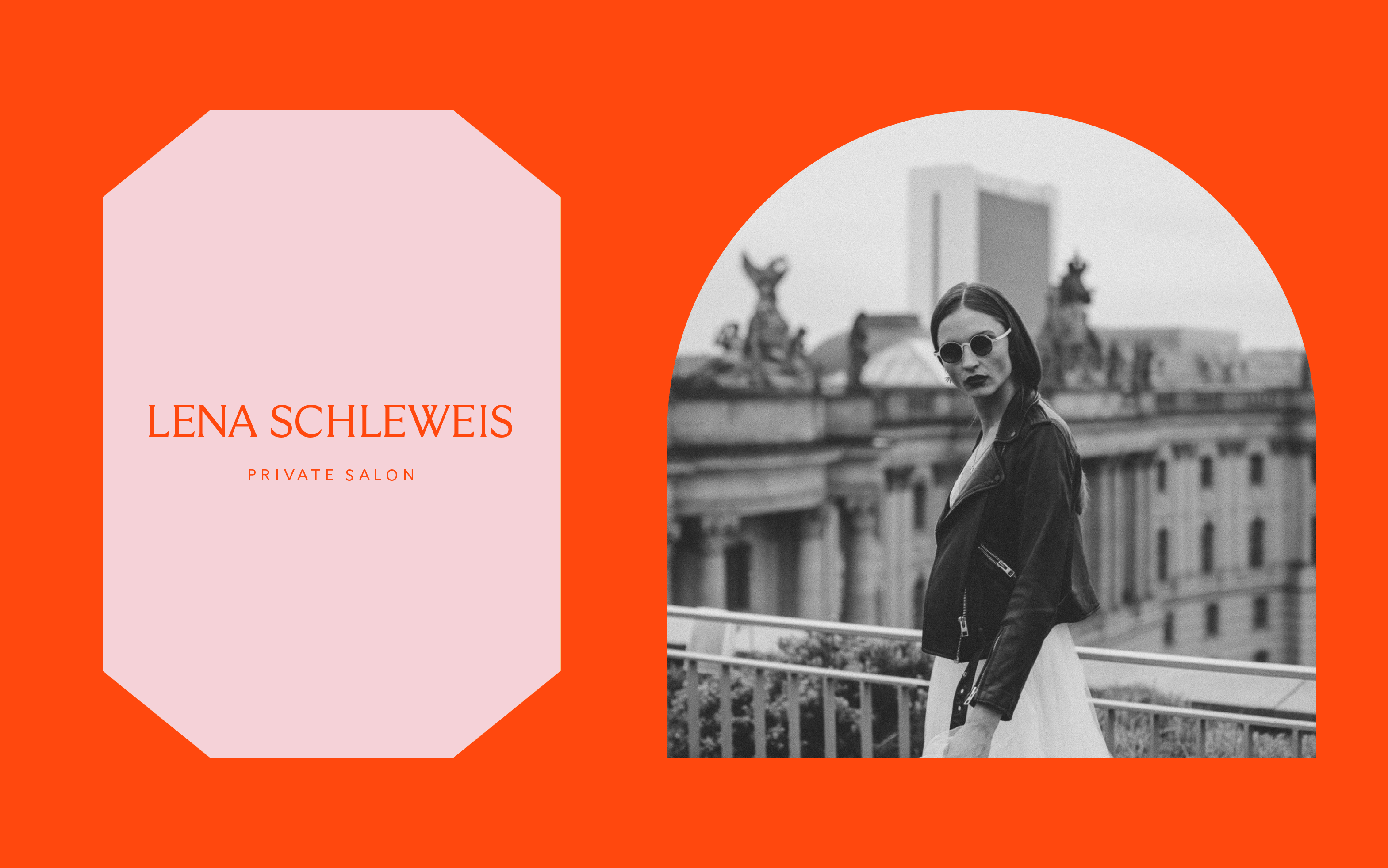
Inspired by Lena honoring the diverse beauty that exists in the world, we created the new identity for Lena Schleweis around the concept of gemstones: recognizing that each woman shines bright like a precious or glowing gem in her own remarkable way, the identity plays with various gem stone shapes to underline the high class and very individual beauty consultancy Lena offers her clients.

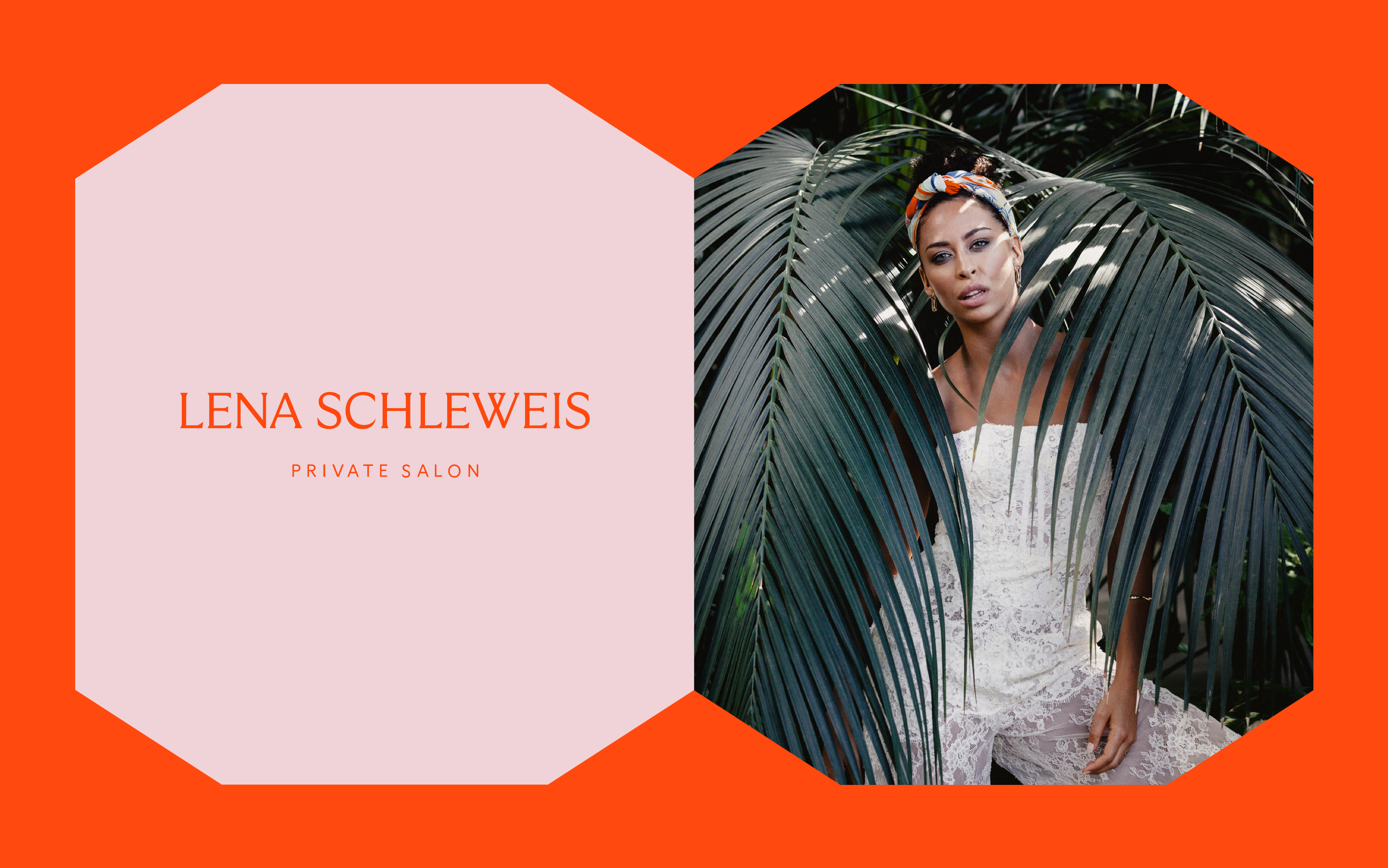
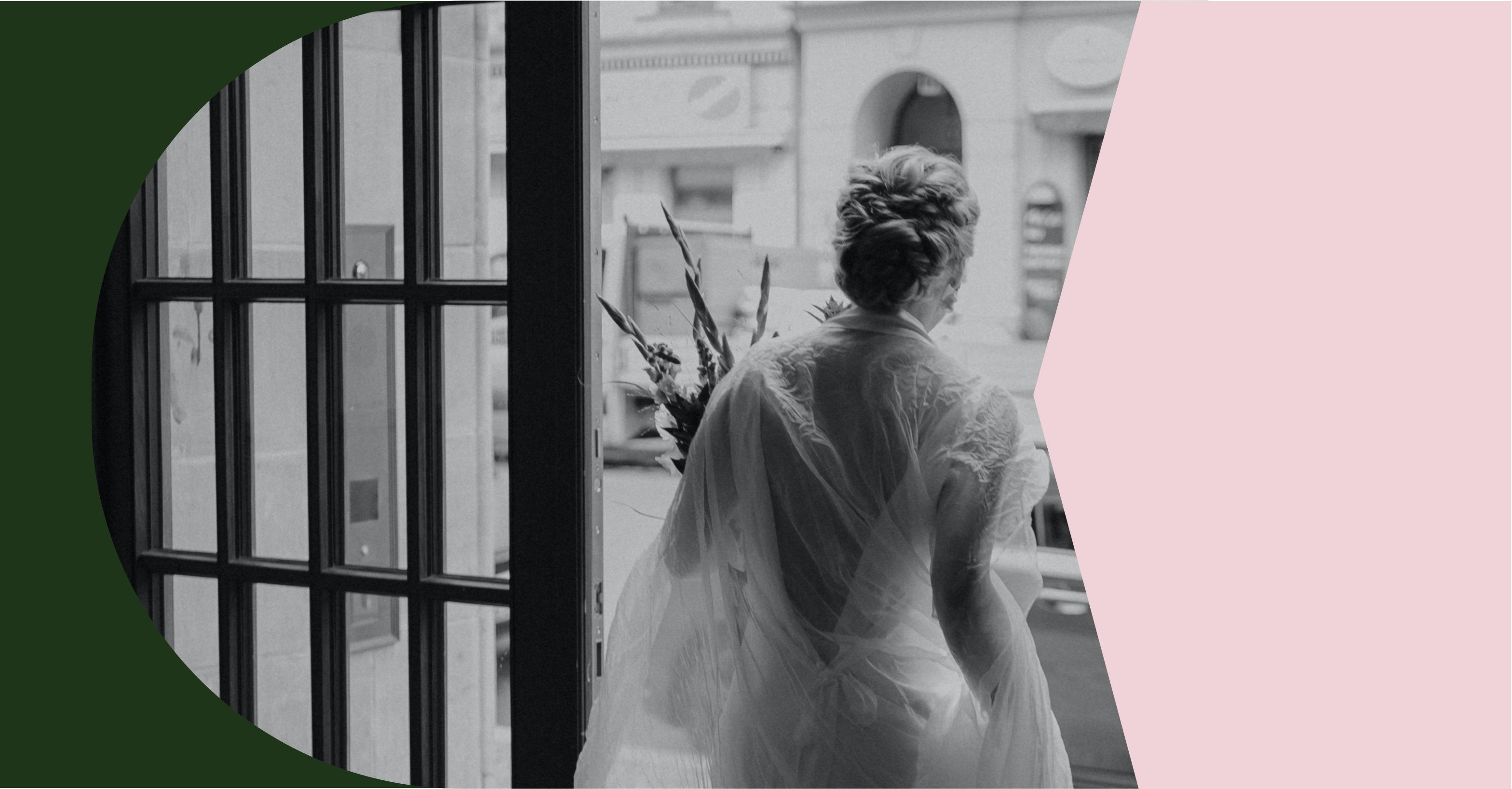
Combining these bold and edgy gemstone shapes with arch shapes inspired by the salon’s shop windows, we balance the visual identity with different facettes – edgy and soft.
Like an open window, the arch shapes transport the warm and inviting atmosphere that is awaiting the clients in the salon.

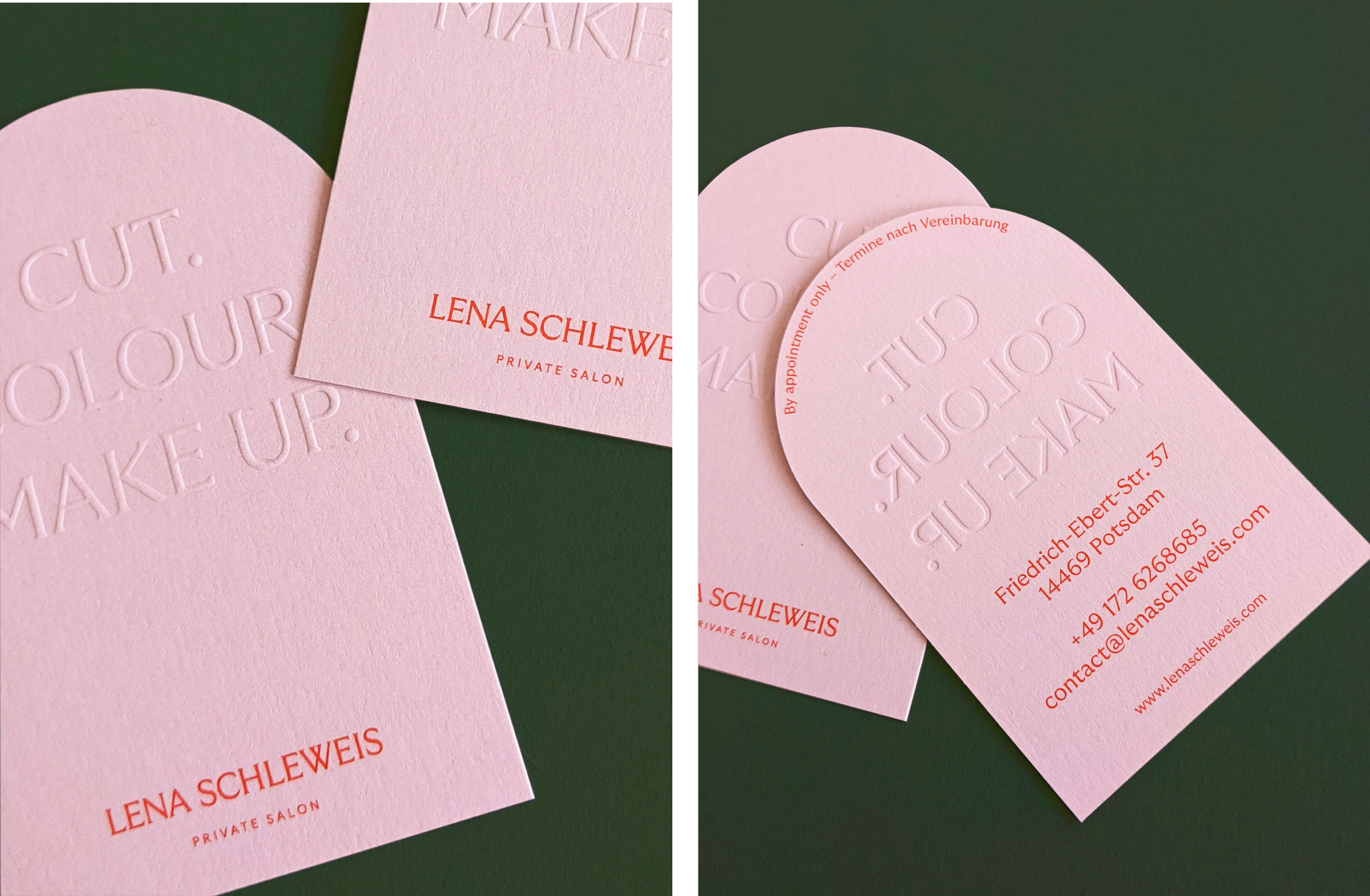
The various shapes can be used overlaid with images, on its own, working as a plain background carrying type, or paired with the logotype.

Beauty

Brand Refresh

Beauty

Brand Refresh

A hidden gem

Like her new private salon is like a hidden gem in the heart of Potsdam, we incorporated a gem stone shape in the new wordmark: Therefore we customized the typeface GT Ultra, a typeface created by Grilli Type, for the wordmark.

Beauty

Brand Refresh

Beauty

Brand Refresh

Beauty

Brand Refresh

Beauty

Brand Refresh

Beauty

Brand Refresh

Beauty

Brand Refresh

Beauty

Brand Refresh

Beauty

Brand Refresh

Beauty

Brand Refresh

Beauty

Brand Refresh

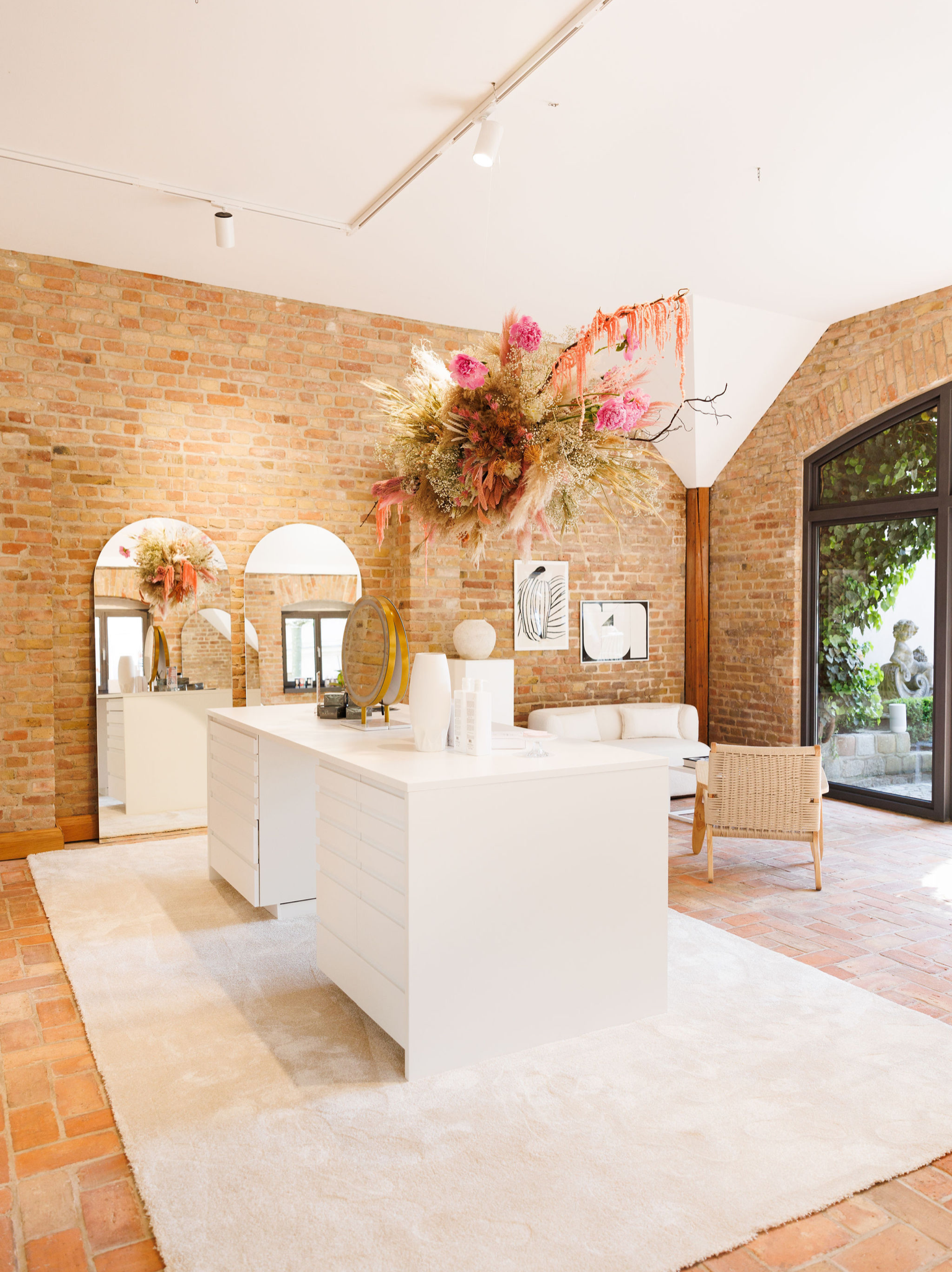
A captivating experience

The key components of the visual identity, the arch and gem stone shapes, were also incorporated into the salon space, to give the customers of Lena Schleweis a holistic and captivating brand experience.

Keeping the lit up salon light and neutral, it leaves room for a personalities and styles created by Lena and her team.

Beauty

Brand Refresh

Beauty

Brand Refresh

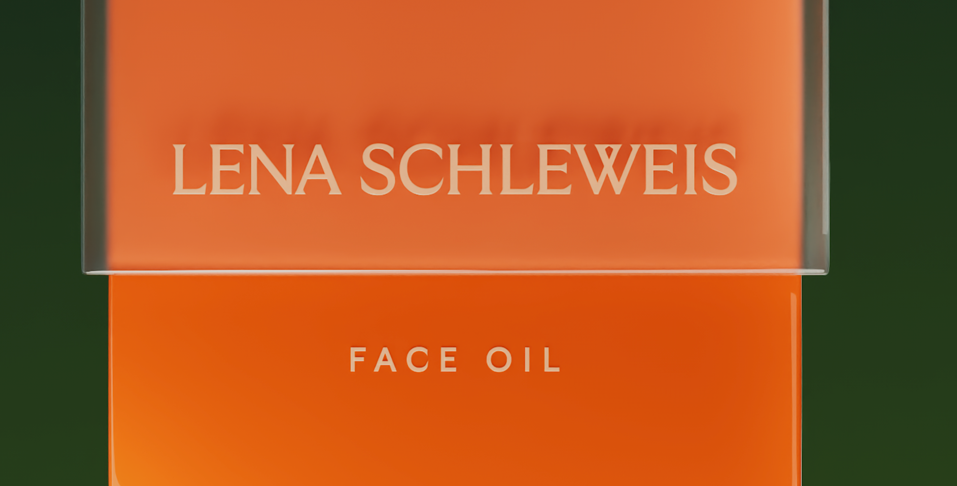
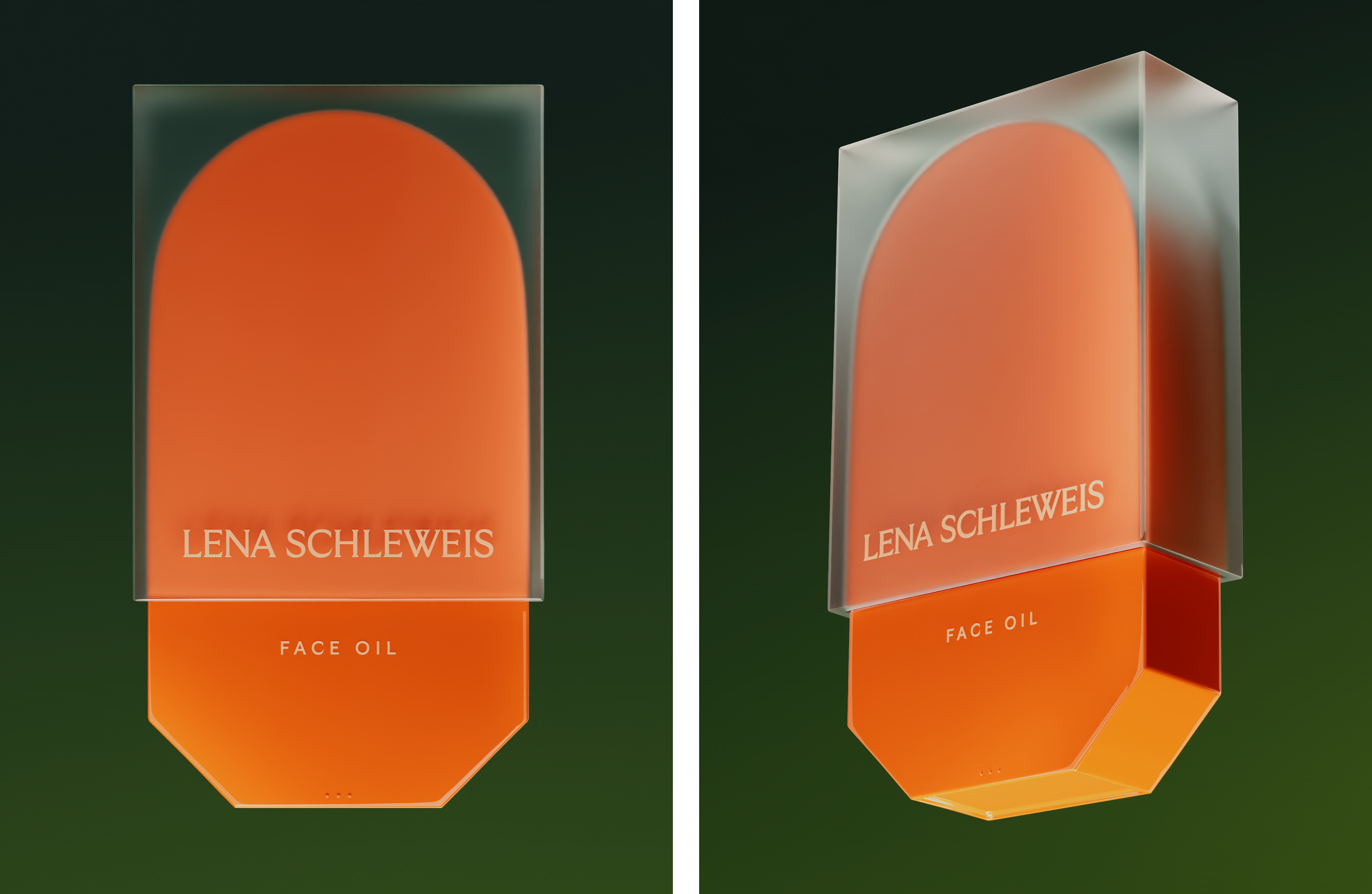
Transformative beauty

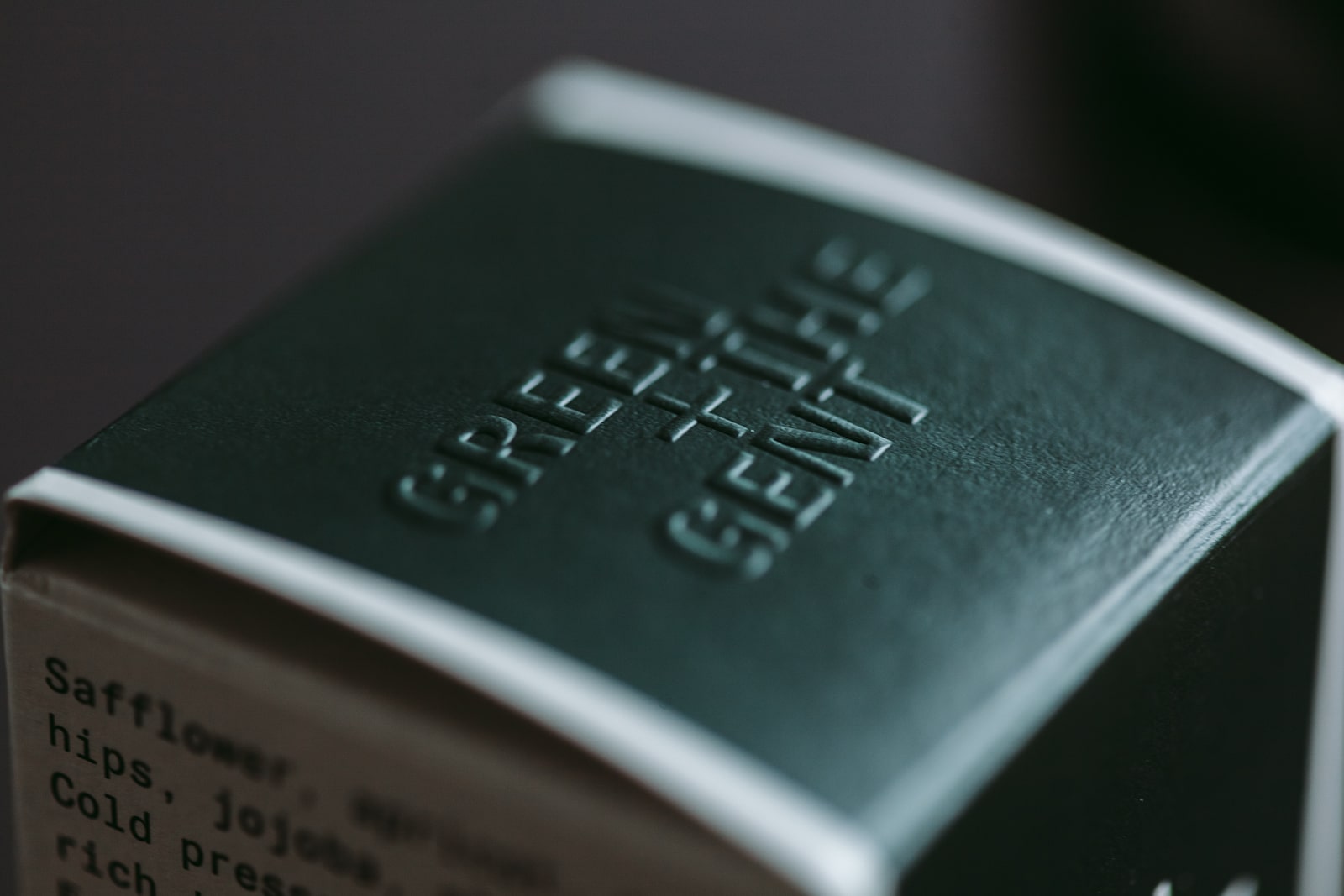
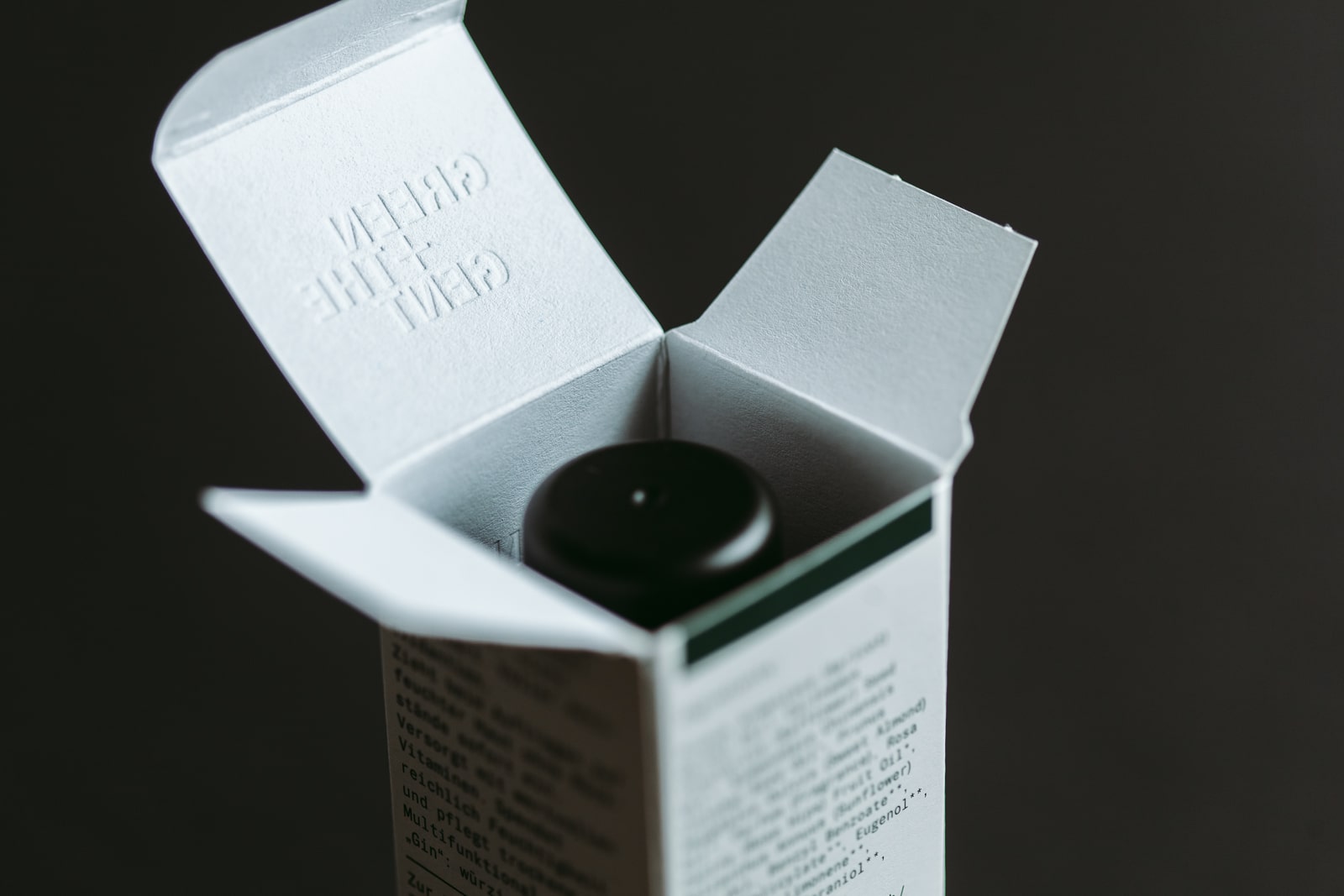
With her new salon, Lena is also about to embark on another exciting new venture: planning her very own beauty product line.

Drawing inspiration from her years of experience in the industry, Lena envisions a collection that encapsulates her vision of authentic and transformative beauty. From innovative skincare formulations to captivating makeup essentials, her upcoming line aims to empower individuals to enhance their natural radiance. With meticulous attention to detail and a commitment to using high-quality, ethically sourced ingredients and materials. Stay tuned as Lena sets out to revolutionize the beauty landscape with her captivating creations.

Beauty

Brand Refresh

Beauty

Brand Refresh

Team Credits

Creative Direction: Franziska Veh
Art Direction: Lind Haugaard
Design: Felicia Usinto
3D Rendering: Alexis M. Varga
Photography Salon Opening: Farina Deutschmann

Do you have a project and need support? Let’s talk: get in touch via phone, through email or by visiting our studio! We look forward to hearing from you.

The whole package

How do we identify a modern-day gentleman? By his name? His manners? His values? His sophistication? A certain appearance? None of these alone is enough, each is part of the formula.

The founders of Green + The Gent have always loved grooming rituals. But it wasn’t until they travelled the world that they realised what had been missing at home in Germany: frequent visits to a traditional barbershop. It became apparent that they were used to making do with the limited selection of products at local drug stores. Yes, the range of products available has been growing more and more, but not the ‘gentlemanly’ products, just those that are gaudy or following trends. The products required for a truly mindful daily ritual must be sustainable, organic and cruelty-free. Therefore the idea for a quality skincare line for men was born.

In the brand strategy workshop, Studio Veh and the Green + The Gent founders identified that the discrepancy between desire and reality was the company’s driving force. The big skincare providers promise an ideal world, but do little to achieve it. Their focus is on low-quality ingredients, unnecessary products, and high-profit margins.

For Green + The Gent, their brand mission is to fill the untouched gap in the market: mindfulness and reduction to the essential grooming products that empower today’s gentleman to enjoy life with a clear conscience.

While it may seem like a modern philosophy, one of the founder’s grandfathers cultivated a similar shaving ritual more than 100 years ago. Therefore the name of this grandfather was also the first idea for the company’s name. Now with strong brand values established and – in close coordination with the founders – Studio Veh began the brand’s naming process. The process considered all possible options, navigating which had emotion and which were legally possible, as there are complex copyright issues in the beauty industry.

The name Green + The Gent was ultimately the perfect blend of the product’s philosophy, which prioritises natural ingredients and the needs of the modern gentleman. Tradition meets modernity, old-fashion meets reclaimed naturalness, the man of today’s world meets values that have endured since razor blades were created.

Based on the established and strategic brand positioning, Studio Veh then developed the packaging that celebrates the philosophy of the brand with every product, as well as the entire skincare range.

In addition, the brand’s sustainable conscience and high-quality ingredients become apparent through the high quality of the packaging. Dark, recyclable glass bottles and FSC-certified paper and cardboard have been combined with printed finishes such as blind embossing on the packaging.

Beauty

Brand Creation

Beauty

Brand Creation

To do justice to the product’s mix of modern, certified-organic ingredients and vintage-look packaging reminiscent of old grooming products, Studio Veh developed a custom typeface for use on the packaging and in the entire brand identity. The mono-spaced execution showcases grooming as a structured ritual, and highlights the barbershop as an old-school shaving tradition.

Beauty

Brand Creation

Beauty

Brand Creation

Beauty

Brand Creation

Beauty

Brand Creation

Green + The Gent’s product range includes shaving soap, facial tonic, moisturiser and shower products, as well as a razor with matching blades. This custom razor is made by the Solingen-based manufacturer Giesen & Forsthoff, and of course, comes engraved with Green + The Gent’s typeface.

Quality and gentlemen have a lot in common: they’re both an art form, and if you’ve got it, you’ve got it.

Beauty

Brand Creation

Beauty

Brand Creation

Team Credits

Brand Workshop & Strategy:
Franziska Veh + Mark-Marcel Müller

Creative Direction:
Franziska Veh

Design:
Lind Haugaard
, Callum O’Neill

Typedesign:
Tobias Rechsteiner

Project Management:
Kiyoshi Stelzner

Porfolio Photography:
Daniel Faró

Do you have a project and need support?
Let’s talk: get in touch via phone, through email or by visiting our studio!
We look forward to hearing from you.