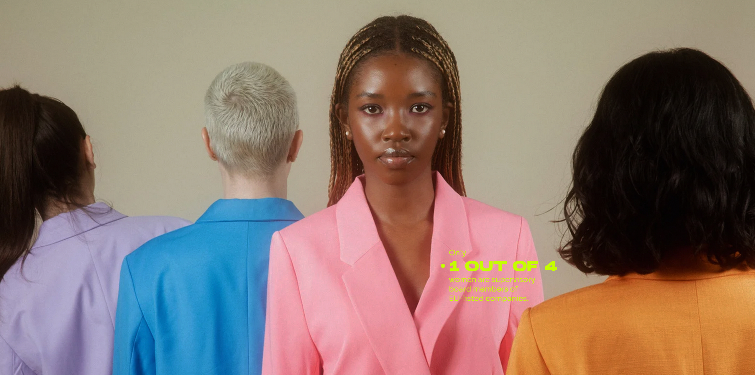
Progress on gender equality has been very low despite efforts in the last years. Better data presentation and verification of correlation is needed: Say hi to Gendex, Europe’s first Gender and Diversity Index, increasing access to women and diverse talents within the EU innovation ecosystem. 💥
The mission:
To be the B Corp for Diversity 🌟
Only 30% of all leadership positions are covered by women. Only 15% of European VC fund partners are women. And only 1% of VC funding in Europe goes to women-only teams. This is why Gendex is building Europe’s first Gender & Diversity index, in order to become the B Corp for Diversity.
Why is this important? Because there is a direct relationship between diversity and financial returns. For example, there’s a 2x revenue per dollar invested in startups with women founders, and a 9.7% uplift in profitability of exit VC firms with 10% more women partners.
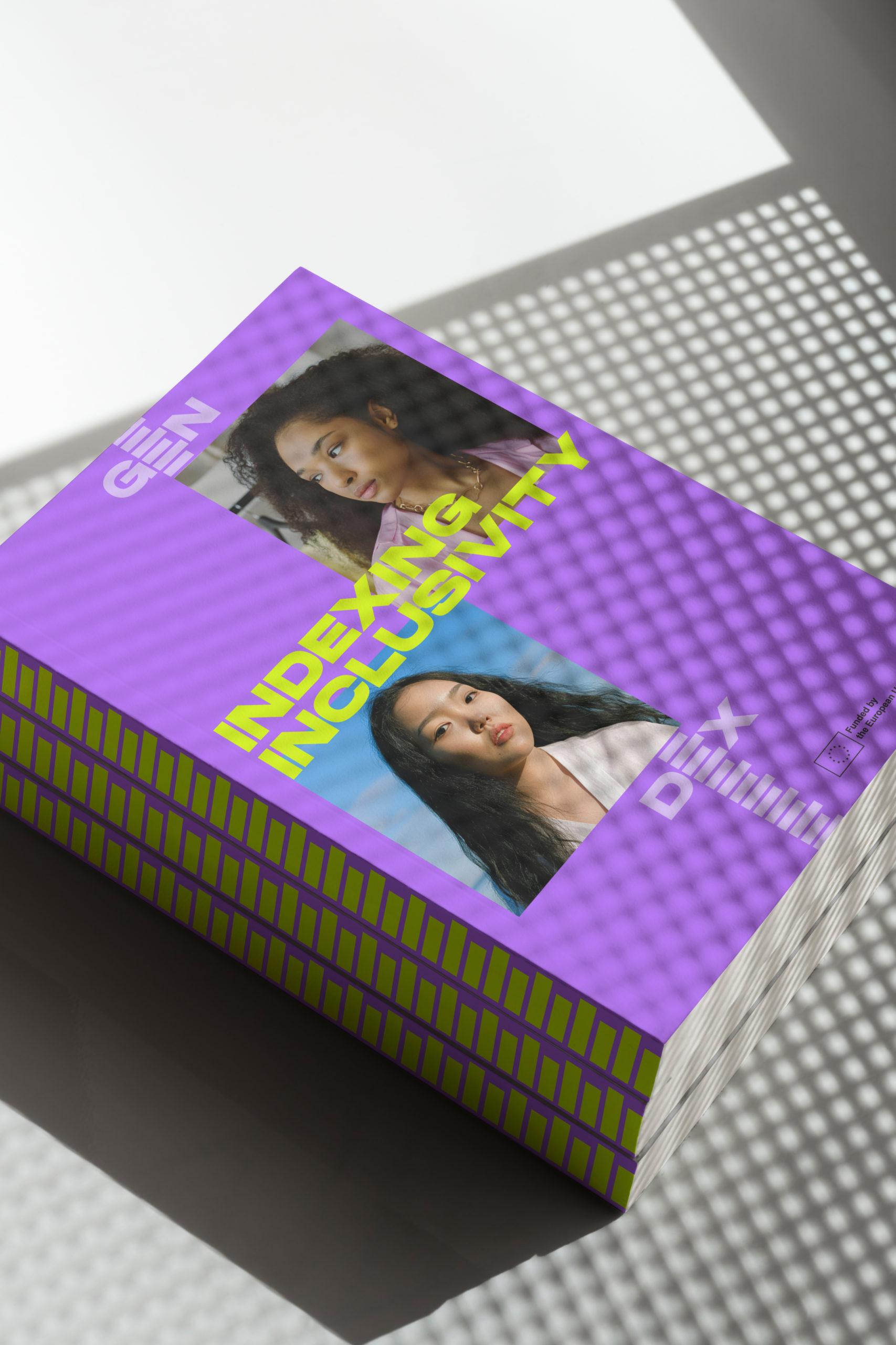
The new index is based on agreed definitions and indicators that can be applied to startups / SMEs and to innovation investments actors in the EU.
Data on diversity categories other than gender, especially as regards discrimination based on ethnicity, sexual orientation, political beliefs, etc. are almost inexistent or very difficult to obtain. The goal is to generate new data thanks to primary research, to help stakeholders make evidence-based decisions – and to have as many companies as possible on the index, striving for inclusivity.
The founding team of Gendex, with Stephanie from Founderland as the project leader, reached out to Studio Veh to create an identity for Gendex. The desired outcome was a flexible identity with simple yet strong guidelines, that could be implemented and used by all project partners.


Studio Veh came up with a concept that visualizes the index and embodies the aim to continually expand the list of companies included. It represents constant movement, development and the commitment to fostering change by promoting continuous growth and progress.
The logo adapts this concept and is opening up for content and visuals, symbolizing the every-expanding space for diversity, inclusivity and innovation.


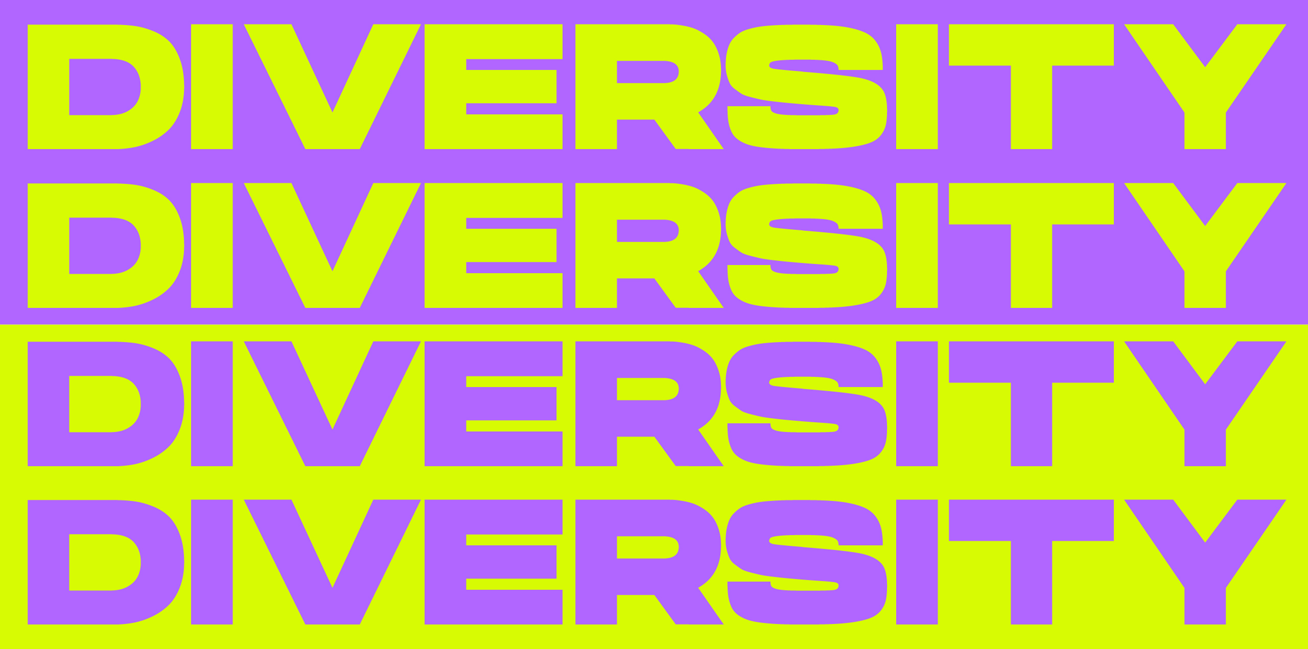
A bold type for
a bold message
Given our brand’s emphasis on presenting clear, understandable facts, we prioritize readability and precision. Simultaneously, our typography captures the bold, impactful essence of Gendex, mirroring a brand that is both steadfast and dynamic.

Respect & innovation
The brand’s color palette is fundamental to the brand identity and perception. The goal is to attract attention with a modern and inclusive color scheme that conveys the brand values.
Purple, often associated with knowledge and respect, stands for diverse perspectives and experiences within an organization. It underscores the importance of treating all individuals with respect and fairness, fostering an environment where everyone’s contributions are valued and appreciated. Yellow, symbolizing positivity and innovation, underscores the importance of thinking outside the box to address diversity challenges and create inclusive environments.
A little sprinkle of a vibrant green suggests a sense of innovation, progress, and forward-thinking perspectives.
With those brand colors, we strive for Gendex to be recognized as a professional and trustworthy brand – one that is capable of changing the status quo.

Celebrating Confidence
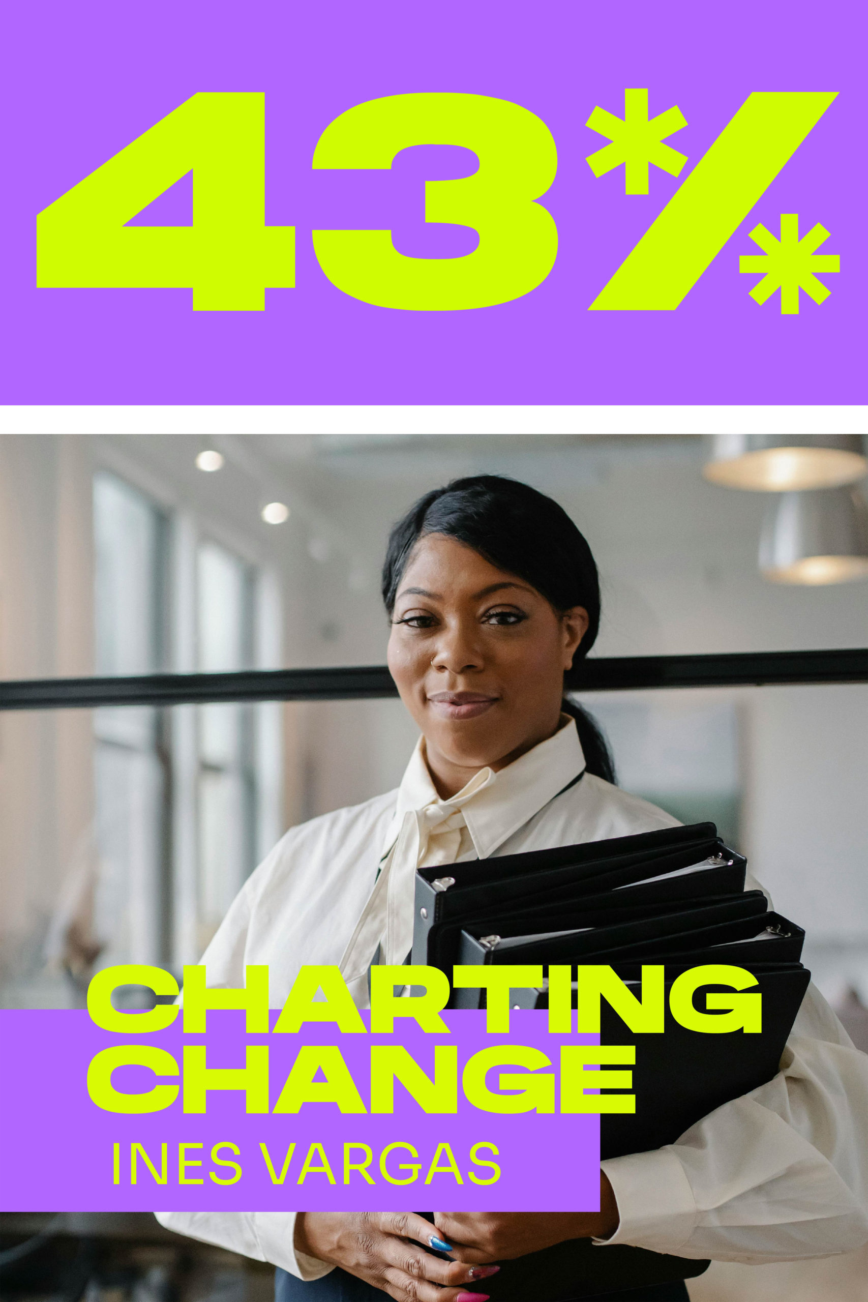
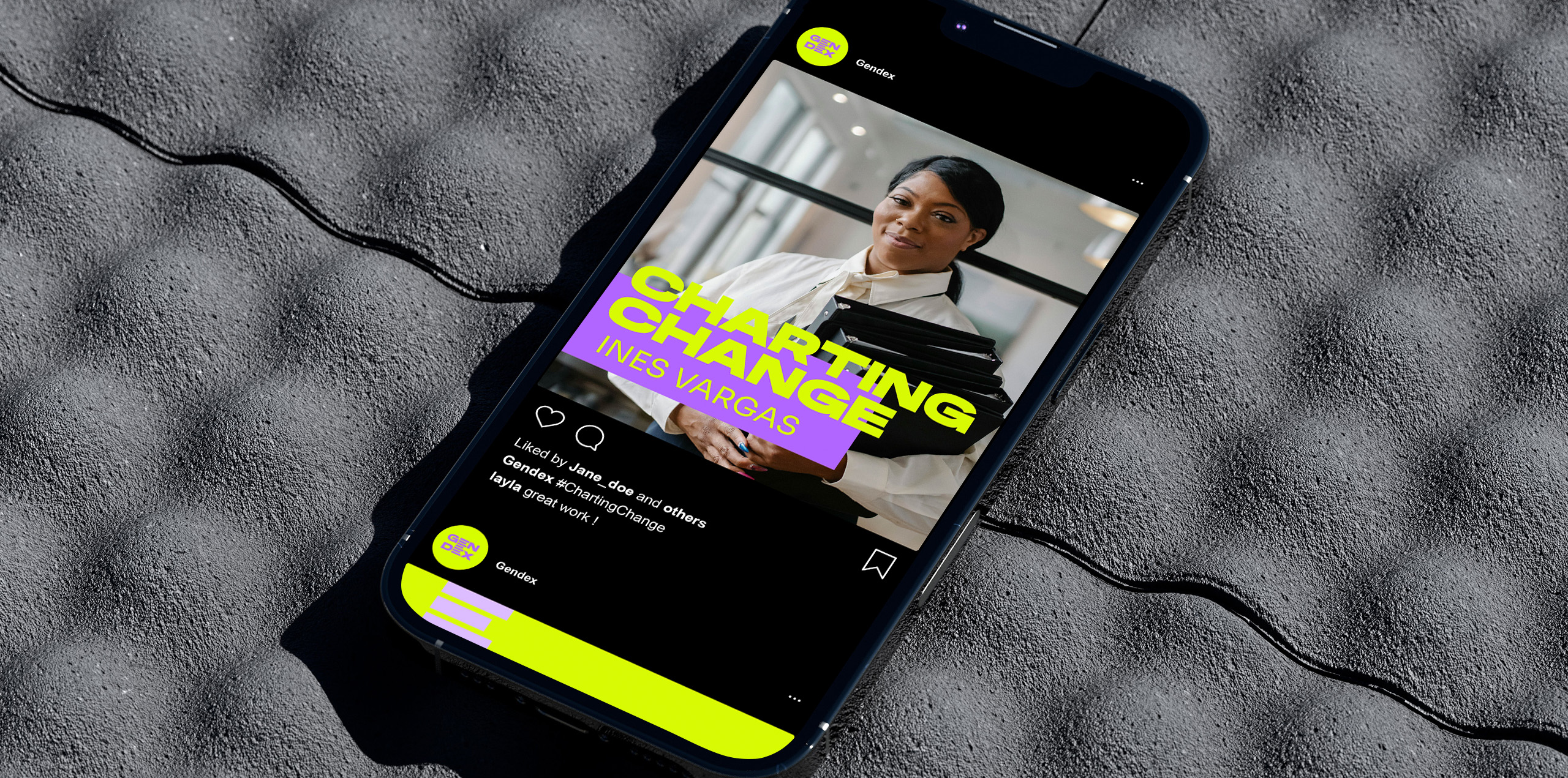
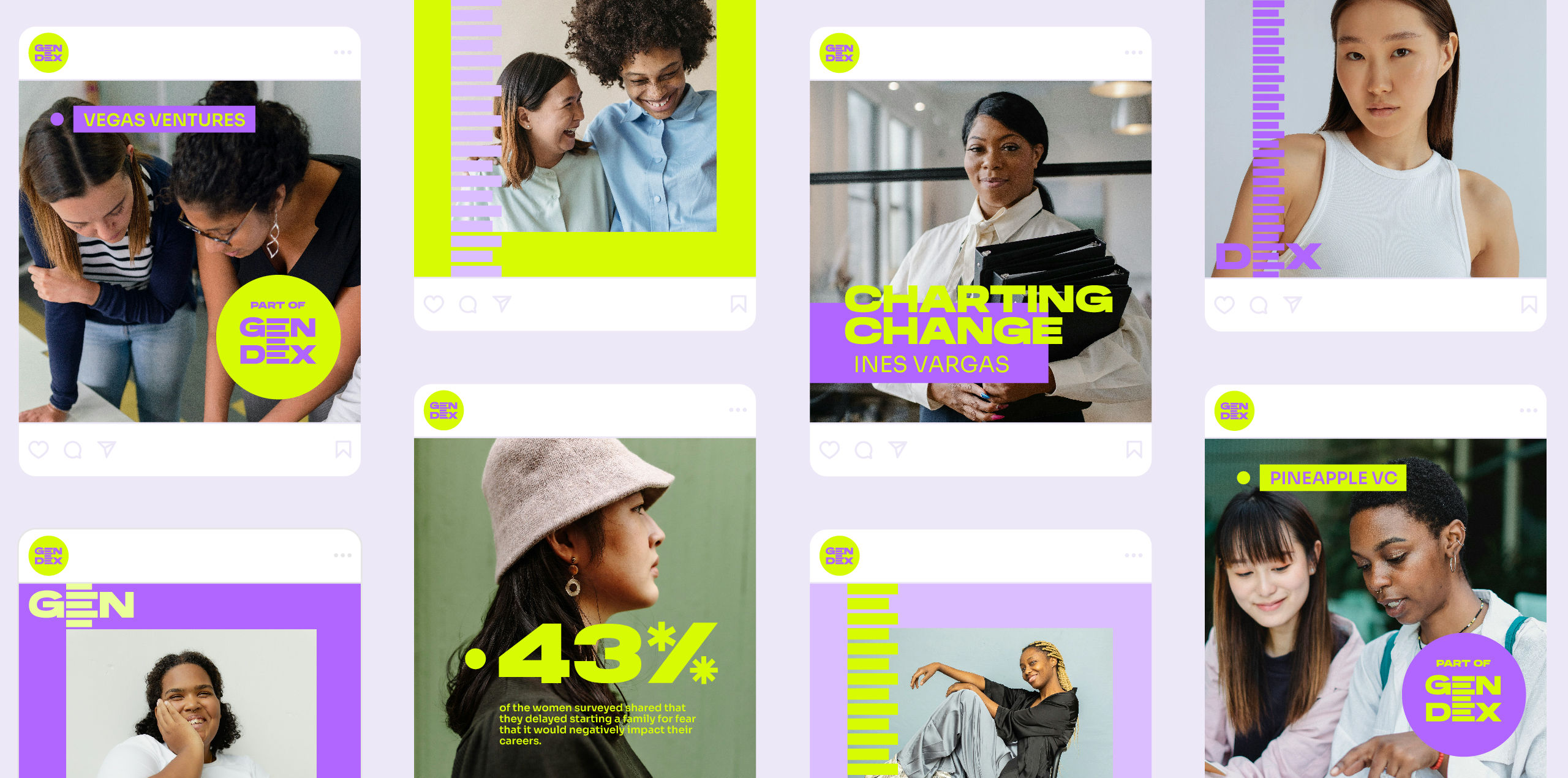
Gendex is a reflection of the people it represents, so showcasing them is essential. Without the individuals it serves, Gendex wouldn’t exist. The images we choose play a significant role in shaping how Gendex is perceived: We celebrate confidence, diversity, professional growth and individual strength.


Empowerment from every angle
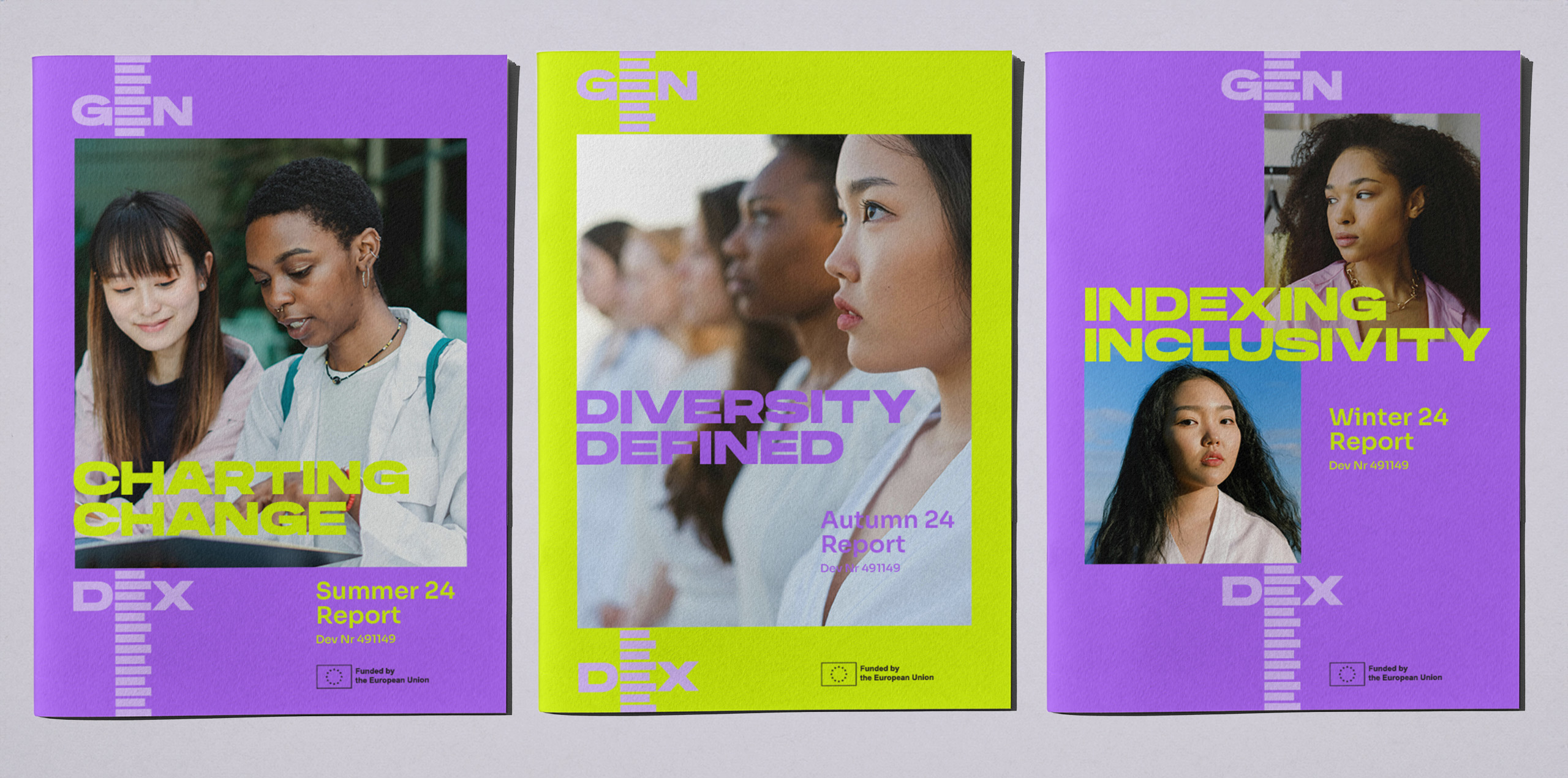
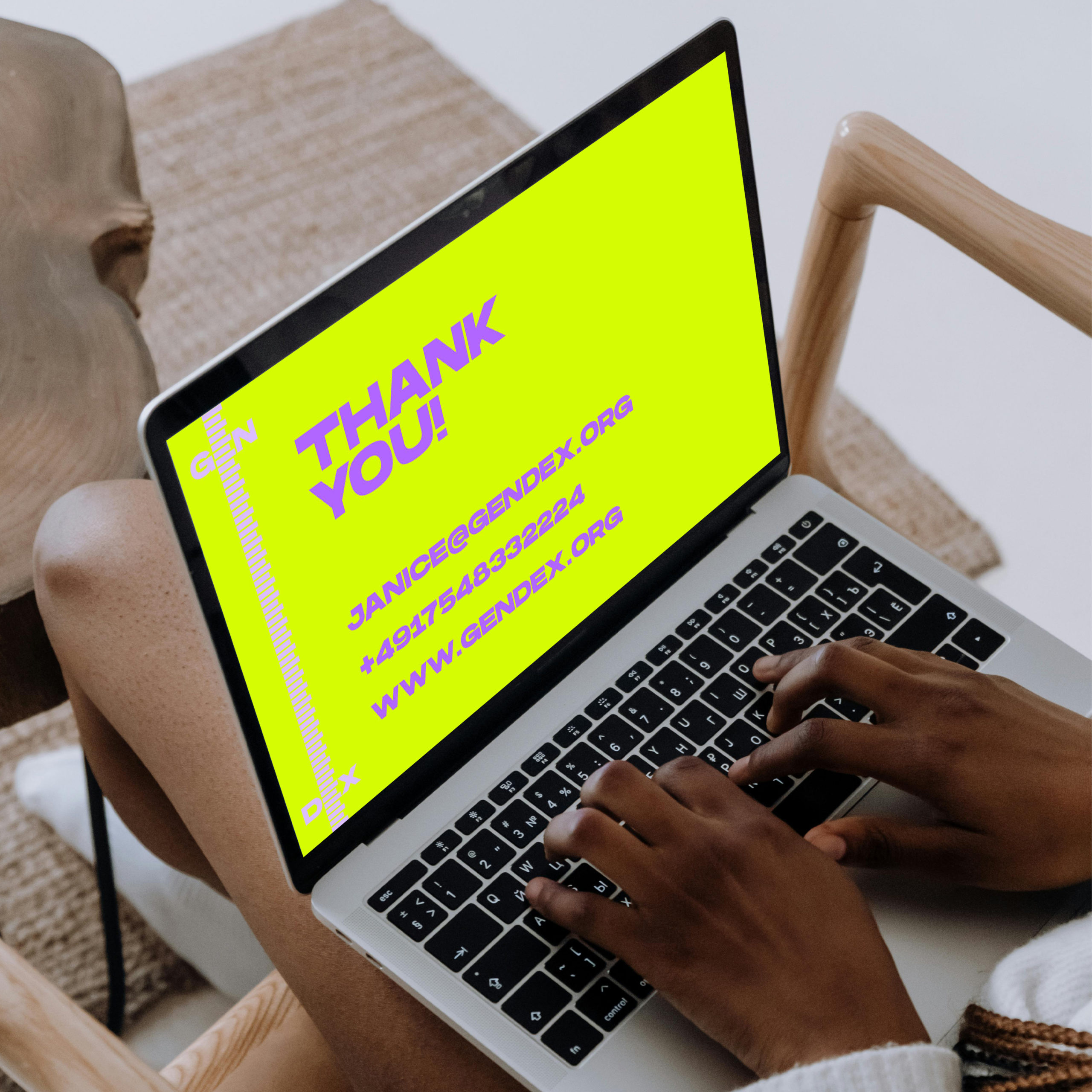
To cultivate a strong and professional brand presence, we’ve developed templates for presentations and reports that are in alignment with the brand’s mission and values. By providing these templates, we empower our team to effectively communicate our message while maintaining a cohesive and unified brand identity.
All templates and guidelines can be found on their online brand guide:
https://gendex.studioveh.com

Sparkling a conversation
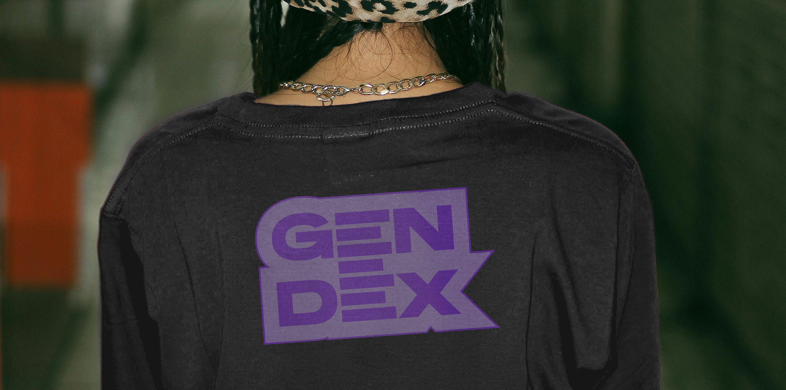
Our promotional products are a strategic way for us to connect with our targeted audience. These items are free and accessible, ensuring that people encounter our brand without any obligation to purchase. By distributing these products around the city or at events, we increase our visibility in a subtle and engaging manner. This approach allows us to spark curiosity and interest in our mission without being intrusive or pushy, creating organic opportunities for people to learn about and support Gendex.


Credits
Strategy: Franziska Veh
Creative Direction: Franziska Veh
Art Direction: Lind Haugaard
Design: Lind Haugaard, Laura Kjer Christiansen
Animation: Laura Kjer Christiansen